Table of contents
- Introduction
- Main points
- How has UK income inequality changed over time?
- What about inequality at the top of the distribution?
- How does UK income inequality compare with other countries?
- What impact do taxes and benefits have on income inequality?
- How do cash benefits affect income inequality?
- How do direct taxes affect income inequality?
- How do indirect taxes affect income inequality?
- What about household wealth?
- Background notes
- Methodology
1. Introduction
Income inequality has become an issue of considerable public debate in recent years, particularly since the economic downturn. Additionally, recent evidence has suggested that rising income inequality may be associated with lower economic growth (OECD, 2015), making it an important issue for consideration by policy makers.
The initial sections of this article use data from ONS and elsewhere to explore what has happened to income inequality both in recent years and over the longer term, including the incomes of the richest 1%.
Most of the remaining sections focus on the impact of taxes and benefits on reducing income inequality, considering how this impact has changed over time, and why.
Back to table of contents2. Main points
Overall trends
Since 2007/08, there has been a slight decrease in overall income inequality, though from a longer-term perspective it is above levels seen in the early 1980s.
While there was little change in overall levels of inequality during the 1990s and early 2000s, unofficial estimates suggest the income share of the richest 1% (and 0.1%) increased steadily over this time. However, since the economic downturn their income share has fallen sharply.
Impact of cash benefits
Cash benefits play a large role in reducing income inequality, leading to a reduction in inequality as measured by the Gini coefficient of 14.2 percentage points in 2014/15.
Since the late 1990s, the progressivity of cash benefits has decreased, meaning that they have become less targeted towards reducing inequality.
However, the average amount households receive in cash benefits as a proportion of their income increased for much of that time. This meant that, between 2001/2 and 2011/12, their overall effect on reducing inequality increased slightly.
Impact of direct taxes
Direct taxes (Income Tax, National Insurance contributions and Council Tax or rates) also reduce income inequality, reducing the Gini coefficient by a further 3.2 percentage points in 2014/15.
Since 1977, the average proportion of income households pay in direct taxes has generally fallen, most recently going from 21.4% of gross income in 2007/08 to 18.8% in 2014/15.
At the same time, despite a number of fluctuations, direct taxes have generally been becoming more progressive. These 2 factors, operating in opposite directions, have led to the overall impact of direct taxes on inequality remaining at a similar level for most of the time since 1977.
Impact of indirect taxes
Unlike cash benefits and direct taxes, indirect taxes are regressive, meaning that they have the effect of increasing income inequality, leading to a 3.5 percentage point increase in the Gini coefficient in 2013/14.
Since 1977, indirect taxes have become more regressive, with most of that change happening during the 1980s.
International context
Before any taxes and benefits, the UK had one of the highest levels of income inequality in the EU. However, the UK’s tax and benefits system appears to be more redistributive than that of many other countries with relatively high pre-tax and benefits inequality, bringing the UK close to the overall EU average for inequality of disposable income.
Across the EU, the countries with the lowest levels of inequality of disposable income in 2013 included Slovakia (24.2%), Slovenia (24.4%), and the Czech Republic (24.6%). The highest levels of income inequality were observed in Bulgaria (35.4%), Latvia (35.2%) and Lithuania (34.6%).
Back to table of contents3. How has UK income inequality changed over time?
There are a number of different ways in which inequality of household income can be presented and summarised. Among them, the Gini coefficient is one of the most widely used measures. This takes values between 0 and 100, with higher values representing an increase in the level of inequality. A value of 0 indicates complete equality in the distribution of household income, implying that all households have the same equivalised income. A value of 100 indicates complete inequality, implying that 1 household has all the income, and the others have no income.
The Gini coefficients for original income (income before any taxes and benefits), gross income (after cash benefits are added), disposable income (after cash benefits are added and direct taxes subtracted) and post -tax income (after cash benefits are added and both direct and indirect taxes are subtracted) for all households are represented in Figure 1.
Figure 1: Gini Coefficients for different income measures, 1977 to 2014/15
UK
Source: Office for National Statistics
Notes:
- 2014/15 data is not yet available for Equivalised Post Tax Income.
Download this chart Figure 1: Gini Coefficients for different income measures, 1977 to 2014/15
Image .csv .xlsThroughout the 1980s, income inequality increased across all 4 measures of income, though the pattern of growth differed according to the measure of income. The Gini coefficient for equivalised original income grew throughout the decade. However, inequality of gross income, disposable income and post- tax income were relatively stable during the first part of the 1980s. There was then a sharp increase in the Gini coefficients for these income measures in the second half of the decade. This was due to a change in the impact of taxes and benefits, which will be explained in more detail later in the article.
The figures for the 1990s show a different story. Inequality of original income was flat initially, before a slight increase towards the middle of the decade. For the remainder of the 1990s, the Gini coefficient for original income was fairly stable, indicating that the level of income inequality was relatively unchanged. In contrast, inequality of disposable income reduced slowly from 1990 until the mid-1990s, although it did not fully reverse the rise seen in the previous decade. In the late 1990s, inequality of gross, disposable and post-tax income rose slightly once again but flattened off by the end of the period.
Between 2001/02 and 2004/05, income inequality fell for all of the inequality measures other than equivalised original income, which remained relatively flat. Over this period there was a slight fall in inequality of original income, due to faster growth in income from earnings and self-employment income at the bottom end of the income distribution. Policy changes, such as increases in the national minimum wage, tax credit payments and National Insurance contributions, also contributed to slightly larger reductions in inequality of disposable and post-tax income.
Between 2004/05 and 2006/07, there was a slight increase in inequality, owing to increased inequality of original income. This was partly because of the faster growth rate of wages, salaries and investment income in the upper part of the distribution compared with the lower part of the distribution. The Gini coefficient for original income continued to rise until 2008/09. Since then, the overall pattern has been one of little change until 2013/14, where the return to real growth in average incomes was accompanied by a fall in inequality of original income.
Since 2006/07, the Gini coefficients for gross, disposable and post-tax income have all decreased, reflecting a fall in income inequality on these measures and resulting in some of the lowest levels of income inequality observed since the late 1980s.
The characteristics of the Gini coefficient make it particularly useful for making comparisons over time, between countries and before or after taxes and benefits. However, no indicator is completely without limitations and one drawback of the Gini is that, as a single summary indicator, it cannot distinguish between different-shaped income distributions. For that reason, it is useful to look at this index alongside other measures of inequality. One such measure is the S80/S20 ratio, which is the ratio of the total income received by the 20% of households with the highest income to that received by the 20% of households with the lowest income. Another related measure is the P90/P10 ratio. This is the ratio of the income of the household at the bottom of the top decile to that of the household at the top of the bottom decile.
A relatively recently developed inequality measure, the Palma ratio, takes the ratio of the income share of the richest 10% of households to that of the poorest 40% of households. The idea behind using the Palma ratio is that the middle 50% of households are likely to have a relatively stable share of income over time, and hence isolating them, should not lead to a substantial loss of information (Cobham and Sumner, 2013). Together these measures provide further evidence on how incomes are shared across households and how this is changing over time.
Figure 2: Change in Gini coefficient, S80/S20 ratio, P90/P10 ratio and Palma ratio for equivalised disposable income, 1977 to 2014/15
UK
Source: Office for National Statistics
Download this chart Figure 2: Change in Gini coefficient, S80/S20 ratio, P90/P10 ratio and Palma ratio for equivalised disposable income, 1977 to 2014/15
Image .csv .xlsFigure 2 shows that income inequality trends in the UK since 1977 have been very similar on all 4 measures. Some year-on-year movements may reflect survey volatility; however, it can be seen that inequality of disposable income increased in the late 1980s and, to a lesser extent, during the late 1990s during periods of faster growth in income from employment, and fell in the early 1990s during a period of slower growth in employment income.
Since the turn of the millennium, changes in income inequality have been relatively small compared with previous decades, though overall there has been a fall in inequality on all the measures.
In the early 2000s, income inequality fell. This was in part owing to faster growth in income from earnings and self-employment at the bottom end of the income distribution. Policy changes, such as increases in the national minimum wage, tax credit payments and National Insurance contributions in 2003/04, are also likely to have had an impact.
The most recent peak in income inequality was in 2006/07 or 2007/08, depending on the measure used. Since then the broad trend has been one of gradual decline in levels of inequality on each of the measures.
Back to table of contents4. What about inequality at the top of the distribution?
There is particular public interest in looking at the incomes of the very richest households and how they relate to the rest of the population. However, with statistics based on household surveys, any estimates for the top 1% (or 0.1%) of the distribution would be based on a small number of households and would not be sufficiently precise to draw accurate conclusions.
The best set of official statistics for looking at high income individuals is the Survey of Personal Incomes (SPI), produced by HMRC. However, the SPI does not cover individuals with personal incomes below the income tax personal allowance, and no attempt is made to estimate the numbers of people below this threshold or the value of their incomes.
An unofficial source of statistics that presents measures on the income share of the top 0.1% and 1% is the World Top Incomes Database, which contains figures for the UK developed by Sir Tony Atkinson. These are shown in Figure 3, alongside the gross income shares of the richest 10% and 20%.
Figure 3: Share of gross income, 1990 to 2014/15
UK
Source: Office for National Statistics. Richest 1% and 0.1%: World Top Incomes Database (Atkinson, 2015)
Notes:
- For the Richest 1% and Richest 0.1%, there is a break in the series between 2007 and 2010 due to missing data
Download this chart Figure 3: Share of gross income, 1990 to 2014/15
Image .csv .xlsSome care should be taken in interpreting the 2 sets of figures in Figure 3, as the different sources used mean that they are not completely comparable. Despite this, it is possible to observe that while any changes in the income share of the richest 10% or 20% have been relatively small since the start of the 1990s. By contrast, the income shares of both the top 1% and 0.1% steadily increased for much of the time through to 2007/08, and remained at similar levels in 2009/10.
This highlights that while overall levels of income inequality (on measures including the Gini coefficient) were stable or even fell slightly over this period, inequality at the top of the distribution was growing, with the richest receiving an increasing share of total income.
Between 2009/10 and 2010/11, there was a sharp fall in the income share of the richest 1% (and 0.1%), with the share remaining broadly stable in the following years. This means that, on these measures as well as those shown in Figures 1 and 2, the years since the economic downturn have seen an overall fall in income inequality.
Back to table of contents5. How does UK income inequality compare with other countries?
Based on the Gini coefficient, equality of equivalised disposable income in the UK was relatively close to the overall EU average in 2014 (30.9% EU average, compared with 31.6% in the UK on a comparable basis).
Figure 4 shows the extent to which taxes and benefits redistribute income in different EU countries in 2013, the latest year for which more detailed information is available across the EU on a comparable basis. As can be seen, the effectiveness of taxes and benefits in reducing inequality varies considerably, meaning that those countries with the lowest inequality of original income are not necessarily those with the lowest levels of inequality of disposable income.
The data indicate that, before any taxes and benefits, the UK had one of the highest levels of income inequality in the EU. However, the UK’s tax and benefits system appears to be more redistributive than that of many other countries with relatively high inequality of original income, bringing the UK close to the overall EU average for disposable income inequality.
Across the EU, the countries with the lowest levels of income inequality in 2013, based on the Gini coefficient for disposable income, included Slovakia (24.2%), Slovenia (24.4%) and the Czech Republic (24.6%). The highest levels of income inequality were observed in Bulgaria (35.4%), Latvia (35.2%) and Lithuania (34.6%).
Figure 4: Gini coefficients of equivalised original and disposable income, 2013
EU
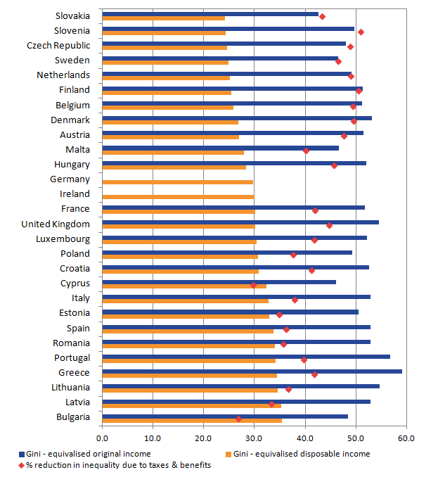
Source: EU Statistics on Income & Living Conditions: Eurostat, UDB 2013 - version 2 of August 2015
Notes:
- Data not available to calculate Gini coefficient for equivalised original income for Germany and Ireland
Download this image Figure 4: Gini coefficients of equivalised original and disposable income, 2013
.png (21.8 kB) .xls (21.0 kB)6. What impact do taxes and benefits have on income inequality?
By comparing Gini coefficients both before and after taxes and benefits are taken into account, it is possible to measure the redistributive effects of taxes and benefits. For example, by making a comparison of the Gini coefficients for original and gross income, the change in inequality caused by cash benefits (for example, tax credits, housing benefits and income support) is shown. A similar comparison of the Gini coefficients for gross and disposable income shows the change caused by direct taxes (income tax, employees’ National Insurance contributions and Council Tax or Northern Ireland rates). A comparison of disposable income and equivalised post- tax income shows the changes caused by the effects of indirect taxes (such as VAT and fuel and alcohol duties).
Figure 5: Change in Gini coefficients because of cash benefits and taxes, 1977 to 2014/15
UK
Source: Office for National Statistics
Notes:
- 2014/15 data is not yet available for indirect taxes.
Download this chart Figure 5: Change in Gini coefficients because of cash benefits and taxes, 1977 to 2014/15
Image .csv .xlsThe change in inequality caused by taxes and benefits for all households between 1977 and 2014/15 can be seen in Figure 5. Throughout this time, cash benefits played the largest role in reducing income inequality. Throughout the late 1970s and early 1980s, the impact of cash benefits on reducing inequality increased, with cash benefits leading to a 16.9 percentage point reduction in the Gini coefficient. This ensured that, even though inequality of original income was increasing substantially over this period, any changes in the Gini for gross income were much smaller. However, during the late 1980s, their redistributive impact weakened, and by 1990 they reduced the Gini by only 12.9 percentage points, accelerating the growth in inequality of disposable income. The impact of cash benefits has continued to vary over time. More recently, there has been a slight increase in the effect of cash benefits on income inequality, with their impact on reducing the Gini rising from 13.5 percentage points in 2006/07 to 15.6 percentage points in 2011/12. However, in the last few years, as inequality of original income has fallen, the impact of cash benefits has again reduced slightly.
Direct taxes act to reduce income inequality, though by a smaller amount. There has also been less variation in the impact of direct taxes over the time studied, with a typical reduction in income inequality between 3 and 4 percentage points.
By contrast, indirect taxes such as VAT act to increase income inequality. The impact of indirect taxes on increasing income inequality grew between 1978 (1.5 percentage point increase in Gini) and about 1991 (3.5 percentage point increase). Since then, there has been very little change in the redistributive impact of indirect taxes.
The following 3 sections of this report examine the effect of taxes and benefits on income inequality in more detail. The redistributive impact of taxes and benefits is dependent on 2 factors:
- the relative size of the tax or benefit as a proportion of income; this can be referred to as the average tax or benefit rate
- the progressivity of the tax or benefit. A tax is considered to be progressive when high-income groups face a higher average tax rate than low-income groups. If those with higher incomes pay a higher amount but still face a lower average tax rate, then the tax is considered regressive; similarly, cash benefits are progressive where they account for a larger share of low- income groups’ income
Progressivity is measured through the Kakwani index (Kakwani, 1977). For taxes, a positive value indicates that the tax is progressive overall and acting to reduce inequality. The larger the value, the more progressive the tax is. A negative value would indicate that the tax is regressive and therefore contributing to increased inequality.
Conversely, for benefits, a negative value indicates that the benefits are progressive and acting to reduce the level of inequality. Again, the larger the negative value, the more progressive the benefit is.
Back to table of contents7. How do cash benefits affect income inequality?
As described in the previous section, the overall redistributive impact of cash benefits is explained by 2 factors: the average rate of those benefits (as a % of original income), and the level of progressivity (Figure 6).
Figure 6: Progressivity, average rate and overall redistributive impact of cash benefits, 1977 to 2014/15
UK
Source: Office for National Statistics
Notes:
- For progressivity (measured using the Kakwani index), a negative value indicates that cash benefits are progressive leading to a reduction in the level of inequality. A decreasing value means that benefits are becoming more progressive leading to an increase in the level of inequality.
Download this chart Figure 6: Progressivity, average rate and overall redistributive impact of cash benefits, 1977 to 2014/15
Image .csv .xlsFigure 6 shows that cash benefits, as measured by the average benefit rate, have fluctuated according to the general economic conditions – the rate rose during and immediately after the early 1980s and 1990s economic downturns, and fell during the following years of economic growth. The exception is the late 2000s, where cash benefits were already rising as a proportion of income before the start of the economic downturn. This general pattern is to be expected: periods of economic downturn are associated with increased unemployment and stagnating or falling wages, meaning that cash benefits will account for a larger proportion of people’s incomes.
During the early 1980s downturn, cash benefits became slightly less progressive and this was accompanied by an increase in their average size. This means that although cash benefits increased during that period, they were less targeted at reducing inequality. The mid and late 1980s saw a decline in average cash benefits while at the same time they became more progressive. The decline in the average rate of cash benefits in the late 1980s was largely driven by reductions in housing benefit, unemployment benefit and income support or supplementary benefit over the period. Despite the increase in progressivity, the overall redistributive impact of cash benefits decreased during this period.
During and after the downturn at the start of the 1990s, there was an increase in both average cash benefits and levels of progressivity. This means that the amount of cash benefits available to households increased and this was targeted towards reducing inequality.
Since the late 1990s, the progressivity of cash benefits has generally decreased, meaning that they have become less targeted towards reducing inequality. Over this time, there have been 2 periods of growth in average cash benefits. The first, in the early 2000s, was associated in part with the introduction of tax credits, as well as growth in the number of State Pension claimants. Housing benefit and the State Pension were 2 of the main contributors to the second period of growth in the average benefit rate, between 2006/07 and 2011/12.
Most recently, the average cash benefit rate has fallen which, along with decreasing progressivity, means that the overall redistributive impact of cash benefits has been reduced.
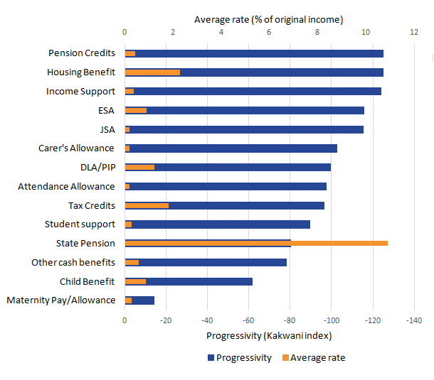
Figure 7 provides a snapshot of both the size and progressivity of individual cash benefits in 2014/15. This shows that whilst all the main cash benefits are progressive, the level of progressivity varies considerably. The most progressive cash benefits in 2014/15 were Pension Credit, Housing Benefit and Income Support, meaning that these were the benefits that were most targeted towards reducing inequality.
Figure 7: Progressivity and average rates of different cash benefits, 2014/15
UK

Source: Office for National Statistics
Download this image Figure 7: Progressivity and average rates of different cash benefits, 2014/15
.png (14.7 kB) .xls (17.9 kB)Maternity Pay and Maternity Allowance were by far the least progressive of the benefits examined, with Child Benefit and the State Pension also less progressive than many other cash benefits.
Figure 8 shows how important individual cash benefits contribute to the overall progressivity of cash benefits and how this has changed over a 20-year period. Throughout this time, the State Pension has made the largest contribution to the overall progressivity of benefits, despite being less progressive than many of the other benefits. This is because, as shown in Figure 7, the State Pension makes up a large proportion of the total cash benefits received by households.
Figure 8: Contribution of key benefits to overall progressivity of cash benefits, 1994/95 to 2014/15
UK
Source: Office for National Statisics
Download this chart Figure 8: Contribution of key benefits to overall progressivity of cash benefits, 1994/95 to 2014/15
Image .csv .xlsFigure 8 highlights some of the impacts of changes to the benefits system over this period. The replacement of Family Credit with Working Families Tax Credit in 1999, followed by the introduction of Child Tax Credit and Working Tax Credit in 2003, has lead to tax credits making an increasing contribution to the overall progressiveness of cash benefits, with tax credits making the third- largest contribution in 2014/15 (after Housing Benefit and the State Pension).
By contrast, the contribution to overall progressivity made by benefits such as Income Support, Pension Credit and Incapacity Benefit, and most recently, Employment and Support Allowance, has reduced over time. In 1994/95, these benefits together accounted for 25% of the overall progressivity of cash benefits. By 2014/15, the contribution of these benefits had reduced to 11%. This effect is the main reason why overall progressivity has generally fallen over this period, despite the increasing contribution of tax credits.
Back to table of contents8. How do direct taxes affect income inequality?
Direct taxes consist of Income Tax, employees’ National Insurance contributions and Council Tax (or rates in Northern Ireland). Figure 9 shows the overall redistributive impact of direct taxes, as well as the 2 factors that contribute to that: the average rate and the level of progressivity.
Based on this measure of progressivity (Kakwani index), this figure indicates that overall, direct taxes in the UK have been progressive in all years between 1977 and 2014/15. Throughout this period, there have been a number of fluctuations in the degree to which these taxes have been progressive as a whole, though the overall pattern has been one of increasing progressivity.
At the same time, the average direct tax rate has fallen, from 22.9% in 1977 to 18.8% in 2014/15, mainly due to Income Tax. These 2 factors, operating in opposite directions, led to the overall redistributive impact of direct taxes (measured as a percentage reduction in the Gini coefficient) remaining between around 9% and 10% for most of this period. The one major exception is a period between the late 1980s and early 1990s, where a falling average tax rate, combined with decreasing progressivity, led to the redistributive impact falling to around 5%.
Figure 9: Progressivity, average rate and overall redistributive impact of direct taxes, 1977 to 2014/15
UK
Source: Office for National Statistics
Notes:
- For progressivity (measured using the Kakwani index), a positive value indicates that taxes are progressive, with an increasing value meaning that taxes are becoming more progressive.
Download this chart Figure 9: Progressivity, average rate and overall redistributive impact of direct taxes, 1977 to 2014/15
Image .csv .xlsThe progressivity of the individual direct taxes is shown in Figure 10. The figure shows that income tax has been more progressive, and therefore more targeted towards reducing inequality than employees’ National Insurance contributions for all years between 1977 and 2014/15; although they have both been progressive throughout this period. The figure also shows that local taxes have been regressive, and as such, not targeted at reducing inequality.
Figure 10: Progressivity of direct taxes, 1977 to 2014/15
UK
Source: Office for National Statistics
Notes:
- A positive value indicates that a tax is progressive, with an increasing value meaning that the tax is becoming more progressive. A negative value indicates that the tax is regressive.
Download this chart Figure 10: Progressivity of direct taxes, 1977 to 2014/15
Image .csv .xlsThe progressivity of both income tax and employees’ National Insurance contributions has fluctuated considerably over the period studied, but the overall trend has been towards increased progressivity, meaning that both income tax and National Insurance have become more targeted towards reducing income inequality over this time.
There have been larger variations over time in the extent to which local taxes have been regressive, which can be attributed in part to the policy changes throughout the period. During the late 1970s and much of the 1980s, local taxes became steadily more regressive, with the Kakwani index falling from -23.5 in 1977 to -31.4 in 1988. The replacement of domestic rates with the Community Charge in Scotland in 1989 and England and Wales in 1990 was associated with local taxation becoming more regressive. Following the introduction of Council Tax, local taxes became considerably less regressive, with the Kakwani index increasing to -22.1 by the 1994/95 financial year. Since then, any changes in the progressivity of local taxes have been much smaller.
Back to table of contents9. How do indirect taxes affect income inequality?
Indirect taxes consist of taxes paid on spending, such as VAT, duties on alcohol, tobacco and fuel, as well as taxes incurred by businesses that are passed onto customers through the prices of goods and services. The amount each household pays is determined by their expenditure rather than their income. Figure 11 shows the progressivity and average rate (as a percentage of income) of indirect taxes, alongside the overall redistributive impact.
Figure 11: Progressivity, average rate and overall redistributive impact of indirect taxes, 1977 to 2013/14
UK
Source: Office for National Statistics
Notes:
- For progressivity (measured using the Kakwani), a negative value indicates that taxes are regressive, with a decreasing value meaning that taxes are becoming more regressive.
Download this chart Figure 11: Progressivity, average rate and overall redistributive impact of indirect taxes, 1977 to 2013/14
Image .csv .xlsIndirect taxes in the UK have been regressive throughout the period for which data are available, meaning that they have the effect of increasing income inequality. Additionally, indirect taxes have become more regressive over time, with most of this change happening during the 1980s. Along with an increase in the average rate of indirect taxes during the first part of the 1980s, this led to indirect taxes having an increasing effect on income inequality.
During the 1990s, both the average rate of indirect taxes and the extent to which they were regressive changed relatively little, meaning that their impact on income inequality was also relatively unchanged during this period.
Most recently, there have been more fluctuations in the average rate as a proportion of disposable income, reflecting in part changes to VAT. In December 2008, the standard rate was reduced from 17.5% to 15% and remained at this level until December 2009 before returning to 17.5%. In January 2011, the VAT rate was further increased to 20% and it has remained at this level since then. The increase in the average rate of indirect taxes from 2010/11 onwards has led to these taxes having a slightly increased impact on income inequality, despite indirect taxes also becoming slightly less regressive over the same time period.
Back to table of contents10. What about household wealth?
The focus of this article is on income inequality. However, it is also important to consider inequalities in wealth, as well as the relationship between income and wealth more generally.
Household wealth is more unevenly distributed than income, something that can be seen in various inequality measures. For example, the Gini coefficient for total household wealth in Great Britain in July 2012 to June 2014 was 63%, compared with 32% for UK equivalised disposable income in the 2013/14 financial year. Similarly, in July 2012 to June 2014, the wealthiest fifth of households owned 62% of all private household wealth, whereas the richest fifth by income received 40% of total equivalised disposable income. The observation that wealth inequality is greater than income inequality is in some ways unsurprising. Even if there was no income inequality, with all households receiving the same income, wealth inequality would still exist as those who are older (and therefore receiving an income for longer) would likely have accumulated more wealth through saving.
Households with high levels of income often have high levels of wealth. Nevertheless, there are exceptions to this rule. For instance, some young individuals might be on high levels of income but have yet to accumulate comparably high levels of wealth, and conversely some retired people may have relatively low incomes but high levels of wealth.
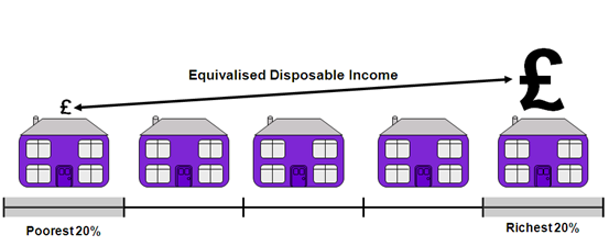
Figure 12 explores the relationship between the income and wealth quintiles that a household belongs to. A higher percentage of households in the top income quintile also found themselves in the top wealth quintile than any other income group (50%). Similarly, a higher percentage of households in the lowest quintile of total household income found themselves in the lowest quintile of total household wealth than any other income group (42%). The distribution of households across the different wealth quintiles was most even for the middle income group.
Figure 12: Distribution of total household wealth, by total household equivalised disposable income quintile
Great Britain, July 2012 to June 2014
Source: Office for National Statistics
Download this chart Figure 12: Distribution of total household wealth, by total household equivalised disposable income quintile
Image .csv .xlsFurther analysis of both inequalities in household wealth and its relationship with income can be found in the Wealth in Great Britain – Wave 4 report.
Back to table of contents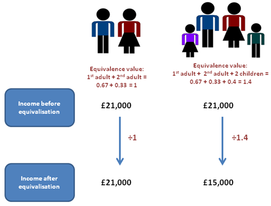
