Table of contents
- Introduction
- House prices
- Annual salary
- Affordability of home ownership
- Repossessions
- Cost of private rent
- Monthly salary
- Affordability of private renting
- Cost of social rent
- Weekly salary and social housing
- Affordability of social housing
- Privately owned housing
- House building
- Housing market activity
- Social housing stock
- Vacant social housing
- Social housing shortfall
1. Introduction
This report provides analysis of 16 housing summary measures, which give an overview of the affordability and availability of home ownership and social renting at the local authority level in England and Wales, as well as the affordability of private rented housing. The housing summary measures include data from multiple sources and provide a summary of recent trends in various measures of housing affordability and availability, for different tenure types.
The housing summary measures have been updated with the most recent data, extending the available time series to the 2015 calendar year where possible. These measures are taken directly from previously published data or calculated using previously published official statistics as the base. Consistent time series data for England and Wales have been included where possible to provide comparable local authority level estimates. Data are expressed as percentages, ratios or prices to ensure comparability across local authorities.
The 2015 housing summary measures include one additional measure than in 2014. This is the number of repossessions by type, which provides a further indication of the changing affordability of housing in different tenures.
Back to table of contents2. House prices
In order to explore house prices, the median price paid for residential properties are taken from the House Price Statistics for Small Areas produced by the Office for National Statistics. The median price paid for residential properties in England and Wales overall was £207,500 in 2015, which is an increase of £12,500 (6.4%) since 2014. This was largely driven by the 7% annual increase in England, while in Wales the annual increase was 2%. The median price paid for property ranged from around £77,000 in Blaenau Gwent to nearly £1.2 million in Kensington and Chelsea.
The majority of local authorities in England and Wales had an increase in median price paid between 2014 and 2015. There were 8 local authorities in which the median price paid decreased, 5 of which were in the North West, 2 in Wales and 1 in London. The one London borough in which the median price paid decreased was Kensington and Chelsea. This is likely to be the result of increases in Stamp Duty payable on the most expensive properties from the end of 2014.
Figure 1 shows the median price paid for properties in the most expensive region in England (London), the least expensive region in England (North East), and Wales. The gap between the median price paid for properties in regions with the highest and lowest prices has become wider over time. This gap is largely the result of the steeper increase of house prices in London. Between 2014 and 2015, London had an average median house price increase of 9.6%, whereas there was an average increase of 5.5% in the North East of England.
Figure 1: Median price paid for properties in the highest and lowest English regions and Wales
1995 to 2015
Source: Office for National Statistics
Notes:
- Data from House Price Statistics for Small Areas.
Download this chart Figure 1: Median price paid for properties in the highest and lowest English regions and Wales
Image .csv .xlsIn 2015, Barking and Dagenham had the lowest median price paid for properties in London, at £245,000. Although this was the lowest median price paid in London, it was higher than two-thirds of all local authorities in England and Wales, reflecting generally higher house prices in London and its surrounding areas.
Figure 2 compares the growth in median price paid for residential properties, with the lowest 10th percentile and the highest 10th percentile of middle layer super output areas (MSOAs) between 1995 and 2015. Between 2007 and 2009, there was a decrease in the lowest 10th percentile, highest 10th percentile and median price paid, coinciding with the economic downturn. Since the downturn, house price growth has been fastest in the most expensive 10% of MSOAs. The median price paid in the least expensive 10% of MSOAs has grown more slowly and has not yet exceeded pre-economic downturn levels.
Figure 2: Indices of House Price Statistics for Small Areas
England and Wales, 1995 to 2015
Source: Office for National Statistics
Notes:
- Data from House Price Statistics for Small Areas.
Download this chart Figure 2: Indices of House Price Statistics for Small Areas
Image .csv .xlsSince 2007, the median price paid for properties in the most expensive 10% of England and Wales has increased by 37.6%. Over the same time, there has been a decrease in median price paid for properties in the least expensive areas, of 3.9%. There are many factors which may cause changes in house prices, including average earnings and the rate of population change. When there is a higher demand for owner occupied housing in an area, house prices tend to rise at a faster rate than in areas where the demand is lower.
Figure 3 shows there is a moderate positive correlation (0.39) between the change in population from 2013 to 2014 and the change in median house prices the following year (2014 to 2015). Given the small population change in local authorities each year, the positive correlation is only moderate. This suggests that local authorities in which the population has increased the most in one year generally have a larger increase in house price the following year. From looking at the correlation, it is clear that other factors also contribute to the house price change.
Figure 3: Changes in population (2013 to 2014) and median house prices (2014 to 2015), local authorities
England and Wales

Source: Office for National Statistics
Notes:
- Data from House Price Statistics for Small Areas and Population Estimates.
Download this image Figure 3: Changes in population (2013 to 2014) and median house prices (2014 to 2015), local authorities
.PNG (30.6 kB) .xls (94.2 kB)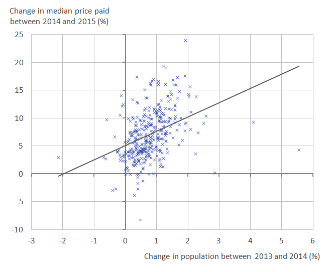
The population of England and Wales has increased steadily over time, but population increase is not the only factor increasing the demand for housing. One of the factors affecting housing demand is the characteristics and composition of residents that live in households. In 2015, 28.6% of all households in the UK were occupied by people living alone. This can contribute to increasing house prices which in turn makes it more difficult for young people to buy a house.
Back to table of contents3. Annual salary
Statistics on median gross annual salary for residents of local authorities in England and Wales are available from the Annual Survey of Hours and Earnings. In 2015, the median annual salary for England and Wales was £22,578. Local authorities where residents had the highest average gross annual salaries were predominantly in London. All local authorities in London, except for Newham, had a higher average annual salary than England and Wales overall. Average gross annual salaries ranged from £16,384 in Blackpool to £37,909 in Westminster; more than double that of Blackpool. Local authorities in which residents’ average salaries were higher than England and Wales overall were the areas that also had the highest median house prices.
Figure 4 shows that, in England and Wales, average annual salaries steadily increased from 2002 to 2015. However, there was a period of decreasing salary from 2009 to 2011, where the average salary had a statistically significant decrease from £21,538 to £21,315. This decrease was driven by England, as the average salary in Wales increased annually over the entire time series.
Figure 4 also shows that the median price paid for a residential property in England and Wales has increased more than the median annual salary since 2002. This was mainly caused by the increases in house prices between 2002 and 2007 (59% increase) and between 2011 and 2015 (29% increase). In 2015, the median price paid had increased by nearly 90% since 2002. During this period, median annual salary has increased by just over 30%, showing that buying a house has become less affordable.
Figure 4: Median price paid for property and annual salary indices
England and Wales, 2002 to 2015
Source: Office for National Statistics
Notes:
Download this chart Figure 4: Median price paid for property and annual salary indices
Image .csv .xls4. Affordability of home ownership
Knowing how much people are able to afford when buying a house requires data on both house prices and average earnings. Figure 5 shows the correlation between the median price paid for residential property (before considering other housing costs such as Council Tax, mortgage repayments or energy payments) and median gross annual salary for each local authority in England and Wales in 2015.
Figure 5: Median gross annual salary and median price paid for property by local authority
England and Wales, 2015
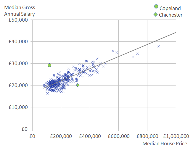
Source: Office for National Statistics
Notes:
Download this image Figure 5: Median gross annual salary and median price paid for property by local authority
.PNG (30.1 kB) .xls (87.0 kB)
There is a positive correlation of 0.8 between the median price paid for residential property and the median gross annual salary. This means that local authorities where the residents earn more are more likely to have a higher median house price. This may be due to the increased likelihood of home ownership in areas with higher average salaries, creating a higher demand for housing in these areas and in turn, higher house prices. Local authorities plotted above the trend line on Figure 5 can be considered as relatively more affordable than the average, whilst those below the trend line can be seen as relatively less affordable.
For Chichester, in the South East of England, it was relatively less affordable to own a house in 2015. Here, the median annual salary was £20,062, which is below the median salary of England and Wales overall, whilst the median house price was in the highest 20% of all local authorities, at £315,500.
By using the Annual Survey for Hours and Earnings, we can compare the salaries for those who live in Chichester but may work elsewhere (residence-based earnings) with the salaries of those who work in Chichester but may live elsewhere (workplace-based earnings). Those who lived in Chichester had higher salaries than those who worked in Chichester (£20,062 and £18,504, respectively). It may be that those who live in Chichester often commute to other, higher salary areas, such as London. These higher earners are more likely to be able to afford the relatively high house prices in Chichester.
Copeland, in the North West of England, appears above the trend line, with a relatively high median annual salary and a relatively low median house price. The median house price in Copeland was £120,000, which falls in the lowest 10% of local authorities. However, Copeland had a median gross annual salary of £29,190 in 2015, which is in the highest 10% of all local authorities in England and Wales. Therefore, Copeland is a relatively affordable area to own a property. The average workplace-based annual salary for Copeland was £10,775 higher than the average residence-based salary (£39,965 compared with £29,190). This is likely to be the result of a large number of relatively high paid, skilled jobs at the Sellafield nuclear power station.
The ratio of median house price to salary is calculated using the ONS House Price Statistics for Small Areas for median house prices and the Annual Survey of Hours and Earnings for gross annual salaries. Median house prices are divided by the median total gross annual salary to derive the affordability ratio.
In 2015, Westminster had the highest ratio of house prices to annual salary in England and Wales, with house prices being 23 times greater than median gross annual salary. Therefore, Westminster is considered as the least affordable area to buy a property in England and Wales. Burnley has replaced Blaenau Gwent as the most affordable area of England and Wales to buy a property in 2015. The average house price in Burnley is less than 4 times the median annual salary.
Figure 6 shows that the affordability ratio for Westminster increased annually in recent years, up to 2014, but decreased slightly in 2015, making it more affordable in 2015 than in 2014. This may be due to the ongoing effects of increasing Stamp Duty charges to the higher threshold of house prices. Between 2014 and 2015, the median price paid for residential property in Westminster increased by 0.2% whilst the average annual salary had a 2.9% increase. During the previous year, the median house price in Westminster increased 20.1%.
Burnley, which was the most affordable local authority in 2015, had an improvement in its affordability ratio, with house prices falling from 4.5 times the average annual salary in 2014, to 3.9 times the average annual salary in 2015. This improvement in affordability ratio was driven by an 8.2% decrease in median house price and a 7.8% increase in median annual salary. This compares with a 1.6% increase in average salary in England and Wales overall, which suggests a different employment mix in Burnley could be driving the larger salary increases.
Figure 6: Ratio of median house price to median salary for the most and least affordable local authorities
England and Wales, 2002 and 2015
Source: Office for National Statistics
Notes:
Download this chart Figure 6: Ratio of median house price to median salary for the most and least affordable local authorities
Image .csv .xlsThe gap between the most and the least affordable local authorities has increased since 2002 and Figure 6 suggests that this is caused by the least affordable areas becoming further away from the overall affordability ratio for England and Wales.
Back to table of contents5. Repossessions
Data on mortgage and landlord possession actions for England and Wales is available from the Ministry of Justice for 2003 to 2015. A mortgage or landlord possession action starts when a mortgage lender or landlord submits a claim to the courts to repossess a property. The court process of possessing a property tends to follow 4 main stages. First of all, a claim for a mortgage or landlord possession is issued by the mortgage lender or landlord; an order is then made by the county court. If the defendant fails to vacate the property by the given date the order may be enforced as a warrant of possession. Lastly, the property is repossessed by the county court bailiff. A total of all possession actions are recorded in the published possession actions statistics.
For 2015 in England and Wales, 38.2% of all possession actions were claims, 29% were orders, 22.1% were warrants and 10.7% were repossessions. Figure 7 shows the total number of possession actions in England and Wales over time for different tenure types. Mortgage possession actions were highest in 2008, during the recent economic downturn. Since then, the number of mortgage possessions has decreased annually and in 2015 was lower than in 2003.
Figure 7: Possession actions by tenure
England and Wales, 2003 to 2015
Source: Ministry of Justice
Notes:
- Data from Mortgage and landlord possession statistics.
Download this chart Figure 7: Possession actions by tenure
Image .csv .xlsThe fall in the number of mortgage possession actions since 2008 coincides with a sustained period of historically low interest rates, which has helped decrease the average cost of mortgages for those who can afford them. Social landlord possession actions were the most common type of possession action in 2015, having overtaken mortgage possession actions in 2011.
Falls in the number of mortgage possessions may also partly be the result of it being more difficult for first-time buyers to purchase a house after the economic downturn – a result of decreasing housing affordability – so those who do buy a property generally earn more and have more invested into a property than they once did. Such mortgage holders are at lower risk of becoming unable to make mortgage payments and are therefore less likely to be subject to mortgage possession actions. However, some prospective homeowners who would once have been able to afford to buy a house with a relatively small deposit now may need to become more financially strained in order to secure a mortgage with a larger deposit.
Mortgage, private landlord and social landlord possession actions all decreased between 2014 and 2015 (by 20%, 11% and 10.6% respectively). However, the number of accelerated possession actions has increased since 2009 and increased by 9% between 2014 and 2015. Accelerated possessions are usually quicker than other types of possession action and can be used by both private and social landlords under certain circumstances. The number of accelerated landlord possessions overtook the number of mortgage possessions in 2015, which indicates that although there were fewer possession actions overall, a quicker process for evictions – usually without a court hearing – is accounting for an increasing share of possession actions.
Back to table of contents6. Cost of private rent
The Valuation Office Agency (VOA) publishes statistics on median monthly private rent by local authorities in England. Data on monthly private rent is not strictly comparable either over time, between geographies or across property types due to the variations in samples used to calculate the statistics. As a result of this, data are only presented for England in 2015.
Welsh data are separate from the VOA statistics and so Welsh private monthly rent data for 2015 are analysed separately, using statistics published by the Welsh government.
For Wales, the majority of rents recorded were for 2 and 3 bedroom properties, where the median rents were £495 and £550 respectively. At a local authority level, the lowest median rent price recorded for Wales was £238.34 per month for a non self-contained single room in Rhondda Cynon Taf. The highest median rent was £975 per month for a 4 bedroom property in Cardiff. Figure 8 shows the range of monthly rents recorded for 2015, for 3 bedroom properties across Wales.
Figure 8: Range of monthly rents recorded for January to December, 2015, for 3 bedroom properties in local authorities in Wales 1,2,3

Source: Rent Officers Wales, Welsh Government
Notes:
- The average rents shown are simple averages and are not comparable over time.
- The range is shown as lower to upper quartile points (50 per cent of rents fall within this range).
- Local authorities are ranked according to median monthly rent.
Download this image Figure 8: Range of monthly rents recorded for January to December, 2015, for 3 bedroom properties in local authorities in Wales ^1,2,3^
.PNG (23.7 kB) .xls (28.2 kB)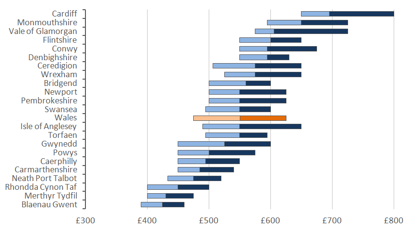
Figure 9 shows the distribution of median private rent prices in England and shows how London local authorities compare with other areas in England. In 2015, most of the expensive areas for renting privately in England were in London. In 2015, there were 3 local authorities which had a median private rent price of more than £2,000 per month. These were Kensington and Chelsea (£2,383), Westminster (£2,318) and City of London (£2,102). The highest median monthly private rents outside of London were in Elmbridge (1,295) and Three Rivers (£1,250), which are both just outside London. The areas with the lowest median monthly private rent in 2015 were Kingston upon Hull (£395) and Burnley (£400).
Figure 9: Distribution of median private rent prices for local authorities
England, 2015
Source: Valuation Office Agency
Notes:
- Data from Private rental market summary statistics.
Download this chart Figure 9: Distribution of median private rent prices for local authorities
Image .csv .xls7. Monthly salary
The Annual Survey of Hours and Earnings provides data on gross monthly salary for England and Wales, which can be used to identify the distribution of monthly salary by local authority. The geographical pattern for monthly salary follows the annual salary figures, in that London local authorities generally had higher salaries than other local authorities in England and Wales.
Figure 10 shows that in 2015, there were fewer local authorities in the lowest salary category and more local authorities in the highest salary categories than in 2007. This shows that there has generally been an increase in salaries on pre-economic downturn levels. Overall in England and Wales, median salary has increased 11.6% (from £1,686 to £1,882) since 2007.
Figure 10: Distribution of local authority median monthly salaries
England and Wales, 2007 and 2015
Source: Office for National Statistics
Notes:
- Data from Annual Survey of Hours and Earnings.
- Income band labels refer to the upper limit of each band.
Download this chart Figure 10: Distribution of local authority median monthly salaries
Image .csv .xlsThere were some exceptions to the pattern of higher salaries in areas of high private rent prices in 2015. For example, Copeland in the North West of England had an average gross monthly salary in the top 10% of all local authorities in England and Wales (£2,433 per month). However, the cost of private rent in Copeland was on average £450 per month, which is in the bottom 10% of all local authorities.
Back to table of contents8. Affordability of private renting
To examine the affordability of private renting in English local authorities, the median monthly private rent as a percentage of median gross monthly salary provides an indicator.
The highest percentage of rent price to monthly salary in 2015 was in Westminster, where median private rent represented 73.4% of median gross monthly salary. Local authorities in London comprised 14 out of the 15 least affordable areas for private renting. The local authority in the top 15 which is not in London was Sevenoaks, which was ranked the 14th least affordable local authority. Here, the median price of private rent represented 59.6% of median gross monthly salary. In 2015, there were 35 local authorities out of 326 with a median monthly private rent equivalent to 50% or more of median monthly salary.
Copeland had the most affordable private rent, with median private rent price being 18.5% of monthly salary. Out of all the local authorities in England, 76 areas had a median private rent price of less than 30% of median salary. Figure 11 shows the geographical spread of the most and least affordable areas for private renting.
Figure 11: Median monthly private rent as a percentage of median gross monthly salary, local authority district
England, 2015
Download this image Figure 11: Median monthly private rent as a percentage of median gross monthly salary, local authority district
.png (181.5 kB) .xls (34.3 kB)
9. Cost of social rent
Statistics on the average cost of social housing rent for local authorities in England and Wales are available from the Department for Communities and Local Government for England and Stats Wales for Wales.
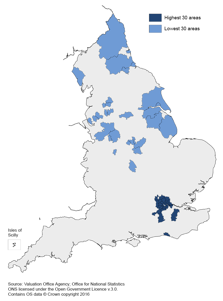
The local authority with the highest average social rent price in 2015 was Newham in London, at £134.52 per week, which is almost double the cheapest local authority, Pembrokeshire in Wales at £68.54 per week. The cost of social rent follows the general trend of other summary measures, in that local authorities in London tend to have higher costs than other areas. In 2015, out of the 348 local authorities in England and Wales, 124 had an average social rent over £100 per week, which is 20 more local authorities than there were in 2014, suggesting a general increase in the cost of social renting. All local authorities in London had an average social rent cost of over £100 per week. Figure 12 shows the geographical distribution of the 30 most and least expensive areas for social housing in England and Wales.
Figure 12: Average weekly social housing rent, local authority district
England and Wales, 2015
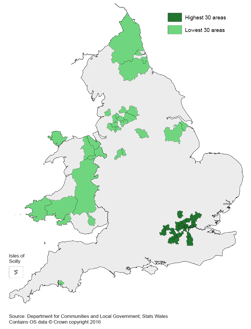
Download this image Figure 12: Average weekly social housing rent, local authority district
.png (201.4 kB) .xls (34.3 kB)
The geographical differences in the cost of social rent are not necessarily indicative of social housing affordability alone, but average earnings must also be considered. An area may have higher costs of social renting, but if the residents earn more on average, it makes the social renting more affordable. This is explored in more detail in section 11 – Affordability of social housing.
In the 2015 Summer Budget, the UK government announced a plan to charge full market rent to those living in social housing but earning a gross household income of more than £30,000, or £40,000 if living in London. This was expected to affect around 10% of households living in socially rented accommodation according to the Institute of Fiscal Studies. The government confirmed in 2016 that this plan has changed. Instead a taper will be applied, with those who fall above the thresholds set to pay an additional 15 pence in rent per week, for every £1 they receive in taxable income above the thresholds. This is due to be implemented from April 2017 and so this analysis of affordability will not be affected by last year’s Summer Budget, but is something that may have an effect on the housing summary measures in the future.
Back to table of contents10. Weekly salary and social housing
The people most likely to live in social rented accommodation in England and Wales are the lowest earning workers. To look at the relationship between social housing and salary, it is therefore useful to use only the lowest paid residents for analysis. To examine the lowest paid workers, we can look at the 10th percentile gross weekly salary, so only the bottom 10% of salaries are considered. Only weekly salary earned from paid work is considered here. This does not take into account additional income such as from housing benefits and other sources.
In 2015, the 10th percentile gross annual salary was £131.60 per week, or £6,843.20 per year. Figure 13 shows that there were 2 periods of decreasing 10th percentile gross weekly salary (from 2004 to 2005 and from 2010 to 2011). Overall, there has been an increase in average 10th percentile weekly salary of 31.4% from 2002 to 2015. This was slightly larger than the increase in median weekly salary which had a 30.1% increase from 2002 to 2015. This suggests that salaries at the lower end of the scale are increasing slightly faster than those in the wider salary distribution.
Tenth percentile weekly salary is expected to increase more in 2016 with the introduction of the new National Living Wage, which will see all workers aged over 25 earning at least £7.20 per hour.
Figure 13: Tenth percentile gross weekly salary
England and Wales, 2002 to 2015
Source: Office for National Statistics
Notes:
- Data from Annual Survey of Hours and Earnings.
Download this chart Figure 13: Tenth percentile gross weekly salary
Image .csv .xlsLondon local authorities comprised the majority of the upper end of the 10th percentile weekly salary.
There were 19 local authorities which had a 10th percentile gross weekly salary of below £100 per week in 2015. The East of England was the region with the most areas that had a 10th percentile weekly salary of less than £100 per week, with 6 local authorities. Of the local authorities that had an average weekly salary below £100 per week, none were in London and Pembrokeshire was the only local authority in Wales.
Workers in Wandsworth had the highest 10th percentile weekly salary in 2015, at £253. This was an increase of £29.70 since 2014 and is nearly 3 times that of the lowest, Newark and Sherwood at £84.60 per week in 2015. Barking and Dagenham was the London borough with the lowest 10th percentile gross weekly salary, at £118.70.
Back to table of contents11. Affordability of social housing
To analyse the affordability of social housing for local authorities in England and Wales, the average weekly social rent as a percentage of 10th percentile gross weekly salary can be examined. Data on weekly salary is available from the Annual Survey of Hours and Earnings and data on social rent costs is available from the Department for Communities and Local Government for England and Stats Wales for Wales.
Tenth percentile gross weekly salary is used as the measure for earnings in the affordability ratio, as the individuals most likely to socially rent are those with the lowest earnings. It is more plausible to use this measure instead of the median weekly salary because social housing tenants are less likely to earn the median amount of salary or more. The percentages presented here do not take into account any rent reductions for those receiving Local Housing Allowance, or any other benefits received. This results in some local authorities having affordability ratios of more than 100, so that it appears more is spent on social rent than is received in weekly earnings, which is unlikely to be the case. However, by looking at affordability ratios of local authorities, it does allow relative comparisons between local authorities.
Figure 14 shows that the social renting affordability ratio in England has increased by 31% since 2002, suggesting social renting has become less affordable. This means that a larger percentage of residents’ weekly salaries are spent on social rent. There has, however, been a slight increase in affordability between 2014 and 2015 (with the ratio decreasing marginally), which is the first increase in affordability since 2007. This is partly the result of the sharper increase in 10th percentile weekly salary between 2014 and 2015. Average weekly social housing costs have been increasing at a steady rate, but the relatively large increase in 10th percentile weekly salary has led to a lower affordability ratio in 2015 than in recent years.
Figure 14: Indices of social housing affordability
England 2002 to 2015
Source: Department for Communities and Local Government, Office for National Statistics
Download this chart Figure 14: Indices of social housing affordability
Image .csv .xlsFigure 15 displays these affordability indices for Wales and shows that the social renting affordability ratio has increased by 30% between 2003 and 2015. Similar to England, Wales had an increase in affordability (decreasing affordability ratio) between 2014 and 2015, but Wales had additional improvements in affordability between 2012 and 2013.
Figure 15: Indices of social housing affordability
Wales 2003 to 2015
Source: Stats Wales and Office for National Statistics
Download this chart Figure 15: Indices of social housing affordability
Image .csv .xlsThe areas with the most affordable social housing were mainly in Wales and the north of England. However, Wandsworth, a local authority in London, was one of the 10 most affordable areas for social renting in 2015. This area had high affordability due to having the largest 10th percentile weekly salary out of all local authorities in England and Wales.
Eight local authorities out of the 10 least affordable in 2015 are in the South East or East of England. One of the 10 least affordable is in London (Barking and Dagenham), which is likely to be the result of relatively higher 10th percentile salaries in London. Figure 16 shows the 5 areas which have had the largest increase and the largest decrease in social housing affordability from 2003 to 2015.
Figure 16: Percentage change in proportion of median social housing rent out of weekly 10th percentile salary in the 5 local authorities which had the largest increase and the largest decrease
England and Wales, 2003 to 2015

Source: Department for Communities and Local Government, Stats Wales, Office for National Statistics
Download this image Figure 16: Percentage change in proportion of median social housing rent out of weekly 10th percentile salary in the 5 local authorities which had the largest increase and the largest decrease
.png (49.3 kB) .xls (34.3 kB)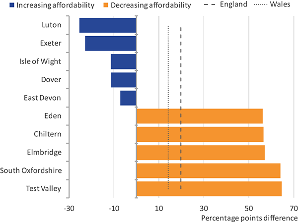
Local authorities that have had the largest change in social housing affordability over the last 14 years are the areas which have become less affordable. Test Valley had the largest increase in the percentage of social housing rent out of weekly 10th percentile salary, increasing by 64.4 percentage points between 2003 and 2015.
In 139 local authorities across England and Wales, residents who earned the 10th percentile income or less could expect to spend more than 75% of their income on social housing rent in 2015. This has decreased from 158 local authorities in 2014, indicating that social renting affordability is improving overall in England and Wales.
Figure 17 shows that the East of England and London contained the highest percentage of local authorities where weekly social rent exceeded 75% of 10th percentile salary. This suggests that for these regions, those on the lowest salaries could expect to spend proportionally the most on the cost of social renting.
Figure 17: Percentage of local authorities within each English region and Wales where the median price of weekly social rent exceeded 75% of 10th percentile weekly salary
England and Wales, 2015
Source: Department for Communities and Local Government, Stats Wales, Office for National Statistics
Notes:
- Wales had no local authorities where the average weekly social rent exceeded 75% of their tenth percentile salary. For more information on social housing stock, please see Section 15.
Download this chart Figure 17: Percentage of local authorities within each English region and Wales where the median price of weekly social rent exceeded 75% of 10th percentile weekly salary
Image .csv .xls12. Privately owned housing
Home ownership is seen by many as a long-term aspiration, with areas that have more owner occupied housing often considered more affluent than areas where social housing is more prevalent. The Department for Communities and Local Government provides data on dwelling stock for England and Stats Wales provides the same information for Wales. In England, the dwelling stock figures by local authority only provide figures for private sector properties overall, which comprises both owner occupied and privately rented housing. The breakdown of the two is provided for Wales, but is not currently available for England.
The percentage of privately owned housing in England and Wales in 2015 stayed at a similar level to 2014 (increasing by 0.08%), suggesting that the size of the private sector has not changed much in the last year. Over this period, there has also been a small decrease in the percentage of social housing stock. It is hard to determine whether changes in privately owned stock are driven by the owner occupied sector or privately rented sector. Research based on 2011 Census data found that the percentage of owner occupied housing decreased between 2001 and 2011, whereas the size of the private rented sector increased. If this trend has continued since 2011, any increases in private sector stock are likely to be driven by the increase in the private rented sector.
Figure 18 shows the percentage of privately owned housing stock from the total housing stock for the 5 highest and 5 lowest local authorities. It compares each of these percentages with the social housing stock percentage for the same local authority, giving an indicator on the relationship between privately owned housing and social housing. Residents in Hackney were least likely to privately own a home out of all the local authorities in England and Wales, with 56.7% of all the housing stock being privately owned in 2015.
Figure 18: Privately owned housing and social housing as a percentage of total housing stock, 5 highest and lowest local authorities
England and Wales, 2015
Source: Department for Communities and Local Government; Stats Wales
Download this chart Figure 18: Privately owned housing and social housing as a percentage of total housing stock, 5 highest and lowest local authorities
Image .csv .xlsFigure 18 also shows that the 5 local authorities with the lowest privately owned housing stock are all in London. Local authorities that had a higher percentage of privately owned housing, in turn had a lower proportion of social housing stock. In Wales, the percentage of privately owned dwellings in 2015 ranged from 75.5% in Blaenau Gwent to 90.6% in Ceredigion. Social housing accounted for around a quarter of all stock in Blaenau Gwent, compared with just 9% in Ceredigion.
Back to table of contents13. House building
The availability of housing is largely determined by the number of new dwellings being constructed, which can have an influence on house prices. The UK government is aiming to increase the number of houses being built, so that anybody who works and aspires to own their own has the opportunity to do so. The aim is to build 1 million new homes by 2020, allowing a higher proportion of owner occupied stock than in recent years.
Housing construction statistics help us to consider the impact of new housing developments on prices. There is a general assumption that areas which have more homes being built have lower house price inflation than areas with fewer newly built properties, which links the availability of houses to their affordability. In many markets, an increase in supply to either meet or exceed demand can result in a reduction in prices. However, this perhaps isn’t always the case for increases in the supply of new housing.
Figure 19 shows that there has been a decrease in the number of new dwellings being built in England and Wales since the post-war boom in house building. In recent years, house building decreased during the economic downturn in 2008 and then stayed at a consistently low level between 2010 and 2014. In 2015, there was an increase in the number of new dwellings built of 20.5%. This is the largest annual increase since 1964.
Figure 19: Number of completed dwellings
England and Wales, 1946 to 2015
Source: Department for Communities and Local Government
Notes:
- Quarterly data are used for England and Wales, Financial year data are also available.
Download this chart Figure 19: Number of completed dwellings
Image .csv .xlsDespite some increase in house building, the median price paid for residential property in England and Wales increased 6.9% between 2014 and 2015. This suggests house building growth may not yet have been large enough to bring about slower house price growth. House building has also not fully recovered since the recent economic downturn before which annual house building peaked at 186,160 completed dwellings in 2007 across England and Wales.
Back to table of contents14. Housing market activity
To examine housing market activity levels in local authorities, it can be useful to look at the number of residential property sales. However, not all areas are the same size, with some having a larger housing stock than others and more housebuilding taking place. Therefore, examining the number of property sales expressed as a percentage of the total privately owned housing stock helps adjust for these differences and creates a more comparable measure of housing stock turnover.
Housing market activity in England and Wales increased between 2012 and 2014, rising from 3.3% of housing stock turnover in 2012 to 4.5% in 2014. In 2015, housing stock turnover decreased slightly, to 4.3%. Figure 20 shows that between 2009 and 2015, England had a higher rate of private sector housing stock turnover than Wales and in 2015, the turnover in Wales was 0.8 percentage points lower than England, at 3.6%.
Figure 20: Number of residential property sales as a percentage of private sector dwellings
England and Wales, 2009 to 2015
Source: Office for National Statistics, Department for Communities and Local Government
Download this chart Figure 20: Number of residential property sales as a percentage of private sector dwellings
Image .csv .xlsOut of the 348 local authorities in England and Wales, 12 had a decrease in housing market activity between 2010 and 2015. Figure 21 shows that the 5 local authorities that have shown the biggest decrease in housing market activity are all in London. The change in percentage of residential property sales out of privately owned stock between 2010 and 2015 ranged from an increase of 2.3% in Salford – which has had a large number of new properties built in recent years – to a decrease of 1.3% in Islington.
Figure 21: Change in property sales as a percentage of privately owned dwelling stock in the 5 local authorities with the largest increase and decrease
England and Wales, 2010 to 2015
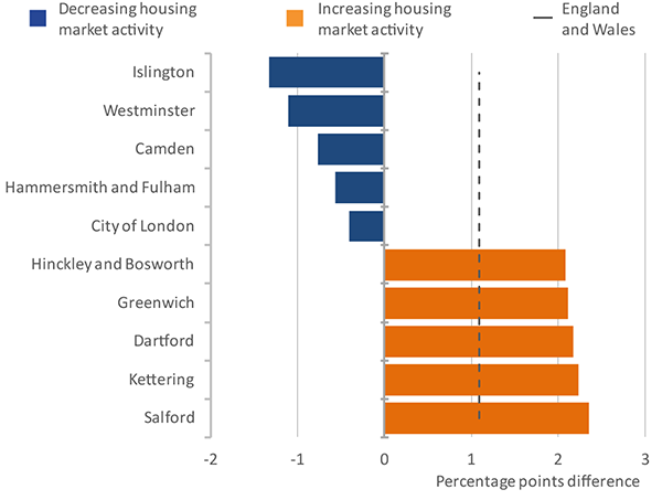
Source: Office for National Statistics, Department for Communities and Local Government
Download this image Figure 21: Change in property sales as a percentage of privately owned dwelling stock in the 5 local authorities with the largest increase and decrease
.png (48.1 kB) .xls (40.4 kB)
16. Vacant social housing
Overall, the prevalence of vacant social housing out of the total social housing stock in England and Wales was 1.4% in 2015, but this varied greatly between local authorities. There were 59,374 vacant social dwellings in total in 2015 out of a total of 4,374,090 social dwellings. Data on social housing vacancies are available from Department for Communities and Local Government for England and Stats Wales for Wales. In 2015, North East Lincolnshire had the highest percentage of vacant social housing (6.6%) out of all local authorities in England and Wales. There were 43 local authorities in which the vacant social housing stock exceeded 2%, whilst for the majority of local authorities this was less than 1%.
The highest percentage of vacant social housing stock in Wales was recorded in Blaenau Gwent in 2015, at 4.2%. Out of the 22 local authorities in Wales, 9 had over 2% vacant social housing stock.
Areas with a high proportion of social housing did not have a lower proportion of social housing vacancies. For example, Hackney had 43.3% of its total stock as social housing, but the prevalence of vacant social housing was similar to the England and Wales average. However, in Wales, Blaenau Gwent had the highest percentage of social housing stock in 2014 to 2015 at 24% and also had the highest percentage of vacant social housing stock at 4.2%. The prominence of vacant dwellings may be determined by the turnover rates of social housing, rather than the overall social housing stock.
Figure 23 compares the vacant social housing percentage with the private housing affordability ratio, in the local authorities which have the highest and lowest percentage of vacant dwellings. The chart shows that the areas where there are more vacant dwellings are generally where it is more affordable to buy property. If more people are able to afford to buy their own property then there will be less need for social housing, which can in turn increase the chances of there being vacant social housing. However, this was not the case for all local authorities, as Ealing had a relatively high proportion of vacant dwellings in 2015, but also had a relatively high affordability ratio. Figure 23 also shows that there were less vacant dwellings in the least affordable areas.
Figure 23: Vacant social housing as a percentage of all social housing and housing affordability ratio for the 5 highest and 5 lowest local authorities for vacant social housing
England and Wales, 2015
Source: Office for National Statistics, Department for Communities and Local Government and Stats Wales
Download this chart Figure 23: Vacant social housing as a percentage of all social housing and housing affordability ratio for the 5 highest and 5 lowest local authorities for vacant social housing
Image .csv .xls17. Social housing shortfall
Social housing shortfall refers to the number of households on a local authority’s social housing waiting list minus vacant social housing. It is expressed as a percentage of the total social housing stock. Social housing waiting lists are not currently available for Wales, so only the local authority level data for England are reported here.
Differences in social housing shortfall between local authorities may be due to the differing approaches taken by each local authority in reviewing and updating their social housing waiting lists. The Localism Act 2011 gave local authorities freedom to manage their own waiting lists so that they can decide who should qualify for social housing in their area and develop solutions which make best use of the social housing stock. Since the Localism Act came into effect, 90% of local authorities have reported changing their waiting list criteria due to the Act. This change is partially responsible for the recent decrease in the number of households on waiting lists.
Waiting lists can be affected by other factors including reviews by local authorities to remove households who no longer require housing. The frequency of local authority reviews varies considerably and therefore, the total number of households on waiting lists can overstate the number of households who still require housing.
In 2015, the 3 areas with the largest shortfall in social housing were Medway, Fylde and Isle of Wight (236% of social housing stock, 145% and 125% respectively). This means that the social housing shortfall in Medway was more than double the social housing stock for Medway in 2015. Six local authorities had a shortfall more than their social housing stock figure, which were mainly in either the South East or North West of England.
Figure 24 compares the indexed number of households on social housing waiting lists, the number of vacant dwellings and the social housing shortfall as a percentage of the total social housing stock, from 2010 to 2015 in England. The chart shows that changes in the number of households on the waiting list coincides with changes in the social housing shortfall. The index of vacant dwellings has remained relatively stable over time, but with a slightly lower level of vacant social housing in 2015 than in 2010. The number of households on social housing waiting lists decreased annually between 2012 and 2015, making the shortfall lower during this period. In 2015, the shortfall in social housing was at its lowest level over the 6 years for which data are available.
Figure 24: Indices of social housing shortfall, waiting lists and vacant dwellings
England, 2010 to 2015
Source: Department for Communities and Local Government
Download this chart Figure 24: Indices of social housing shortfall, waiting lists and vacant dwellings
Image .csv .xlsSocial housing stock is partly determined by the uptake in the government’s Right to Buy scheme. Additional social housing dwellings that have been added to the stock of England and Wales between 1999 to 2000 and 2014 to 2015 was 418,572 (including both newly built social housing and acquisition of existing dwellings). There was a higher number of sales of social housing under the Right to Buy scheme than additional social housing dwellings provided, with a total of 555,875 sales under the scheme since 1999 to 2000 (523,610 from England and 32,365 from Wales). England and Wales have slightly different policies for the Right to Buy scheme, in that the 2011 Housing Measure in Wales allows authorities to apply for suspension of the Right to Buy in their area. There have been recent changes on the discount allowed on Right to Buy sales in Wales and there was a recent proposal to introduce legislation to end Right to Buy in Wales. These factors affect the rate of sales differently in Wales to England.
Figures 25 and 26 compare the additional social housing with sales under the Right to Buy scheme in England and Wales separately. They show that since 2013 to 2014, the Right to Buy uptake has overtaken the provision of additional social housing in England but not in Wales. This means that the demand for the Right to Buy scheme is greater than the number of additional social housing in England, which can lead to an increased number of households on social housing waiting lists.
Figure 25: Number of property sales under the Right to Buy scheme and number of additional social rented properties provided
England, financial year ending 2000 to financial year ending 2015
Source: Department for Communities and Local Government
Download this chart Figure 25: Number of property sales under the Right to Buy scheme and number of additional social rented properties provided
Image .csv .xls
Figure 26: Number of property sales under the Right to Buy & Right to Acquire scheme and number of additional social rented properties provided
Wales, financial year ending 2000 to financial year ending 2015
Source: Stats Wales
Notes:
- Data from Wales refer to Total Statutory sales, which includes Right to Buy and Right to Acquire sales.
Download this chart Figure 26: Number of property sales under the Right to Buy & Right to Acquire scheme and number of additional social rented properties provided
Image .csv .xlsIn Wales, the additional social housing provided became marginally higher than the number of sales under the Right to Buy and Right to Acquire schemes in the financial year ending 2009. The gap between additional social housing and Right to Buy sales was not as large as in England after 2008.
Back to table of contents
15. Social housing stock
In 2015, the 7 local authorities with the highest percentages of social housing out of total dwelling stock were in London. Hackney was the local authority which had the highest percentage of social housing, with 43.3% of overall dwelling stock. This is more than double the average for England and Wales, which was 17.5% in 2015.
Figure 22 shows the 5 areas with the highest and the lowest percentages of social housing stock and compares this with 10th percentile weekly salary. Although we would expect areas with more social housing stock to have lower 10th percentile weekly salaries, salaries in London tend to be higher than the rest of England and Wales despite some London boroughs having relatively high levels of social housing stock.
In 2015, Islington had a social housing stock percentage of 41.4% – the third highest in England and Wales – but also had a 10th percentile gross weekly salary of £210.40 which is the second highest in England and Wales. This shows that areas that have the highest prevalence of social housing also have some of the highest average earnings. This is predominantly a feature of salaries in London.
Figure 22: Social Housing prevalence and 10th percentile gross weekly salary for the 5 highest and lowest local authorities for social housing prevalence
England and Wales, 2015
Source: Office for National Statistics, Stats Wales and Department for Communities and Local Government
Notes:
Download this chart Figure 22: Social Housing prevalence and 10th percentile gross weekly salary for the 5 highest and lowest local authorities for social housing prevalence
Image .csv .xls