1. Main points
This bulletin releases the main results from the Wealth and Assets Survey for the period July 2014 to June 2016; all values are in nominal terms (not adjusted for inflation).
Aggregate total net wealth of all households in Great Britain was £12.7 trillion in July 2014 to June 2016, up 17% from the July 2012 to June 2014 figure of £10.9 trillion.
Median household total net wealth was £262,400 in July 2014 to June 2016, up from £223,100 in the previous period (an increase of 18%).
In July 2014 to June 2016, the wealth held by the top 10% of households was around five times greater than the wealth of the bottom half of all households combined.
In July 2014 to June 2016, aggregate total private pension wealth of all households in Great Britain was £5.4 trillion; this has increased from £4.4 trillion in July 2012 to June 2014.
In July 2014 to June 2016, 50% of individuals aged 16 to 64 years had some form of active private pension that they were contributing to (up from 44% in the previous period).
In July 2014 to June 2016, 67% of employees were actively contributing to a private pension scheme compared with 28% of self-employed, with median current pension wealth for employees being £34,300 compared with £25,000 for the self-employed.
There was a striking increase in the value of net property wealth for households in London compared with all other regions; median net property wealth in London was £356,000 in July 2014 to June 2016, a 37% increase from £260,000 in July 2012 to June 2014.
Total aggregate debt of all households in Great Britain was £1.22 trillion in July 2014 to June 2016 (an 8% increase from July 2012 to June 2014), of which £1.11 trillion was mortgage debt (8% higher) and £107.3 billion was financial debt (15% higher).
2. Things you need to know about this release
The Wealth and Assets Survey (WAS) is a longitudinal household survey, which aims to address the economic well-being of households by gathering information on, amongst other things, level of savings and debt, saving for retirement, how wealth is distributed across households and factors that affect financial planning.
Respondents are interviewed every two years – with each two-year period being termed a “wave”. Wave 1 covered the period July 2006 to June 2008. This bulletin marks the release of the full wave 5 datasets, covering the period July 2014 to June 2016. At the start of each wave, in addition to going back to responding households from the previous wave, a new “cohort” of addresses are selected with the aim of maintaining an achieved number of responding households of around 20,000. The advantages of this are discussed in the detailed methodology paper.
WAS defines total net wealth as the sum of four components and is net of all liabilities:
net property wealth
net financial wealth
private pension wealth
physical wealth
These components are discussed in more detail in this section.
Net property wealth
Respondents’ self valuation of any property owned, both their main residence plus any other land or property owned in the UK or abroad; less the outstanding value of any loans or mortgages secured on these properties. Self valuation tends to yield higher estimates of worth than most other property indicators may suggest – however, when assessing individuals’ opinions or behaviours, it is this perceived worth that will drive the individuals concerned.
Net financial wealth
The values of any financial assets held, both formal investments such as bank or building society current or saving accounts, investment vehicles such as Individual Savings Accounts (ISAs), endowments, stocks and shares, and informal savings (money under the bed or loaned to family or friends) and children’s assets; less any financial liabilities such as outstanding balances on credit cards, arrears on household bills, loans (including student loans) from formal or informal sources.
Private pension wealth
The value of any pension pots already accrued that are not state basic retirement or state earning related. This includes occupational pensions, personal pensions, retained rights in previous pensions and pensions in payment. Estimating the value of some private pension pots is straightforward. For example, if a pension is a defined contribution type scheme (not in payment) the valuation is obtained from the respondents’ latest statement from their pension administrator. This is an accurate estimation of each individual pension pot taking into account any relevant market influences (for example, investment returns).
However, estimating the value of other schemes where a specific level of payment is guaranteed at retirement (for example, defined benefit type schemes) or for pensions in payment where an annuity has already been purchased, any pension statements received would not include the value of the pension pot, only the value of the benefit to be received on retirement. Therefore, the value of the pot required to pay the defined benefit is estimated using the length of employment, accrual fraction and earned income, together with external economic indicators such as annuity rates and discount factors.
As a result, the value of such pots can change significantly between waves when the underlying information received from respondents has not really changed. Whilst this can seem intuitively incorrect, it is simply recognising that external economic factors can significantly change the value of a pension pot required to yield a specific value of pension.
Physical wealth
The (self-evaluated) value of household contents, possessions and valuables owned such as antiques, artworks, collections and any vehicles owned by individuals (including the value of any personalised number plates).
As wealth is highly skewed towards the top, the survey was designed to pick up the very wealthy. However, this does mean that the sample now contains some very wealthy outliers. All such cases are thoroughly checked but they are included in the survey results. Given the skewed nature of wealth data and the effect that outliers can have on parametric estimates, this bulletin and the associated background tables do not generally report mean values, instead using the median values to report central tendency (except for physical wealth estimates for which the median value is meaningless).
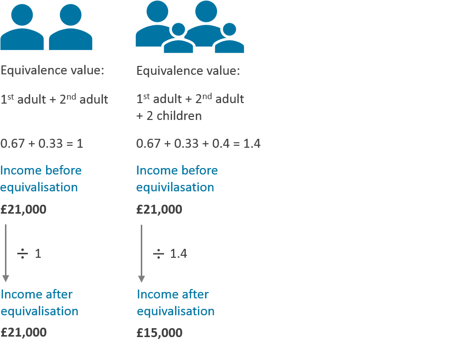
Equivalisation
Equivalisation is a standard methodology that adjusts measures to account for different demands on resources, by considering the household size and composition. For the first time, net equivalised income is presented alongside wealth. However, measures of wealth have not been equivalised.
To calculate equivalised income each member of the household is given an equivalence value. The first adult is given a value of 0.67 while a second adult gets a value of 0.33 to account for the use of joint amenities. For larger households, each additional person over the age of 14 years is given a smaller value of 0.33. Children under the age of 14 years are given a value of 0.2 to take account of their lower living costs.
Figure 1: Income equivalisation
Source: Office for National Statistics
Download this image Figure 1: Income equivalisation
.png (36.9 kB)
Accounting for inflation
All estimates within the Wealth in Great Britain 2014 to 2016 report are presented as current values (that is, the value at time of interview) and have not been adjusted for inflation. Like equivalisation, deflating wealth estimates is not as straight-forward as for other economic estimates.
Sampling errors and significance testing
All reasonable attempts have been made to ensure that the data are as accurate as possible. However, there are two potential sources of error that may affect the reliability of estimates and for which no adequate adjustments can be made; these are known as “sampling” and “non-sampling errors”. These concepts are explained further in the Quality and Methodology Information report.
No estimates are included that are based on fewer than 30 responding households. However, due to the complexity of the data (such as imputed values and complex weighting) no formal significance testing has been undertaken at this stage, though this will be covered in later chapters.
Back to table of contents3. Total wealth
Aggregate total wealth of all private households in Great Britain was £12.7 trillion in the period July 2014 to June 2016. This was an increase of 17% compared with the period July 2012 to June 2014, when the figure was £10.9 trillion. The majority of the change is due to the growth in private pension wealth and net property wealth.
Table 1: Breakdown of aggregate total wealth, by components1
| Great Britain, July 2012 to June 2016 | |||
|---|---|---|---|
| £ billion | |||
| July 2012 to June 2014 | July 2014 to June 2016 | Percentage Change | |
| Property Wealth (net) | 3,806 | 4,516 | 19 |
| Financial Wealth (net) | 1,564 | 1,630 | 4 |
| Physical Wealth | 1,130 | 1,230 | 9 |
| Private Pension Wealth | 4,385 | 5,354 | 22 |
| Total Wealth (including Private Pension Wealth) | 10,886 | 12,730 | 17 |
| Total Wealth (excluding Private Pension Wealth) | 6,500 | 7,376 | 13 |
| Source: Wealth and Assets Survey, Office for National Statistics | |||
| Notes: | |||
| 1. See table 2.1 of the datasets for more detailed figures. | |||
Download this table Table 1: Breakdown of aggregate total wealth, by components^1^
.xls (39.4 kB)Private pension wealth (which forms 42% of total aggregate wealth – Figure 2) was the component of total wealth, which has shown the strongest growth accounting for more than half (53%) of the growth in aggregate total wealth. Aggregate private pension wealth increased by 22% from £4.4 trillion to £5.4 trillion between the periods. However, as noted in section 2 and explained in more detail in section 4, the calculation of the value of some private pensions is dependent on external market factors. It is estimated that over a third of the increase in aggregate private pension wealth is due to the effect of changes in these market factors, rather than any increase in the number of people contributing to or the levels of contributions they are making to private pension schemes.
Figure 2: Breakdown of aggregate total wealth, by components
Great Britain, July 2014 to June 2016
Source: Wealth and Assets Survey, Office for National Statistics
Notes:
- See table 2.1 of the datasets for more detailed figures.
Download this chart Figure 2: Breakdown of aggregate total wealth, by components
Image .csv .xlsAggregate net property wealth (which forms 35% of total aggregate wealth) accounted for a further 38% of the growth in aggregate total wealth. Aggregate net property wealth increased by 19% from £3.8 trillion in July 2012 to June 2014 to £4.5 trillion in July 2014 to June 2016. This is considered further in section 5 of this bulletin.
The two other components of wealth, net financial wealth and physical wealth both had much less effect on the overall levels of aggregate total wealth. Aggregate physical wealth (which forms 10% of total aggregate wealth) accounted for just 5% of the overall increase. Aggregate net financial wealth (which forms 12% of total aggregate wealth) accounted for just 4% of the overall increase.
Distribution of household total wealth
This section aims to demonstrate the inequality of wealth across households in Great Britain and considers how this has changed over time.
The median household total wealth including private pension wealth was £262,400 in July 2014 to June 2016 (Table 2). This means that 50% of households had wealth of £262,400 or more. This increased by 18% from £223,100 in July 2012 to June 2014.
The median household total wealth excluding private pension wealth was £156,300 in July 2014 to June 2016. This increased by 12% from £140,000 in July 2012 to June 2014.
Table 2: Median household total wealth, including and excluding private pension wealth1
| Great Britain, July 2012 to June 2016 | ||||||||
| £ | ||||||||
|---|---|---|---|---|---|---|---|---|
| July 2012 to June 2014 | July 2014 to June 2016 | Percentage change | ||||||
| Household wealth including private pension wealth | 223,100 | 262,400 | 18 | |||||
| Household wealth excluding private pension wealth | 140,000 | 156,300 | 12 | |||||
| Source: Wealth and Assets Survey, Office for National Statistics | ||||||||
| Notes: | ||||||||
| 1. See table 2.8 of the datasets for more detailed figures. | ||||||||
Download this table Table 2: Median household total wealth, including and excluding private pension wealth^1^
.xls (36.9 kB)Whilst the median gives a good “average” picture, this does not reflect the large differences in the value of total wealth held by households with the lowest wealth and those households with the greatest wealth.
There has been little change in the proportion of total wealth held by wealthier households compared with less wealthy households between July 2012 to June 2014 and July 2014 to June 2016. The wealth held by the top 10% of households was around five times greater than the wealth of the bottom half of all households combined (see table 2.3 of the datasets).
The wealthiest 10% of households owned 44% of aggregate total wealth in Great Britain in July 2014 to June 2016. The wealthiest 10% also had more total wealth than the aggregate wealth of the first eight deciles put together, as well as more than double the total wealth of the ninth decile in July 2014 to June 2016. This was also the case in July 2012 to June 2014, as well as all other survey periods since the first in July 2006 to June 2008.
Figure 3 shows the percentile points for total household wealth (these are the boundary values for total household wealth if the population is split into 100 groups) in July 2014 to June 2016. The median value, that is, the 50th percentile point, for household total wealth was £262,400. Belonging to the wealthiest 10% of households required total wealth greater than £1,224,900. The top 1% of households had total wealth of at least £3,243,400. To be in the bottom 10% of the distribution, a household’s value of total wealth needed to be less than £13,900.
Figure 3: Distribution of household total wealth, percentile points
Great Britain, July 2014 to June 2016
Source: Wealth and Assets Survey, Office for National Statistics
Notes:
Bottom 10% of households have total wealth of £13,900 or less.
Median total household wealth is £262,400.
Top 10% of households have total wealth of £1,224,900 or more.
Top 1% of households have total wealth of £3,243,400 or more.
Download this chart Figure 3: Distribution of household total wealth, percentile points
Image .csv .xlsThe inequality in total wealth and its components across the whole wealth distribution can be compared using a number of methods. Here we present Gini coeffecients (Table 4) and Lorenz curves (Figure 4) to demonstrate wealth inequality.
The Gini coefficient takes a value between zero and one, with zero representing a perfectly equal distribution and one representing maximal inequality.
Table 4: Gini coefficients for aggregate total wealth, by components1,2
| Great Britain, July 2006 to July 2016 | |||||||||||||||||
|---|---|---|---|---|---|---|---|---|---|---|---|---|---|---|---|---|---|
| July 2006 to June 20082 | July 2008 to June 2010 | July 2010 to June 2012 | July 2012 to June 2014 | July 2014 to June 2016 | |||||||||||||
| Property Wealth (net) | 0.62 | 0.63 | 0.64 | 0.66 | 0.67 | ||||||||||||
| Financial Wealth (net) | 0.89 | 0.89 | 0.92 | 0.91 | 0.91 | ||||||||||||
| Physical Wealth2 | 0.46 | 0.45 | 0.44 | 0.45 | 0.46 | ||||||||||||
| Private Pension Wealth | 0.77 | 0.76 | 0.73 | 0.73 | 0.72 | ||||||||||||
| Total Wealth2 | 0.61 | 0.61 | 0.61 | 0.63 | 0.62 | ||||||||||||
| Source: Wealth and Assets Survey, Office for National Statistics | |||||||||||||||||
| Notes: | |||||||||||||||||
| 1. The Gini coefficient is a measure of inequality, where 0 expresses no inequality (e.g. where everyone has the same income) and 1 expresses maximal inequality (e.g. one person has all the wealth and all others have none). | |||||||||||||||||
| 2. July 2006 to June 2008 estimates for physical and total wealth are based on half sample. | |||||||||||||||||
| 3. See table 2.5 of the datasets. | |||||||||||||||||
Download this table Table 4: Gini coefficients for aggregate total wealth, by components^1,2^
.xls (38.4 kB)Of the four wealth components, inequality remained the lowest for physical wealth, with a Gini coefficient of 0.46 in the period July 2014 to June 2016, which has differed by no more than 0.2 over all five survey periods.
Unlike net financial and net property wealth, every household will have a positive physical wealth value, as they will have some physical assets. However, it is possible to have negative financial and property wealth where liabilities exceed assets in these areas.
The wealth component with the highest inequality in the latest period of July 2014 to June 2016 was net financial wealth, which had a Gini coefficient of 0.91, unchanged from the period July 2012 to June 2014. Financial wealth has always had the highest Gini coefficient since July 2006 to June 2008, but inequality increased between July 2008 to June 2010 and July 2010 to June 2012 when the Gini coefficient increased from 0.89 to 0.92. This reflected the difference in recovery of financial assets following the economic downturn of 2007 by those with higher levels of financial assets.
The order in which the four components of wealth have been displayed in terms of inequality has remained the same over the five survey periods. However, there was a continuation in the worsening of inequality in net property wealth in the period July 2014 to June 2016. It displayed a Gini coefficient of 0.67, the highest it has been over the five survey periods.
Private pension wealth was the only component of wealth where the trend in inequality has decreased over the five survey periods, with a Gini coefficient of 0.72 in July 2014 to June 2016, compared with 0.77 in the first survey period of July 2006 to June 2008.
The difference in inequality between each of the four wealth components is also illustrated in Figure 4, which shows the Lorenz curves for the wealth components in the period July 2014 to June 2016. Lorenz curves are a graphical representation of the inequality of distribution, where the diagonal 45 degree line illustrates a scenario where wealth is equally shared. The closer the Lorenz curve is to the diagonal line, the more equal the distribution becomes.
Figure 4: Lorenz curves for the components of wealth
Great Britain, July 2014 to June 2016
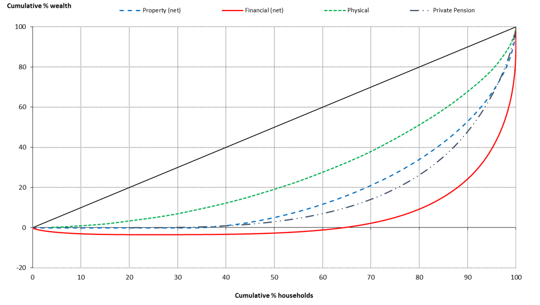
Source: Wealth and Assets Survey, Office for National Statistics
Download this image Figure 4: Lorenz curves for the components of wealth
.png (104.7 kB) .xlsx (1.1 MB)
Figure 5 shows aggregate total wealth by deciles, which are broken down by the components of total wealth. Deciles divide the data, sorted in ascending order, into 10 equal parts so that each part contains 10% of the wealth distribution. The least wealthy 10% of households are in the first decile and the wealthiest 10% are in the 10th.
Figure 5: Breakdown of aggregate total wealth, by deciles and components1
Great Britain, July 2014 to June 2016
Source: Wealth and Assets Survey, Office for National Statistics
Notes:
- See tables 2.3 and 2.4 of the datasets for more detailed figures.
Download this chart Figure 5: Breakdown of aggregate total wealth, by deciles and components^1^
Image .csv .xlsPrivate pension wealth made up the largest component of total wealth for the wealthiest 30% of households in July 2014 to June 2016. It made up 44% of the wealthiest 10%, 47% of the second wealthiest 10% and 41% of the third wealthiest 10%. The component of total wealth that made up the smallest proportion for the wealthiest 30% was physical wealth, which made up 10% or less of the wealth of each of the three wealthiest deciles.
Net property wealth made up the largest proportion of total wealth of the fourth to the seventh deciles, making up between 36% and 44% of each in July 2014 to June 2016. The component that made up the smallest proportion of total wealth for these deciles was net financial wealth, which made up between 5% and 9% of each (see table 2.3 of the datasets).
The least wealthy 10% of households had negative net property wealth and net financial wealth in July 2014 to June 2016 (Figure 6). This means that their liabilities in these areas exceeded their assets. The component that made up the largest proportion of their total wealth was physical wealth. However, due to the fact that the least wealthy 10% had negative net financial and property wealth, physical wealth was more than double their total wealth, once liabilities had been accounted for.
Figure 6: Breakdown of aggregate total wealth, by lowest three deciles and components1
Great Britain, July 2014 to June 2016
Source: Wealth and Assets Survey, Office for National Statistics
Notes:
- See tables 2.3 and 2.4 of the datasets for more detailed figures.
Download this chart Figure 6: Breakdown of aggregate total wealth, by lowest three deciles and components^1^
Image .csv .xlsPhysical wealth was the largest component of total wealth for each of the least wealthy deciles in July 2014 to June 2016, showing that it makes up a very significant proportion of the wealth of the least wealthy. This is in sharp contrast to the proportion that it makes up of the wealthiest deciles. The component that had the smallest positive contribution to each of the three least wealthy deciles was financial wealth.
Household total wealth by main household characteristics
This section considers differences in household total wealth by total household net equivalised income and by region of residence. Data for total wealth by household type are also provided in datasets 2.10 to 2.13.
Distribution of household total wealth by income
To give a truer reflection of a household’s income than the raw figures, a process of “equivalisation” has been performed. This is a process that takes into account the size and composition of households. For example, we might expect two households of equal income to have different financial outcomes if one has a larger household size than another, or contains more dependents. Therefore, this adjustment means that the incomes of all households will be on a comparable basis (see section 2 for further details).
Figure 7 shows the median household wealth by the levels of household net equivalised income. In July 2014 to June 2016, households in the highest income band had a median household total wealth of £1,061,200. This increased by 20% from £887,100 in July 2012 to June 2014. Households in the lowest band of income had a median total wealth of £31,900 in July 2014 to June 2016. This decreased by 9% from £35,100 in July 2012 to June 2014. The median total wealth also decreased for the second income band between these periods, but increased over these periods for each of the top eight income deciles.
Figure 7: Median household total wealth, by household net equivalised income deciles
Great Britain, July 2012 to June 2016
Source: Wealth and Assets Survey, Office for National Statistics
Notes:
- See table 2.10 of the datasets for more detailed figures.
Download this chart Figure 7: Median household total wealth, by household net equivalised income deciles
Image .csv .xlsThe distribution of wealth is far more unequal than that of income. This is shown clearly in Figures 8 and 9. The median household net equivalised income for those in the lowest decile is £10,000, which is higher than the median total wealth of £5,800 for those in the lowest wealth decile. However, the median household net equivalised income of households in the top decile is £68,000, which is far smaller than the median total wealth figure of £1,724,100 for households in the top wealth decile. The median household net equivalised income of the top decile is 6.8 times that of the lowest decile.
Figure 8: Median household net equivalised income and median total wealth by decile
Great Britain, July 2014 to June 2016
Source: Wealth and Assets Survey, Office for National Statistics
Download this chart Figure 8: Median household net equivalised income and median total wealth by decile
Image .csv .xls
Figure 9: Median household net equivalised income and median total wealth by decile
Great Britain, July 2014 to June 2016
Source: Wealth and Assets Survey, Office for National Statistics
Download this chart Figure 9: Median household net equivalised income and median total wealth by decile
Image .csv .xlsHouseholds that have high levels of income often also have high levels of wealth. However, this is not always the case. For example, there are some in the younger age groups who have high incomes, as they may have well-paid jobs. However, they have comparatively low levels of wealth. This is because they have not yet had time to accumulate levels of wealth that would put them in a decile equivalent to that which they are in for income.
This can be seen by comparing the distributions shown in Tables 5 and 6. In July 2014 to June 2016, 79% of households with a household reference person (HRP) aged 16 to 34 years were in one of the lowest four wealth deciles, whilst only 42% of such households were in one of the lowest four net equivalised income deciles.
Conversely, there are some households in the older age groups that have high levels of wealth, having accumulated it for long periods of time. However, once they have retired, their incomes may not be as comparatively high. This can also be seen in the data, as 51% of those households with a HRP aged 65 and over were in the top four deciles of wealth. However, only 34% of such households were in the top four deciles for net equivalised income.
Table 5: Percentage of households in each household total wealth decile, by age of household reference person
| Great Britain, July 2014 to June 2016 | |||
|---|---|---|---|
| % | |||
| Total Wealth decile | 16 to 34 | 35 to 64 | 65+ |
| Decile 1 (lowest) | 24 | 9 | 5 |
| Decile 2 | 20 | 9 | 7 |
| Decile 3 | 19 | 9 | 7 |
| Decile 4 | 16 | 9 | 8 |
| Decile 5 | 9 | 10 | 10 |
| Decile 6 | 7 | 10 | 11 |
| Decile 7 | 3 | 10 | 13 |
| Decile 8 | 2 | 11 | 13 |
| Decile 9 | 0 | 11 | 13 |
| Decile 10 (highest) | 0 | 12 | 12 |
| Source: Wealth and Assets Survey, Office for National Statistics | |||
| Notes: | |||
| 1. The age groups used in this table are not standard age groups but have been used to demonstrate the distribution of wealth between the young and old. | |||
Download this table Table 5: Percentage of households in each household total wealth decile, by age of household reference person
.xls (25.6 kB)
Table 6: Percentage of households in each household net equivalised income decile, by age of household reference person
| Great Britain, July 2014 to June 2016 | |||||
|---|---|---|---|---|---|
| % | |||||
| Net household equivalised income decile | 16 to 34 | 35 to 64 | 65+ | ||
| Decile 1 (lowest) | 11 | 10 | 10 | ||
| Decile 2 | 11 | 8 | 13 | ||
| Decile 3 | 10 | 9 | 12 | ||
| Decile 4 | 10 | 9 | 11 | ||
| Decile 5 | 11 | 10 | 10 | ||
| Decile 6 | 9 | 10 | 10 | ||
| Decile 7 | 11 | 10 | 9 | ||
| Decile 8 | 10 | 10 | 9 | ||
| Decile 9 | 10 | 11 | 8 | ||
| Decile 10 (highest) | 7 | 12 | 7 | ||
| Source: Wealth and Assets Survey, Office for National Statistics | |||||
| Notes: | |||||
| 1. The age groups used in this table are not standard age groups but have been used to demonstrate the distribution of income between the young and old. | |||||
Download this table Table 6: Percentage of households in each household net equivalised income decile, by age of household reference person
.xls (37.4 kB)Distribution of household total wealth by region
Figure 10 shows aggregate household total wealth broken down by the four wealth components for Scotland, Wales and the nine English regions (with London shown separately; the figures for the South East exclude London).
Figure 10: Aggregate household total wealth by region and components1
Great Britain, July 2014 to June 2016
Source: Wealth and Assets Survey, Office for National Statistics
Download this chart Figure 10: Aggregate household total wealth by region and components^1^
Image .csv .xlsIn July 2014 to 2016, the South East region of England had the highest aggregate household total wealth of all regions (though this does reflect the fact that this region is also the largest in terms of number of households), contributing £2.44 trillion to the aggregate wealth of households in Great Britain. This was closely followed by London, which had aggregate total wealth of £2.17 trillion (which is also the region with the second highest number of households in Great Britain). Changes affecting these areas will have a high impact on the overall aggregate household total wealth estimates for Great Britain.
Conversely, the North East, with the fewest number of households of all regions, contributed the least to the aggregate household total wealth of Great Britain (£0.37 trillion), followed by Wales, which had aggregate total wealth of £0.53 trillion. Changes affecting these areas will have less impact on the overall aggregate household total wealth estimates for Great Britain.
Figure 11: Contribution of wealth components to aggregate household total wealth by region
Great Britain, July 2014 to June 2016
Source: Wealth and Assets Survey, Office for National Statistics
Notes:
- See tables 2.11 and 2.12 of the datasets for more detailed figures.
Download this chart Figure 11: Contribution of wealth components to aggregate household total wealth by region
Image .csv .xlsFigure 11 illustrates how the various components of wealth contribute to aggregate household total wealth in each region. Private pension wealth is the main component of aggregate wealth in most areas – with the exception of London, where property wealth contributes the most, and the South East, where pension wealth and property wealth contribute almost the same to aggregate total wealth.
Figure 12 shows where the changes in aggregate household total wealth occurred between July 2012 to June 2014 and July 2014 to June 2016. The most striking change is the increase in the percentage change to property wealth in London, increasing by 45% from £0.71 trillion to £1.03 trillion over the period.
In summary, the increase in property values in London seems to be one of the main reasons for the increase in aggregate household total wealth in Great Britain between July 2012 to June 2014 and July 2014 to June 2016. This is explored further in section 5.
Figure 12: Change in aggregate household total wealth by region and components1
Great Britain, July 2012-June 2014 to July 2014-June 2016
Source: Wealth and Assets Survey, Office for National Statistics
Notes:
- See tables 2.11 and 2.12 of the datasets for more detailed figures.
Download this chart Figure 12: Change in aggregate household total wealth by region and components^1^
Image .csv .xlsThe breakdowns of aggregate wealth by region can assist in understanding why aggregate wealth in Great Britain has increased, this alone does not indicate whether the growth has been evenly distributed across Great Britain.
Figure 13 shows the median values of household total wealth by region of residence. The South East remains the wealthiest; where half of all households had wealth of £387,400 or more in the period July 2014 to June 2016.
The South East was followed by the South West and London, with median household total wealth of £337,200 and £326,200 respectively.
The North East remains the lowest median household total wealth in the period July 2014 to June 2016 with a value of £165,200.
Figure 13: Median household total wealth, by region
Great Britain, July 2012 to June 2016
Source: Wealth and Assets Survey, Office for National Statistics
Notes:
- See tables 2.11 and 2.12 of the datasets for more detailed figures.
Download this chart Figure 13: Median household total wealth, by region
Image .csv .xlsThe median household total wealth for England rose by 18% to £268,100 between July 2012 to June 2014 and July 2014 to June 2016. In comparison, the median household total wealth for Scotland increased by 28% to £237,600 and the median household total wealth for Wales increased by 7% to £226,300.
Looking at how the separate components of wealth have contributed to these changes, Scotland saw an increase in all four wealth components, but most significantly in financial wealth and private pension wealth where the medians increased by 34% and 28% respectively. Similarly, England saw an increase in all four components, but most significantly in private pension wealth (17%). Conversely, Wales saw a fall in financial, but this was offset by the increases in private pension wealth. In July 2014 to June 2016, the median household total wealth for Wales was 5% lower than the corresponding value for Scotland and 15% lower than the value for England.
Back to table of contents4. Private pensions wealth
As reported in section 3 of this bulletin, aggregate private pension wealth accounted for over half (53%) of the growth in aggregate total wealth between July 2012 to June 2014 and July 2014 to June 2016, increasing by 22% from £4.4 trillion to £5.4 trillion over this period. As explained later in this section, some of this increase has been caused by market factors changing over this period (annuity rates and discount factors used to determine the value a pension pot needs to be to pay out a certain level of pension), but even after this is taken into account, private pension wealth would still account for 28% of the change in aggregate total wealth. This section explores where this growth has occurred and any possible reasons for the growth.
Household private pension wealth
Table 7 shows the proportion of households with wealth in private pensions and the amount of wealth held in each pension type from July 2012 to June 2016. The percentages of households with pension wealth held in defined contribution pension schemes (either current occupational or retained rights) have increased between July 2012 to June 2014 and July 2014 to June 2016. This growth in membership is likely to be as a result of automatic enrolment to workplace pensions.
Automatic enrolment was introduced in October 2012 as a consequence of the Pensions Act 2011 and 2014 and applies to eligible employees who are not already participating in a qualifying workplace pension scheme. Automatic enrolment states that all employers select a qualifying pension scheme for their employees and consequently enrol eligible employees into this scheme. Staged automatic enrolment began in October 2012 (based on the size of employer’s Pay As You Earn (PAYE) scheme) and is being rolled out to all employers by 2018.
Between October 2012 and April 2018, the minimum contribution is 2% of an employee’s qualifying earnings of which at least 1% must come from the employer. Automatic enrolment means that individuals will have a new pension pot with each new employer, resulting in an increase to retained and current occupational defined contribution schemes. This is highlighted throughout the bulletin.
The percentage of households with wealth in all other types of private pension remained largely unchanged when compared with July 2012 to June 2014. In July 2014 to June 2016, the pension type with the largest median wealth was pensions in payment.
Table 7: Proportion of households with wealth in private pensions and amount of wealth (£) held in such pensions, by pension type1,2,3,4,5,6,7
| Great Britain, July 2012 to June 2016 | ||||||||||||
|---|---|---|---|---|---|---|---|---|---|---|---|---|
| July 2012 to June 2014 | July 2014 to June 2016 | |||||||||||
| % with | £ Median1 | Aggregate private pension wealth1 £ Billion | % with | £ Median1 | Aggregate private pension wealth1 £ Billion | |||||||
| Current occupational defined benefit pensions1 | 28 | 85,300 | 1,341 | 29 | 109,700 | 1,729 | ||||||
| Current occupationaldefined contribution pensions1 | 17 | 10,800 | 137 | 22 | 7,000 | 201 | ||||||
| Personal pensions1 | 15 | 21,000 | 208 | 14 | 25,800 | 228 | ||||||
| AVCs1 | 1 | 8,900 | 7 | 1 | 7,700 | 8 | ||||||
| Retained rights in defined benefit pensions1 | 14 | 46,200 | 379 | 14 | 64,200 | 497 | ||||||
| Retained rights in defined contribution pensions1 | 15 | 10,100 | 139 | 18 | 12,400 | 179 | ||||||
| Rights retained in pensions for drawdown1 | 0 | 120,000 | 6 | 0 | 60,000 | 11 | ||||||
| Pensions expected from former spouse/partner1 | 2 | 14,200 | 17 | 1 | 9,600 | 20 | ||||||
| Pensions in payment1 | 30 | 150,500 | 2,153 | 30 | 177,000 | 2,482 | ||||||
| Total pension wealth1 | N/A | 96,800 | 4,385 | N/A | 114,800 | 5,354 | ||||||
| Total pension wealth (whole population)2 | 76 | 46,400 | 4,385 | 79 | 61,000 | 5,354 | ||||||
| Source: Wealth and Assets Survey, Office for National Statistics | ||||||||||||
| Notes: | ||||||||||||
| 1. Calculations for wealth estimates exclude those with zero pension wealth (i.e. only cover those with pensions). | ||||||||||||
| 2. The rows highlighted in bold and labelled ‘Total pension wealth (whole population)’ include those with zero pension wealth. | ||||||||||||
| 3. Although the methodology for calculating DB pension wealth has remained the same in all three waves, there have been changes in the financial assumptions. | ||||||||||||
| 4. Households can have wealth in more than one type of pension. | ||||||||||||
| 5. Where the percentage is denoted as 0 it is rounded to the nearest figure, therefore it means the percentage of individuals with wealth in pensions in payment is closer to 0 than it is to 1. | ||||||||||||
| 6. N/A = not applicable | ||||||||||||
| 7. See table 6.11 of the datasets for more detailed figures. | ||||||||||||
Download this table Table 7: Proportion of households with wealth in private pensions and amount of wealth (£) held in such pensions, by pension type^1,2,3,4,5,6,7^
.xls (36.9 kB)A breakdown of aggregate household private pension wealth is shown for July 2012 to June 2016 (Figure 14). The largest share of private pension wealth in July 2014 to June 2016 was pensions in payment, at 46%, followed by current pensions (occupational and personal), at 40%. This is consistent with July 2012 to June 2014, with pensions in payment accounting for 49% and current pension wealth accounting for 38% of all private pension wealth.
Wealth from defined benefit pensions (current, retained and pensions in payment) is valued as the pension pot required for a specific income in the future. It is calculated using financial assumptions (discount and annuity factors) that are obtained each month to reflect current market influences. The resulting effect of changes to these rates between July 2012 to June 2014 and July 2014 to June 2016 consequently accounted for approximately 54% of the increase to aggregate pension in payment wealth (see table 6.17 of the datasets).
Figure 14: Breakdown of aggregate household private pension wealth by components1
Great Britain, July 2012 to June 2016
Source: Wealth and Assets Survey, Office for National Statistics
Notes:
“Other” includes pension wealth expected from former partner, retained rights for drawdown and AVC schemes.
Calculations for wealth estimates exclude those with zero pension wealth (that is, only cover those with pensions).
Download this chart Figure 14: Breakdown of aggregate household private pension wealth by components^1^
Image .csv .xlsThe percentage of households with wealth in private pensions and the value of wealth are shown in Table 8 by household type. Between July 2012 and June 2014 and July 2014 and June 2016, households that include lone parents, couples with dependent children and couples below State Pension age have seen the largest increases in private pension wealth ownership. The rise for all of these household types was predominantly due to their accumulation of current occupational defined contribution scheme wealth.
Table 8: Percentage of households with wealth in private pensions and amount of wealth (£) held in such pensions, by household type1,2,3
| Great Britain, July 2012 to June 2016 | ||||
|---|---|---|---|---|
| July 2012 to June 2014 | July 2014 to June 2016 | |||
| % with | £ Median1 | % with | £ Median1 | |
| Single HHold, over SPA2 | 68 | 73,600 | 69 | 84,300 |
| Single HHold, under SPA2 | 63 | 54,300 | 68 | 70,000 |
| Married/Cohabiting both over SPA2, no children | 89 | 200,000 | 90 | 240,400 |
| Married/Cohabiting both under SPA2, no children | 86 | 97,000 | 91 | 132,100 |
| Married/Cohabiting 1 over, 1 under SPA2, no children | 91 | 331,500 | 88 | 408,500 |
| Married/Cohabiting, dependent children | 79 | 76,500 | 84 | 88,300 |
| Married/Cohabiting, non-dependent children only | 91 | 206,300 | 92 | 253,600 |
| Lone parent, dependent children | 47 | 27,500 | 51 | 29,700 |
| Lone parent, non-dependent children | 70 | 80,500 | 77 | 77,300 |
| 2 or more families/Other HHold type | 70 | 87,800 | 73 | 73,000 |
| Source: Wealth and Assets Survey, Office for National Statistics | ||||
| Notes: | ||||
| 1. Medians and quartiles exclude individuals with zero wealth; percentages do not exclude such individuals. | ||||
| 2. SPA – refers to State Pension Age at time of interview. | ||||
| 3. See table 6.16 of the datasets for more detailed figures. | ||||
Download this table Table 8: Percentage of households with wealth in private pensions and amount of wealth (£) held in such pensions, by household type^1,2,3^
.xls (33.8 kB)Individual pension wealth
Current occupational pension wealth
Table 9 shows that the percentage of adults aged 16 to 64 years in Great Britain contributing to a private pension increased to 50% in July 2014 to June 2016 from 44% in July 2012 to June 2014. The percentage varies by gender with 52% of men making contributions compared with 47% of women.
Table 9: Percentage of individuals aged 16 to 64 years that currently contribute to a private pension scheme, by pension type and sex1
| Great Britain, July 2010 to June 2016 | |||||||||||||
|---|---|---|---|---|---|---|---|---|---|---|---|---|---|
| % | |||||||||||||
| July 2010 to June 2012 | July 2012 to June 2014 | July 2014 to June 2016 | |||||||||||
| Men | Women | All | Men | Women | All | Men | Women | All | |||||
| No current pension | 55 | 61 | 58 | 54 | 59 | 56 | 48 | 53 | 50 | ||||
| Any type of pension | 45 | 39 | 42 | 46 | 41 | 44 | 52 | 47 | 50 | ||||
| of which | |||||||||||||
| Occupational defined benefit only | 18 | 23 | 21 | 17 | 23 | 20 | 19 | 25 | 22 | ||||
| Occupational defined contribution only | 10 | 7 | 8 | 13 | 9 | 11 | 19 | 14 | 16 | ||||
| Personal pension only | 10 | 4 | 7 | 10 | 5 | 8 | 8 | 5 | 6 | ||||
| More than one type | 7 | 4 | 6 | 6 | 4 | 5 | 6 | 4 | 5 | ||||
| Source: Wealth and Assets Survey, Office for National Statistics | |||||||||||||
| Notes: | |||||||||||||
| 1. Figures may not sum to totals due to rounding. | |||||||||||||
| 2. Additional Voluntary Contributions are included within "more than one type" of pension | |||||||||||||
| 3. Private pensions currently contributed to are; occupational defined benefit, defined contribution, additional voluntary contribution or personal pension schemes | |||||||||||||
Download this table Table 9: Percentage of individuals aged 16 to 64 years that currently contribute to a private pension scheme, by pension type and sex^1^
.xls (26.6 kB)During July 2014 to June 2016, there were 67% of employees (aged 16 and over) actively contributing to a private pension scheme (occupational defined benefit, defined contribution or personal pension), compared with 28% of self-employed. The median pension wealth of these schemes for employees is £34,300 compared with £25,000 for the self-employed (see table 6.19 of the datasets).
Current occupational defined contribution pension wealth
The increase in membership of current private pensions was driven by the rise in membership of occupational defined contribution schemes, which have been increasing since 2012. As already mentioned, this rise is likely to be a consequence of automatic enrolment into workplace pensions.
Figure 15 illustrates the percentage of employed men, (self-employed and employees) aged 16 to 64 years with an active occupational defined contribution scheme. This chart shows that there was an 8 percentage points increase in males with membership of a current occupational defined contribution scheme, from 20% in July 2012 to June 2014 to 28% in July 2014 to June 2016.
Males aged 25 to 34 years were the age group with the largest growth in membership between July 2012 to June 2014 and July 2014 to June 2016. There were 20% of men contributing to an occupational defined contribution scheme in July 2012 to June 2014, compared with 30% of men contributing to a scheme in July 2014 to June 2016. There was also a growth in membership levels for employed women aged 16 to 64 years, rising from 16% in July 2012 to June 2014 to 22% in July 2014 to June 2016 (Figure 16).
Figure 15: Percentage of employed men (self-employed and employees) aged 16 to 64 years with current occupational defined contribution wealth by age1
Great Britain, July 2010 to June 2016
Source: Wealth and Assets Survey, Office for National Statistics
Notes:
Employed includes employees and self-employed.
"All" includes individuals aged 16 to 64 years.
Download this chart Figure 15: Percentage of employed men (self-employed and employees) aged 16 to 64 years with current occupational defined contribution wealth by age^1^
Image .csv .xls
Figure 16: Percentage of employed women (self-employed and employees) aged 16 to 64 years with current occupational defined contribution wealth by age1
Great Britain, July 2010 to June 2016
Source: Wealth and Assets Survey, Office for National Statistics
Notes:
Employed includes employees and self-employed.
"All" includes individuals aged 16 to 64 years.
Download this chart Figure 16: Percentage of employed women (self-employed and employees) aged 16 to 64 years with current occupational defined contribution wealth by age^1^
Image .csv .xlsAlthough membership of current occupational defined contribution schemes increased between July 2012 to June 2014 and July 2014 to June 2016, the median value of wealth held in such schemes decreased during this period for almost all age groups (Table 10). This is a result of the increase of occupational defined contribution membership because of automatic enrolment, with members contributing at the current minimum level and only having a small period of time to accumulate their wealth.
As staged automatic enrolment began in October 2012 and will not be implemented to all employers until April 2018, automatically enrolled members have had less time to accumulate their wealth hence pulling down the median wealth of all current occupational defined contribution schemes.
Table 10: Percentage of individuals with wealth in current occupational defined contribution pensions and amount of wealth (£) held in such pensions, by age and sex1,2,3,4
| Great Britain, July 2012 to June 2016 | ||||||||||||
|---|---|---|---|---|---|---|---|---|---|---|---|---|
| July 2012 to June 2014 | July 2014 to June 2016 | |||||||||||
| Men | Women | All | Men | Women | All | |||||||
| % with | £ Median1 | % with | £ Median1 | % with | £ Median1 | % with | £ Median1 | % with | £ Median1 | % with | £ Median1 | |
| 16 to 24 | 6 | 1,500 | 4 | 1,000 | 5 | 1,000 | 9 | 1,000 | 7 | 900 | 8 | 1,000 |
| 25 to 34 | 16 | 4,300 | 13 | 4,100 | 15 | 4,300 | 26 | 2,500 | 19 | 2,000 | 22 | 2,000 |
| 35 to 44 | 20 | 16,800 | 13 | 8,000 | 17 | 11,400 | 27 | 10,000 | 19 | 4,500 | 23 | 7,000 |
| 45 to 54 | 17 | 20,000 | 12 | 8,000 | 15 | 14,500 | 25 | 13,000 | 16 | 7,500 | 21 | 10,000 |
| 55 to 64 | 12 | 23,000 | 7 | 10,000 | 9 | 17,000 | 17 | 20,000 | 10 | 9,000 | 13 | 15,000 |
| 65+ | 1 | 20,000 | .. | .. | 1 | 10,000 | 1 | 11,700 | .. | .. | 1 | 11,700 |
| All | 12 | 12,000 | 8 | 5,600 | 10 | 8,800 | 17 | 5,700 | 11 | 3,600 | 14 | 4,800 |
| Source: Wealth and Assets Survey, Office for National Statistics | ||||||||||||
| Notes: | ||||||||||||
| 1. Medians and quartiles and percetages exclude individuals with zero wealth in current occupational DC schemes. | ||||||||||||
| 2. "Figures may not sum to totals due to rounding." | ||||||||||||
| 3. ".." - estimates that have been suppressed due to fewer than 30 unweighted cases. | ||||||||||||
| 4. See table 6.3 of the datasets for more detailed figures | ||||||||||||
Download this table Table 10: Percentage of individuals with wealth in current occupational defined contribution pensions and amount of wealth (£) held in such pensions, by age and sex^1,2,3,4^
.xls (34.8 kB)The Wealth and Assets Survey collects information on pension contributions. Contribution rates are likely to be influenced by automatic enrolment to workplace pensions. To assess whether the participant should be assumed likely to be a member of an automatically enrolled scheme, eligibility requirements relating to multiple characteristics were applied. These included age, employment earnings, employer size with corresponding staging date, date of joining pension scheme and date of entering current employment.
For longitudinal members, additional analysis was performed using information from the last period (July 2012 to June 2014) such as whether the participant was in the same job, whether they were a member of an occupational pension scheme and details from their pension schemes. Figure 17 shows contribution rates (member contribution only) for current occupational defined contribution pension schemes in July 2014 to June 2016 by whether the scheme member is assumed to be automatically enrolled or not.
Three-quarters of assumed automatically enrolled members had a contribution rate up to 3%, with a clear spike at 1% contribution, the current required automatic enrolment minimum level. This compares with 41% of members assumed not automatically enrolled having member contributions of up to 3%. There was a broader distribution spread for the assumed not automatically enrolled members.
Figure 17: Member contribution rate of current occupational defined contribution scheme by whether assumed automatically enrolled1,2
Great Britain, July 2014 to June 2016
Source: Wealth and Assets Survey, Office for National Statistics
Notes:
Automatically enrolled and not automatically enrolled are assumptions based on eligibility criteria.
Where the contribution rate is denoted as 0 it is rounded to the nearest figure, therefore it means the contribution rate is closer to 0 than it is to 1.
Download this chart Figure 17: Member contribution rate of current occupational defined contribution scheme by whether assumed automatically enrolled^1,2^
Image .csv .xlsCurrent occupational defined benefit pension wealth
Occupational defined benefit schemes remain the pension category with the highest membership levels within current private pension schemes. Table 11 shows that in July 2014 to June 2016, the percentages of both men and women with current occupational defined benefit membership increased by 1 percentage point to 18% and 21% respectively.
Table 11: Percentage of individuals with wealth in current occupational defined benefit pensions and amount of wealth (£) held in such pensions, by age and sex1,2,3,4,5
| July 2012 to June 2014 | July 2014 to June 2016 | ||||||||||||||||||||||||||||||||||||||||||||||||||||||||||||||||||||||||||||||||||||||||||||||||||||||||||||||||||||||||||||||||||||||||||||||||||||||||||||||||||||||||||||||||||||||||||||||||||||||||||||||||||||||||||||||||||||||||||||||||||||||||||||||
|---|---|---|---|---|---|---|---|---|---|---|---|---|---|---|---|---|---|---|---|---|---|---|---|---|---|---|---|---|---|---|---|---|---|---|---|---|---|---|---|---|---|---|---|---|---|---|---|---|---|---|---|---|---|---|---|---|---|---|---|---|---|---|---|---|---|---|---|---|---|---|---|---|---|---|---|---|---|---|---|---|---|---|---|---|---|---|---|---|---|---|---|---|---|---|---|---|---|---|---|---|---|---|---|---|---|---|---|---|---|---|---|---|---|---|---|---|---|---|---|---|---|---|---|---|---|---|---|---|---|---|---|---|---|---|---|---|---|---|---|---|---|---|---|---|---|---|---|---|---|---|---|---|---|---|---|---|---|---|---|---|---|---|---|---|---|---|---|---|---|---|---|---|---|---|---|---|---|---|---|---|---|---|---|---|---|---|---|---|---|---|---|---|---|---|---|---|---|---|---|---|---|---|---|---|---|---|---|---|---|---|---|---|---|---|---|---|---|---|---|---|---|---|---|---|---|---|---|---|---|---|---|---|---|---|---|---|---|---|---|---|---|---|---|---|---|---|---|---|---|---|---|---|---|---|---|
| Men | Women | All | Men | Women | All | ||||||||||||||||||||||||||||||||||||||||||||||||||||||||||||||||||||||||||||||||||||||||||||||||||||||||||||||||||||||||||||||||||||||||||||||||||||||||||||||||||||||||||||||||||||||||||||||||||||||||||||||||||||||||||||||||||||||||||||||||||||||||||
| % with | £ Median1 | % with | £ Median1 | % with | £ Median1 | % with | £ Median1 | % with | £ Median1 | % with | £ Median1 | ||||||||||||||||||||||||||||||||||||||||||||||||||||||||||||||||||||||||||||||||||||||||||||||||||||||||||||||||||||||||||||||||||||||||||||||||||||||||||||||||||||||||||||||||||||||||||||||||||||||||||||||||||||||||||||||||||||||||||||||||||||
| 16 to 24 | 6 | 6,800 | 6 | 4,700 | 6 | 5,100 | 7 | 9,700 | 10 | 9,500 | 9 | 9,600 | |||||||||||||||||||||||||||||||||||||||||||||||||||||||||||||||||||||||||||||||||||||||||||||||||||||||||||||||||||||||||||||||||||||||||||||||||||||||||||||||||||||||||||||||||||||||||||||||||||||||||||||||||||||||||||||||||||||||||||||||||||
| 25 to 34 | 21 | 24,100 | 25 | 18,500 | 23 | 21,400 | 23 | 37,100 | 27 | 27,800 | 25 | 32,400 | |||||||||||||||||||||||||||||||||||||||||||||||||||||||||||||||||||||||||||||||||||||||||||||||||||||||||||||||||||||||||||||||||||||||||||||||||||||||||||||||||||||||||||||||||||||||||||||||||||||||||||||||||||||||||||||||||||||||||||||||||||
| 35 to 44 | 26 | 78,200 | 34 | 47,300 | 30 | 58,200 | 28 | 105,500 | 33 | 71,800 | 31 | 80,100 | |||||||||||||||||||||||||||||||||||||||||||||||||||||||||||||||||||||||||||||||||||||||||||||||||||||||||||||||||||||||||||||||||||||||||||||||||||||||||||||||||||||||||||||||||||||||||||||||||||||||||||||||||||||||||||||||||||||||||||||||||||
| 45 to 54 | 28 | 206,000 | 34 | 101,700 | 31 | 146,900 | 28 | 231,200 | 36 | 120,800 | 32 | 164,000 | |||||||||||||||||||||||||||||||||||||||||||||||||||||||||||||||||||||||||||||||||||||||||||||||||||||||||||||||||||||||||||||||||||||||||||||||||||||||||||||||||||||||||||||||||||||||||||||||||||||||||||||||||||||||||||||||||||||||||||||||||||
| 55 to 64 | 18 | 286,500 | 20 | 142,300 | 19 | 191,900 | 20 | 359,600 | 22 | 156,100 | 21 | 213,600 | |||||||||||||||||||||||||||||||||||||||||||||||||||||||||||||||||||||||||||||||||||||||||||||||||||||||||||||||||||||||||||||||||||||||||||||||||||||||||||||||||||||||||||||||||||||||||||||||||||||||||||||||||||||||||||||||||||||||||||||||||||
| 65+ | 1 | 216,300 | 1 | 154,700 | 1 | 154,700 | 1 | 192,800 | 1 | 118,700 | 1 | 175,700 | |||||||||||||||||||||||||||||||||||||||||||||||||||||||||||||||||||||||||||||||||||||||||||||||||||||||||||||||||||||||||||||||||||||||||||||||||||||||||||||||||||||||||||||||||||||||||||||||||||||||||||||||||||||||||||||||||||||||||||||||||||
| All | 17 | 86,800 | 20 | 52,500 | 18 | 64,700 | 18 | 112,400 | 21 | 67,900 | 19 | 80,100 | |||||||||||||||||||||||||||||||||||||||||||||||||||||||||||||||||||||||||||||||||||||||||||||||||||||||||||||||||||||||||||||||||||||||||||||||||||||||||||||||||||||||||||||||||||||||||||||||||||||||||||||||||||||||||||||||||||||||||||||||||||
| Source: Wealth and Assets Survey, Office for National Statistics | |||||||||||||||||||||||||||||||||||||||||||||||||||||||||||||||||||||||||||||||||||||||||||||||||||||||||||||||||||||||||||||||||||||||||||||||||||||||||||||||||||||||||||||||||||||||||||||||||||||||||||||||||||||||||||||||||||||||||||||||||||||||||||||||
| Notes: | |||||||||||||||||||||||||||||||||||||||||||||||||||||||||||||||||||||||||||||||||||||||||||||||||||||||||||||||||||||||||||||||||||||||||||||||||||||||||||||||||||||||||||||||||||||||||||||||||||||||||||||||||||||||||||||||||||||||||||||||||||||||||||||||
| 1. Medians and percentages exclude individuals with zero wealth in current occupational DB schemes. | |||||||||||||||||||||||||||||||||||||||||||||||||||||||||||||||||||||||||||||||||||||||||||||||||||||||||||||||||||||||||||||||||||||||||||||||||||||||||||||||||||||||||||||||||||||||||||||||||||||||||||||||||||||||||||||||||||||||||||||||||||||||||||||||
| 2. Although the methodology for calculating DB pension wealth has remained the same across the three waves (2010-2016), there have been changes in the financial assumptions. | |||||||||||||||||||||||||||||||||||||||||||||||||||||||||||||||||||||||||||||||||||||||||||||||||||||||||||||||||||||||||||||||||||||||||||||||||||||||||||||||||||||||||||||||||||||||||||||||||||||||||||||||||||||||||||||||||||||||||||||||||||||||||||||||
| 3. "Figures may not sum to totals due to rounding." | |||||||||||||||||||||||||||||||||||||||||||||||||||||||||||||||||||||||||||||||||||||||||||||||||||||||||||||||||||||||||||||||||||||||||||||||||||||||||||||||||||||||||||||||||||||||||||||||||||||||||||||||||||||||||||||||||||||||||||||||||||||||||||||||
| 4. Additional Voluntary Contributions are not included within this table | |||||||||||||||||||||||||||||||||||||||||||||||||||||||||||||||||||||||||||||||||||||||||||||||||||||||||||||||||||||||||||||||||||||||||||||||||||||||||||||||||||||||||||||||||||||||||||||||||||||||||||||||||||||||||||||||||||||||||||||||||||||||||||||||
| 5. See table 6.2 of the datasets for more detailed figures. | |||||||||||||||||||||||||||||||||||||||||||||||||||||||||||||||||||||||||||||||||||||||||||||||||||||||||||||||||||||||||||||||||||||||||||||||||||||||||||||||||||||||||||||||||||||||||||||||||||||||||||||||||||||||||||||||||||||||||||||||||||||||||||||||
Download this table Table 11: Percentage of individuals with wealth in current occupational defined benefit pensions and amount of wealth (£) held in such pensions, by age and sex^1,2,3,4,5^
.xls (35.8 kB)Current occupational defined benefit pension wealth continues to be the only pension wealth component with higher participation rates from women than men (Figure 18). The median current occupational defined benefit pension wealth increased at a similar rate for men and women between July 2012 to June 2014 and July 2014 to June 2016, with men maintaining substantially higher wealth than women. Lower defined benefit pension wealth of women reflects the combination of generally lower earnings of women and fewer years of pension membership.
Figure 18: Percentage of women and men with private pension wealth, by pension type1
Great Britain, July 2014 to June 2016
Source: Wealth and Assets Survey, Office for National Statistics
Notes:
See tables 6.2, 6.3, 6.4, 6.7 and 6.9 of the datasets for more detailed figures.
Retained schemes include retained defined benefit, defined contribution (including personal pensions), retained drawdown and expected pensions from former spouse/partner.
Percentages exclude individuals with zero private pension wealth for each type of pension wealth (a small number of individuals that report contributing to private pensions are deemed to have no actual pension wealth when pension wealth is calculated).
Download this chart Figure 18: Percentage of women and men with private pension wealth, by pension type^1^
Image .csv .xlsThe aggregate wealth for this pension type grew by 29% between July 2012 to June 2014 and July 2014 to June 2016, with current occupational defined benefit wealth accounting for 32% of all private pension wealth (Table 7). The increase to wealth between these periods is predominantly explained by the derivation of occupational defined benefit wealth (valued as the pension pot required for a specific income in future). The variables applied in the formulae include age, annuity factors and discount rates with annuity factors and discount rates being obtained monthly to reflect market influences.
Between July 2012 to June 2014 and July 2014 to June 2016, the average annuity factor for defined benefit wealth (not yet in payment) increased by 7% (see table 6.18 of the datasets). The resulting changes to annuity factors and discount rates consequently accounted for approximately 82% of the increase to current occupational defined benefit pension wealth (see table 6.17 of the datasets). Although the derivation methodology of this wealth type accounted for more than three-quarters of the growth, the overall increase is still large.
Active occupational pension scheme membership in the private sector increased from 42% in July 2012 to June 2014 to 53% in July 2014 to June 2016. This is likely to be due to the introduction of automatic enrolment (Table 12) boosting the membership of occupational defined contribution schemes in the private sector.
The majority of active memberships of occupational pension schemes in the public sector are for defined benefit schemes. Although automatic enrolment also applies to defined benefit schemes, a much larger proportion of public sector employees were already members of qualifying pension schemes prior to automatic enrolment, compared with the private sector.
Active occupational pensions in the public sector also saw membership levels increase but at a much slower pace than the private sector, from 84% to 87% between July 2012 to June 2014 and July 2014 to June 2016. There was a large difference between the median value of current occupational pension wealth of employees in the public sector (£82,700) compared with employees in the private sector (£16,000) in July 2014 to June 2016. This difference (£66,700) was nearly twice the size of that in July 2012 to June 2014 (£37,800).
This is seemingly a consequence of automatic enrolment requirements, as a large proportion of recently automatically enrolled members in the private sector are contributing the current minimum level (referenced in Figure 17) and as recent joiners, have had a small time period to accumulate their wealth compared with public sector employees. As the majority of public sector employees have active defined benefit schemes, the median wealth growth for these schemes is partially explained by the derivation of occupational defined benefit wealth, which is affected by changes to the economic market (such as annuity factors and discount rates).
Table 12: Percentage of employees with wealth in current occupational (defined benefit and defined contribution) pension schemes and amounts of wealth (£) held in such pensions, by age and sector1,2,3,4,5
| Great Britain, July 2012 to June 2016 | ||||||||||||
|---|---|---|---|---|---|---|---|---|---|---|---|---|
| July 2012 to June 2014 | July 2014 to June 2016 | |||||||||||
| Public | Private | All Employees | Public | Private | All Employees | |||||||
| % with | Median1 £ | % with | Median1 £ | % with | Median1 £ | % with | Median1 £ | % with | Median1 £ | % with | Median1 £ | |
| 16 to 24 | 49 | 4,200 | 16 | 2,500 | 20 | 3,500 | 62 | 7,400 | 23 | 2,000 | 29 | 3,500 |
| 25 to 34 | 85 | 21,900 | 38 | 8,200 | 51 | 13,300 | 89 | 37,300 | 54 | 5,000 | 62 | 12,000 |
| 35 to 44 | 89 | 56,100 | 50 | 27,800 | 62 | 38,900 | 90 | 82,700 | 62 | 19,100 | 70 | 35,600 |
| 45 to 54 | 89 | 134,400 | 51 | 52,900 | 63 | 87,400 | 90 | 154,100 | 63 | 37,100 | 71 | 70,000 |
| 55 to 64 | 82 | 162,900 | 46 | 70,000 | 57 | 114,700 | 84 | 194,700 | 56 | 50,000 | 64 | 109,600 |
| 65+ | 40 | 144,500 | 22 | 50,800 | 27 | 62,300 | 44 | 166,400 | 17 | 56,000 | 23 | 108,000 |
| All | 84 | 61,800 | 42 | 24,000 | 53 | 36,300 | 87 | 82,700 | 53 | 16,000 | 62 | 32,500 |
| Source: Wealth and Assets Survey, Office for National Statistics | ||||||||||||
| Notes: | ||||||||||||
| 1. Medians, quartiles and percentages exclude those with zero occupational pension wealth. | ||||||||||||
| 2."All employees” includes cases which were not classified as belonging to either the public or private sector, but still have some occupational pension wealth. | ||||||||||||
| 3. This table refers only to employees contributing to occupational pension schemes at the time of the interview. It does not include those employees who have personal pensions. | ||||||||||||
| 4. "Figures may not sum to totals due to rounding." | ||||||||||||
| 5. Additional voluntary contributions funds (AVCs) are excluded from this table. | ||||||||||||
| 6. See table 6.6 of the datasets for more detailed figures. | ||||||||||||
Download this table Table 12: Percentage of employees with wealth in current occupational (defined benefit and defined contribution) pension schemes and amounts of wealth (£) held in such pensions, by age and sector^1,2,3,4,5^
.xls (38.4 kB)Current personal pension wealth
Between July 2012 to June 2014 and July 2014 to June 2016, current personal pension membership declined by 1 percentage point from 9% to 8% (see table 6.4 of the datasets). The Wealth and Assets Survey is a longitudinal survey returning to responding households every two years. Around three-quarters of respondents in July 2014 to June 2016 had also been interviewed in July 2012 to June 2014. By restricting analysis to this longitudinal group, movements of respondents into and out of different pension schemes can be followed.
Based on respondents in both the two latest surveys, just over two-fifths of people with active personal pensions in July 2012 to June 2014 stopped contributing to a personal pension in July 2014 to June 2016. Figure 19 demonstrates that of those no longer contributing to a personal pension in July 2014 to June 2016, more than half did not have an active pension of any type and just over a quarter were contributing to only an employer defined contribution pension.
Figure 19: Percentage of longitudinal individuals that had an active personal pension in July 2012 to June 2014 but did not have an active personal pension in July 2014 to June 2016 and whether actively contributing to a pension1,2
Great Britain
Source: Wealth and Assets Survey, Office for National Statistics
Notes:
Longitudinal individuals are those that responded in July 2012 to June 2014 and July 2014 to June 2016.
Includes all economic activities (employees, self-employed, unemployed, inactive).
Additional Voluntary Contributions are included within "more than one type" of pension.
Private pensions currently contributed to are; occupational defined benefit, defined contribution, additional voluntary contribution or personal pension schemes.
Download this chart Figure 19: Percentage of longitudinal individuals that had an active personal pension in July 2012 to June 2014 but did not have an active personal pension in July 2014 to June 2016 and whether actively contributing to a pension^1,2^
Image .csv .xlsIn July 2014 to June 2016, 8% of individuals had an active personal pension (see table 6.4 of the datasets). This varied considerably if employment status was considered. 10% of employees had a personal pension, slightly fewer than in the period July 2012 to June 2014 (11%). However, 23% of self-employed individuals had a personal pension in July 2014 to June 2016, again slightly lower than in the period July 2012 to June 2014 (25%). Total aggregate wealth in personal pensions also decreased during this period for the self-employed, from £60 billion to £55 billion, whilst aggregate wealth in personal pensions increased for employees from £123 billion to £135 billion.
Table 13: Percentage of individuals aged 16 plus that currently contributes to a personal pension scheme by economic activity1,2
| Great Britain, July 2012 to June 2016 | |||||||||||||||||||||||
|---|---|---|---|---|---|---|---|---|---|---|---|---|---|---|---|---|---|---|---|---|---|---|---|
| July 2012 to June 2014 | July 2014 to June 2016 | ||||||||||||||||||||||
| % with | Weighted frequency | Unweighted frequency | Aggregate personal pension wealth (£ million) | % with | Weighted frequency | Unweighted frequency | Aggregate personal pension wealth (£ million) | % change in aggregate personal pension wealth | |||||||||||||||
| Employee | 11 | 2,748,000 | 2,170 | 123,000 | 10 | 2,608,000 | 1,903 | 135,000 | 10 | ||||||||||||||
| Self-employed | 25 | 902,000 | 798 | 60,000 | 23 | 828,000 | 696 | 55,000 | -8 | ||||||||||||||
| Other | 3 | 611,000 | 547 | 25,000 | 3 | 613,000 | 524 | 39,000 | 56 | ||||||||||||||
| Source: Wealth and Assets Survey, Office for National Statistics | |||||||||||||||||||||||
| Notes: | |||||||||||||||||||||||
| 1. "Other" relates to unemployed and economically inactive. | |||||||||||||||||||||||
| 2. Percentage change relates to July 2012 to June 2014 compared to July 2014 to June 2016. | |||||||||||||||||||||||
| 3. Percentages include individuals with zero wealth in current personal pension schemes. | |||||||||||||||||||||||
Download this table Table 13: Percentage of individuals aged 16 plus that currently contributes to a personal pension scheme by economic activity^1,2^
.xls (34.8 kB)Retained pension wealth
The total number of adults with retained pension entitlements increased by 2 percentage points from 16% in July 2012 to June 2014 to 18% in July 2014 to June 2016 (see table 6.7 of the datasets), with defined benefit or defined contribution schemes accounting for nearly all retained pension wealth.
Table 14 presents the percentage of adults with wealth in retained defined benefit and defined contribution schemes and their corresponding median wealth by age and sex. Increases in the number of adults with retained pensions are primarily a result of increases to defined contribution schemes, particularly for adults aged 35 to 64 years. It is most likely that auto enrolment has contributed to this, either through job moves post-auto enrolment or through employers providing new schemes based on the auto enrolment criteria.
The increase in the value of retained pension wealth in July 2014 to June 2016 is highly influenced by defined benefit schemes. Between July 2012 and June 2014 and July 2014 and June 2016, median retained defined benefit pension wealth grew by approximately £14,000, whereas median retained defined contribution pension wealth remained stable.
The difference between these growths is a result of the derivation of retained defined benefit wealth and the increase to the number of small retained defined contribution pension pots, influenced by auto enrolment. Derived on the same basis as current defined benefit wealth, retained defined benefit pension wealth growth is influenced by the methodology derivation (market influences, annuity rates and discount factors). The consequence of changes to annuity factors and discount rates resulted in approximately 114% of the growth to retained defined benefit pension wealth.
Table 14: Percentage of individuals with wealth in retained defined benefit and defined contribution pensions and median wealth held in such pensions by age and sex1,2,3
| Great Britain, July 2012 to June 2016 | ||||||||||||
|---|---|---|---|---|---|---|---|---|---|---|---|---|
| July 2012 to June 2014 | ||||||||||||
| Defined Benefit | Defined Contribution | |||||||||||
| Men | Women | All | Men | Women | All | |||||||
| % with | £ Median1 | % with | £ Median1 | % with | £ Median1 | % with | £ Median1 | % with | £ Median1 | % with | £ Median1 | |
| 16 to 24 | .. | .. | .. | .. | .. | .. | .. | .. | .. | .. | .. | .. |
| 25 to 34 | 4 | 16,300 | 6 | 10,200 | 5 | 14,000 | 8 | 6,200 | 5 | 3,000 | 6 | 5,000 |
| 35 to 44 | 13 | 29,300 | 13 | 23,500 | 13 | 26,100 | 15 | 9,600 | 12 | 5,900 | 13 | 7,700 |
| 45 to 54 | 17 | 68,500 | 17 | 42,800 | 17 | 54,900 | 20 | 13,900 | 14 | 8,000 | 17 | 10,600 |
| 55 to 64 | 13 | 113,900 | 10 | 62,200 | 12 | 88,400 | 19 | 17,000 | 10 | 10,100 | 14 | 14,000 |
| 65+ | 1 | 153,700 | 1 | 47,800 | 1 | 90,400 | 3 | 25,000 | 1 | 11,900 | 2 | 20,000 |
| All | 8 | 54,200 | 8 | 30,400 | 8 | 41,700 | 11 | 12,000 | 7 | 7,000 | 9 | 9,900 |
| July 2014 to June 2016 | ||||||||||||
| Defined Benefit | Defined Contribution | |||||||||||
| Men | Women | All | Men | Women | All | |||||||
| % with | £ Median1 | % with | £ Median1 | % with | £ Median1 | % with | £ Median1 | % with | £ Median1 | % with | £ Median1 | |
| 16 to 24 | .. | .. | .. | .. | .. | .. | .. | .. | .. | .. | .. | .. |
| 25 to 34 | 4 | 20,900 | 6 | 16,500 | 5 | 19,300 | 7 | 8,000 | 5 | 2,500 | 6 | 3,900 |
| 35 to 44 | 13 | 40,200 | 13 | 28,600 | 13 | 33,800 | 17 | 10,000 | 14 | 5,500 | 16 | 7,800 |
| 45 to 54 | 17 | 104,000 | 17 | 54,700 | 17 | 73,400 | 24 | 18,000 | 18 | 7,000 | 21 | 12,000 |
| 55 to 64 | 13 | 137,300 | 12 | 78,700 | 12 | 108,700 | 21 | 23,000 | 12 | 12,000 | 16 | 17,000 |
| 65+ | 1 | 197,700 | 1 | 32,200 | 1 | 67,500 | 3 | 45,000 | 1 | 22,400 | 2 | 37,000 |
| All | 8 | 75,500 | 8 | 44,200 | 8 | 55,400 | 13 | 14,800 | 9 | 6,900 | 11 | 11,000 |
| Source: Wealth and Assets Survey, Office for National Statistics | ||||||||||||
| Notes: | ||||||||||||
| 1. Medians and percentages exclude individuals with zero wealth. | ||||||||||||
| 2. Retained defined contribution wealth comprises of occupational and personal pensions but excludes retained pensions for drawdown. | ||||||||||||
| 3. ".." - estimates that have been suppressed due to fewer than 30 unweighted cases. | ||||||||||||
Download this table Table 14: Percentage of individuals with wealth in retained defined benefit and defined contribution pensions and median wealth held in such pensions by age and sex^1,2,3^
.xls (37.4 kB)Pensions in payment
Table 15 shows estimates for the percentage of individuals that are in receipt of private pension payments and the value of this wealth, by age and sex. The percentage of men (22%) and women (17%) in receipt of private pensions did not alter between July 2012 to June 2014 and July 2014 to June 2016.
Similar to the derivation of current and retained defined benefit wealth, the calculation of pensions in payment wealth is calculated as the pension pot required to provide a specific income for the remainder of life. Consequently, those with a shorter period of remaining life (older age groups) will have less pension wealth than younger age groups who will be in receipt of pension income for a longer period.
As with defined benefit pension, wealth factors such as individuals’ age and monthly market annuity factors are used to determine the wealth of pensions in payment. Between July 2012 to June 2014 and July 2014 to June 2016, the average annuity factor used to calculate pensions in payment wealth increased from 23% to 25% (see table 6.18 of the datasets), hence accounting for 54% of the wealth increase (see table 6.17 of the datasets). During July 2014 to June 2016, the median wealth held in pensions in payment for men (£199,200) was considerably larger and continued to escalate at a faster rate than for women (£87,700). This (as with defined benefit schemes) is a reflection of generally lower earnings of women and fewer years of pension membership.
Table 15: Percentage of individuals with wealth in pensions in payment and amount of wealth held in such pensions, by age and sex1,2,3,4,5
| Great Britain, July 2012 to June 2016 | ||||||||||||||
|---|---|---|---|---|---|---|---|---|---|---|---|---|---|---|
| July 2012 to June 2014 | July 2014 to June 2016 | |||||||||||||
| Men | Women | All | Men | Women | All | |||||||||
| % with | £ Median1 | % with | £ Median1 | % with | £ Median1 | % with | £ Median1 | % with | £ Median1 | % with | £ Median1 | |||
| < 50 | 1 | 364,300 | 0 | 338,300 | 0 | 363,200 | 0 | 409,700 | .. | .. | 0 | 339,000 | ||
| 50 to 54 | 8 | 363,300 | 5 | 189,500 | 7 | 278,600 | 6 | 403,400 | 2 | 221,400 | 4 | 357,000 | ||
| 55 to 59 | 20 | 349,000 | 13 | 223,800 | 17 | 276,300 | 21 | 433,400 | 13 | 230,300 | 17 | 342,900 | ||
| 60 to 64 | 48 | 353,800 | 45 | 138,800 | 46 | 213,300 | 45 | 393,300 | 43 | 176,600 | 44 | 259,900 | ||
| 65 to 69 | 77 | 239,000 | 53 | 105,200 | 64 | 170,800 | 75 | 281,500 | 53 | 136,600 | 64 | 208,400 | ||
| 70 to 74 | 77 | 148,300 | 49 | 68,600 | 63 | 114,800 | 79 | 193,000 | 53 | 85,600 | 66 | 141,100 | ||
| 75+ | 78 | 72,900 | 53 | 34,500 | 64 | 50,400 | 80 | 86,900 | 54 | 45,600 | 65 | 61,800 | ||
| All | 22 | 165,200 | 17 | 75,200 | 19 | 118,200 | 22 | 199,200 | 17 | 87,700 | 20 | 138,800 | ||
| Source: Wealth and Assets Survey, Office for National Statistics | ||||||||||||||
| Notes: | ||||||||||||||
| 1. Medians, quartiles and percentages exclude individuals with zero private pension wealth (i.e. only includes those with private pension wealth. | ||||||||||||||
| 2. Pension in payment wealth comprises private pensions from which individuals were receiving an income (including spouse pensions). | ||||||||||||||
| 3. Where the percentage is denoted as 0 it is rounded to the nearest figure, therefore it means the percentage of individuals with wealth in pensions in payment is closer to 0 than it is to 1. | ||||||||||||||
| 4. ".." - estimates that have been suppressed due to fewer than 30 unweighted cases. | ||||||||||||||
| 5. See table 6.9 of the datasets for more detailed figures. | ||||||||||||||
Download this table Table 15: Percentage of individuals with wealth in pensions in payment and amount of wealth held in such pensions, by age and sex^1,2,3,4,5^
.xls (40.4 kB)5. Property wealth
As reported in section 3 of this bulletin, aggregate net property wealth accounted for 38% of the growth in aggregate total wealth between July 2012 to June 2014 and July 2014 to June 2016, increasing by 19% from £3.8 trillion to £4.5 trillion over this period. This section explores where this growth has occurred and any possible reasons for the growth.
Property ownership
Table 16 presents estimates of property in each two-year period covered by the separate periods of the survey. Around two-thirds of households interviewed in each period owned their main residence (either outright or buying it with a mortgage); a percentage which has seen little change since 2006. There were no changes in the percentage of households who owned their main residence either with or without a mortgage in the latest two survey periods, with half of those households who owned their main residence owning their properties outright and half buying it with the help of a mortgage. Around one-third of households did not own their main residence.
Table 16: Property ownership rates1,2,3,4,5,6,7
| Great Britain, July 2006 to June 2016 | ||||||
|---|---|---|---|---|---|---|
| % | ||||||
| July 2006 to June 2008 | July 2008 to June 2010 | July 2010 to June 2012 | July 2012 to June 2014 | July 2014 to June 2016 | ||
| Ownership of main residence | ||||||
| Owned2 | 68 | 69 | 68 | 66 | 66 | |
| of which owned outright | 30 | 31 | 32 | 32 | 33 | |
| of which owned with mortgage | 38 | 37 | 36 | 33 | 33 | |
| Not owned (rent or rent free)1 | 32 | 31 | 32 | 34 | 34 | |
| All Households2 | 100 | 100 | 100 | 100 | 100 | |
| % of other property owned3 | ||||||
| Other houses/flats in UK4 | 6 | N/A | N/A | N/A | N/A | |
| Second Homes | N/A | 3 | 3 | 3 | 4 | |
| Buy-to-lets | N/A | 4 | 4 | 4 | 5 | |
| Other buildings | 1 | 1 | 1 | 1 | 1 | |
| Land in the UK | 1 | 1 | 1 | 1 | 1 | |
| Land or property overseas | 3 | 3 | 3 | 3 | 3 | |
| All Other Property5 | 10 | 10 | 11 | 11 | 12 | |
| All Property6 | 70 | 70 | 70 | 68 | 68 | |
| Source: Wealth and Assets Survey, Office for National Statistics | ||||||
| Notes: | ||||||
| 1. Includes squatting. | ||||||
| 2. Includes a small number of households (<1%) who part own part rent their residence. | ||||||
| 3 Ownership of other property relates to mortgaged or owned outright. | ||||||
| 4. During the period July 2006 to June 2008, respondents were only offered the category ‘Other houses/flats in the UK’, second homes and buy-to-lets were not separately identified. | ||||||
| 5. Households may own more than one type of other property, resulting in the columns not adding up. This estimate also includes households who owned other property but did not specify the type of other property owned. | ||||||
| 6 Includes either main residence or other property. | ||||||
| 7. See tables 3.1 to 3.3 of the datasets for more detailed figures. | ||||||
Download this table Table 16: Property ownership rates^1,2,3,4,5,6,7^
.xls (36.9 kB)Some households own property other than their main residence. In July 2014 to June 2016, 12% of households owned some other property. Most of these were buy-to-lets (5%) or second homes (4%). As a result, 68% of households own either their main residence or some other property (some households who rent their main residence own additional property).
Net property wealth is the value of property (gross) less any mortgages secured on the property. Table 17 shows aggregate gross property wealth, mortgage debt and net property wealth. The increase in aggregate net property wealth was greater between the latest two survey periods (19%) than any of the other periods shown. Aggregate gross property wealth increased by 16% between July 2012 to June 2014 and July 2014 to June 2016, whilst mortgage debt only increased by 8%.
Table 17: Aggregate and median estimates of property wealth, Great Britain July 2006 to June 2016
| £ Billion | |||||
| July 2006 to June 2008 | July 2008 to June 2010 | July 2010 to June 2012 | July 2012 to June 2014 | July 2014 to June 2016 | |
|---|---|---|---|---|---|
| Aggregate household gross property wealth | 4,492 | 4,359 | 4,541 | 4,835 | 5,626 |
| Aggregate mortgage debt | 960 | 980 | 1,012 | 1,029 | 1,110 |
| Aggregate household net property wealth | 3,532 | 3,379 | 3,528 | 3,806 | 4,516 |
| Median household net property wealth1 (£) | 150,000 | 148,000 | 150,000 | 152,000 | 175,000 |
| Source: Wealth and Assets Survey, Office for National Statistics | |||||
| Notes: | |||||
| 1. Includes only those households who owned any property. | |||||
| 2. See tables 3.7 and 3.8 of the datasets for more detailed figures. | |||||
Download this table Table 17: Aggregate and median estimates of property wealth, Great Britain July 2006 to June 2016
.xls (29.2 kB)In July 2014 to June 2016, half of all households who owned property had a net property wealth of £175,000, that is 15% higher than the median value in July 2012 to June 2014.
Characteristics of households with property wealth
This section looks at two characteristics of households who own property, the annual household income and the region of residence, to see if the increase in property wealth is distributed evenly across all households.
Household income
Figure 20 shows property ownership rates by net equivalised income deciles. As might be expected, ownership rates increase as income increases, with half or less of households in the lowest three deciles of net equivalised income owning property. In contrast, over 90% of households in the top wealth decile owned some form of property. There was very little difference in the ownership rates in July 2014 to June 2016 compared with the previous survey period.
Figure 20: Property ownership rates, by total household net equivalised income decile1,2
Great Britain, July 2012 to June 2016
Source: Wealth and Assets Survey, Office for National Statistics
Notes:
Results are for the ownership of main residence and any other property.
See table 3.9 of the datasets for further details.
Download this chart Figure 20: Property ownership rates, by total household net equivalised income decile^1,2^
Image .csv .xlsFigure 21 shows median household net property wealth within each net equivalised income decile. The fact that half or less of households in the bottom three wealth deciles own any property was reflected in the fact that the median value of net property wealth for all households in these deciles was zero. However, if we consider only those households who do own property, half of all such households in the lowest income decile had net property wealth of £150,000 or more in July 2014 to June 2016 (an 11% increase from the median estimate in July 2012 to June 2014).
The median value of net property wealth increases for all households as income increases. However, the picture is slightly different if we consider only property owners in each income decile. Households with income in the fourth and fifth income deciles had the lowest median net property wealth (£130,000 and £131,000 respectively) and these values were similar to that seen in the previous survey period.
Figure 21: Median household net property wealth by net equivalised income decile1,2
Great Britain, July 2012 to June 2016
Source: Wealth and Assets Survey, Office for National Statistics
Notes:
Results are for the ownership of main residence and any other property.
See table 3.10 of the datasets for more detailed figures.
Download this chart Figure 21: Median household net property wealth by net equivalised income decile^1,2^
Image .csv .xlsRegion of residence
Figure 11 of section 3 highlighted the disproportionate increase in aggregate property wealth in London and lesser so in the South East of England. This section explores the regional changes in property wealth a little further.
Figure 22 shows property ownership rates according to the location of the main residence of the household. It shows Scotland, Wales and the nine English regions (with London shown separately; the figures for the South East exclude London).
Fewer households own their main residence in London (61% in July 2014 to June 2016) and the North East (62%). The regions with the highest property ownership rates are the South East and South West of England – where 70% of households owned property in July 2014 to June 2016. The ownership rates for all regions remained fairly stable between the latest two survey periods (changing by no more than 2 percentage points), so ownership rates do not explain the large increases in property wealth.
Figure 22: Property ownership rates, by region of residence1
Great Britain, July 2012 to June 2016
Source: Wealth and Assets Survey, Office for National Statistics
Notes:
Results are for the ownership of main residence and any other property.
See table 3.11 of the datasets for more detailed figures.
Download this chart Figure 22: Property ownership rates, by region of residence^1^
Image .csv .xlsMedian household net property wealth for property owners in Great Britain as a whole stood at £175,000 in the period July 2014 to June 2016. The wealthiest parts of Great Britain in terms of median net household property wealth were London and the South East (Figure 23), with values of £356,000 and £255,000 respectively. The North East region had the lowest median value of net property wealth at £106,000.
Figure 23: Median household net property wealth by region of residence1,2
Great Britain, July 2012 to June 2016
Source: Wealth and Assets Survey, Office for National Statistics
Notes:
Results are for the ownership of main residence and any other property.
See table 3.12 of the datasets for more detailed figures.
Download this chart Figure 23: Median household net property wealth by region of residence^1,2^
Image .csv .xlsFigure 24 shows the percentage increase in median value of net property wealth, along with the changes in the first quartile and third quartile points of the distribution (that is, the value of net property at the 25th and 75th percentile points in the distribution of net property wealth in the region). There was a striking increase in the median value of net property wealth in London compared with all the other areas shown, with the median value in London increasing by some 37% between July 2012 to June 2014 (£260,000) and July 2014 to June 2016 (£356,000). Such an increase in the median value does not necessarily mean net property values have increased equally for all properties in this region.
However, as comparable increases can be seen across the distribution, with the first quartile and third quartile points also increasing by more than 40%, this indicates that in London net property wealth had similar growth throughout the distribution. Other house price indicators (for example, Halifax, Nationwide or the Office for National Statistics (ONS) House Price Index) all show large increases in house prices in London. There is a similar picture across regions as given by other house price indicators. For more information, see the Wealth and Assets Survey (WAS) Wave 5 quality assurance report.
Figure 24: Percentage change in the distribution of household net property wealth, by region of residence1,2
Great Britain, July 2012-June 2014 to July 2014-June 2016
Source: Wealth and Assets Survey, Office for National Statistics
Notes:
Results are for the ownership of main residence and any other property.
See table 3.12 of the datasets for further details.
Download this chart Figure 24: Percentage change in the distribution of household net property wealth, by region of residence^1,2^
Image .csv .xlsThe North East region of England was the only area where median net property wealth fell between July 2012 to June 2014 and July 2014 to June 2016. There seems to have been a decrease in net property values for those with lower property wealth but a small increase for those with higher property wealth.
Back to table of contents6. Household debt
Aggregate debt
In the period July 2014 to June 2016, the aggregate level of household debt in Great Britain was £1.22 trillion. This was 8% higher than the figure in the period July 2012 to June 2014, which was £1.12 trillion. The aggregate debt figure is made up of property debt (mortgages) and financial debt (credit cards, loans and other non-mortgage debt). In the period July 2014 to June 2016, property debt was £1.11 trillion, which rose by 8% from £1.03 trillion in the period July 2012 to June 2014. Financial debt rose by 15% from £93.5 billion to £107.3 billion in the same period.
In July 2014 to June 2016, 49% of households had some form of financial debt and 36% had some form of property debt. This was stable compared with the period July 2012 to June 2014, where 48% had some form of financial debt and 36% had property debt.
Figure 25: Total household debt, (£ billion)
Great Britain, July 2010 to June 2016
Source: Wealth and Assets Survey, Office for National Statistics
Download this chart Figure 25: Total household debt, (£ billion)
Image .csv .xls
Figure 26: Total household property debt (£ billion)
Great Britain, July 2010 to June 2016
Source: Wealth and Assets Survey, Office for National Statistics
Download this chart Figure 26: Total household property debt (£ billion)
Image .csv .xls
Figure 27: Total household financial debt (£ billion)
Great Britain, July 2010 to June 2016
Source: Wealth and Assets Survey, Office for National Statistics
Download this chart Figure 27: Total household financial debt (£ billion)
Image .csv .xlsThe largest category of financial debt in Great Britain in July 2014 to June 2016 was loans (excluding student loans). The level of debt from loans stood at £34.4 billion, which was 6% higher than in the period July 2012 to June 2014. The category of financial debt that grew the most between the periods July 2012 to June 2014 and July 2014 to June 2016 was student loans from the Student Loan Company, which grew by 36% from £17.9 billion to £24.4 billion.
Figure 28: Total household financial liabilities, by type (£ billion)
Great Britain, July 2010 to June 2016
Source: Wealth and Assets Survey, Office for National Statistics
Notes:
- Includes arrears of household bills and loan, mail order or hire purchase payments.
Download this chart Figure 28: Total household financial liabilities, by type (£ billion)
Image .csv .xlsThe median level of household financial debt for those who had it, in the period July 2014 to June 2016, was £4,000. This increased by 18% from £3,400 in the period July 2012 to June 2014. The median level of household property debt for those who had it, in the period July 2014 to June 2016, was £90,000. This increased by 6% from £85,000 in the period July 2012 to June 2014.
Figure 29: Median household property debt, (£)
Great Britain, July 2010 to June 2016
Source: Wealth and Assets Survey, Office for National Statistics
Notes:
- Includes only those households who had any property debt.
Download this chart Figure 29: Median household property debt, (£)
Image .csv .xls
Figure 30: Median household financial debt, (£)
Great Britain, July 2010 to June 2016
Source: Wealth and Assets Survey, Office for National Statistics
Notes:
- Includes only those households who had any financial debt.
Download this chart Figure 30: Median household financial debt, (£)
Image .csv .xlsDebt burden
The level of debt alone does not measure its effect on the household’s finances. It is also dependent on other factors such as a household’s income, the attitudes of its members to money and their financial acuity. Therefore, we ask those with both property debt and with financial debt to report the extent to which they find these debts to be a burden.
Of those with property debt, who were asked about debt burden, 9% indicated that they found it to be a heavy burden. This fell slightly from 12% in the period July 2012 to June 2014. A further 60% reported that it was not a problem at all in the period July 2014 to June 2016, which increased from 55% in the period July 2012 to June 2014.
The proportion of individuals with financial debt remained similar between July 2010 to June 2012 and July 2014 to June 2016 (Figure 31). In July 2014 to June 2016, of those with financial debts, 17% indicated that they found these debts to be a “heavy burden”, 32% that it was somewhat of a burden and 52% that it was not a problem at all. Since the period July 2010 to June 2012, there has been a decline in the proportion of respondents with financial debt who considered it to be somewhat of a burden or a heavy burden, from 36% and 20% respectively. This corresponded with an increase in the proportion of respondents who reported that their financial debts were not a problem at all, from 44% in July 2010 to June 2012 to 52% in July 2014 to June 2016.
Figure 31: Individuals with financial debt
Great Britain, July 2010 to June 2016
Source: Wealth and Assets Survey, Office for National Statistics
Download this chart Figure 31: Individuals with financial debt
Image .csv .xls
Figure 32: Self-reported debt burden of individuals with financial debt
Great Britain, July 2010 to June 2016
Source: Wealth and Assets Survey, Office for National Statistics
Notes:
- Based only on those individuals who are in financial debt and were asked about debt burden.
Download this chart Figure 32: Self-reported debt burden of individuals with financial debt
Image .csv .xlsThe North West (32%), the South West (31%) and Wales (31%) were the three regions that had the highest percentage of individuals with some financial liabilities in July 2014 to June 2016. All three regions had shown a slight increase from the period July 2012 to June 2014.
Of those with financial liabilities in these three regions, between 16% and 18% of individuals reported financial debt to be a heavy burden in July 2014 to June 2016. However, London had the highest proportion of individuals (22%) in debt who reported their financial debts to be a heavy burden in July 2014 to June 2016. This fell from 27% in the period July 2012 to June 2014.
Of individuals in Scotland, 25% reported having some financial liabilities in the period July 2014 to June 2016. This was the joint lowest, along with the West Midlands and London, of any region of Great Britain but increased slightly from 24% in the period July 2012 to June 2014. Scotland was also the region with the joint lowest proportion of individuals reporting their financial debts to be a heavy burden – 12% reported this, which fell from 17% in the period July 2012 to June 2014.
However, it was the South East where the highest proportion of individuals reported their financial debts to not be a problem at all – 57% reported this, which rose from 52% in the period July 2012 to June 2014. In the South East, 28% of individuals reported having some financial liabilities.
Figure 33: Percentage of individuals with financial liabilities by region
Great Britain, July 2010 to June 2016
Source: Wealth and Assets Survey, Office for National Statistics
Download this chart Figure 33: Percentage of individuals with financial liabilities by region
Image .csv .xls
Figure 34: Those with financial liabilities who reported them to not be a problem at all by region
Great Britain, July 2010 to June 2016
Source: Wealth and Assets Survey, Office for National Statistics
Notes:
- Based only on those individuals who are in financial debt and were asked about debt burden.
Download this chart Figure 34: Those with financial liabilities who reported them to not be a problem at all by region
Image .csv .xlsThe age groups for which the highest proportion of individuals had financial liabilities was 25 to 34 years and 35 to 44 years, of which 50% had some in the period July 2014 to June 2016, similar to the levels for both age groups during the period July 2012 to June 2014.
Those in the age group 35 to 44 years were also the most likely to find their financial debts to be a heavy burden, with 20% reporting this in the period July 2014 to June 2016. This fell from 24% in the period July 2012 to June 2014. Of those aged 25 to 34 years, 15% also reported their financial debts to be a heavy burden. This fell from 19% when compared with the period July 2012 to June 2014.
The age group for which the lowest proportion of individuals had financial liabilities was those aged 65 years and over, of which 14% had some financial liabilities in the period July 2014 to June 2016. This was stable when compared with the period July 2012 to June 2014.
Those aged 65 years and over were also the least likely to find their financial debts to be a heavy burden, with 10% of those with financial debts reporting this in the period July 2014 to June 2016. This fell slightly from 12% in the period July 2012 to June 2014. They were also the most likely to report their financial debts to not be a problem at all, with 67% of those with financial liabilities reporting this in the period July 2014 to June 2016. This increased from 60% in the period July 2012 to June 2014.
Figure 35: Percentage of individuals with financial liabilities by age group
Great Britain, July 2010 to June 2016
Source: Wealth and Assets Survey, Office for National Statistics
Download this chart Figure 35: Percentage of individuals with financial liabilities by age group
Image .csv .xls
Figure 36: Adults with financial debts, who find them to be a heavy burden, by age group
Great Britain, July 2010 to June 2016
Source: Wealth and Assets Survey, Office for National Statistics
Notes:
- Based only on those individuals who are in financial debt and were asked about debt burden.
Download this chart Figure 36: Adults with financial debts, who find them to be a heavy burden, by age group
Image .csv .xls
Figure 37: Adults with financial debts, who find them to be somewhat of a burden, by age group
Great Britain, July 2010 to June 2016
Source: Wealth and Assets Survey, Office for National Statistics
Notes:
- Based only on those individuals who are in financial debt and were asked about debt burden.
Download this chart Figure 37: Adults with financial debts, who find them to be somewhat of a burden, by age group
Image .csv .xls
Figure 38: Adults with financial debts, who find them to not be a problem at all, by age group
Great Britain, July 2010 to June 2016
Source: Wealth and Assets Survey, Office for National Statistics
Notes:
- Based only on those individuals who are in financial debt and were asked about debt burden.
Download this chart Figure 38: Adults with financial debts, who find them to not be a problem at all, by age group
Image .csv .xlsProblem debt
For a minority of households, their debt has become more than just a burden. This section sets out the prevalence of “problem debt” in households in Great Britain. A household is defined as being in problem debt if they are living in a household that has liquidity problems only, solvency problems only or both liquidity and solvency problems. These terms are defined in this section.
Liquidity problems
Where household debt repayments represent at least 25% of net monthly income and at least one adult in the household reports falling behind with bills or credit commitments; or where at least one adult in the household is currently in two or more consecutive months arrears on bills or credit commitments and at least one adult in the household reports falling behind with bills or credit commitments.
Solvency problems
Where household debt represents at least 20% of net annual income and at least one adult considers their debt a heavy burden.
Student loans are very different to other forms of debt as the levels of monthly repayments are determined by the level of income. As a result, they have been excluded from the calculation of debt. Further details can be found in the methods note in the household debt dataset.
The Institute for Fiscal Studies (IFS) has recently (16 January 2018) published a report “Problem debt and low-income households” where they consider in detail when households with unsecured debt might be thought to be in problem debt. The concepts they have developed differ from those used in this bulletin. Instead of the liquidity and solvency measures we use, they identify households with “servicing pressure” or “repayment pressure”. The main difference between these concepts and the concepts used in this bulletin, is that the IFS have not considered any subjective measures and have considered other financial assets of the household that might be used to pay off debt.
More precisely, the liquidity measure used here is similar to the “servicing pressure” concept, except that it does not require anyone in the household to have reported that they felt they were falling behind with bills or credit commitments. We would therefore expect the IFS’s measure of servicing pressure to apply to a greater proportion of the population than our liquidity measure of problem debt.
The solvency measure of problem debt used in this bulletin is again broadly similar to the concept of “repayment pressure” developed by the IFS, but more significantly the IFS only considers when debt net of financial assets represents at least 20% of a household’s annual income, and do not require that anyone in the household feel that their debt is a heavy burden. It is therefore likely that the IFS’s measure of repayment pressure will apply to a smaller proportion of the population than our solvency measure of problem debt.
A separate report will be produced in the coming months comparing these different concepts and exploring the question of problem debt further.
In July 2014 to June 2016, 5% of households were identified as being in problem debt. This was down slightly from 7% in July 2012 to June 2014.
The three regions of Great Britain for which the largest proportion of households had problem debt were the East Midlands (8%), London (7%), Yorkshire and the Humber (7%). The region with the lowest percentage of households identified as being in problem debt was Scotland, which had 3%.
Figure 39: Percentage of households with problem debt by region
Great Britain, July 2010 to June 2016
Source: Wealth and Assets Survey, Office for National Statistics
Download this chart Figure 39: Percentage of households with problem debt by region
Image .csv .xlsThis section considers the proportion of households with problem debt by wealth bands. Households are ranked by their total wealth and split into “deciles”. The 10% of households with the most total wealth were in the 10th (top) decile and the 10% of households with the least total wealth were in the first (bottom) decile.
Of those households in the bottom decile, 13% had problem debt in the period July 2014 to June 2016. This was a fall of 5 percentage points when compared with the period July 2012 to June 2014, when the figure was 18%. The proportion of households with problem debt in the next four wealthiest deciles was around half that of households in the bottom decile, with 7% in problem debt in the period July 2014 to June 2016, similar to the 8% level in the period July 2012 to June 2014.
The proportion of households in the wealthiest 50% of households (top five deciles) with problem debt was 2% in the period July 2014 to June 2016. This was stable when compared with the period covering July 2012 to June 2014.
Figure 40: Distribution of households in problem debt by wealth band
Great Britain, July 2010 to June 2016
Source: Wealth and Assets Survey, Office for National Statistics
Download this chart Figure 40: Distribution of households in problem debt by wealth band
Image .csv .xlsIn the period July 2014 to June 2016, 64% of households in problem debt rented their homes. This increased slightly from 58% in the period July 2012 to June 2014 and was compared with 34% of the general population.
A further 36% of households with problem debt owned their home either outright, with a mortgage, or as part of a shared ownership scheme. This decreased from 42% in the period July 2012 to June 2014 and was compared with 66% of the general population.
Table 18: Distribution of general population and households in problem debt by housing tenure, (%), Great Britain, July 2010 to June 2016
| % | ||||||
|---|---|---|---|---|---|---|
| July 2010 to June 2012 | July 2012 to June 2014 | July 2014 to June 2016 | ||||
| Households with problem debt | General Population | Households with problem debt | General Population | Households with problem debt | General Population | |
| Own it outright | 6 | 32 | 6 | 32 | 5 | 33 |
| Buying it with the help of a mortgage or loan/shared ownership | 40 | 36 | 36 | 34 | 31 | 33 |
| Rent it (including living rent free) | 54 | 32 | 58 | 34 | 64 | 34 |
| Source: Wealth and Assets Survey, Office for National Statistics | ||||||
Download this table Table 18: Distribution of general population and households in problem debt by housing tenure, (%), Great Britain, July 2010 to June 2016
.xls (32.8 kB)Of all households in problem debt in July 2014 to June 2016, 8% had a household reference person (HRP) who was unemployed. This decreased slightly from 10% in the period July 2012 to June 2014 and was compared with 2% of the general population.
However, the opposite relationship can be observed of households where the HRP was retired. Of all households in problem debt, 6% were retired in the period July 2014 to June 2016, which was stable when compared with the period July 2012 to June 2014. This was compared with 29% of the general population.
Table 19: Distribution of general population and households in problem debt by employment status of the Household Representative Person (HRP)
| Great Britain, July 2010 to June 2016 | ||||||||
|---|---|---|---|---|---|---|---|---|
| % | ||||||||
| July 2010 to June 2012 | July 2012 to June 2014 | July 2014 to June 2016 | ||||||
| Households with problem debt | General Population | Households with problem debt | General Population | Households with problem debt | General Population | |||
| Employed | 65 | 60 | 61 | 59 | 66 | 60 | ||
| Unemployed | 8 | 3 | 10 | 3 | 8 | 2 | ||
| Inactive | 26 | 38 | 28 | 38 | 26 | 38 | ||
| of which retired | 5 | 28 | 6 | 29 | 6 | 29 | ||
| Source: Wealth and Assets Survey, Office for National Statistics | ||||||||
Download this table Table 19: Distribution of general population and households in problem debt by employment status of the Household Representative Person (HRP)
.xls (33.3 kB)8. Quality and methodology
The Wealth and Assets Survey (WAS) launched in 2006 and is a biennial longitudinal survey conducted by Office for National Statistics (ONS). This survey measures the well-being of households and individuals in terms of their assets, savings and debt and planning for retirement. The survey also examines attitudes and attributes related to these. Classificatory variables (age, sex, employment status) are also collected.
Data from this longitudinal survey will also provide users with the ability to measure changes of wealth in Great Britain over time. The survey is currently sponsored by a funding consortium, including ONS, Department for Work and Pensions (DWP), HM Revenue and Customs (HMRC), Financial Services Authority (FSA) and the Scottish Government (SG). Interviewers working on the survey refer to it as the Household Assets Survey (HAS).
The first wave of the survey commenced with interviews carried out over two years from July 2006 to June 2008 with approximately 30,000 households interviewed. A second wave took place two years on from initial interviews, covering the period July 2008 to June 2010, with approximately 20,000 interviews obtained. Wave 3 obtained approximately 21,000 interviews, wave 4 obtained 20,000 and wave 5 obtained 18,000. As wealth is known to be unevenly distributed, addresses more likely to contain wealthier households were sampled at a higher rate to improve the efficiency of the sample. These addresses were identified utilising data from HMRC.
The WAS is a continuous survey with interviews spread evenly over the year, which helps to ensure that estimates are not biased by seasonal variations. The survey samples private households in Great Britain, excluding north of the Caledonian Canal, the Scottish Islands and the Isles of Scilly.
The Wealth and Assets Survey Quality and Methodology Information report contains important information on:
the strengths and limitations of the data and how it compares with related data
uses and users of the data
how the output was created
the quality of the output including the accuracy of the data
Accounting for inflation
All estimates within the Wealth in Great Britain 2014 to 2016 report are presented as current values (that is, the value at time of interview) and have not been adjusted for inflation. Like equivalisation, deflating wealth estimates is not as straight-forward as for other economic estimates.
Sampling errors
All reasonable attempts have been made to ensure that the data are as accurate as possible. However, there are two potential sources of error that may affect the reliability of estimates and for which no adequate adjustments can be made; these are known as sampling and non-sampling errors.
Wave 1 half sample
A methodological decision at wave 1 (July 2006 to June 2008) of the WAS to reduce respondent burden resulted in a selection of questions, including components of physical wealth, to be asked only of a subset of households. This decision had implications for the estimation of aggregate total wealth. This subsequent “half sample” was sufficiently large to produce robust results and does not affect the reliability of the wealth distributions at a household level. Estimates of total household wealth are therefore based upon data from this half-sample of 17,316 households.
To estimate aggregate total wealth, the full sample has been used for property wealth, financial wealth and private pension wealth (to correspond with the estimates presented in the separate chapters). However, estimates of aggregate physical wealth are based on responses for the half sample (17,316 households), which have been adjusted using a “rating up factor” in addition to our standard weighting procedures. For subsequent periods of the survey, each household were asked the full suite of questions on the components of net wealth. Consequentially, later estimates of total household and aggregate total wealth are both based upon the full responding sample.
Back to table of contents