1. Main points
Labour productivity as measured by output per hour fell by 0.1% in Quarter 2 (Apr to June) 2017, up from a fall of 0.5% in the previous quarter.
The gap between UK labour productivity and the labour productivity of the rest of the G7 remained relatively stable in 2016, narrowing from 16.1% to 15.4% in output per worker terms.
Experimental estimates of industry by country labour productivity suggest that the size of the UK’s labour productivity gap varies across industries, but that the UK’s performance is weak relative to leading European economies.
Firm level analysis suggests that firms which attract FDI are 74% more productive than domestically orientated firms, after accounting for firm size, industry and location.
In 2016, quality adjusted labour input grew at the fastest rate since 2012, more than offsetting slower growth of hours worked; quality adjusted labour input grew by 2.1% in 2016, compared with 1.6% in 2015.
In Quarter 2 2017, productivity for public services fell by 0.5%, down from a revised contraction of 0.1% in the previous quarter
2. Economist’s comment
ONS Head of Productivity Philip Wales said:
“Labour productivity fell back slightly in the second quarter as growth in the number of hours worked outstripped gross domestic product growth.
“UK labour productivity continued to lag behind our international partners in 2016. New, innovative analysis suggests that this lower level of productivity was evident across all industries, although the size of the gap varies considerably.
“UK companies in receipt of investment from abroad were significantly more productive than those that were not in 2015, even after controlling for firm size, industry and region. However, this may be a reflection that international investment tends to flow into the most successful businesses.”
Back to table of contents4. Labour productivity
Labour productivity as measured by output per hour fell by 0.1% in Quarter 2 (Apr to June) 2017, up from a fall of 0.5% in the previous quarter. As a consequence, UK labour productivity broadly matched its pre-downturn peak in Quarter 4 (Oct to Dec) 2007. The fall in labour productivity reflected lower output per hour in manufacturing (down by 1.3% on the quarter) and in construction (down by 2.9% on the quarter). Labour productivity in the services industries increased by 0.2% over the same period.
Revisions to gross value added (GVA) introduced in the recent Quarterly National Accounts – which are consistent with Blue Book 2017 – left the profile of the UK’s “productivity puzzle” largely unchanged. The puzzle is demonstrated by Figure 1, which shows the paths of output per worker and output per hour relative to their pre-downturn peaks, as well as the projected paths of these measures had their respective pre-downturn growth rates been sustained. On an output per hour basis, had labour productivity continued to grow at its pre-downturn rate, it would be around 21% higher than at present. The gap on a per worker basis is slightly smaller – reflecting changes in average hours over this period – but remains substantial.
Figure 1: Output per hour and output per worker
UK, whole economy, chained volume measure, seasonally adjusted, Quarter 1 (Jan to Mar) 1994 to Quarter 2 (Apr to June) 2017
Source: Office for National Statistics
Download this chart Figure 1: Output per hour and output per worker
Image .csv .xlsAs productivity growth is closely associated with long run changes in earnings and living standards more broadly, ONS have been working to provide statistics, analysis and research that improve our understanding of the productivity puzzle. In previous quarters, new data on the labour productivity of detailed industries, of different regions and of regional industries have all been published, with the aim of helping users to identify areas of relative strength or weakness.
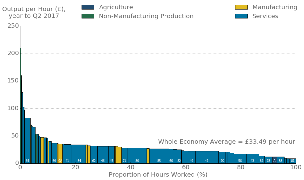
This quarter a further marginal innovation has been added: current price output per hour worked by detailed industry. These data are summarised in Figure 2, which shows the labour productivity of each industry (the height of the bar) as well as the share of hours worked in that industry (the width of the bar). Industries are ordered from the most productive on the left-hand side, to the least productive on the right-hand side, and the UK average for the period is also shown for reference.
Figure 2: Output per hour by industry (excluding real estate)
UK, current prices, seasonally adjusted, Quarter 3 (July to Sept) 2016 to Quarter 2 (Apr to June) 2017
Source: Office for National Statistics
Notes:
-
- Industry data exclude real estate, but whole economy average includes real estate.
Download this image Figure 2: Output per hour by industry (excluding real estate)
.png (38.0 kB) .xls (26.6 kB)Figure 2 shows that while the UK produced £33.49 per hour in the year to Quarter 2 2017 (in current prices), labour productivity varied substantially across industries. The most productive UK industries are located in production – mining and quarrying, water transport, and pharmaceutical manufacturing – and in industries that account for a relatively small share of total hours. Services account for a large share of the hours worked at below average productivity.
However, there are some high-productivity services industries that – compared with other high-productivity industries – have a relatively large share of hours. Industry 64 (financial services excluding insurance) and industry 69 (legal and accounting activities) each have above average productivity and a share of hours greater than 1.5%. These data should enable more detailed analysis – in particular of the contribution of the “reallocation” effect, which is thought in general to shift resources away from less productive industries towards more productive industries over time.
Back to table of contents5. International comparisons of labour productivity
The relative weakness of recent labour productivity growth is one of two “puzzles” that define the UK’s productivity performance since the economic downturn. The second, long-standing puzzle concerns the gap between the UK’s level of output per hour and that of other advanced economies. As part of this release, we have published updated estimates of this gap between the UK and the other G7 economies to 2016. These estimates use data compiled by the Organisation for Economic Co-operation and Development (OECD) on gross domestic product (GDP), labour input and use Purchasing Power Parity (PPP) exchange rates to generate estimates of labour productivity in a common currency. Although this is common practice, users should be aware of the limitations of these PPPs.
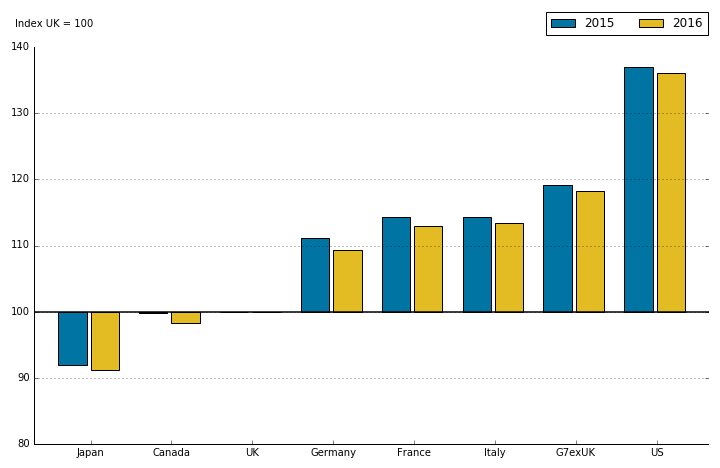
These first estimates of labour productivity indicate that the gap between the UK and the rest of the G7 remained relatively stable in 2016, narrowing slightly from 16.1% to 15.4% in output per worker terms. Figure 3 shows the ratio of UK GDP per worker to that in the other G7 economies and to the G7 excluding the UK. It indicates that the UK’s productivity performance improved relative to all of the G7 countries in 2016, with the largest improvements relative to Canada, Germany and France. On this basis, the UK is fifth out of seven in the G7 on both a GDP per hour worked and GDP per worker basis. On a per hour basis, the gap between the UK and the rest of the G7 is broadly similar, at around 15.1%. More details on these results can be found in the main International comparisons of productivity release.
Figure 3: Current price gross domestic product per worker, G7 countries, 2015 and 2016
Source: Organisation for Economic Co-operation and Development, and Office for National Statistics calculations
Download this image Figure 3: Current price gross domestic product per worker, G7 countries, 2015 and 2016
.png (11.4 kB) .xls (25.6 kB)The size and persistence of the gap between UK labour productivity and that in other developed economies has generated considerable interest among policymakers. Research in this area is motivated by the potential for productivity “catch up” – as relatively strong productivity performance in one economy may present lessons for others.
To support this analysis, we have published experimental estimates of labour productivity by country and industry alongside this release. This release uses a set of “production side” PPPs – which are conceptually preferable to the conventional and widely used “expenditure side” PPPs – to compare the level of output per hour worked in nine industries across a set of 29 European economies in 2014. While these production side PPPs are not without their limitations – which are set out in the companion article to this bulletin – these data offer important insights on the industries in which the UK performs relatively weakly compared to its European peers, providing understanding of the aggregate UK productivity gap.
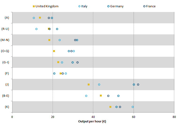
This work suggests that the productivity gap between the UK and other leading economies at the aggregate level is reflected at the industry level. Figure 4 shows the level of output per hour worked by industry in the four largest European economies – the UK, Italy, France and Germany. Industries are ranked from the least productive to the most productive UK industries, and points to the left-hand side (right-hand side) of Figure 4 indicate lower (higher) levels of labour productivity.
Figure 4: Output per hour in euros, 2014, selected industries and countries
Source: Eurostat and Office for National Statistics
Notes:
- Key:
Agriculture, forestry and fishing (A);
Production (except construction) (B-E);
Construction (F);
Wholesale and retail trade, transport, accommodation and food service activities (G-I);
Information and communication (J);
Financial and insurance activities (K);
Professional, scientific and technical activities; administrative and support service activities (M-N);
Public administration, defence, education, human health and social work activities (O-Q);
Arts, entertainment and recreation; other service activities; activities of household and extra-territorial organisations and bodies (R-U)
Download this image Figure 4: Output per hour in euros, 2014, selected industries and countries
.png (18.2 kB) .xls (26.6 kB)The size of the UK’s labour productivity gap varies across industries, but the UK’s performance is weak relative to other leading European economies. The UK is fourth of this group in five of the nine industries presented, and has the second lowest labour productivity in each of the remaining four industries. Even among those industries in which the UK’s level of productivity is relatively high – including financial services (K) and the production industries (B to E) – the UK’s performance is weaker than several other European economies.
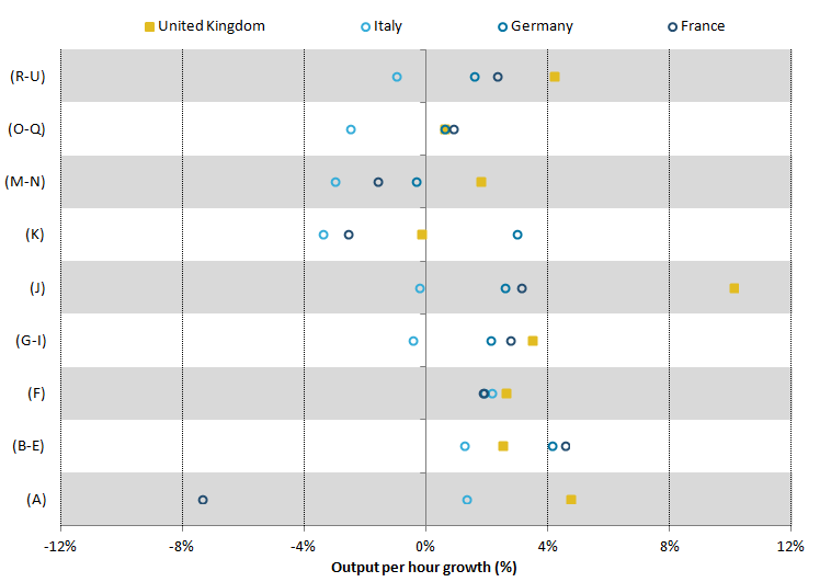
Although the level of labour productivity by industry in the UK appears to be relatively weak compared with the other largest European economies, UK productivity growth has been relatively strong in recent periods. Figure 5 shows the growth rates of country by industry productivity in real terms. It shows that all but one industry in the UK experienced productivity growth over the 2014 to 2016 period, and had the strongest growth rate in five of these industries.
While there remains work to be done to improve the production side PPPs that enable these analyses – and we invite user feedback on the uses and usefulness of these experimental data – these data are broadly consistent with the headline International comparisons of productivity release. In particular, they help to explain how the UK marginally closed the gap with the other G7 economies on an output per hour basis, through an employment structure that concentrated hours worked in a number of higher productivity growth industries.
Figure 5: Growth in output per hour in euros, 2014 to 2016, selected industries and countries
Source: Eurostat and Office for National Statistics calculations
Notes:
- Key:
Agriculture, forestry and fishing (A);
Production (except construction) (B-E);
Construction (F);
Wholesale and retail trade, transport, accommodation and food service activities (G-I);
Information and communication (J);
Financial and insurance activities (K);
Professional, scientific and technical activities; administrative and support service activities (M-N);
Public administration, defence, education, human health and social work activities (O-Q);
Arts, entertainment and recreation; other service activities; activities of household and extra-territorial organisations and bodies (R-U)
Download this image Figure 5: Growth in output per hour in euros, 2014 to 2016, selected industries and countries
.png (18.8 kB) .xls (18.9 kB)6. Foreign direct investment and labour productivity
The substantial differences in industry-level labour productivity across countries underline the potential for international collaborations to enhance firm performance. The link between foreign direct investment (FDI)1 and productivity is the subject of large academic literature and is the subject of a paper published alongside this bulletin. In this paper, we link an Office for National Statistics (ONS) dataset on FDI2 to the Annual Business Survey (ABS) to explore the composition and productivity outcomes of firms with FDI links relative to domestically orientated firms. The study covers the period 2012 to 2015 and so comprises several recent years during which the UK’s rate of labour productivity growth has been relatively slow. While our results cannot be read as causal, they are consistent with the results in the wider literature and form the foundations for future analysis.
The literature identifies a wide range of different ways in which flows of FDI can influence the productivity of domestic industries (Griffith, 2002). Firms that attract flows of investment from overseas corporations (inwards investment) are widely thought to benefit from increased investment, access to technology and expertise, as well as stronger management and organisational practices, while firms which undertake investment overseas (outwards investment) are thought to benefit from access to larger markets. The literature also posits that spillovers – within the same industry (horizontal spillovers) or across industries in the supply chain (vertical spillovers) – between FDI and non-FDI firms can influence the productivity of domestic firms (Javorcik, 2004).
Our analysis suggests that firms with FDI links account for a relatively small fraction of firms, but a disproportionate share of employment and turnover. Firms with FDI relationships (inwards or outwards) account for a very small proportion (1%) of firms in the ABS population, but they account for a much larger proportion of total annual turnover (37%) and employment (20%) over the period of the study. The average FDI firm is found to be larger than the average non-FDI firm.
We also conclude that FDI firms have considerably higher productivity on average. Table 1 shows summary statistics for FDI and non-FDI firms. This indicates that the median firm level labour productivity of FDI firms is at least twice that of the median of non-FDI firms in recent years, while mean labour productivity among FDI firms is more than three times that of non-FDI firms. This finding is broadly consistent for firms with inward or outward FDI, indicating that firms which engage in FDI (either inward or outward) have higher labour productivity than domestically-orientated firms.
Table 1: Mean and median of real labour productivity by FDI status, Great Britain, 2012 to 2015
| £,000 per worker per year | |||||||||||||||
| Median | Mean | Of which mean of: | |||||||||||||
| No FDI | FDI | No FDI | FDI | Inward FDI | Outward FDI | ||||||||||
| 2012 | 25.3 | 61.6 | 44.3 | 123.0 | 125.5 | 119.2 | |||||||||
| 2013 | 26.5 | 53.4 | 47.5 | 156.8 | 159.2 | 161.7 | |||||||||
| 2014 | 27.1 | 63.3 | 48.6 | 153.4 | 165.7 | 109.0 | |||||||||
| 2015 | 27.7 | 59.3 | 48.3 | 172.7 | 185.6 | 140.3 | |||||||||
| Source: Office for National Statistics | |||||||||||||||
| Notes: | |||||||||||||||
| 1. Labour productivity is calculated as GVA/employment, in 2015 constant prices. | |||||||||||||||
| 2. FDI includes firms with either inward or outward FDI relationship. In the final two columns, FDI has been split between these different relationships. | |||||||||||||||
| 3. Includes all firms covered by the Annual Business Survey (ABS) excluding section K (Financial and Insurance Activities), weighted to reflect the population of firms. | |||||||||||||||
Download this table Table 1: Mean and median of real labour productivity by FDI status, Great Britain, 2012 to 2015
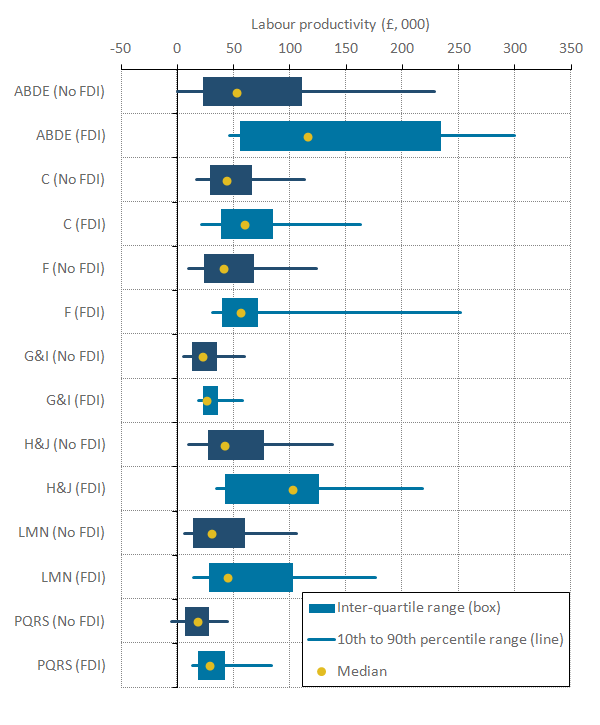
.xls (28.7 kB)Labour productivity is known to vary widely across industries (for more information, see the “Distribution of productivity” section in Economic Review: January 2016), reflecting variations in composition and the organisation of activity in terms of firm size, labour quality and capital intensity, and other factors. In Figure 6, we compare the productivity outcomes for firms with and without FDI across industries, as the industry mix of FDI and non-FDI firms may also play an important role in explaining these labour productivity trends. Figure 6 shows the productivity of the median firm (the dots), the 10th and 90th percentiles (the lines) and the inter-quartile range (that is, the difference between the 75th and 25th percentiles – the bars) for each industry group in 2015.
Figure 6: Labour productivity distribution by industry and foreign direct investment status
Great Britain, 2015
Source: Office for National Statistics
Notes:
- Labour productivity is calculated as GVA/employment, in 2015 constant prices.
- FDI includes firms with either inward or outward FDI relationship.
- Includes all firms covered by the Annual Business Survey (ABS) excluding sections K (Financial and Insurance Activities).
- Firms can have negative levels of value added per worker in specific periods when they report larger values of purchases than their total turnover.
- Tails represent the 10th to 90th percentiles, boxes represent the inter-quartile ranges, and dots show medians.
- Key:
ABDE – Non-manufacturing production: A (Agriculture, Forestry and Fishing), B (Mining and Quarrying), D (Electricity, Gas, Steam and Air Conditioning Supply) and E (Water Supply; Sewerage, Waste Management and Remediation Activities).
C – Manufacturing
F – Construction
G&I – Distribution, Hotels & Restaurants Services: G (Wholesale and Retail Trade; Repair of Motor Vehicles and Motorcycles) and I (Accommodation and Food Service Activities).
H&J – Transport, Storage & Communication Services: H (Transportation and Storage) and J (Information and Communication).
LMN – Business Services & Real Estate: L (Real Estate Activities), M (Professional, Scientific and Technical Activities) and N (Administrative and Support Service Activities).
PQR – Other Services: P (Education), Q (Human Health and Social Work Activities), R (Arts, Entertainment and Recreation) and S (Other Service Activities).
Download this image Figure 6: Labour productivity distribution by industry and foreign direct investment status
.png (22.4 kB) .xls (23.6 kB)Figure 6 presents some striking features of the relative performance of FDI and non-FDI firms. Firstly, median labour productivity was higher for FDI firms than for domestic firms in all these high-level industries. This difference was particularly marked in the production industries (ABDE) and transport, storage and communication services (H&J). Secondly, the gap in productivity between the 10th percentile – the least productive firms – and the 90th percentile – the most productive – varies markedly across industries, but is typically wider for FDI firms. This suggests that while average productivity among FDI firms is higher, they also have a wider dispersion of productivity levels. Finally, all three summary statistics – the median, inter-quartile range and the 10th to 90th percentiles – are shifted to the right for FDI firms relative to non-FDI firms. This suggests that while industry composition may be important in explaining the average performance of FDI firms relative to non-FDI firms, there also appears to be some additional premium associated with FDI status within industries.
Alongside these descriptive statistics, we also present conditional analysis of the labour productivity performance of FDI and non-FDI firms. We find that even after controlling for industry, size and region, firms that attract FDI are around 74% more productive on average than non-FDI firms. Our detailed analysis suggests that this premium varies considerably across industries, with some of the largest differences between FDI and non-FDI firms in the mining and quarrying, and electricity, gas, steam and air conditioning supply industries. We plan to use this work as the foundation for future analysis, which will consider the link between FDI and multi-factor productivity and the role of spillovers from FDI in explaining the productivity performance of domestic firms.
Notes for: Foreign direct investment and labour productivity
- In this study foreign direct investment (FDI) refers to cross-border investment of at least a 10% ownership stake or voting rights in an enterprise.
- The FDI dataset relates to the immediate foreign ownership of an enterprise and may differ from other studies that are based on the ultimate foreign ownership.
7. Quality adjusted labour input
Alongside the work linking foreign direct investment (FDI) and productivity, we have also published an article presenting updated estimates of quality adjusted labour input (QALI) for the whole economy and for the market sector. A QALI index accounts for both changes in the composition (or “quality”) of the employed workforce as well as changes in hours worked, and is an input into measuring multi-factor productivity (MFP).
QALI indices weight the hours worked by relatively high productivity workers more heavily than the hours supplied by relatively low productivity workers – using relative earnings as weights – and can consequently be read as changes in the effective supply of labour. As a result of this manner of construction, QALI indices are more sensitive to changes in the supply of labour by relatively high-productivity workers than aggregate labour input series like total hours worked.
The companion article published with this bulletin marks a further step in the development work on our growth accounting framework. Compared with previous QALI releases, we have expanded the level of industry granularity and we now utilise information on earnings of different types of workers from the Annual Survey of Hours and Earnings (ASHE) as well as from the Labour Force Survey (LFS). The market sector estimates of QALI will be incorporated into MFP estimates in a future publication, and the greater industrial granularity will support more detailed multi-factor productivity work planned for 2018.
The new QALI estimates for 2016 show an improvement in the labour composition or “quality” of the workforce in both the whole economy and the market sector compared with 2015 (Figure 7). At the whole economy level, labour quality grew at the fastest rate since 2012, more than offsetting slower growth of hours worked such that the overall growth of quality adjusted labour was 2.1% in 2016, compared with 1.6% in 2015. By contrast, an index of total hours worked would have increased by just 1.4% in 2016, down from growth of 1.5% in 2015.
Figure 7: Annual quality adjusted labour input (QALI) growth, whole economy
UK, 1995 to 2016
Source: Office for National Statistics
Download this chart Figure 7: Annual quality adjusted labour input (QALI) growth, whole economy
Image .csv .xlsThe performance of the “quality” element of QALI in the most recent data is in marked contrast to the results for the two prior years. The contribution of changes in the composition of the workforce in 2016 (0.8 percentage points) followed a negligible movement in composition in 2015 and a slight fall in “quality” in 2014. It was also above the trend movement in composition observed prior to the economic downturn. The accompanying article shows that labour composition improved across a broad range of industries in 2016, with especially large improvements in non-manufacturing production industries, financial services and other services.
The drivers for this QALI result can be discerned by examining the detailed earnings weights and labour supply of different “types” of worker. ONS’s QALI framework follows the international standard in stratifying workers by industry, age, sex and educational attainment. This design is influenced both by economic theory and pragmatism. Theory suggests that worker “quality” is reflected in their marginal product, which in competitive markets is reflected in their earnings – higher quality workers earn more per hour than lower quality workers. The pragmatic driver is to find a stratification framework that picks up systematic variations in hourly earnings in terms of measurable worker characteristics.
Table 2 summarises the QALI data on hourly earnings and shares of hours worked. The first two columns of figures in the table show relative hourly remuneration in 2007 (the last year before the economic downturn) and 2016, summarised over different QALI sub-aggregates and expressed relative to estimated average hourly remuneration of the UK total employed workforce in each year. These data show that hourly remuneration is not uniform across QALI categories and also that relative remuneration has changed over time, reflecting movements in supply and demand for different categories of labour. The two columns of figures on the right-hand side of Table 2 show shares of hours worked in the same years (2007 and 2016).
Table 2: Relative hourly remuneration and shares of hours by quality adjusted labour input categories, UK, 2007 and 2016
| Hourly remuneration | Shares of hours worked | ||||
|---|---|---|---|---|---|
| Whole economy = 100 | % | ||||
| 2007 | 2016 | 2007 | 2016 | ||
| Industry | |||||
| Agriculture, Forestry and Fishing (A) | 51 | 44 | 1.6 | 1.5 | |
| Mining and Quarrying (B) | 229 | 254 | 0.3 | 0.2 | |
| Manufacturing (C) | 114 | 126 | 10.9 | 9.0 | |
| Electricity, Gas, Steam and Air Conditioning Supply (D) | 171 | 164 | 0.4 | 0.5 | |
| Water Supply; Sewerage, Waste Management and Remediation Activities (E) | 150 | 123 | 0.5 | 0.6 | |
| Construction (F) | 82 | 86 | 8.6 | 7.8 | |
| Wholesale and Retail Trade; Repair of Motor Vehicles and Motorcycles (G) | 80 | 86 | 14.8 | 14.3 | |
| Transportation and Storage (H) | 104 | 106 | 5.3 | 5.2 | |
| Accommodation and Food Service Activities (I) | 59 | 59 | 5.5 | 5.7 | |
| Information and Communication (J) | 143 | 135 | 4.5 | 4.8 | |
| Financial and Insurance Activities (K) | 198 | 181 | 4.0 | 3.6 | |
| Real Estate Activities (L) | 83 | 83 | 1.4 | 1.6 | |
| Professional, Scientific and Technical Activities (M) | 106 | 84 | 7.7 | 8.8 | |
| Administrative and Support Service Activities (N) | 64 | 80 | 7.5 | 8.4 | |
| Public Administration and Defence; Compulsory Social Security (O) | 114 | 131 | 5.9 | 4.5 | |
| Education (P) | 140 | 123 | 6.4 | 7.1 | |
| Human Health and Social Work Activities (Q) | 90 | 90 | 10.0 | 11.3 | |
| Arts, Entertainment and Recreation (R) | 54 | 65 | 2.2 | 2.2 | |
| Other Services (STU) | 104 | 118 | 2.5 | 2.6 | |
| Sex | |||||
| Females | 88 | 91 | 39.2 | 39.5 | |
| Males | 107 | 106 | 60.8 | 60.5 | |
| Age | |||||
| 16-29 years | 70 | 71 | 25.0 | 23.5 | |
| 30-49 years | 113 | 110 | 50.2 | 47.2 | |
| 50+ | 105 | 108 | 24.8 | 29.3 | |
| Education | |||||
| No qualifications | 66 | 65 | 8.5 | 5.2 | |
| GCSEs or equivalent | 80 | 79 | 33.8 | 28.4 | |
| A – levels or trade apprenticeships | 92 | 87 | 23.7 | 22.6 | |
| Certificates of education or equivalent | 110 | 103 | 9.5 | 9.4 | |
| First and other degrees | 134 | 121 | 17.0 | 22.6 | |
| Masters and doctorates | 162 | 146 | 7.4 | 11.8 | |
| Source: Office for National Statistics | |||||
Download this table Table 2: Relative hourly remuneration and shares of hours by quality adjusted labour input categories, UK, 2007 and 2016
.xls (36.4 kB)While Table 2 shows systematic variation in hourly earnings in terms of industry of employment, sex and age group, the variation in shares of hours worked in terms of these characteristics, and hence the scope for compositional change across these dimensions, is fairly muted. In terms of education, however, the QALI dataset shows a strong link between levels of education and relative hourly remuneration, combined with substantial movements in the shares of hours worked by workers with different levels of education. The premium earned by the highest education cohort (masters and doctorates) was lower in 2016 than in 2007 but remains substantial. Meanwhile, the share of hours worked of the highest two education categories increased by almost 10 percentage points between 2007 and 2016, mirroring a similar fall in the shares of the lowest two education categories.
This indicates a shift in the composition of the workforce away from less-educated workers and towards higher-educated workers. Combined with the strong correlation between education and hourly earnings, this is the main driver of improvements in labour quality at the aggregate level and across industries, age classes and sex.
Back to table of contents8. Public service productivity
Also reported alongside this bulletin are the most recent experimental estimates of quarterly public service productivity. They show that in Quarter 2 (Apr to June) 2017, productivity for public services fell by 0.5%, down from a revised contraction of 0.1% in the previous quarter. Breaking this down into the underlying components, the fall in productivity was driven by a 0.5% increase in inputs, while total public service output was flat.
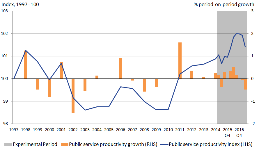
The recent fall in public service productivity marks a change in the upward trend that has been experienced in recent years. Figure 8 shows the growth in public service productivity since 1997, combining the latest experimental quarterly estimates – covering Quarter 1 (Jan to Mar) 2015 to Quarter 2 (Apr to June) 2017 – with annual estimates for between 1997 and 2014, taken from the Public service productivity estimates: total public service, UK: 2014 release. It suggests that the productivity of UK public services has been on an upwards trend for much of the last seven years. As a consequence, UK total public service productivity was 3.2% higher in 2016 than in 2010. This was driven by growth in total public service output, which rose by 4.9% over the same period.
Inputs, on the other hand, have experienced somewhat slower growth, growing by 1.6% between 2010 and 2016. The fall in productivity in the most recent two quarters has reversed some of these gains, and the fall in the most recent quarter represents the sharpest quarterly contraction in public service productivity since the start of quarterly records in 2014.
Figure 8: Total UK public service productivity, 1997 to Quarter 2 (Apr to June) 2017
Source: Office for National Statistics
Notes:
- Estimates from 1997 to 2014 are based on the existing annual series.
- Estimates from 2015 Q1 to 2017 Q2 are based on the experimental quarterly total public service productivity series.
- Estimates for 2015 Q1 reflect the growth rate between annualised quarterly productivity for 2014 and 2015 Q1.
- Estimates of productivity for the experimental period are indirectly seasonally adjusted, calculated using seasonally adjusted inputs and seasonally adjusted output.
- Asterisks (*) and greyed out area reference periods were estimates are based on experimental methodology.
Download this image Figure 8: Total UK public service productivity, 1997 to Quarter 2 (Apr to June) 2017
.png (26.7 kB) .xls (22.0 kB)Alongside estimates of the productivity of the public services, this release also contains new proposed methods to quality adjust our measure of output of the criminal justice system – a sub-component of public order and safety (POS), itself a component of total UK public services. Historically, the output of this industry has been measured without a quality adjustment, capturing only changes in associated activities. Further information on methods and sources used are available in the Sources and methods for public service productivity estimates: total public services.
In line with recommendations from the Atkinson Review, the methodology article published alongside this release presents a set of proposed methods by which to capture changes in the quality of services of the criminal justice system – on both a holistic1 and service specific basis2 – and approaches by which to implement them. The aim of this new approach is to better reflect how the quality of associated activities and services provided may change over time, independent of changes in measures of simple activity.
Figure 9 compares the output of public order and safety service with and without the effect of the quality adjustment. It suggests that, while output had been falling since 2003, the quality of that output rose over much of the mid- to late-2000s, causing quality adjusted output to increase. However, later in the period, this trend begins to change, with quality adjusted output falling from 2009 onwards.
Figure 9: Comparison of quality and non-quality adjusted public order and safety output
UK, 1997 to 2014
Source: Office for National Statistics
Notes:
- Quality adjustment uses data from England and Wales only.
Download this chart Figure 9: Comparison of quality and non-quality adjusted public order and safety output
Image .csv .xlsFeedback on this methodology article and this proposed method, as well as suggestions for improvements are invited, and will support the future development of these measures ahead of their proposed implementation within the upcoming annual release.
Notes for: Public service productivity
- Applied uniformly to treat criminal justice as one interlinked system.
- Indentifying changes in quality of services with unique outcomes, for example, prisons and courts.
9. The mystery of Total Factor Productivity (TFP)
As part of its work to better understand and explain the UK’s productivity puzzle, Office for National Statistics (ONS) has commissioned a range of research outputs from the newly established Economic Statistics Centre of Excellence (ESCoE). Published alongside this release is among the first in a series of discussion papers established by the ESCoE, which analyses Total Factor Productivity (TFP) across a range of countries.
Oulton (2017) examines TFP growth at the sectoral and aggregate level, using data for 10 industry groups covering the market sector for 18 countries over the period 1970 to 2007 drawn from the EU KLEMS dataset. He finds that TFP growth displays considerable persistence at the aggregate level but not at the industry level, and argues that this suggests industry outputs are measured with error. To support this finding, he shows that in all countries resources have been shifting away from industries with high TFP growth towards industries with low TFP growth – which runs counter to the expectations of theory. This paper is among the first in a sequence that the ESCoE are planning, and which will actively be considered as ONS establishes its plans for further development.
Back to table of contents