Table of contents
- Introduction
- Main points and summary of assessment
- Economy
- Society
- Environment
- How the assessment is made
- Changes to this year's publication
- Sustainable development goals
- Sources, reports and surveys related to 'Sustainable development indicators, July 2015'
- Methods of assessment of change
- Background notes
1. Introduction
Sustainable Development Indicators
The Sustainable Development Indicators (SDIs) provide an overview of progress towards a sustainable economy, society and environment.
There are 12 headline and 23 supplementary indicators, which are supported by 25 and 41 measures respectively. Where there are sufficient data to be compared, measures have been assessed over the long-term and short-term to see if there has been clear improvement, deterioration or if there has been little or no overall change.
Data are the latest available at 30 June 2015. Where possible, indicators have been presented for the United Kingdom. Where UK data are not available, indicators may be presented for England and Wales combined, or for England.
The Sustainable Development Indicator set was launched by DEFRA in 2001, and following consultation in 2012 a streamlined set was published in 2013. The first results from this revised indicator set were published in July 2013. While DEFRA retain the policy lead for this work, ONS took responsibility for updating and publishing SDI's in 2014.
Back to table of contents2. Main points and summary of assessment
Figure 1 shows the number of measures which are showing improvement, deterioration or no change in the long-term and short-term. A long term assessment of change is made when there a comparison can be made over at least 10 years, that is 11 years of data. A short term assessment is made between the latest year and the year 5 years before, that is 6 years of data. Further information can be found in the Appendix and the 'How the assessment is made' sections of this publication.
Summary Figure 1: Long-term and short term assessments for all measures
Source: Office for National Statistics
Download this chart Summary Figure 1: Long-term and short term assessments for all measures
Image .csv .xlsOverall, 22 out of 60 indicators or measures showed an improvement over the long-term, and 22 showed improvement over the short-term.
Overall, 8 out of 60 indicators or measures showed deterioration over the long-term, and 10 showed deterioration over the short-term.
There has been an increase in the number of economic indicators or measures showing an improvement, (from 7 in 2014 to 8 in 2015) and a decrease in those assessed as deteriorating (from 6 in 2014 to 4 in 2015).
The number of environmental indicators or measures showing an improvement fell over both the long and short term. The number of indicators or measures showing a fall over the long term fell from 11 in 2014 to 10 in 2015, the number falling over the short term indicators fell from 13 in 2014 to 12 in 2015.
The number of society indicators showing a long term improvement has increased (from 3 to 6 between 2014 and 2015) this has been countered by an decrease in the number of short term assessments (from 11 to 8).
The number of environmental indicators or measures classified as 'deteriorating' increased (from 4 in 2014 to 5 in 2015) for both long and short term measures.
The number of households in fuel poverty in 2013 is estimated to be the lowest since 2006.
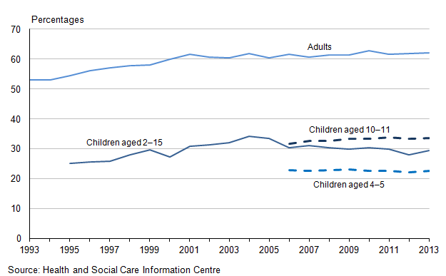
The number of overweight or obese adults is assessed as deteriorating over the long and short term. 62.1% of adults in England were overweight in 2013.
The increase in the rate of recycling of household waste in England has slowed, growing by just 0.5% between the financial year ending 2012 and the financial year ending 2014.
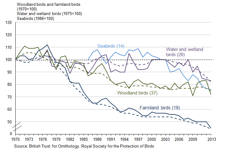
Overall, measures for UK breeding bird populations are deteriorating over both the long and short term, except for the short term measure for woodland birds which shows little or no change.
Summaries of long and short term change for each of the three areas - Economy, Society and Environment are presented next, followed by data for each indicator and measure and reasons given for their inclusion in the SDI set.
Summary of change for Economy
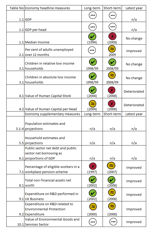
The table gives a summary of the long and short term changes for Economy.
Summary of change for Society
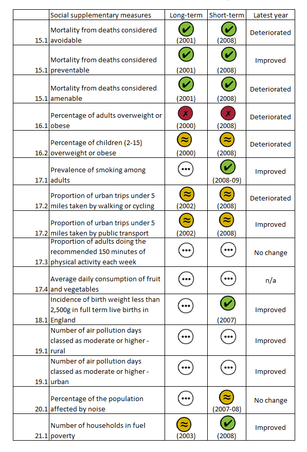
The table gives a summary of the long and short term changes for Society.
Summary of change for Environment
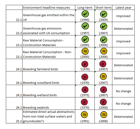
The table gives a summary of the long and short term changes for Environment.
Assessment of change - Environment
Download this image Assessment of change - Environment
.png (73.5 kB)3. Economy
There has been a recent increase in the number of economic indicators showing an improvement, (from 7 in 2014 to 8 in 2015) and a decrease in those assessed as deteriorating (from 6 in 2014 to 4 in 2015).
Of all those improving, 2 are as a result of there now being enough data (at least 10 years), to make an assessment of long term change. These were the 'Stock of human capital' and 'Total non-financial assets net worth'.
All the measures that are assessed as deteriorating in 2015 were also deteriorating in 2014. The measure for 'Adults unemployed for over 12 months' is assessed as showing little or no overall change in 2015 against an assessment of deteriorating in 2014, which is consistent with the fall in unemployment in recent years as the UK recovers from the economic downturn. Although the long term assessment for 'Research and development related to environmental protection' has changed from deteriorating in 2014 to no overall change in 2015, caution should be used as recorded expenditure varies from year to year and the short term assessment has changed from improving to little or no overall change.
While no assessment of change is made against the measures of Gross Domestic Product (GDP), GDP has grown in recent years. However, the short term assessment of 'median income' is deteriorating. Again this is consistent with both low earnings growth in the last few years and with the 'GDP per capita' measure.
Headline Indicator 1: Economic prosperity
Economic prosperity generally means that the economy is doing well, and that most people have sufficient income. Comparing GDP and Median income gives an indication to economic prosperity.
Figure 1.1: Indices of Gross Domestic Product (GDP), GDP per head and median income, 1997 to 2014 (1,2,3)
United Kingdom
Source: Office for National Statistics
Notes:
- GDP forms Quarter 1 2015 Quarterly National Accounts and GDP per capita ONS's UK Economic Accounts
- Median Income is from DWP’s households below average income publication. Median income is presented in financial years, such that 2011 represents financial year ending 2011, it is income before housing costs
- All figures are adjusted for inflation to represent change in real terms
Download this chart Figure 1.1: Indices of Gross Domestic Product (GDP), GDP per head and median income, 1997 to 2014 (1,2,3)
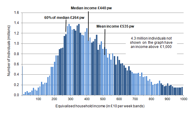
Image .csv .xlsExamining income distribution can reveal the inequalities within household income. Income distribution displays the spread of household income under £1000 per week.
Figure 1.2: Income distribution for the whole population before housing cost, financial year ending 2013 (1)
UK
Source: Family Resources Survey - Department for Work and Pensions
Notes:
- Although the numbers are shown as real numbers presented in millions they are for graphical purposes only and should not be used in any other way unless banded together in larger groups (i.e £50 bands) and any figures used should be quoted to the nearest 100,000.
Download this image Figure 1.2: Income distribution for the whole population before housing cost, financial year ending 2013 (1)
.png (16.7 kB)Headline Indicator 2: Long-term unemployment
Extended periods of unemployment can impact on individuals and families, through loss of income, social isolation, sense of worth and other factors. Employment enables people to meet their needs and improve their living standards, and is an effective and sustainable way to tackle poverty and social exclusion for those who can work.
Figure 2.1: Proportion of economically active adults unemployed (1) for over 12 months: by age group, 1992 to 2014 (2)
United Kingdom
Source: Labour Force Survey - Office for National Statistics
Notes:
- Annual figures are represented by the October to December period each year.
- International Labour Organisation definition – “Looked for work in the last 4 weeks and available to start job within 2 weeks, or waiting to start a job". Duration of unemployment is the length of time the respondent reports they have been looking for work (or the period since they left their last job if that is shorter). Its accuracy depends on respondent recall, and it is not possible to measure for certain whether the respondent was unemployed for a continuous period of 12 months or more. Trends in these figures may be affected by welfare reforms that are helping people previously in receipt of inactivity benefits to start looking for work and become unemployed. Many of these people will have been out of work for an extended period of time and are therefore more likely to report that they have been looking for work for 12 months or more, even if that didn't involve active job search.
Download this chart Figure 2.1: Proportion of economically active adults unemployed (1) for over 12 months: by age group, 1992 to 2014 (2)
Image .csv .xlsHeadline Indicator 3: Poverty
Poverty can perpetuate from one generation to the next, and the proportion of children in poverty is a key issue for intergenerational well-being. Poverty is measured by the proportion of children living in households with incomes below 60% of the median.
Figure 3.1: Proportion of children in relative and absolute low income households before housing costs, 1994/95 to 2013/14 (1,2)
England
Source: Family Resources Survey - Department for Work and Pensions
Notes:
- Family Resources Survey (FRS) figures are for Great Britain up to financial year ending 1998, and for the United Kingdom from financial year ending 1999, with estimates for Northern Ireland imputed for the financial years ending 1999 through 2002. The reference period for FRS figures is single financial years
- The table use grossing factors based on 2011 Census data. Figures have been revised back to financial year ending 2003 using these grossing factors. Imputed figures for Northern Ireland have also been revised using these grossing factors
Download this chart Figure 3.1: Proportion of children in relative and absolute low income households before housing costs, 1994/95 to 2013/14 (1,2)
Image .csv .xlsHeadline Indicator 4: Knowledge and skills
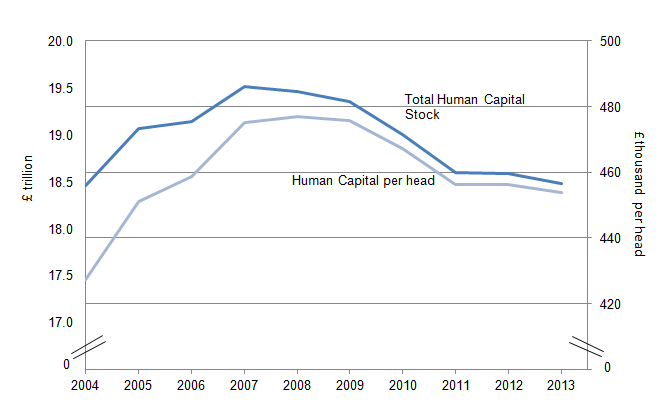
The concept of human capital is broad and encompasses a range of personal attributes, such as people’s health conditions. However, in practical terms the focus of measurement has been limited to people’s skills, knowledge and abilities, and in particular on the role of formal education and training in developing them.
Human capital is recognised as having important economic benefits; for example, there is a link between increased human capital (as measured by qualifications) and economic growth. For this indicator, the measurement of human capital has been restricted to people’s skills1 and abilities.
Figure 4.1: Human capital stock and human capital per head, 2004 to 2013 (1,2,3,4)
UK
Source: Office for National Statistics
Notes:
- Figures in 2013 prices.
- Labour productivity growth rate = 2%.
- Discount rate = 3.5%.
- Population figures used in this estimate come from the Annual Population Survey.
Download this image Figure 4.1: Human capital stock and human capital per head, 2004 to 2013 (1,2,3,4)
.png (18.4 kB) .xls (19.5 kB)
Figure 4.2: Employed human capital: by age group, 2004 to 2013 (1,2,3)
United Kingdom
Source: Office for National Statistics
Notes:
- Components may not sum to total due to rounding.
- Labour productivity growth rate = 2%.
- Discount rate = 3.5%.
Download this chart Figure 4.2: Employed human capital: by age group, 2004 to 2013 (1,2,3)
Image .csv .xlsSupplementary Indicator 5: Population demographics
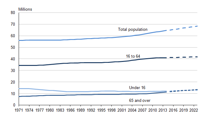
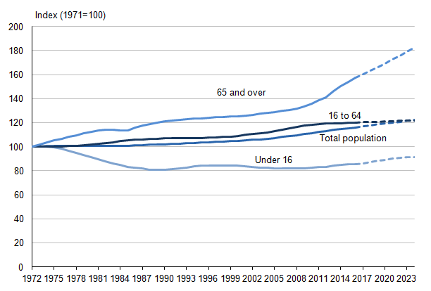
Population and population growth are key drivers behind many challenges for sustainable development as population growth increases the pressure on resources and services. Household projections are an indication of the likely increase in households given the continuation of recent demographic trends. Household formation may increase the pressure for housing or resources and services.
Figure 5.1: Total population and projected population in the UK, 1971 to 2023 (1,2,3)
UK
Source: Office for National Statistics
Notes:
- Projections are from 2014 onwards.
- Figures may not add exactly due to rounding.
- The estimated resident population of an area includes all those people who usually live there, regardless of nationality. Arriving international migrants are included in the usually resident population if they remain in the UK for at least a year. Students are taken to be usually resident at their term time address.
Download this image Figure 5.1: Total population and projected population in the UK, 1971 to 2023 (1,2,3)
.png (13.1 kB) .xls (34.8 kB)
Figure 5.2: Index of UK total population and projected population, 1971 to 2023 (1,2)
UK
Source: Office for National Statistics
Notes:
- Projections are from 2013 onwards.
- The estimated resident population of an area includes all those people who usually live there, regardless of nationality. Arriving international migrants are included in the usually resident population if they remain in the UK for at least a year. Students are taken to be usually resident at their term time address.
Download this image Figure 5.2: Index of UK total population and projected population, 1971 to 2023 (1,2)
.png (15.8 kB) .xls (23.0 kB)
Figure 5.3: Total population and projected population in England, 1971 to 2023 (1,2,3)
England
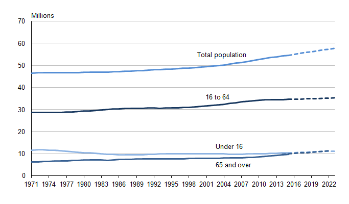
Source: Office for National Statistics
Notes:
- Figures may not add exactly due to rounding.
- Projections are from 2014 onwards.
- The estimated resident population of an area includes all those people who usually live there, regardless of nationality. Arriving international migrants are included in the usually resident population if they remain in the UK for at least a year. Students are taken to be usually resident at their term time address.
Download this image Figure 5.3: Total population and projected population in England, 1971 to 2023 (1,2,3)
.png (13.4 kB) .xls (23.0 kB)
Figure 5.4: Index of total population and projected population in England, 1971 to 2023 (1)
England
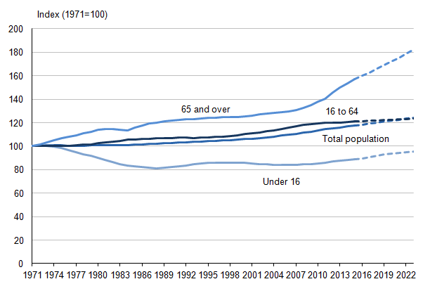
Source: Office for National Statistics
Notes:
- Projections are from 2014 onwards.
Download this image Figure 5.4: Index of total population and projected population in England, 1971 to 2023 (1)
.png (15.8 kB) .xls (22.5 kB)
Figure 5.5: Total number of households and projected household numbers, 1971 to 2033 (1,2,3)
England, Wales, Scotland and Northern Ireland
Source: Communities and Local Government
Notes:
- Figures for England from 2002 are based on the 2012–based household projections
- A household is defined as one person living alone, or a group of people (not necessarily related) living at the same address with common housekeeping – that is, sharing either a living room or sitting room or at least one meal day
- 1961–1981: Census day estimates. 1991–2011: Estimates of households and dwellings in Scotland, as at 30 June. 2012–2033: 2012–based household projections for Scotland. Northern Ireland 2008-based household projections
Download this chart Figure 5.5: Total number of households and projected household numbers, 1971 to 2033 (1,2,3)
Image .csv .xlsSupplementary Indicator 6: Debt
Figure 6.1: Public Sector Net Debt (Percentage of GDP) and Public Sector Net Borrowing (Percentage of GDP), 1992-93 to 2019-20 (1,2,3)
UK
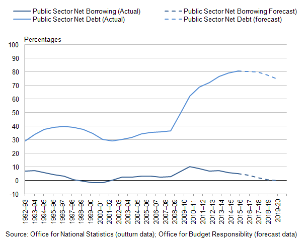
Source: Office for National Statistics (outtum data); Office for Budget Responsibility (forecast data)
Notes:
- Data are forecast from financial year ending 2015 onwards.
- Gross Domestic Product (GDP) measures the scale of economic activity (goods and services produced) within a country. GDP per head (also known as per capita) is equivalent GDP per individual in the population which allows us to take into account effects of changes in the population size.
- Debt at the end of March; centred on end of March. When expressed as percentage of GDP, this uses forecast GDP. All fiscal forecasts are subject to significant uncertainty, described in more detail in the OBR's Economic and Fiscal Outlook.
Download this image Figure 6.1: Public Sector Net Debt (Percentage of GDP) and Public Sector Net Borrowing (Percentage of GDP), 1992-93 to 2019-20 (1,2,3)
.png (19.5 kB) .xls (32.8 kB)Supplementary Indicator 7: Pension provision
Financial security is an important contribution to personal well-being, and pension provision is an important aspect of a sustainable economy. A lack of adequate pension provision (particularly for an ageing population) would have long-term consequences for the sustainability of public finances, the economy and society.
Figure 7.1: Percentage of workers in the automatic enrolment eligible population with a workplace pension scheme, 1997 to 2013 (1,2)
Great Britain
Source: Annual Survey of Hours and Earnings (ASHE) - Office for National Statistics
Notes:
- The automatic enrolment eligible population refers to workers aged at least 22 and under State Pension age, and who earn £8,105 or more per year (in financial year ending 2013 earnings terms).
- These data are DWP estimates derived from the ONS Annual Survey of Hours and Earnings.
Download this chart Figure 7.1: Percentage of workers in the automatic enrolment eligible population with a workplace pension scheme, 1997 to 2013 (1,2)
Image .csv .xlsSupplementary Indicator 8: Physical infrastructure
A sustainable economy has to maintain the physical capital needed to support production. This measure looks at the extent to which the UK is improving its stock of fixed capital, as measured by the value of its tangible asset base2.
Figure 8.1: Estimated asset net worth at year end by type of structure, at current prices, 2002 to 2013 (1,2,3,4)
United Kingdom
Source: Office for National Statistics
Notes:
- Includes the value of the land underneath the assets
- Formerly Intangible fixed assets
- Formerly Intangible non-produced assets
- Non–financial assets include both tangible and intangible assets. Tangible assets consist of property, machinery, agricultural assets, vehicles, farming stock and some military equipment. Intangible assets refer to computer software, patents, mineral exploration and artistic originals. Financial assets (not included in this graph) refer to means of payment, financial claims, loans and economic assets that are close to financial claims in nature. The category ’Other’ comprises cultivated assets, inventories, intangible fixed assets and intangible non-produced assets
Download this chart Figure 8.1: Estimated asset net worth at year end by type of structure, at current prices, 2002 to 2013 (1,2,3,4)
Image .csv .xlsSupplementary Indicator 9: Research and development
Business innovation and research and development are vital ingredients in raising the productivity, competitiveness and growth potential of modern economies. The indicator compares cash terms (the actual amount spent) and real terms (prices indexed to 2013). By looking at the real terms we can see how much spending has actually increased (whilst controlling for inflation) which allows a better perspective on actual changes in spending.
Figure 9.1: Expenditure on research and development performed in businesses, 2002 to 2013 (1)
United Kingdom
Source: Office for National Statistics
Notes:
- At 2013 prices
Download this chart Figure 9.1: Expenditure on research and development performed in businesses, 2002 to 2013 (1)
Image .csv .xlsResearch and development specific to environmental protection by business is important to a sustainable economy through businesses minimising their impact and supporting the local environment.
Figure 9.2: Expenditure on research and development related to environmental expenditure, constant prices, 2000 to 2013 (1,2)
United Kingdom
Source: Environment, Food and Rural Affairs
Notes:
- At 2013 prices.
- Data are not National Statistics.
Download this chart Figure 9.2: Expenditure on research and development related to environmental expenditure, constant prices, 2000 to 2013 (1,2)
Image .csv .xlsSupplementary Indicator 10: Environmental goods and services sector
Moving towards a green economy includes developing opportunities and markets for environmentally oriented goods, services and jobs. The low carbon and environmental goods and services sector could be a key part of future social and economic prosperity.
Figure 10.1: Estimated output, value added and employment for the 'Environmental goods and services' sector, 2010 to 2012 (1,2)
United Kingdom
Source: Office for National Statistics
Notes:
- Gross Value Added (GVA) = calculated as the difference between the values of the output (environmental goods and services produced) and the intermediate consumption (goods and services used up in the process of producing the output).
- Employment is measured in full-time equivalent units as specified by the EU regulation. This is based on converting part-time employees’ hours into a full-time employees’ equivalent and provides a better indication of total labour input than a simple headcount.
Download this chart Figure 10.1: Estimated output, value added and employment for the 'Environmental goods and services' sector, 2010 to 2012 (1,2)
Image .csv .xlsNotes for economy:
This measure is based on the value of qualifications gained during education, including early childhood education, school-based compulsory education, post-compulsory vocational or general education, tertiary education, labour market education and adult education. As the population grows, changes in human capital can be masked when looking at the stock measure, and we have therefore also presented human capital per head. This measure of human capital is currently experimental. Measures of human capital are still being developed and may have a slightly different form in the future.
Tangible fixed assets comprise buildings and other structures (including historic monuments), vehicles, other machinery and equipment, and cultivated assets in the form of livestock and orchards.
4. Society
While the number of society indicators showing a long term improvement has increased (from 3 to 6 between 2014 and 2015) this has been countered by an decrease in the number of short term assessments (from 11 to 8). Within the headline measures 2 of the social capital indicators are now supplied by Understanding Society: 'volunteering' and 'those who feel they belong to their neighbourhood'. There is no short term assessment available for either of these or for the social mobility indicator. For the latter this is because the latest data are not directly comparable to earlier data, for the first 2 it is because the questions are not asked in each survey year.
Within the supplementary indicators, long term assessments of change are now available for all 3 mortality indicators, both 'trips under 5 miles' indicators, and for 'households in fuel poverty'. In addition a short term assessment of the 'prevalence of smoking among adults' is also available for the first time.
The smoking prevalence indicator and all 3 mortality indicators are assessed as improving while both 'trips under five miles' and 'fuel poverty' are assessed as showing little or no change. However the number of households in fuel poverty in 2013 is estimated to be at its lowest since 2006. Despite some small increases in the latest year the mortality rates for 'avoidable', 'preventable' and 'amenable' deaths all continue on a downward trend. Obesity among adults in 2013 was at its second highest rate since 1993 at 62.1%, only 2010 at 62.8% was higher. Healthy life expectancy for both men and women continues to increase, reaching 64.2 years for men and 66.1 year for women in the period 2009 to 2011.
Headline Indicator 11: Healthy life expectancy
As life expectancy continues to increase, it is important to understand whether increasing longevity is accompanied by longer periods in favourable or unfavourable health states. Variations in the proportion of life spent in good health have impacts on general health and well-being as well as having potentially significant implications for future healthcare resource need and fitness for work in the face of planned state pension age increases.
Figure 11.1: Years of life expectancy and healthy life expectancy at birth, 2000-02 to 2009-11 (1,2)
UK
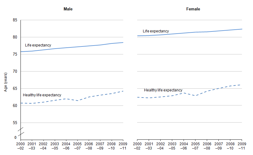
Source: Office for National Statistics
Notes:
- Based on five-point response general health question 2005-07 to 2009-11. Estimates for 2000-02 to 2004-06 are simulations based on original survey data.
- Significant increases in health expectancies over time, indicated by non-overlapping 95% confidence intervals, can be deduced only from non-overlapping datasets, for example as 2003-05 is an aggregation of data from 2003, 2004 and 2005, this can only be compared with datasets that do not include those years i.e. 2000-02 which consists of aggregated data from 2000, 2001 and 2002.
Download this image Figure 11.1: Years of life expectancy and healthy life expectancy at birth, 2000-02 to 2009-11 (1,2)
.png (18.4 kB) .xls (21.0 kB)Headline Indicator 12: Social capital
Civic participation, social participation, social networks and trust
Social capital can be described as the pattern and intensity of networks among people, and the shared values which arise from those networks. While definitions vary, the main aspects include personal relationships, social networks and civic engagement and trust and co-operative norms1. These measures may change slightly over time as Cabinet Office and the Office for National Statistics further develop their work on measuring social capital.
Figure 12.1: The proportion of people engaging in actions designed to identify and address issues of public concern at least once a year, 2001 to 2013-14 (1)
England
Source: Communities and Local Government, Cabinet Office
Notes:
- Updated in financial year ending 2013 to include online participation and so the trend data are not directly comparable.
Download this chart Figure 12.1: The proportion of people engaging in actions designed to identify and address issues of public concern at least once a year, 2001 to 2013-14 (1)
Image .csv .xls
Figure 12.2: Proportion of people engaging in any volunteering activity at least once a year, 2010/11 and 2012/13 (1)
United Kingdom
Source: Understanding Society, the UK Household Longitudinal Study
Notes:
- Adults aged 16 and over are asked 'How frequently do you do unpaid voluntary work?" at two yearly intervals.
Download this chart Figure 12.2: Proportion of people engaging in any volunteering activity at least once a year, 2010/11 and 2012/13 (1)
Image .csv .xls
Figure 12.3: The proportion of people who have a partner, family member or friend to rely on if they have a serious problem, 2010/11 (1)
England
Source: Understanding Society
Notes:
- Based on the proportion of respondents agreeing that they had a partner, friend or family member they could rely on 'a lot', 'somewhat' or 'a little' if they had a serious problem. Proportions are calculated for all aged over 16 and not only those who have said they have a partner, friend or relative to rely on
Download this chart Figure 12.3: The proportion of people who have a partner, family member or friend to rely on if they have a serious problem, 2010/11 (1)
Image .csv .xls
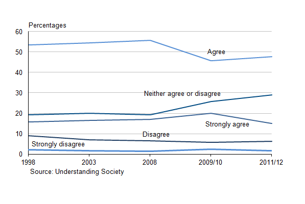
Figure 12.4: Belonging to a neighbourhood, 1998 to 2011/12 (1,2)
England
Source: Understanding society
Notes:
- Responses have always been on a 5 point scale varying from strongly/very agree to strongly/very disagree. However, the British Household Panel Survey the question was asked by the interviewer with a show card of potential responses whereas in Understanding Society the question was completed by the individual.
- In 2010 the British Household Panel Survey sample was incorporated into the Understanding Society sample. Although these are longitudinal surveys, the data have been weighted for cross-sectional analysis. Comparisons can be made but caution needs to be taken.
Download this image Figure 12.4: Belonging to a neighbourhood, 1998 to 2011/12 (1,2)
.png (14.0 kB) .xls (30.7 kB)Headline Indicator 13: Social mobility in adulthood
Patterns of inequality and a lack of social mobility can carry over from one generation to the next and this is a key issue for intergenerational well-being. Improving social mobility is about making sure individuals can fulfil their potential, regardless of their own or their parents’ background.
Figure 13.1: Proportion of 16 to 65 year-olds who are in paid employment who are in managerial or professional positions by social background using parent's occupational group, 1991-95 to 2009-12 (1,2)
United Kingdom
Source: Department for Business, Innovation and Skills, British Household Panel Survey/Understanding Society Survey
Notes:
- More advantaged groups are those where either parent was employed in managerial or professional positions. Less advantaged groups are those where either parent was in intermediate, manual or routine occupations or unemployed. This is based on the National Statistics Socio-Economic Classification (NS-SEC).
- Figures for 2009–2012 use the UKHLS measure and are not directly comparable to figures for earlier years, which use the British Household Panel Survey (BHPS) measure.
Download this chart Figure 13.1: Proportion of 16 to 65 year-olds who are in paid employment who are in managerial or professional positions by social background using parent's occupational group, 1991-95 to 2009-12 (1,2)
Image .csv .xlsHeadline Indicator 14: Housing provision
As the number of households increases so too does the need for an adequate housing supply. Additional housing provision offers economic and social sustainability and should be looked at alongside other aspects of sustainable development.
Figure 14.1: Trends in net additional dwellings, 2000-01 to 2013-14 (1)
England
Source: Communities and Local Government
Notes:
- The dwelling counts from the 2011 Census were previously used to revise the net supply estimates from financial year ending 2002 to financial year ending 2011.
Download this chart Figure 14.1: Trends in net additional dwellings, 2000-01 to 2013-14 (1)
Image .csv .xlsSupplementary Indicator 15: Avoidable mortality
This indicator presents mortality figures for causes of death that are considered avoidable with timely and effective healthcare, or public health interventions (avoidable mortality). Also presented are trends in mortality by causes considered preventable (if the death could be avoided by public health interventions) or amenable (treatable) to healthcare, which are subsets of total avoidable mortality.
Figure 15.1: Mortality rate per 100,000 population due to avoidable causes, 2001 to 2013 (1,2,3,4,5)
England and Wales
Source: Office for National Statistics
Notes:
- Previously published data was for England only
- Revisions to data due to a change in methodolgy
- Figures are for deaths registered in each calendar year
- Figures for England and Wales include deaths of non-residents
- Rates per 100,000 population standardised to the 2013 European Standard Population
Download this chart Figure 15.1: Mortality rate per 100,000 population due to avoidable causes, 2001 to 2013 (1,2,3,4,5)
Image .csv .xlsSupplementary Indicator 16: Obesity
Obesity is one of the most serious risks to health in Europe, being linked to diabetes, hypertension, heart disease and cancer. Overweight children are of particular concern, because when unhealthy food habits and an inactive lifestyle continue over years the result is obesity.
Figure 16.1: Percentage of adults and children overweight or obese, 1993 to 2013 (1,2,3,4,5,6)
England
Source: Health and Social Care Information Centre
Notes:
- Overweight including obese adults = BMI 25kg/m2 or more.
- Overweight including obese children = BMI ≥85th centile of the British 1990 growth reference.
- All young adults from core and boost samples in 2002 were included in analysis of those aged 16-24 but only the core sample was included in the overall total.
- Data up to 2002 are unweighted; from 2003 onwards data have been weighted for non-response.
- All adults from core and boost samples in 2005 were included in analysis of 65-74 and 75+ age groups but only the core sample was included in the overall total.
- Health Survey for England and National Child Measurement Programme data.
Download this image Figure 16.1: Percentage of adults and children overweight or obese, 1993 to 2013 (1,2,3,4,5,6)
.png (14.0 kB) .xls (22.5 kB)
Figure 16.2: Percentage of children overweight or obese based on deprivation level, 2006/7 to 2013/14 (1)
England
Source: National Child Measurement Programme
Notes:
- Deprivation is based on the Index of Multiple Deprivation 2010.
Download this chart Figure 16.2: Percentage of children overweight or obese based on deprivation level, 2006/7 to 2013/14 (1)
Image .csv .xlsSupplementary Indicator 17: Lifestyles
This indicator features in the Public Health Outcomes Framework for England. Smoking is an unhealthy lifestyle choice that is linked with a range of long-term health problems.
Figure 17.1: Proportion of people aged over 18 who smoke, 2009-10 to 2013
England
Source: Integrated Household Survey - Office for National Statistics
Download this chart Figure 17.1: Proportion of people aged over 18 who smoke, 2009-10 to 2013
Image .csv .xlsThe use of sustainable local travel contributes to improvements in road safety and in public health. This indicator shows the proportion of all trips under five miles by English residents living in an urban area (settlement over 3,000 population) where the main mode of transport was walking or cycling, and public transport.
Figure 17.2: Proportion of urban trips under 5 miles: by method, 2002 to 2013 (1,2,3)
England
Source: National Travel Survey, Department for Transport
Notes:
- Trips made by residents living in an urban area only (Rural-Urban Classification).
- Data between 2002 and 2012 have been revised to reflect the switch to using the Rural-Urban Classification.
- This is a survey-based indicator: small year-to-year fluctuations are quite common and do not necessarily mean that long-term trends have altered.
Download this chart Figure 17.2: Proportion of urban trips under 5 miles: by method, 2002 to 2013 (1,2,3)
Image .csv .xlsPhysical activity is a core aspect of maintaining a healthy lifestyle. Lack of sufficient physical activity costs the NHS over £1bn per year to the wider economy – and is one of the top risk factors for premature mortality. This indicator is aligned with the Public Health Outcome Framework (PHOF). Physical activity in this indicator includes sport, recreational cycling, recreational walking, walking and cycling for travel purposes, dancing and gardening. The PHOF defines physically active adults as those adults 'doing more than 150 minutes of at least moderate intensity physical activity per week in sessions of 10 minutes or more'.
Figure 17.3: Proportion of adults doing physical activity by time spent exercising, 2013-14
England
Source: Public Health England
Download this chart Figure 17.3: Proportion of adults doing physical activity by time spent exercising, 2013-14
Image .csv .xlsFruit and vegetables are key components to a healthy balanced diet and an important part of a healthy lifestyle.
Figure 17.4: Average daily consumption of '5 a day' portions: by age group, 2008/09 to 2011/12 (1,2)
UK
Source: National Diet and Nutrition Survey, Department of Health
Notes:
- Includes fruit and vegetables as part of composite dishes, but excludes potatoes. Fruit juice is included, up to a maximum contribution of one portion per day. Baked beans and other pulses are included, up to a maximum contribution of one portion per day.
- This is a rolling programme and the results for the financial year ending 2012 supersede the results from the first three years of the survey combined.
Download this chart Figure 17.4: Average daily consumption of '5 a day' portions: by age group, 2008/09 to 2011/12 (1,2)
Image .csv .xlsTrends in fruit and vegetable purchasing from Defra’s Family Food Survey can be presented for low income groups. The statistics are not directly comparable with those from the National Diet and Nutrition Survey because of the different data collection methods used in the surveys. They also reflect portions bought rather than eaten, and do not take into account fruit and vegetables consumed as part of composite dishes.
Figure 17.5: Trends in fruit and vegetable purchases measured as portions, 2001/02 to 2013 (1)
United Kingdom
Source: Environment, Food and Rural Affairs
Notes:
- Excludes potatoes.
Download this chart Figure 17.5: Trends in fruit and vegetable purchases measured as portions, 2001/02 to 2013 (1)
Image .csv .xlsSupplementary Indicator 18: Infant health
Birthweight can be an important indicator of community health and health inequalities, which are key issues for the long-term health of our society.
This indicator shows low birth weight of full term live births in England and Wales where the birth weight is less than 2,500g, and corresponds with the Public Health Outcome Framework indicators.
Figure 18.1: Proportion of full term live births with weight less than 2,500g, 2006 to 2012 (1)
England and Wales
Source: Office for National Statistics
Notes:
- Full-term includes term (37 weeks and over) and post-term (42 weeks and over) babies.
Download this chart Figure 18.1: Proportion of full term live births with weight less than 2,500g, 2006 to 2012 (1)
Image .csv .xlsDifferences in socio-economic groups
An analysis of low birth weight by the occupation of parents can highlight any differences between different socio-economic groups. This breakdown is not currently available for full term births so the analysis is presented for all live births. As such it includes premature babies and therefore the proportion of babies born with a low birth weight is higher in Figure 22.2 than in Figure 22.1.
Figure 18.2: Proportion of all live births with weight less than 2,500g based on parent's occupation, 2005 to 2013 (1, 2)
England and Wales
Source: Office for National Statistics
Notes:
- Low birth weight of all live births where the most advantaged of either parent’s occupation is classified as managerial, professional or intermediate. The National Statistics Socio-economic Classification (NS-SEC rebased on the SOC2010).
- Low birth weight of all live births where the most advantaged of either parent’s occupation is classified as routine and manual occupations, never worked or long–term unemployed. The National Statistics Socio-economic Classification (NS-SEC rebased on the SOC2010).
Download this chart Figure 18.2: Proportion of all live births with weight less than 2,500g based on parent's occupation, 2005 to 2013 (1, 2)
Image .csv .xlsSupplementary Indicator 19: Air quality
Poor air quality can have effects on health and well-being due to both short-term and long-term exposure. Individuals with existing heart or respiratory conditions are at greater risk of experiencing effects when levels of air pollutants rise. The number of days when air quality is 'moderate or higher' is an indicator of how often air pollution is raised to levels when there is an increased risk of health effects from short-term exposure.
Through improving air quality people will be at less risk from the effects of poor air quality, and may be more likely to spend more time in the natural environment. An improvement in air quality would be reflected by a lower number of pollution days in this indicator.
Figure 19.1: Days when air pollution is moderate or higher: by site, 2010 to 2014 (1)
United Kingdom
Source: Environment, Food and Rural Affairs
Notes:
- Not every site in the automatic monitoring network is included. Sites must also meet certain data capture targets to be used in the index. Urban sites are required to monitor PM10 and rural sites are required to monitor ozone. For the required pollutants it should be more than or equal to 75% of the year. For ozone this applies to both the full year and the summer period in isolation.
Download this chart Figure 19.1: Days when air pollution is moderate or higher: by site, 2010 to 2014 (1)
Image .csv .xlsSupplementary Indicator 20: Noise
This indicator comprises information about noise complaints and exposure to transport noise. It also features in the Public Health Outcomes Framework for England. There are a number of direct and indirect links between exposure to noise and health outcomes such as stress, heart attacks, and other health and well-being issues. Complaints about noise are the largest single cause of complaint to most local authorities, and there is evidence that exposure to noise is a key determinant of health and well-being.
Figure 20.1: Noise complaints per 1,000 population, 2006-07 to 2012-13
England
Source: Environment, Food and Rural Affairs
Download this chart Figure 20.1: Noise complaints per 1,000 population, 2006-07 to 2012-13
Image .csv .xls
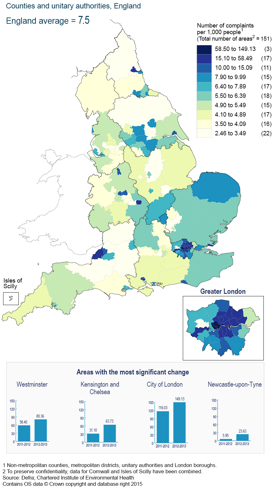
Figure 20.2 Number of complaints per 1,000 people by counties and unitary authorities, 2012–13 (1,2)
England (Average = 7.5)
Source: Environment, Food and Rural Affairs
Notes:
- Data are supplied by the Chartered Institute for Environmental Health (CIEH).
Download this image Figure 20.2 Number of complaints per 1,000 people by counties and unitary authorities, 2012–13 (1,2)
.png (361.6 kB)Supplementary Indicator 21: Fuel poverty
Fuel poverty is a serious problem from three main perspectives. The first is poverty, because high energy costs can exacerbate difficulties faced by those on low incomes. The second is health and well-being, because it is responsible for a range of issues such as social exclusion, cardiovascular problems and excess winter deaths. The third is carbon, because the energy inefficiency of the homes of those living in fuel poverty is a concern in terms of reducing carbon emissions.
Figure 21.1: Total number of households living in fuel poverty under the low income high cost definition, 2003 to 2013 (1)
England
Source: Department of Energy and Climate Change
Notes:
- Under the Low Income High Costs definition, a household is considered to be fuel poor if they have required fuel costs that are above average (the national median level) or were they to spend that amount, they would be left with a residual income below the official poverty line.
Download this chart Figure 21.1: Total number of households living in fuel poverty under the low income high cost definition, 2003 to 2013 (1)
Image .csv .xlsNotes for society
- The indicators in this section have been chosen to reflect four domains of a framework on social capital developed by the Office for National Statistics. These four domains are: civic participation, which relates to individual involvement in local and national affairs and perceptions of ability to influence them; social participation, which means involvement in, and volunteering for, organised groups; social networks, which refers to contact with, and support from, family and friends; and reciprocity and trust which refers to the amount of trust individuals have in those they know and do not know, as well was trust in formal institutions.
5. Environment
The number of environment indicators showing a long term improvement has decreased (from 11 to 10 between 2014 and 2015) and (from 13 to 12) in the short term assessment. The number of indicators or measures assessed as 'deteriorating' has increased from 4 to 5 in both the long and short term assessments. In the long term assessment this is because the assessment of breeding seabirds has changed from little or no overall change to a deteriorating status. In the short term measures it is because, for the first time, an assessment has been made on the biological quality of rivers in England and this was assessed as deteriorating.
Within the headline measures, the amount of Greenhouse gas emissions associated with the UK, expressed as millions of tonnes (mt) of carbon dioxide (C02) continues to fall and is at the lowest point between 1990 and 2014 at 520mt (422mt as CO2) compared with 809mt (598mt as CO2) in 1990. The sector breakdown of water abstractions shows that abstractions for electricity supply have, for the first time, exceeded abstractions for public water supply, 45% and 42% respectively. The breeding bird population of the UK continues to show little sign of improving, with woodland birds showing little or no overall change in the short term being the only measure that is not deteriorating.
Within the supplementary measures, the carbon dioxide emissions by sector measure shows that transport is the only sector that has shown a long term increase in emissions, increasing from an estimated 72 million tonnes in 1970 to 117 million tonnes in 2014, an increase from 11% to 28% of all emissions between 1970 and 2014. While the total amount of emissions by the energy sector has fallen from 262 million tonnes to 153 million tonnes, its proportion of output is similar, falling from 38% in 1970 to 36% in 2014. The rate of recycling of household waste in England continues to increase. It is currently 43.5% but has slowed greatly, changing by half a percent in the last three years. The biological quality of rivers has deteriorated in the short term and the chemical quality of rivers is showing little or no overall change in the short term. However, both these assessments should be treated with caution until longer time series become available.
Headline Indicator 22: Greenhouse gas emissions1
Human emissions of greenhouse gases since the industrial revolution are very likely responsible for most of the global surface warming seen over recent decades.
Figure 22.1: Greenhouse gas emissions (1,2,3,4) million tonnes carbon dioxide equivalent, 1990 to 2014
United Kingdom (2)
Source: Energy and Climate Change
Notes:
- 2014 data are provisional
- Geography also includes the Crown Dependencies of Jersey, Guernsey, and the Isle of Man
- The entire time series is revised each year to take account of methodological improvements in the UK emissions inventory
- Emissions are presented as carbon dioxide equivalent in line with international reporting and carbon trading. To convert carbon dioxide into carbon equivalents, divide figures by 44/12
Download this chart Figure 22.1: Greenhouse gas emissions (1,2,3,4) million tonnes carbon dioxide equivalent, 1990 to 2014
Image .csv .xlsEstimates of territorial emissions published by the Department for Energy and Climate Change cover only those emissions generated in the UK. Consumption emissions estimates published by the Department for the Environment, Food and Rural Affairs relate to those associated with UK consumption, wherever in the world these emissions occur. This allows us to understand the overseas impact on emissions our consumption is having. For a more sustainable world, both our territorial emissions and our consumption emissions should decrease.
Figure 22.2: Greenhouse gas emissions associated with UK consumption, 1997 to 2012 (1)
UK
Source: Environment, Food and Rural Affairs
Notes:
- The greenhouse gases figures for consumption emissions are currently classified as experimental statistics.
Download this chart Figure 22.2: Greenhouse gas emissions associated with UK consumption, 1997 to 2012 (1)
Image .csv .xlsHeadline Indicator 23: Natural resource use
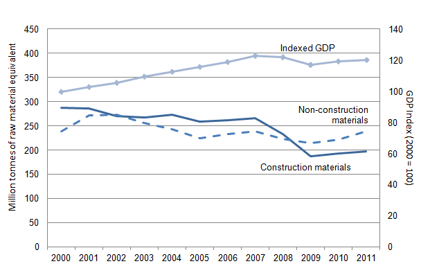
Natural resource use is a consumption-based-indicator showing the amount of material used to meet UK consumption. A reduction in non-renewable resource use, either by switching to renewable materials from sustainable sources, or from increased resource productivity, would be a positive outcome. To examine changes in resource productivity, and the comparative changes in materials, an indexed time series against Gross Domestic Productivity (GDP) is used.
Figure 23.1: Raw material consumption of construction and non–construction materials, 2000 to 2011 (1,2)
UK
Source: Environment, Food and Rural Affairs
Notes:
- Excludes use of fossil fuels. These are currently classified as experimental statistics.
- This includes material used in the production of imports to the UK which is not incorporated into the product. The indicator has two components: construction materials (e.g. sand and gravel) and non-construction materials (i.e. biomass and minerals). This indicator does not include fossil fuels or other energy carriers.
Download this image Figure 23.1: Raw material consumption of construction and non–construction materials, 2000 to 2011 (1,2)
.png (17.8 kB) .xls (30.2 kB)Headline Indicator 24: Wildlife
Natural capital includes those elements of the environment that provide resources and ecosystem services. We cannot determine our entire capital of natural resources and instead have to focus on selected aspects of the natural environment and changes in its state. Populations of key species of birds are a good indicator of the broad state of wildlife and countryside because they occupy a wide range of habitats and key positions in the food chain.
Figure 24.1: Populations of wild birds, 1970 to 2013 (1,2,3)
UK
Source: British Trust for Omithology, Royal Society for the Protection of Birds
Notes:
- Where possible long term and short term assessments are made on the basis of smoothed data. While percentage changes in these indices are reported based on the most recent unsmoothed data point (2013) any long and short term assessment of the statistical significance of these changes is made using the unsmoothed data point from 2012. Smoothed data are available for farmland birds, woodland birds and wetland birds, but not for seabirds. All latest year assessments are based on unsmoothed data.
- Figures in brackets give the number of species.
Download this image Figure 24.1: Populations of wild birds, 1970 to 2013 (1,2,3)
.png (41.3 kB) .xls (27.6 kB)Headline Indicator 25: Water use
Water is a vital resource that needs to be managed carefully to ensure both that people have access to affordable and safe drinking water and sanitation, and that industry needs are met, without depleting water resources or damaging ecosystems. A decrease in abstraction over a period of several years means less water is being taken from surface and ground waters. As this indicator has been included to represent the state of our natural environmental (water) stocks, a decrease in abstractions has been assessed on balance as being a favourable outcome. Year-on-year estimated direct actual abstraction is likely to fluctuate up or down as a consequence of a range of factors; such as changes in abstraction licences, prevailing weather conditions and changes in patterns of water use. As such, an increase in abstraction may also be observed in the estimates.
Figure 25.1: Estimate of direct actual abstractions from non–tidal surface waters and groundwaters, 1991 to 2013 (1)
England and Wales
Source: Environment Agency, Natural Resources Wales
Notes:
- Data relates only to direct abstraction authorised by the Environment Agency
Download this chart Figure 25.1: Estimate of direct actual abstractions from non–tidal surface waters and groundwaters, 1991 to 2013 (1)
Image .csv .xls
Figure 25.2: Estimate of direct actual abstractions from non-tidal surface waters and ground waters: by use, 2000 to 2013 (1,2)
England and Wales
Source: Environment Agency, Natural Resources Wales
Notes:
- Data relates only to direct abstraction authorised by the Environment Agency.
- 'Other' includes spray irrigation, agriculture (excluding spray irrigation), private water supply.
Download this chart Figure 25.2: Estimate of direct actual abstractions from non-tidal surface waters and ground waters: by use, 2000 to 2013 (1,2)
Image .csv .xlsSupplementary Indicator 26: UK Carbon Dioxide emissions by sector
The key sectors of the UK economy will produce differing amounts of emissions. To limit our impact on the world’s climate, it is important that all sectors emit less carbon dioxide over time.
Figure 26.1 Annual emissions per sector, 1970 to 2014 (1,2,3,4,5,6)
UK
Source: Energy and Climate Change
Notes:
- Data for 2014 are provisional
- Geography also includes Crown Dependencies
- Provisional 2014 CO2 emissions for the agriculture, waste and LULUCF sectors are assumed to be the same as 2013 estimates as unlike other CO2 estimates these cannot be estimated from energy statistics
- The entire time series is revised each year to take account of methodological improvements in the UK emissions inventory
- Emissions are presented as carbon dioxide equivalent in line with international reporting and carbon trading. To convert carbon dioxide into carbon equivalents, divide figures by 44/12
- Emissions from the land use, land use change and forestry (LULUCF) sector are only included from 1990 onwards as data are not available prior to 1990. In 1990 net LULUCF emissions amounted to 2.9 MtCO2.
Download this chart Figure 26.1 Annual emissions per sector, 1970 to 2014 (1,2,3,4,5,6)
Image .csv .xlsSupplementary Indicator 27: Energy from renewable sources
Using renewable resources will make a strong contribution to our energy needs and allow us to be less reliant both on other countries and on non-renewable and less environmentally sound sources of energy.
Figure 27.1: Proportion of gross energy consumption from renewable sources, 2005 to 2013 (1)
United Kingdom
Source: Energy and Climate Change
Notes:
- Figures show renewable energy consumption as a percentage of capped gross final energy consumption used to indicate progress under the 2009 EU Renewable Energy Directive
Download this chart Figure 27.1: Proportion of gross energy consumption from renewable sources, 2005 to 2013 (1)
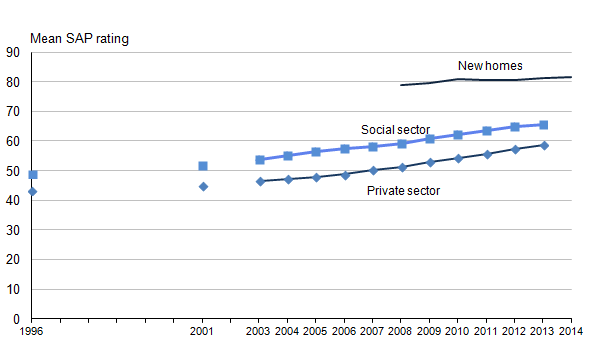
Image .csv .xlsSupplementary Indicator 28: Housing energy efficiency
More energy efficient dwellings are needed if the UK is to reduce its greenhouse gas emissions.
Figure 28.1: Mean Standard Assessment Procedure (SAP) (1) rating by tenure (2), 1996 to 2014
England
Source: Communities and Local Government
Notes:
- The Standard Assessment Procedure (SAP) is the UK Government's recommended method system for measuring the energy rating of residential dwellings.
- Data for private and social sector 1996 to 2013. Data for new homes 2008 to 2014.
Download this image Figure 28.1: Mean Standard Assessment Procedure (SAP) (1) rating by tenure (2), 1996 to 2014
.png (11.4 kB) .xls (20.5 kB)Supplementary Indicator 29: Waste disposal and recycling
The types of waste we produce, all forms of waste management, and the transport of waste have impacts on the environment. Waste is a potential resource and increased rates of re-use, recycling and energy recovery will result in a lower proportion of waste being disposed of in a way that causes environmental damage.
Household waste
In order to move towards a European recycling society with a high level of resource efficiency, EU targets for re-use and recycling of household waste have been set. Under the Revised Waste Framework Directive, the EU has set a target for 50% of United Kingdom (UK) household waste to be recycled by 2020. The offical measure that the UK reports against this EU target is the 'waste from households' recycling rate, which is reported on a calendar year basis. This was a new measure introduced in 2014. The UK 'waste from households' recycling rate reached 43.9% in 2012, the latest calendar year for which data are currently available.
The previous measure used was a slightly broader 'household rate' recycling rate. Comparison of the 2 measures for England showed the recycling rates using the 'waste from households' measure was marginally higher. A longer time series of the 'household waste' recycling rate on a financial year basis is available and is shown in Figure 29.1 below to illustrate trends over the longer time period.
Figure 29.1: Household waste recycling rate, 2000/01 to 2013/14
England
Source: Environment, Food and Rural Affairs
Download this chart Figure 29.1: Household waste recycling rate, 2000/01 to 2013/14
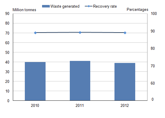
Image .csv .xlsThe EU has identified construction and demolition waste as a priority waste stream. Many of its components have a high resource value and there is high potential for recycling. This type of waste is also one of the heaviest and most voluminous waste streams generated in the EU. Under the Revised Waste Framework Directive, the EU has set a target for 70% of United Kingdom (UK) Construction and Demolition waste to be recovered from landfill by 2020.
The UK recovery rate from non-hazardous construction and demolition waste in 2012 was 86.5%.
Figure 29.2: Non-hazardous construction and demolition waste recovery rate, 2010 to 2012 (1)
England
Source: Environment, Food and Rural Affairs
Notes:
- Excludes excavation waste.
Download this image Figure 29.2: Non-hazardous construction and demolition waste recovery rate, 2010 to 2012 (1)
.png (11.7 kB) .xls (18.4 kB)Supplementary Indicator 30: Land use
Sustainable use of land is important in delivering new development, as well as protecting the natural and historic environment.
Figure 30.1: Land use by type, 2000 to 2012
England
Source: Environment, Food and Rural Affairs
Download this chart Figure 30.1: Land use by type, 2000 to 2012
Image .csv .xlsThe ‘other uses’ category presented in Figure 30.1 only gives a very broad indication of what land is used for, and includes built-up areas as well as non-commercial agricultural area and other non-agricultural uses. As a result, more detailed figures on land cover have been presented in Figure 30.2, based on detailed satellite images taken between 2005 and 2008.
The data used in this chart (30.2) is not directly comparable to the data in Figure 30.1. It uses a different data source and data collection methodology, and shows the breakdown for the UK rather than England only.
This indicator is not assessed because the impacts of changes in land use vary depending on local circumstance. Therefore at a national level there is no clear favourable direction for the assessment to measure progress against. However, the indicator is included to provide some general context to patterns of development which can be considered alongside other indicators.
Figure 30.2: Detailed land cover: by type, 2007 (1)
UK
Download this chart Figure 30.2: Detailed land cover: by type, 2007 (1)
Image .csv .xlsSupplementary Indicator 31: Origins of food consumed in the United Kingdom
Maintaining a range of supply sources means that any risk to our total food supply is spread. This lowers the impacts of any unforeseen disruptions involving any particular trading partner or from within our domestic agriculture sector. The production to supply ratio for food takes into account net trade. For 2014, the United Kingdom's (UK) production of indigenous type food, that is, food stuffs that the UK can produce domestically, was 76% of total supply.
Figure 31.1: Proportion of food consumed in the UK: by region or origin, 1988 to 2014 (1,2,3)
United Kingdom
Source: Environment, Food and Rural Affairs
Notes:
- Based on farm gate value of raw food.
- Consumption of UK origin consists of UK domestic production minus UK exports.
- Membership of the EU increased between 2002 and 2013, from 15 to 28 countries.
Download this chart Figure 31.1: Proportion of food consumed in the UK: by region or origin, 1988 to 2014 (1,2,3)
Image .csv .xlsSupplementary Indicator 32: Water quality
The indicator shows the biological quality of rivers using data from the Water Framework Directive assessment of water body status.
Figure 32.1: The biological quality of rivers, 2009 to 2014
England
Source: Environment Agency
Download this chart Figure 32.1: The biological quality of rivers, 2009 to 2014
Image .csv .xlsThis indicator shows the chemical status of rivers using data from the Water Framework Directive assessment of water body status. Chemical status is assessed from compliance with environmental standards for chemicals that are priority substances and/or priority hazardous substances. A list of priority substances can be found in the Chemical Standards database on the Environment Agency’s website.
Figure 32.2: The chemical status of rivers, 2009 to 2014
England
Source: Environment Agency
Download this chart Figure 32.2: The chemical status of rivers, 2009 to 2014
Image .csv .xlsSupplementary Indicator 33: Sustainable fisheries
Fish are an integral component of marine biodiversity. They are an important element of the food chain for seabirds, seals, whales, dolphins, and porpoises, and are a very important source of food for people. Sustainable fisheries will help to ensure our marine ecosystems remain diverse and resilient, and provide a long-term and viable fishing industry.
Figure 33.1: Fish stocks harvested sustainably and at full reproductive capacity, 1990 to 2012
United Kingdom
Source: International Council for the Exploration of the Sea, Centre for Environment, Fisheries and Aquaculture Science
Download this chart Figure 33.1: Fish stocks harvested sustainably and at full reproductive capacity, 1990 to 2012
Image .csv .xlsSupplementary Indicator 34: European protected species and habitats
This indicator shows progress with maintaining and/or restoring favourable conservation status for species and habitat types that the UK has European level conservation responsibilities for. This assessment occurs every six years. Trends in unfavourable conservation status allow identification of whether progress is being made, as it will take many years for some species to reach favourable conservation status.
Figure 34.1: Percentage of UK species of European importance in improving or declining conservation status, 2007 and 2013 (1,2)
United Kingdom
Source: Environment, Food and Rural Affairs
Notes:
- The number of species assessed was 89 in 2007 and 93 in 2013
- Based on species listed in annexes II, IV and V of the Habitats Directive, excluding vagrants, that are found in the United Kingdom
Download this chart Figure 34.1: Percentage of UK species of European importance in improving or declining conservation status, 2007 and 2013 (1,2)
Image .csv .xls
Figure 34.2: Percentage of UK habitats of European importance in improving or declining conservation status, 2007 and 2013 (1)
United Kingdom
Source: Environment, Food and Rural Affairs
Notes:
- Based on 70 habitats listed on Annex I of the Habitats Directive that are found in the United Kingdom
Download this chart Figure 34.2: Percentage of UK habitats of European importance in improving or declining conservation status, 2007 and 2013 (1)
Image .csv .xlsNotes for environment
- The data from this indicator is derived from the UK greenhouse gas emission statistics produced by the Department of Energy and Climate Change. The indicator focuses on the basket of greenhouse gases covered by the Kyoto protocol.
6. How the assessment is made
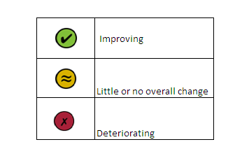
When changes in the indicator measures are small it can be difficult to judge whether they are sufficient to indicate that there has been clear improvement or deterioration. For this reason, each measure has been assessed using a 'traffic light' system. They show whether changes in the trends are showing clear improvement or deterioration. Further details of what the assessment measures are can be found in the background notes of this article.
The change in an indicator or measure is assessed over a set time. The value at the start year is compared to the value at the end year. Where data are available, two assessment periods have been used:
Long-term – an assessment of change since the earliest date for which data are available (usually back to 1990). If the earliest data available is after 2000 a minimum of 11 years is required for an assessment to be made.
Short-term – an assessment of change for the latest five-year period.
The traffic lights only show the overall change in the measure from the start year to the end year, and do not reflect fluctuations during the intervening years.
The individual measures also have a third marker, showing the direction of change between the two most recent data points. This period is too short for a meaningful assessment. However, when it exceeds a one percentage point threshold, the direction of change is given simply as an acknowledgement of very recent trends, and as a possible early sign of emerging trends.
Making the assessment
The traffic light assessments are as follows:
Where data are not available for the relevant time period, an assessment is not given. If a comparison cannot be made over at least an 11 year period, for example 2002 to 2012, a long-term assessment cannot be made. This is shown as not assessed:
Traffic light assessment - not assessed symbol

Download this image Traffic light assessment - not assessed symbol
.png (4.2 kB)Where possible, the traffic light assessment has been made by evaluating trends using statistical analysis techniques. A green or red traffic light is only applied when there is sufficient confidence that the change is statistically significant.
Where it has not been possible to formally determine statistical significance, an assessment has been made by comparing the difference between the value of the measure in the base or start year and the value in the end year against a ‘rule of thumb’ threshold. The standard threshold used is three percentage points. Where an indicator value has changed by less than the threshold of three percentage points, the traffic light has been set at amber, signifying little or no overall change.
A minority of indicators do not have an assessment. This may be for a number of reasons:
The indicator is for context, where no action from government would intentionally affect change (for example, projected population estimates).
The indicator is based on forecasts or projections and as such the assessment year is unclear (for example, forecasts of public sector net debt and borrowing).
There is no clear ‘favourable’ direction of travel (for example, with land use or origins of food). A full explanation of the reasons for this is given in the relevant section.
7. Changes to this year's publication
A number of changes have been made this year including layout, changes of source, definition and methods of assessment. Where there have been changes, these are listed below:
Structure
The layout of the article has changed this year so that headline and supplementary indicators and measures for each section (Economy, Society, Environment) have been brought together and the affected indicators renumbered accordingly. This has been done to simplify the layout of the publication and to allow for easier analysis of each of the sections.
Indicator 5: Population demographics
Data for this indicator are now published on a United Kingdom basis, instead of England as previously reported.
Indicator 9: Research and development
Data for indicator 9.2, Expenditure on research and development related to environmental protection expenditure, are now in constant prices, that is, adjusted for inflation. In previous publications the data were presented in current prices, that is, not adjusted for inflation.
Indicator 10: Environmental Goods and Services Sector
Data for this indicator are now supplied by the Office for National Statistics on a United Kingdom basis. Previous data were supplied by Business and Innovation (BIS) and were England only.
Indicator 11: Healthy life expectancy
Data are now presented for the United Kingdom, instead of England only.
Indicator 12: Social capital
Proportion of people volunteering. This is now supplied by Understanding Society and is for the United Kingdom. Previously data were taken from the Taking Part survey for England.
Those with someone to rely on. This is now supplied by Understanding Society and is for the United Kingdom. Previously data were taken from the Taking Part survey for England.
Trust in neighbourhood. This is now supplied by Understanding Society and is for the United Kingdom. Previously data were taken from the Taking Part survey for England.
Indicator 15: Mortality
All data are now presented for England and Wales, instead of England only.
Indicator 18: Infant health
Full term babies with birth weight less than 2500g. Data are now presented for England and Wales, instead of England only.
Full term babies <2500g based on parent's occupation. Data are now presented for England and Wales, instead of England only.
Indicator 17: Lifestyles
Prevalence of smoking among adults. There was previously no method of assessment for this indicator. It will now be assessed against the Public Health England target for cessation of smoking among adults.
Trends in purchase of fruit and veg. There was previously no method of assessment for this indicator. It is now assessed using standard errors.
Indicator 24: Wildlife
The geography for Wild birds has now been corrected to United Kingdom, instead of England, as listed in previous publications.
Indicator 27: Gross energy from renewable resources
The method of assessment used now is the one for progress towards EU renewables target for the United Kingdom, in line with the method used in the National Well-being programme. The previous method used was based on three per cent change between periods.
Indicator 32: Water Quality
A short term assessment of change is now possible for both the biological and chemical status of rivers indicators. The classification for the chemical status of rivers has changed to High and Moderate, from Pass and Fail.
Back to table of contents8. Sustainable development goals
ONS continues to coordinate the Government Statistical Services’ input into the global United Nations' development agenda for ‘Sustainable Development Goals' (SDGs)’ which will run from 2015 to 2030. The latest proposals for SDGs and targets comprise 17 Goals and 169 Targets.
A key principle of the SDGs is to ‘leave no one behind’ and there is an expectation that indicators will need to be disaggregated for example by gender, disability, income and geographies. SDGs will be agreed at the United Nations Summit in September 2015 and ONS is developing a platform to monitor and report UK progress against SDGs from 2016.
ONS is also responsible for reporting on National Well-being as well as the Sustainable Development Indicators. It is anticipated there will be significant overlap with these data sets and SDG indicators. ONS is planning to align these reporting frameworks from 2016.
Back to table of contents

