1. Introduction
The House Price Statistics for Small Areas (HPSSAs) include statistics for a range of geographies. The smallest areas for which statistics are presented are middle layer super output areas (MSOAs), of which there are 7,201 in England and Wales. The largest area available is England and Wales overall. Statistics for the smallest areas provide a more detailed geographic understanding of housing trends. It can be useful to view them in the context of the larger areas in which they sit, such as local authorities, regions and the country as a whole. This context helps provide a thorough understanding of whether the housing statistics for a small area are representative of wider trends, which would not be possible without the inclusion of statistics for larger geographic areas.
Many of the statistics and breakdowns are new for this publication. Information on these additions and the different measures and their uses can be found in our HPSSAs Explained.
Back to table of contents2. Median house prices
House Price Statistics for Small Areas (HPSSAs) report statistics at middle layer super output area (MSOA) level. These contain a minimum of 5,000 residents and 3,000 households with an average population size of 7,500. There are 7,201 MSOAs in England and Wales. These areas are useful in assessing patterns over time and between areas at a more local level. For a more detailed explanation of MSOAs and other statistical geographies visit the ONS guidance page on output areas.
When observing average house prices at the MSOA level, it is clear that the most expensive areas of England and Wales are in central London. Further from London, the average house price of an area tends to be lower. This has been the case throughout the time series covered by HPSSAs. Reading and Guildford, towns within easily commutable distances to central London had notably higher average house prices than their surroundings. House prices in these towns provide evidence of the impact London house prices are having on its neighbouring areas. Most other parts of England and Wales show a general pattern of less expensive housing in urban areas with a few notable exceptions such as parts of Cardiff.
Looking at Map 1, we see that there are many areas outside of London which have varying characteristics. One such area is the grouping of cities and urban extent surrounding the M62 and M1 from Liverpool and Manchester in the west to Hull in the east. This largely urban area contains some of the least expensive housing in England and Wales and is situated between relatively more expensive, rural areas such as those in and around the Yorkshire Dales and Peak District national parks. This has created a "corridor" of cheaper housing in the north of England. This pattern of cheaper housing in urban areas is also visible around the Newcastle and Sunderland area of the North East, Birmingham and its surrounding towns in the West Midlands.
Map 1: Median house price for all dwellings by MSOA, England and Wales
Year ending Quarter 2 2015
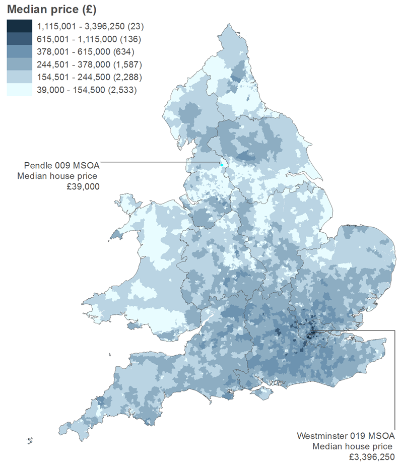
Source: Office for National Statistics and Land Registry under the Open Government Licence v3.0. Contains OS data © Crown copyright 2015
Notes:
- MSOA = Middle layer super output area.
Download this image Map 1: Median house price for all dwellings by MSOA, England and Wales
.png (330.6 kB)
The pattern of house price variation between areas is also apparent at the local authority level. The local authorities with extremely high and low median house prices show the broad distribution of house prices. For the year ending Quarter 2, 2015, the most expensive local authority for all dwelling types was Kensington and Chelsea in London, with a median house price of £1,200,000. This was a £10,000 decrease in median price on the previous period of four quarters, the first dip in this area since the year ending Quarter 3, 2009. Kensington and Chelsea was also the only local authority in which the median price for all dwelling types was more than £1,000,000. The local authority with the next highest average was Westminster, with a median price of £880,000.
Figure 1 shows that the local authority with the lowest median price for all dwelling types was Blaenau Gwent in Wales (£74,950). This is around 6.2% of the median price of Kensington and Chelsea. The median house price in Blaenau Gwent has remained relatively stable after a short period of decline following the recent economic downturn.
Figure 1: Median house price for the highest and lowest priced local authorities in England and Wales
Year ending Quarter 4 1995 to year ending Quarter 2 2015
Source: Office for National Statistics and Land Registry
Notes:
- Q4 is Quarter 4, October to December.
Download this chart Figure 1: Median house price for the highest and lowest priced local authorities in England and Wales
Image .csv .xls3. The changing composition of the housing market
Data showing the number of residential property transactions are published alongside the house price measures in the HPSSAs. Looking at the number of sales by dwelling type in a given area can help give context around its average price and how it has changed over time, or how it differs from its neighbouring areas and from the national picture.
Figure 2 shows the number of sales of existing dwellings by dwelling type in England and Wales between 1995 and the year ending Quarter 2, 2015. Terraced houses have been the most numerous at most points throughout the time series including the most recent period with 241,048 sold in England and Wales overall. Flats have remained the least sold dwelling type in all periods with 147,261 sales in the year ending Quarter 2, 2015.
In terms of the number of sales for existing dwellings, all dwelling types have followed the same broad trend, steadily increasing overall until 2004 when they each enter a brief period of decline. The numbers sold of each dwelling type then rise again before a much larger dip in 2007, not long before the economic downturn. Between then and the most recent period, sales of each type have recovered, but not yet to pre-economic downturn levels.
Figure 2: Number of residential property sales of existing dwellings by dwelling type, England and Wales
Year ending Quarter 4 1995 to year ending Quarter 2 2015
Source: Office for National Statistics and Land Registry
Notes:
- Q4 is Quarter 4, October to December.
Download this chart Figure 2: Number of residential property sales of existing dwellings by dwelling type, England and Wales
Image .csv .xlsThe total number of newly built dwellings sold in year ending Quarter 2, 2015 accounted for 9.3% of all sales. This percentage has remained relatively stable since 1995. The economic downturn appeared to impact the number of sales overall, but not the relative composition of newly built and existing dwellings.
Although proportionally smaller, the trend in the overall number of newly built dwellings sold closely reflects the number of sales of existing dwellings. When broken down by type however, this is not the case. Figure 3 shows the number of sales for newly built dwellings by type between 1995 and the year ending quarter 2, 2015. Unlike sales of existing dwellings, the types of newly built dwellings sold do not all follow the same pattern. Between 1995 and 2003, detached houses represented the largest proportion of sales of newly built dwellings and between the year ending Quarter 2, 1996 and the year ending Quarter 1, 2002, had more than twice the number of sales of any other dwelling type.
After 2003, flats and maisonettes became the most sold type of newly built dwelling. At its peak in 2006, 69,891 newly built flats/maisonettes were sold. This was more than any other single dwelling type for any period of four quarters since 1995. However, in the most recent period covered - the year ending Quarter 2, 2015 - the number of sales of detached dwellings exceeded flats/maisonettes, to again become the most sold type of newly built dwelling.
Figure 3: Number of residential property sales of newly built dwellings by dwelling type, England and Wales
Year ending Quarter 4 1995 to year ending Quarter 2 2015
Source: Office for National Statistics and Land Registry
Download this chart Figure 3: Number of residential property sales of newly built dwellings by dwelling type, England and Wales
Image .csv .xlsMap 2 displays the most numerous house type sold by MSOA for the most recent period, the year ending Quarter 2, 2015. Unsurprisingly, the areas where flats and maisonettes were the most commonly sold dwelling type were those areas that were most urban, notably London and its immediate surroundings.
Map 2: Most commonly sold dwelling type for all sales by MSOA, England and Wales
Year ending Quarter 2 2015
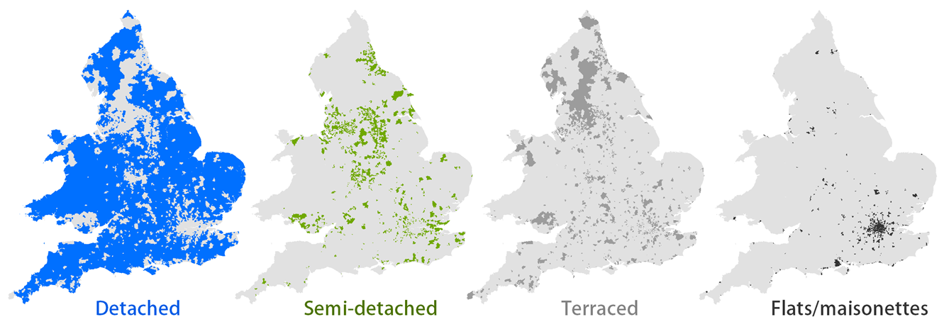
Source: Office for National Statistics and Land Registry under the Open Government Licence v3.0. Contains OS data © Crown copyright 2015
Notes:
- MSOA = Middle layer super output area.
Download this image Map 2: Most commonly sold dwelling type for all sales by MSOA, England and Wales
.png (226.4 kB)
There is a contrast in the prevalence of terraced housing as the most commonly sold dwelling type between the northern and southern regions of England, where terraced housing is more commonly sold in the northern areas England. This pattern is partly due to the differing composition of overall dwelling stock.
Sales of flats/maisonettes and terraced housing was more prevalent in urban areas of England and Wales, whilst detached dwellings were the most commonly sold dwelling type in rural areas. Figure 4 illustrates the changing composition of sales by type overall for ten classifications covering all of England and Wales, from the most rural to the most urban.
Figure 4: Percentage of sales by dwelling type and rural/urban classification, England and Wales
Year ending Quarter 2 2015
Source: Office for National Statistics and Land Registry
Notes:
- The 2011 rural/urban classification provides a consistent view of datasets from a rural/urban definition.
Download this chart Figure 4: Percentage of sales by dwelling type and rural/urban classification, England and Wales
Image .csv .xls4. A focus on Wales
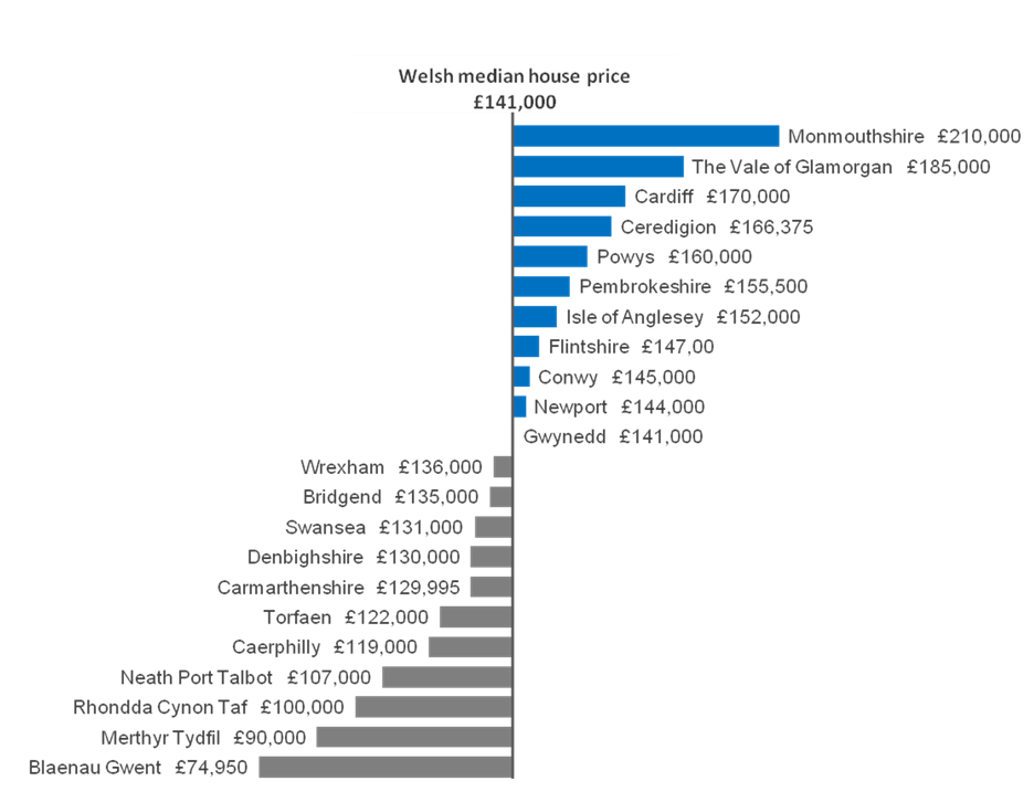
The data published in House Price Statistics for Small Areas allows us to take a more detailed look at specific parts of England and Wales. When looking at the average house price by local authority and MSOA in Wales, clear geographical patterns can be seen with notable variation between areas. Figure 5 shows the distribution of median house prices across Welsh local authorities.
Figure 5: Median house price for all dwelling types by local authority, Wales
Year ending Quarter 2 2015
Source: Office for National Statistics and Land Registry
Download this image Figure 5: Median house price for all dwelling types by local authority, Wales
.png (94.9 kB) .xls (116.7 kB)
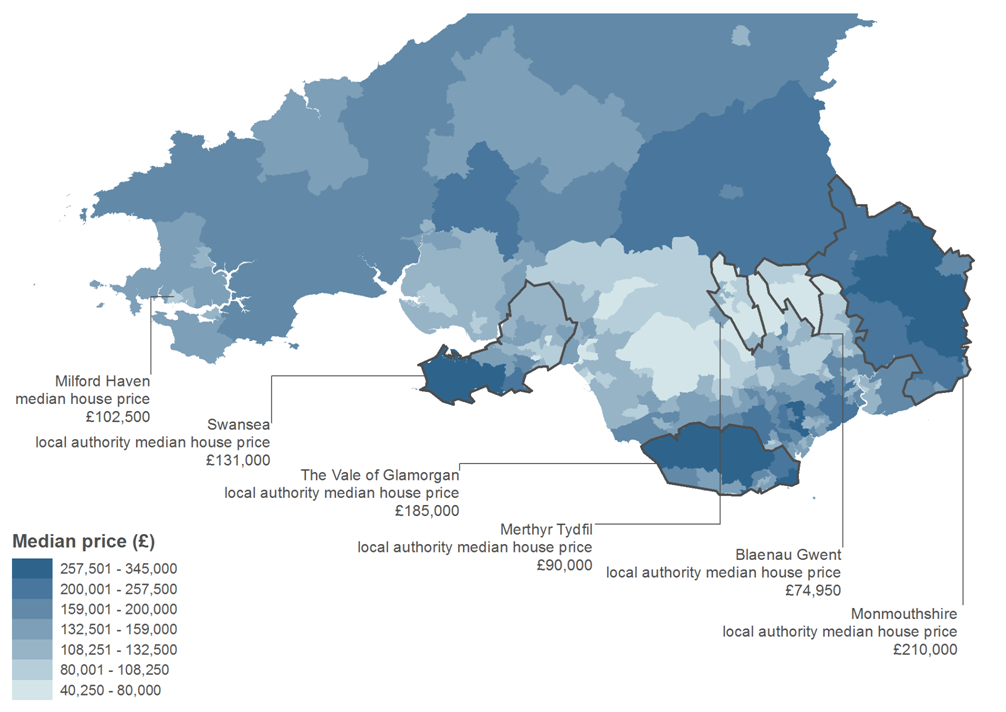
Map 3 shows that the southern cities of Cardiff and Swansea have neighbouring areas of higher average house prices than most parts of South Wales. The Vale of Glamorgan local authority for example had a median house price of £185,000, higher than the median for Wales overall which was £141,000 in the year ending Quarter 2, 2015. This could partly be driven by a larger and more diverse jobs market provided by these cities as well as their proximity to more major transport networks such as rail routes to London and the M4 motorway. The smaller city of Newport also shows this pattern but to a lesser extent.
North of the coastal cities in the valleys region of South Wales, some areas of the least expensive housing in England and Wales are found. This area includes Blaenau Gwent, the least expensive local authority in England and Wales with a median house price of £74,950 in the year ending Quarter 2, 2015. The local authority of Merthyr Tydfil, also in this area, had a median house price of £90,000, the second least expensive area in England and Wales in the same period. These local authorities had the highest proportion of sales of terraced houses in Wales (63% and 55% respectively), which partly explains the low median price for all types.
Map 3 also shows that most other areas of South and Mid Wales exhibit broadly similar median house prices with pockets of cheaper housing in Haverford West and Milford Haven areas of Pembrokeshire and gradually more expensive housing in the South East, approaching the English border close to Gloucester and Hereford.
Map 3: Median house price for all dwelling types by MSOA, South Wales
Year ending Quarter 2 2015
Source: Office for National Statistics and Land Registry under the Open Government Licence v3.0. Contains OS data © Crown copyright 2015
Notes:
- MSOA = Middle layer super output area.
Download this image Map 3: Median house price for all dwelling types by MSOA, South Wales
.png (210.5 kB)
5. The cost of new housing
In 2014, the Coalition Government announced a new housing scheme to offer 100,000 first-time buyers under the age of 40, new homes with a 20% discount. Commonly referred to as the Starter Homes initiative; the scheme provides incentives to housing developers to sell newly built properties for at least 20% less than market value. The incentives include the reduction of various planning costs and levies. This initiative to promote home ownership and house building has been included in the current Government’s Housing and Planning Bill.
The Government’s Starter Homes initiative aims to increase the number of first-time buyers by offering financial incentives to buy newly built dwellings. First time buyers are likely to purchase a home towards the lower end of the property market in terms of price. Therefore, rather than using the average price, looking at the difference between tenth percentile price for newly built dwellings and existing dwellings can provide a better understanding of the potential effects of the Starter Homes initiative. Details about the definition and calculation of tenth percentile house prices are available in our HPSSAs Explained.
Figure 6 shows that in England and Wales, the tenth percentile price of newly built dwellings has been higher than the tenth percentile price of existing dwellings since records began, and that this gap has been widening since the recent economic downturn. In the year ending Quarter 3, 2009 the tenth percentile price of newly built dwellings was 8.4% higher than existing dwellings in England and Wales. This gap has widened to 35.9% in the year ending Quarter 2, 2015.
Figure 6 also shows the tenth percentile price of newly built dwellings if a 20% discount were applied. It shows that the discounted tenth percentile price of newly built dwellings was higher than the tenth percentile price of existing dwellings for all years except year ending Quarter 1, 2007 to year ending Quarter 1, 2012. This period includes the recent economic downturn and a period of decreasing house prices and decreasing number of sales of newly built dwellings.
Since the economic downturn, the discounted tenth percentile price for newly built dwellings has increased to a higher level than existing dwellings, and reached its highest ever level of £100,000 in quarter 2, 2015. This was 8.7% higher than the tenth percentile price of existing dwellings, which was £92,000.
Figure 6: Tenth percentile house price for newly built and existing dwellings, England and Wales
Year ending Quarter 4 1995 to year ending Quarter 2 2015
Source: Office for National Statistics and Land Registry
Notes:
- Q4 is Quarter 4, October to December.
Download this chart Figure 6: Tenth percentile house price for newly built and existing dwellings, England and Wales
Image .csv .xlsFigure 7 shows how the percentage difference between the costs of newly built and existing housing at the lower end of the market (tenth percentile) has changed over time and differs from the middle of the market (median). The difference between newly built and existing housing for the median dwelling price broadly grew since 1995. This difference peaked at 43.9% in the year ending quarter 2, 2001, where the difference for tenth percentile house prices peaked at 85% in 2002.
The difference in median newly built and existing dwellings then fell to a point where newly built dwellings were at times cheaper than existing dwelling. For the lower end of the market (tenth percentile), this gap decreased to its lowest point of 8.4% in the year ending Quarter 3, 2009.
For the most recent period (Quarter 2, 2015), the difference between median newly built dwellings and existing dwellings had grown to 17.9%. At the lower end of the market, the difference between tenth percentile newly built and existing dwellings had grown to 35.9%.
Figure 7: Percentage difference in tenth percentile house price for newly built and existing dwellings, England and Wales
Year ending Quarter 4 1995 to year ending Quarter 2 2015
Source: Office for National Statistics and Land Registry
Download this chart Figure 7: Percentage difference in tenth percentile house price for newly built and existing dwellings, England and Wales
Image .csv .xlsThe tenth percentile price of newly built dwellings was higher than the tenth percentile price of existing dwellings in all English regions and Wales in year ending Quarter 2, 2015. The difference was largest in the North East where the tenth percentile price of newly built dwellings (£104,950) was 81% higher than existing dwellings (£57,950). Figure 8 shows that the regions in which the tenth percentile price of existing dwellings were lower generally had the largest gap between the prices of newly built dwellings and existing dwellings.
Figure 8: Tenth percentile price of newly built and existing dwellings by region and country, England and Wales
Year ending Quarter 2 2015
Source: Office for National Statistics and Land Registry
Download this chart Figure 8: Tenth percentile price of newly built and existing dwellings by region and country, England and Wales
Image .csv .xlsThe general pattern of higher house prices for newly built dwellings than existing dwellings does not occur for all areas of England and Wales. In Quarter 2, 2015 there were 35 local authorities out of 348 in England and Wales in which the tenth percentile price of newly built dwellings was lower than existing dwellings. These local authorities were widely distributed across England and Wales.
Figure 9 shows the tenth percentile price of newly built and existing dwellings for Pendle and Luton in year ending Quarter 2, 2015. These are the local authorities in England and Wales for which the relative gap was largest, with Pendle having a tenth percentile price for newly built dwellings 332% higher than existing dwellings. In Luton the tenth percentile price of existing dwellings was 96.7% higher than newly built dwellings.
Figure 9: Tenth percentile price of newly built and existing dwellings for local authorities where newly built dwellings were highest and lowest relative to existing dwellings, England and Wales
Year ending Quarter 2 2015
Source: Office for National Statistics and Land Registry
Download this chart Figure 9: Tenth percentile price of newly built and existing dwellings for local authorities where newly built dwellings were highest and lowest relative to existing dwellings, England and Wales
Image .csv .xlsThe varying difference between the price of newly built and existing dwellings is explained by differences in the number of sales of individual house types. Figure 9 shows the percentage of sales for newly built dwellings out of all sales. The difference in the number of sales of newly built properties, particularly for detached houses which tend to be more expensive than other types, could in part account for the difference in the varying price of newly built dwellings relative to existing dwellings. Figure 10 shows the proportion of newly built sales that were of detached dwellings in Pendle (32.4%) was higher than in Luton (13%). This demonstrates the importance of looking at the distribution of the number of sales by house type, because the distribution can influence the overall house prices.