Table of contents
- Authors
- Main points
- Introduction
- Distribution of earnings over time
- Regional differences in earnings distribution
- Earnings distribution by gender
- Earnings distribution by working pattern
- Earnings distribution by occupation and skill group
- Earnings distribution by age bands
- Growth in earnings
- Growth in hourly earnings by region
- Growth in hourly earnings by gender
- Growth in hourly earnings by working pattern
- Growth in hourly earnings by working pattern for each gender
- Growth in earnings by skill group
- Growth in earnings by age bands
- Annex A: Regional distribution of earnings 2016, all regions
- Background notes
2. Main points
In 2016, there was a continuation of the trend for a growing concentration of pay at the bottom of the UK’s earnings distribution, clustered around the new National Living Wage (NLW) of £7.20 per hour which is required to be paid for those employees who are 25 years and older.
The largest regional difference in the distribution of earnings and the share of employees earning around £7.20 per hour is between London where around 5.8% of employees earn this amount, and Northern Ireland where around 13.7% earn this amount.
There are large differences in the earnings distribution for men and women with a greater share of women earning around the NLW in 2016 compared to men. This partly reflects the greater share of women working in part-time jobs which are more likely to be paying around the NLW in 2016 than full-time jobs.
Comparing earnings by skill level shows that those working in lower-skill occupations such as cleaning and basic administrative roles are strongly clustered around the £7.20 NLW rate in April 2016.
Around 10% of full-time 16- to 24-year-olds and 15% of part-time 16- to 24-year-olds appear to be getting paid at around the £7.20 NLW in April 2016, although they are not legally required to be paid this rate.
A greater share of employees in older age groups (35 to 49 and 50 to 64) tend to dominate the higher end of the hourly earnings distribution compared to younger age groups of 16 to 24 and 25 to 34.
A greater share of part-time workers employed in both 2015 and 2016 experienced hourly pay growth of around 11% (the change from the old National Minimum Wage to the NLW) compared to full-time workers.
Looking at occupation and skill level, workers who were employed in both 2015 and 2016 and who saw a pay rise of around 11% following the introduction of the NLW are almost exclusively in the low skill group.
Back to table of contents3. Introduction
The UK labour market in recent years has shown a trend of falling unemployment with growing evidence of a tightening in the labour market which has been accompanied by rising earnings growth. This trend is affirmed by results from the Annual Survey of Hours and Earnings (ASHE) – our most comprehensive survey of individual pay. It suggests that median gross weekly earnings for full-time employees were £539 in April 2016, up 2.2% from £527 in April 2015.
Definitions
The analysis in this article uses hourly pay, including incentive pay, overtime and shift premiums as the variable of interest. This is because it reflects the actual gross pay of individuals, independent of the hours they work, enabling full comparisons to be made between groups in each time period.
The standard filter used for weekly and hourly earnings analyses presented in the main ASHE statistical bulletin ( that is, employees on adult rates of pay whose earnings have not been affected by absence) has not been applied as hourly pay is less affected than weekly pay by loss of earnings during the pay period. This is however, indirectly applied for the earnings distribution with the use of loss of pay weight.
The analysis also includes all employees 16-years-old and above, with no upper age limit. This article often highlights the £7.20 level for the new National Living Wage (NLW), which applies to those 25 years and over. This group of employees represent around 87% of all employees included in the analysis.
Back to table of contents4. Distribution of earnings over time
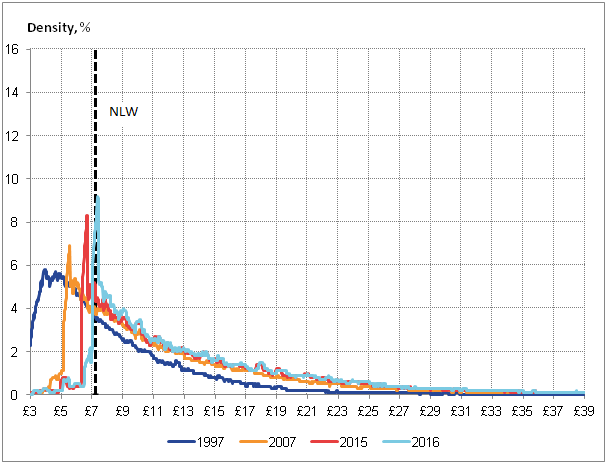
Figure 1 shows the distribution of gross hourly earnings for all employees in 1997, 2007, 2015 and 2016. In 1997, prior to the introduction of the National Minimum Wage (NMW), the UK’s earnings distribution was relatively smooth, positively skewed and centred on hourly earnings of between £4 and £5 per hour. Relatively few jobs paid below £3 per hour, while the long, thinning right-hand tail indicates the steadily falling number of jobs as hourly earnings rise. As a result of this positive skew, mean hourly pay was around 24.2% above the median in 1997.
By 2007, however, the shape of this distribution had changed markedly. The earlier, smooth profile started getting replaced by a striking, sharply-edged distribution, with a mass around £5.00 to £5.50 per hour, close to the prevailing adult NMW of £5.35 in April 2007. Above this level of pay, the density of the distribution is less affected – albeit shifted to the right by both productivity gains and inflation.
By 2015, the spike of the distribution had shifted with a mass of people around £6.50 – the prevailing NMW. In 2016, the spike of the earnings distribution has become even sharper, with a mass at around £7.20 per hour – the prevailing adult National Living Wage (NLW) in April 2016. Above this level of pay, the density of the distribution has slightly shifted to the right.
Examining the distribution of earnings in this manner exposes several characteristics of the UK’s recent experience. The growing concentration of pay at the bottom of the UK’s earnings distribution is particularly marked. While in 1997, the modal rate of hourly pay was between £3.74 and £4.14 and covered 6.0% of all jobs, in 2016, the modal rate of hourly pay was around £7.34 (plus or minus 20 p), and covered 9.2% of all jobs.
Figure 1: Distribution of gross nominal hourly earnings, 1997, 2007, 2015 and 2016, and the Adult National Living Wage in April 2016
+/-20 pence, years, UK
Source: Office for National Statistics, Annual Survey of Hours and Earnings
Notes:
- Each point on the x-axis represents a rolling sum of the density of jobs receiving greater than or equal to 20 pence below, and strictly less than 20 pence above, the stated hourly earnings.
- As the density records the rolling sum of jobs paid within 20 pence of the stated amount at each point on the x-axis, jobs paid the April 2016 Adult National Living Wage (£7.20) will appear between the x-axis values of £7.00 and £7.40.
Download this image Figure 1: Distribution of gross nominal hourly earnings, 1997, 2007, 2015 and 2016, and the Adult National Living Wage in April 2016
.png (23.3 kB) .xls (216.6 kB)
5. Regional differences in earnings distribution
While the headline earnings distribution shows some important characteristics of the experience of UK as a whole, there are some important regional differences (Figure 2). Annex A shows the earnings distribution for all regions and devolved administrations of the UK in 2016.
Each region shows a clear spike around £7 representing the new National Living Wage (NLW) for 25s and over introduced in April 2016. However, the main difference between regions is the height of the spike. Figure 2 shows three regions; the two extreme regions – London (with the least number of people on the NLW) and Northern Ireland (with the most number of people on the NLW), and a region with a distribution in between the two extremes – in this case East.
The modal distribution across all regions is between £7.00 and £7.40. London and the South East have a similar earnings distribution, with modal earnings covering around 5.8% and 7% of all jobs respectively. Scotland, East, and South West have a similar earnings distribution to each other with modal earnings covering around 8.4%, 9.4%, and 9.5% of all jobs respectively. Wales, North East, North West, West Midlands, Yorkshire, and East Midlands have a similar earnings distribution, with modal earnings covering between 10% to 12% of all jobs. Northern Ireland displays the biggest spike on the NLW with modal earnings covering 13.7% of all jobs.
This means more people receive a wage closer to the NLW in Northern Ireland than in London. London also features a greater proportion of people on higher hourly wages compared with the other regions.
Figure 2: Distribution of gross nominal hourly earnings, for selected regions of UK, April 2016
+/-20 pence
Source: Office for National Statistics, Annual Survey of Hours and Earnings
Notes:
- Each point on the x-axis represents a rolling sum of the density of jobs receiving greater than or equal to 20 pence below, and strictly less than 20 pence above, the stated hourly earnings.
- As the density records the rolling sum of jobs paid within 20 pence of the stated amount at each point on the x-axis, jobs paid the April 2016 Adult National Living Wage (£7.20) will appear between the x-axis values of £7.00 and £7.40.
Download this chart Figure 2: Distribution of gross nominal hourly earnings, for selected regions of UK, April 2016
Image .csv .xls6. Earnings distribution by gender
Figure 3: Distribution of gross nominal hourly earnings by gender April 2016
+/-20 pence, UK
Source: Office for National Statistics, Annual Survey of Hours and Earnings
Notes:
- Each point on the x-axis represents a rolling sum of the density of jobs receiving greater than or equal to 20 pence below, and strictly less than 20 pence above, the stated hourly earnings.
- As the density records the rolling sum of jobs paid within 20 pence of the stated amount at each point on the x-axis, jobs paid the April 2016 Adult National Living Wage (£7.20) will appear between the x-axis values of £7.00 and £7.40.
Download this chart Figure 3: Distribution of gross nominal hourly earnings by gender April 2016
Image .csv .xlsMen and women tend to have different earnings profiles; more men tend to be in higher pay brackets and the proportion of women closer to the National Living Wage (NLW) is higher than men. Figure 3 shows the distribution of earnings by gender in April 2016. It shows that there is a clear difference between the spikes of men and women. In 2016, the modal earnings for both men and women is around £7.00 (plus or minus 20p), covering 6.9% of all jobs for men, and 11.5% of all jobs for women. This means that women’s earning profile has a bigger spike around the National Living Wage in comparison to men. A greater share of men than women receive hourly earnings of more than £12, although previous analysis suggests that the gap between the earnings profile of men and women has declined substantially since 1997.
Back to table of contents7. Earnings distribution by working pattern
While the distribution of earnings by gender provides useful information on the pay difference between men and women, the composition of working patterns can be an important factor to identify. Figure 4 shows the hourly earnings distribution for full-time and part-time workers.
There is a stark difference between the earning profiles of those working full-time and those working part-time. More part-time workers earn an hourly wage close to the National Living Wage (NLW) than full-time workers in 2016. Whereas, part-time workers are more concentrated between hourly earnings of £7 and £10.50, full-time workers have a lower concentration of workers in that range. Greater numbers of people earning wages more than £10.50 per hour are working full-time.
Figure 4: Distribution of gross nominal hourly earnings by working pattern, April 2016
+/-20 pence, UK
Source: Office for National Statistics, Annual Survey of Hours and Earnings
Notes:
- Full-time defined as employees working more than 30 paid hours per week (or 25 or more for the teaching professions).
- Each point on the x-axis represents a rolling sum of the density of jobs receiving greater than or equal to 20 pence below, and strictly less than 20 pence above, the stated hourly earnings.
- As the density records the rolling sum of jobs paid within 20 pence of the stated amount at each point on the x-axis, jobs paid the April 2016 Adult National Living Wage (£7.20) will appear between the x-axis values of £7.00 and £7.40.
Download this chart Figure 4: Distribution of gross nominal hourly earnings by working pattern, April 2016
Image .csv .xlsGiven, that more women and more part-time workers earn wages close to the National Living Wage, it is interesting to explore if women earn less than men because more of them are working part-time. To explore this Figure 5a and 5b breaks down the gross hourly earnings distribution of full-time and part time workers in 2016 by gender.
Figure 5a shows that a greater share of women who work full-time earn wages close to the National Living Wage (between £7 and £10 per hour) compared to men in 2016. There is therefore a difference in earnings between full-time women and men across a large part of the earnings distribution.
On the other hand, comparing gender differences for part-time workers Figure 5b shows that a greater share of men earn wages close to the National Living Wage (between £7 and £7.50) than women. The earnings distribution for both genders is then fairly closely matched at higher wage rates.
For both full-time and part-time employees, at higher hourly wages (above £11), the difference between the pay of men and women is reduced significantly when controlling for working pattern.
Figure 5a: Distribution of gross nominal hourly earnings by gender for full-time workers, April 2016
+/-20 pence, UK
Source: Office for National Statistics, Annual Survey of Hours and Earnings
Notes:
- Full-time defined as employees working more than 30 paid hours per week (or 25 or more for the teaching professions).
- Each point on the x-axis represents a rolling sum of the density of jobs receiving greater than or equal to 20 pence below, and strictly less than 20 pence above, the stated hourly earnings.
- As the density records the rolling sum of jobs paid within 20 pence of the stated amount at each point on the x-axis, jobs paid the April 2016 Adult National Living Wage (£7.20) will appear between the x-axis values of £7.00 and £7.40.
Download this chart Figure 5a: Distribution of gross nominal hourly earnings by gender for full-time workers, April 2016
Image .csv .xlsFigure 5b: Distribution of gross nominal hourly earnings by gender for part-time workers
+/-20 pence, April 2016
Source: Office for National Statistics, Annual Survey of Hours and Earnings
Notes:
- Each point on the x-axis represents a rolling sum of the density of jobs receiving greater than or equal to 20 pence below, and strictly less than 20 pence above, the stated hourly earnings.
- As the density records the rolling sum of jobs paid within 20 pence of the stated amount at each point on the x-axis, jobs paid the April 2016 Adult National Living Wage (£7.20) will appear between the x-axis values of £7.00 and £7.40.
Download this chart Figure 5b: Distribution of gross nominal hourly earnings by gender for part-time workers
Image .csv .xls8. Earnings distribution by occupation and skill group
While breakdowns of the earning distribution by gender and working pattern are important, an interesting breakdown to explore is the distribution of earnings by skill of the workers. The Standard Occupational Classification 2010 (SOC2010) separates the labour market into nine major groups, based on criteria such as the qualifications, skills and experience associated with each job. These nine major groups can be combined further into four skill groups; levels 1 through 4. Level 1 indicates relatively low skill requirements and level 4 indicates relatively high skill requirements.
Table 1 describes some of important features of each skill group.
Table 1: SOC 2010 classification of skill groups and share of employees by skill group
| Skill group | Proportion of men, ASHE 2016 | Proportion of women, ASHE 2016 | Typical occupations | |||
| 1 (low) | 12% | 11% | Labourers (e.g. agriculture, construction), cleaners & basic admin workers | |||
| 2 (lower-mid) | 26% | 46% | Secretaries, carers, hairdressers, cashiers, machine operatives, transport drivers | |||
| 3 (upper-mid) | 31% | 16% | Skilled trade workers, associate professionals and technical occupations | |||
| 4 (upper) | 31% | 27% | Professionals (e.g. teachers, doctors, scientists, engineers, managers, directors) | |||
| Source: Office for National Statistics | ||||||
Download this table Table 1: SOC 2010 classification of skill groups and share of employees by skill group
.xls (27.1 kB)Figure 6a and 6b shows the distribution of nominal hourly earnings by skill-group for full-time and part-time workers. It shows that the distribution of earnings differs considerably by skill group. Those in the “low” category are clustered at or just above the National Living Wage (NLW) in 2016. This applies to both full and part-time jobs, although more so for part-time workers. Around 21% of low-skilled full-time workers and around 32% of low-skilled part-time workers received a wage just over the £7.20 National Living Wage (using the plus or minus 20p brackets).
The “lower-mid” category workers are also grouped at the NLW (more so for part-time workers), but with a greater proportion of workers earning above the NLW than in the lowest skill group. Around 9% of “lower-mid” full-time workers and 20% of “lower-mid” part-time workers received a wage just over the National Living Wage. While around 4% of “lower-mid” full-time workers earn a wage of about £11 an hour, only around 3% of ”low”-skilled full-time workers earn the same wage. The corresponding figures for part-time workers are 2.5% for “lower-mid” and 1% for “low”-skilled workers.
The “upper-mid” category shows less clustering at the NLW, although part-time workers in particular still show a clear NLW spike. Around 13% of “upper-mid” part-time workers receive a wage just above the £7.20 an hour National Living Wage. However, part-time workers account for only around 12% of this skill group. A large proportion of full-time workers in this group earn between £10 and £20.
The highest skill category shows a relatively even distribution across the wage brackets shown here, extending well into £30 plus per hour territory. This applies for both full-time and part-time workers.
Figure 6a: Distribution of gross nominal hourly earnings by skill group for full-time workers, April 2016
+/-20 pence, UK
Source: Office for National Statistics, Annual Survey of Hours and Earnings
Notes:
- Full-time defined as employees working more than 30 paid hours per week (or 25 or more for the teaching professions).
- Each point on the x-axis represents a rolling sum of the density of jobs receiving greater than or equal to 20 pence below, and strictly less than 20 pence above, the stated hourly earnings.
- As the density records the rolling sum of jobs paid within 20 pence of the stated amount at each point on the x-axis, jobs paid the April 2016 Adult National Living Wage (£7.20) will appear between the x-axis values of £7.00 and £7.40.
Download this chart Figure 6a: Distribution of gross nominal hourly earnings by skill group for full-time workers, April 2016
Image .csv .xlsFigure 6b: Distribution of gross nominal hourly earnings by skill group for part-time workers, April 2016
+/-20 pence, UK
Source: Office for National Statistics, Annual Survey of Hours and Earnings
Notes:
- Each point on the x-axis represents a rolling sum of the density of jobs receiving greater than or equal to 20 pence below, and strictly less than 20 pence above, the stated hourly earnings.
- As the density records the rolling sum of jobs paid within 20 pence of the stated amount at each point on the x-axis, jobs paid the April 2016 Adult National Living Wage (£7.20) will appear between the x-axis values of £7.00 and £7.40.
Download this chart Figure 6b: Distribution of gross nominal hourly earnings by skill group for part-time workers, April 2016
Image .csv .xlsComparison with 2007
The distribution of gross nominal hourly earnings by skill group has changed markedly since 2007 (before the economic downturn). Figure 7a and 7b shows the distribution of gross nominal hourly earnings by skill group for full-time and part-time workers for April 2007. It shows that although there was clearly a clustering of “low” and “lower-mid” skill workers around the NMW (£5.35) for those aged 22 plus in 2007, the clustering is less pronounced than in 2016, particularly for full-time workers. This is seen by the modal value of earnings at around £7.20 per hour in 2016 covering over 21% of lower-skill full-time employees, compared to a modal value of £5.35 covering around 13% of full-time lower-skill employees in 2007. This provides some evidence that wages have become increasingly compressed around the minimum wage over time (particularly the wages of lower-skilled workers).
Figure 7a: Distribution of gross nominal hourly earnings by skill group for full-time workers, April 2007
+/- 20 pence, UK
Source: Office for National Statistics, Annual Survey of Hours and Earnings
Notes:
- Full-time defined as employees working more than 30 paid hours per week (or 25 or more for the teaching professions).
- Minimum Wage for those aged 22+ was £5.35 in April 2007.
- Each point on the x-axis represents a rolling sum of the density of jobs receiving greater than or equal to 20 pence below, and strictly less than 20 pence above, the stated hourly earnings.
- As the density records the rolling sum of jobs paid within 20 pence of the stated amount at each point on the x-axis, jobs paid the April 2016 Adult National Living Wage (£7.20) will appear between the x-axis values of £7.00 and £7.40.
Download this chart Figure 7a: Distribution of gross nominal hourly earnings by skill group for full-time workers, April 2007
Image .csv .xlsFigure 7b: Distribution of gross nominal hourly earnings by skill group for part-time workers
+/-20 pence, April 2007
Source: Office for National Statistics, Annual Survey of Hours and Earnings
Notes:
- Minimum Wage for those aged 22+ was £5.35 in April 2007.
- Each point on the x-axis represents a rolling sum of the density of jobs receiving greater than or equal to 20 pence below, and strictly less than 20 pence above, the stated hourly earnings.
- As the density records the rolling sum of jobs paid within 20 pence of the stated amount at each point on the x-axis, jobs paid the April 2016 Adult National Living Wage (£7.20) will appear between the x-axis values of £7.00 and £7.40.
Download this chart Figure 7b: Distribution of gross nominal hourly earnings by skill group for part-time workers
Image .csv .xls9. Earnings distribution by age bands
Looking at a breakdown of the Annual Survey of Hours and Earnings (ASHE) data by age is particularly interesting with the 2016 data, given that the National Living Wage (NLW) wage only legally applies to those aged 25 or over. Looking at the wage distribution for 16- to 24-year-olds in particular can give an indication as to whether employers have chosen to keep younger workers on lower rates, or whether they moved them up to the NLW along with workers aged 25 plus.
Figure 8a and 8b shows the distribution of gross nominal hourly earnings for specific age bands for full-time and part-time workers in 2016. The distribution for full-time workers shows that those aged 16 to 24 are clustered most heavily around the NLW (£7.20). There are secondary “peaks” around £6.95 (the National Minimum Wage (NMW) for 21- to 24-year-olds) and £5.55 (the NMW for 18- to 20-year-olds), although these are clearly lower. This may indicate that some employers might be paying younger full-time workers the NLW even if they are not legally required to do so.
The earnings distribution for 16- to 24-year-olds is more spread out than the earnings distributions for other age brackets, which show sharper albeit smaller spikes at the NLW. The other age bands also see a peak at the NLW, but they are relatively small for the older age brackets. Above the NLW the three older groups tend to converge, with the distribution for the 25 to 34 slightly to the left of the other two.
For part-time workers the distribution around the NLW is somewhat different. Each age band has a much sharper spike at the NLW, with 25- to 34-year-olds seeing the largest concentration at this rate. 16- to 24-year-olds still have the highest peak at the NLW, but the difference between this peak and the peak around £6.90 is only marginal (unlike with full-time workers).
The age distribution of earnings for part-time employees (Figure 8b) is not as differentiated as the age distribution of earnings for full-time employees. This may be partly because part-time work is accessible to a wide range of ages. In contrast, Figure 8a clearly shows that higher wage rates are more accessible to those over 35-years-old, with young employees distribution much more focused between NMW and NLW levels up to around £12 per hour.
Figure 8a: Distribution of gross nominal hourly earnings by age band for full-time workers, April 2016
+/-20 pence, UK
Source: Office for National Statistics, Annual Survey of Hours and Earnings
Notes:
- Full-time defined as employees working more than 30 paid hours per week (or 25 or more for the teaching professions).
- Each point on the x-axis represents a rolling sum of the density of jobs receiving greater than or equal to 20 pence below, and strictly less than 20 pence above, the stated hourly earnings.
- As the density records the rolling sum of jobs paid within 20 pence of the stated amount at each point on the x-axis, jobs paid the April 2016 Adult National Living Wage (£7.20) will appear between the x-axis values of £7.00 and £7.40.
Download this chart Figure 8a: Distribution of gross nominal hourly earnings by age band for full-time workers, April 2016
Image .csv .xlsFigure 8b: Distribution of gross nominal hourly earnings by age band for part-time workers
+/-20 pence, April 2016
Source: Office for National Statistics, Annual Survey of Hours and Earnings
Notes:
- Each point on the x-axis represents a rolling sum of the density of jobs receiving greater than or equal to 20 pence below, and strictly less than 20 pence above, the stated hourly earnings.
- As the density records the rolling sum of jobs paid within 20 pence of the stated amount at each point on the x-axis, jobs paid the April 2016 Adult National Living Wage (£7.20) will appear between the x-axis values of £7.00 and £7.40.
Download this chart Figure 8b: Distribution of gross nominal hourly earnings by age band for part-time workers
Image .csv .xls10. Growth in earnings
Analysis of variation in levels of pay provides useful insight into distributional outcomes in the UK, yielding information about how much more or less one group earns relative to another. However, the Annual Survey of Hours and Earnings (ASHE) datasets can also be used to examine the typical experience of earnings growth through time.
Analysis of this sort can be used to address questions about the degree of inflationary pressure and the extent of spare capacity remaining in the UK labour market, which in turn may help economists understand wage pressures. By necessity, this work focuses on workers who report being in employment in consecutive periods – which permits the calculation of earnings growth rates for individuals. As before, earnings in this analysis includes overtime, incentive pay and shift premiums to enable the full earnings of individuals to be considered over time.
Growth in earnings over time
The experience of earnings growth is remarkably varied from one period to the next. Figure 9a shows the distribution of nominal hourly earnings growth rates in the year to:
- April 2007 (corresponding to individuals in employment in both 2006 and 2007)
- April 2014 (corresponding to individuals in employment in both 2013 and 2014)
- April 2015 (corresponding to individuals in employment in both 2014 and 2015)
- April 2016 (corresponding to individuals in employment in both 2015 and 2016)
For each growth rate on the horizontal axis, the area under the curve indicates a portion of employees who experienced earnings growth within 0.5 percentage points of that rate.
Perhaps the most striking feature of Figure 9a is the extent of variation in hourly earnings growth. Just below 1% of employees experienced close to 20% weekly earnings growth in 2016, while a similar portion experienced a fall of 10%.
Secondly, Figure 9a suggests that the experience of earnings growth – as measured by the most frequently occurring earnings growth rates – remained fairly steady between 2015 and 2016. In both years the median of the growth distribution is around 2.5%.
In 2015, the most common nominal pay rise was between 2% and 3% – accounting for just fewer than 11% of employees – while a little over 10% of employees experienced around zero nominal hourly earnings growth. In 2016, the most frequently occurring rate of growth was around zero percent – with around 9% of employees receiving a pay rise between 1% and 2%, and around 7% of employees receiving between 2% and 3% pay rise. The increase in the share of employees receiving between 10% and 11% pay rises compared to rates around this level is likely to reflect the 11% increase in pay from the National Minimum Wage of £6.50 an hour in April 2015 to the National Living Wage of £7.20 in April 20161.
These data suggest both (a) that a larger number of people experienced a nominal pay freeze in the year to April 2016, and (b) that among those experiencing changes in earnings, those receiving the National Living Wage instead of the National Minimum Wage saw a large increase in pay.
This picture of relatively limited earnings growth for some of the employed in April 2015 and April 2016 may partially reflect the historically low levels of inflation during this period. CPI annual growth in April 2015 was minus 0.1% and in April 2016 was 0.3%. Continued wage restraint for public sector workers which were capped at 1% in many areas during this time may also contribute to this overall picture.
Figure 9a: Distribution of growth in gross nominal hourly earnings, 2007, 2014, 2015 and 2016
+/- 0.5 percentage points, UK
Source: Office for National Statistics, Annual Survey of Hours and Earnings
Notes:
- This chart uses individual level data from ASHE to calculate the growth of nominal weekly earnings for individuals observed in pairs of years in 2006 and 2007; 2013 and 2014; 2014 and 2015; and 2015 and 2016. Note that the ASHE methodology is not specifically designed to model earnings growth for individuals over time.
- Note that the proportion of people experiencing a pay growth between 10% and 11% may not reflect the proportion of people on the National Living Wage in the earnings distribution in April 2016. This is because the growth analysis is focusing on employed workers in two consecutive periods and not just in April 2016.
Download this chart Figure 9a: Distribution of growth in gross nominal hourly earnings, 2007, 2014, 2015 and 2016
Image .csv .xlsCumulative frequency presentation for growth in gross nominal hourly earnings
An alternative visualisation of the distribution of gross nominal earnings growth can be shown using cumulative percentage frequency charts. Figure 9b plots the same growth rates as Figure 9a but as a cumulative frequency chart.
Once again, the jump at around zero percent growth for workers in 2016 is higher than for the workers in 2015. Consistent with Figure 9a, more workers received a pay rise of between 0% and 2% in 2016 than in 2015. However, slightly more workers received higher wage increases (above 3%) in 2016 than 2015. The median of the growth rates (represented by 50% of workers) remains broadly similar between the two years at 2.5% (note that this is a different concept to the growth in the median).
In 2016, the slight jump between 10% and 11% (represented by the change from the National Minimum Wage (NMW) to the National Living Wage (NLW)) can also be seen in the cumulative graph and not in other years. Figure 9b also shows that while the growth in earnings have generally been improving since 2014, (the curves have been shifting rightwards) they are still much weaker in nominal terms compared to 2007 (before the economic downturn). In real terms the growth rates in hourly earnings will be more similar, as Consumer Prices Index (CPI) growth was 2.8% in April 2007 compared to 1.8% in April 2014, minus0.1% in April 2015 and 0.3% in April 2016.
Figure 9b: Cumulative frequency of growth in gross nominal hourly earnings, 2007, 2014, 2015 and 2016
UK
Source: Office for National Statistics, Annual Survey of Hours and Earnings
Notes:
- This chart uses individual level data from ASHE to calculate the growth of nominal weekly earnings for individuals observed in pairs of years in 2006 and 2007; 2013 and 2014; 2014 and 2015; and 2015 and 2016. Note that the ASHE methodology is not specifically designed to model earnings growth for individuals over time.
- This chart only looks at workers whose pay growth between 2015 and 2016 fell between -10% and +20%. As such, the proportion of workers on the y-axis should not be interpreted as the entire population of workers.
Download this chart Figure 9b: Cumulative frequency of growth in gross nominal hourly earnings, 2007, 2014, 2015 and 2016
Image .csv .xlsNotes for Growth in earnings section:
- Note that the proportion of people experiencing a pay growth between 10% and 11% may not reflect the proportion of people on the National Living Wage in the earnings distribution in April 2016. This is because the growth analysis is focussing on employed workers in two consecutive periods and not just in April 2016.
11. Growth in hourly earnings by region
Figures 10a and 10b show the growth in gross nominal hourly earnings for selected regions across the UK in the year to April 2016. Most regions of England show a similar trend in the growth distribution – the biggest peak is clustered around zero growth with around 10% to 13% of workers receiving no wage increase. Another 5% to 9% of workers received between 1% and 3% pay rise, and around 2% to 3% of workers received a pay increase of between 10% and 11%, representing a shift from the National Minimum Wage (NMW) to the National Living Wage (NLW).
Amongst the countries of UK, Northern Ireland stands out with a large proportion (around 15%) of people receiving between minus 1% and 0% pay rise. Around 5% of workers in Northern Ireland received a pay increase of between 10% and 11% – corresponding to the shift from the NMW to the NLW. This was much larger than any other region. Another country that stands out is Scotland, which experienced a higher share of pay increases at around 2% than any other region. Around 12% of workers in Scotland received a pay increase of between 1% and 3%, but fewer workers (around 3%) benefitted from the switch from the NMW to the NLW compared to other regions.
Figure 10a: Distribution of growth in gross nominal hourly earnings, East, London and Yorkshire, April 2016
+/- 0.5 percentage points
Source: Office for National Statistics, Annual Survey of Hours and Earnings
Notes:
- This chart uses individual level data from ASHE to calculate the growth of nominal weekly earnings for individuals observed in pairs of years in 2015 and 2016. Note that the ASHE methodology is not specifically designed to model earnings growth for individuals over time.
- Note that the proportion of people experiencing a pay growth between 10% and 11% may not reflect the proportion of people on the National Living Wage in the earnings distribution in April 2016. This is because the growth analysis is focussing on employed workers in two consecutive periods and not just in April 2016.
Download this chart Figure 10a: Distribution of growth in gross nominal hourly earnings, East, London and Yorkshire, April 2016
Image .csv .xlsFigure 10b: Distribution of growth in gross nominal hourly earnings, Scotland, Northern Ireland and Wales, April 2016
+/- 0.5 percentage points
Source: Office for National Statistics, Annual Survey of Hours and Earnings
Notes:
- This chart uses individual level data from ASHE to calculate the growth of nominal weekly earnings for individuals observed in pairs of years in 2015 and 2016. Note that the ASHE methodology is not specifically designed to model earnings growth for individuals over time.
- Note that the proportion of people experiencing a pay growth between 10% and 11% may not reflect the proportion of people on the National Living Wage in the earnings distribution in April 2016. This is because the growth analysis is focussing on employed workers in two consecutive periods and not just in April 2016.
Download this chart Figure 10b: Distribution of growth in gross nominal hourly earnings, Scotland, Northern Ireland and Wales, April 2016
Image .csv .xls12. Growth in hourly earnings by gender
Figure 11 looks at the growth in nominal hourly earnings in 2016 by gender. It shows that the most common nominal pay rise was around zero percent for both men and women – accounting for around 12% of men and 11% of women. Around 9% of women and 8% of men experienced a nominal hourly earnings growth between 1% and 2%, and around 8% of men and 7% of women experienced a nominal hourly earnings growth between 2% and 3%.
Figure 11 also shows that a greater share of women (3.5%) received a pay growth of around 10% in 2016 than men (2.8%). This is likely to be partly attributable to the introduction of the National Living Wage.
Figure 11: Distribution of growth in gross nominal hourly earnings, by gender, April 2016
+/- 0.5 percentage points, UK
Source: Office for National Statistics, Annual Survey of Hours and Earnings
Notes:
- This chart uses individual level data from ASHE to calculate the growth of nominal weekly earnings for individuals observed in pairs of years in 2015 and 2016. Note that the ASHE methodology is not specifically designed to model earnings growth for individuals over time.
- Note that the proportion of people experiencing a pay growth between 10% and 11% may not reflect the proportion of people on the National Living Wage in the earnings distribution in April 2016. This is because the growth analysis is focussing on employed workers in two consecutive periods and not just in April 2016.
Download this chart Figure 11: Distribution of growth in gross nominal hourly earnings, by gender, April 2016
Image .csv .xls13. Growth in hourly earnings by working pattern
Figure 12 shows the growth in nominal hourly earnings for full-time and part-time employees in 2016. A greater share of part-time workers (around 5%) compared to full-time workers experienced nominal hourly earnings growth between 10% and 11% – which reflects the switch from the National Minimum Wage to the National Living Wage.
The most common rate (around 11%) of growth of nominal hourly earnings for both full-time and part-time workers is around zero percent.
Figure 12: Distribution of growth in gross nominal hourly earnings, by working pattern, April 2016
+/- 0.5 percentage points, UK
Source: Office for National Statistics, Annual Survey of Hours and Earnings
Notes:
- Full-time defined as employees working more than 30 paid hours per week (or 25 or more for the teaching professions)
- This chart uses individual level data from ASHE to calculate the growth of nominal weekly earnings for individuals observed in pairs of years in 2015 and 2016. Note that the ASHE methodology is not specifically designed to model earnings growth for individuals over time.
- Note that the proportion of people experiencing a pay growth between 10% and 11% may not reflect the proportion of people on the National Living Wage in the earnings distribution in April 2016. This is because the growth analysis is focussing on employed workers in two consecutive periods and not just in April 2016.
Download this chart Figure 12: Distribution of growth in gross nominal hourly earnings, by working pattern, April 2016
Image .csv .xlsCumulative frequency graph for growth in gross nominal hourly earnings by working pattern
Figures 13a and 13b plot the cumulative percentage frequency of growth in nominal hourly earnings for full-time and part-time workers, to compare data from 2015 with 2016. Figure 13a shows that in 2015 full-time workers were more likely to receive higher pay rises (for example, 3% plus) – potentially due to the characteristics of full-time workers and the occupations they are in compared to part-time workers.
However, in 2016 (Figure 13b) the part-time cumulative frequency has a clear step-up at just under 11% earnings growth – which corresponds to the percentage increase in the previous NMW to reach the new NLW. As noted before, a greater share of part-time workers seem to have experienced an increase in their earnings to reach the National Living Wage with a correspondingly smaller share receiving lower pay rises this year.
Figure 13a: Hourly earnings growth for full-time and part-time workers, cumulative percentage frequency, 2015
UK
Source: Office for National Statistics, Annual Survey of Hours and Earnings
Notes:
- Full-time defined as employees working more than 30 paid hours per week (or 25 or more for the teaching professions)
- This chart uses individual level data from ASHE to calculate the growth of nominal weekly earnings for individuals observed in pairs of years in 2014 and 2015. Note that the ASHE methodology is not specifically designed to model earnings growth for individuals over time.
- This chart only looks at workers whose pay growth between 2015 and 2016 fell between -10% and +20%. As such, the proportion of workers on the y-axis should not be interpreted as the entire population of workers.
Download this chart Figure 13a: Hourly earnings growth for full-time and part-time workers, cumulative percentage frequency, 2015
Image .csv .xlsFigure 13b: Hourly earnings growth for full-time and part-time workers, cumulative percentage frequency, 2016
UK
Source: Office for National Statistics, Annual Survey of Hours and Earnings
Notes:
- Full-time defined as employees working more than 30 paid hours per week (or 25 or more for the teaching professions)
- This chart uses individual level data from ASHE to calculate the growth of nominal weekly earnings for individuals observed in pairs of years in 2015 and 2016. Note that the ASHE methodology is not specifically designed to model earnings growth for individuals over time.
- This chart only looks at workers whose pay growth between 2015 and 2016 fell between -10% and +20%. As such, the proportion of workers on the y-axis should not be interpreted as the entire population of workers.
Download this chart Figure 13b: Hourly earnings growth for full-time and part-time workers, cumulative percentage frequency, 2016
Image .csv .xls14. Growth in hourly earnings by working pattern for each gender
Figure 14a and 14b looks at the growth in nominal hourly earnings by gender for full-time and part-time workers between 2015 and 2016. For full-time workers (Figure 14a), both genders see a small increase in the share of people seeing a 10% to 11% pay growth between 2015 and 2016. The rest of the distribution is similar to the distribution of growth in earnings of all workers, albeit with a higher share of full-time women also seeing an 8% pay increase than men.
For part-time workers (Figure 14b), while the distribution of growth in earnings for men and women is similar to the distribution of growth in earnings by gender for all workers at less than 5% growth rate, the main difference is seen around the 10% to 11% increase in earnings mark. A greater share of men working part-time (around 6.5%) compared to women (around 4.7%) have seen the 10% to 11% pay rise. This is likely to reflect the smaller base of men who are part-time.
Figure 14a: Distribution of growth in gross nominal hourly earnings, by gender for full-time workers, April 2016
+/- 0.5 percentage points, UK
Source: Office for National Statistics, Annual Survey of Hours and Earnings
Notes:
- Full-time defined as employees working more than 30 paid hours per week (or 25 or more for the teaching professions)
- This chart uses individual level data from ASHE to calculate the growth of nominal weekly earnings for individuals observed in pairs of years in 2015 and 2016. Note that the ASHE methodology is not specifically designed to model earnings growth for individuals over time.
- Note that the proportion of people experiencing a pay growth between 10% and 11% may not reflect the proportion of people on the National Living Wage in the earnings distribution in April 2016. This is because the growth analysis is focussing on employed workers in two consecutive periods and not just in April 2016.
Download this chart Figure 14a: Distribution of growth in gross nominal hourly earnings, by gender for full-time workers, April 2016
Image .csv .xlsFigure 14b: Distribution of growth in gross nominal hourly earnings, by gender for part-time workers, April 2016
+/- 0.5 percentage points, UK
Source: Office for National Statistics, Annual Survey of Hours and Earnings
Notes:
- This chart uses individual level data from ASHE to calculate the growth of nominal weekly earnings for individuals observed in pairs of years in 2015 and 2016. Note that the ASHE methodology is not specifically designed to model earnings growth for individuals over time.
- Note that the proportion of people experiencing a pay growth between 10% and 11% may not reflect the proportion of people on the National Living Wage in the earnings distribution in April 2016. This is because the growth analysis is focussing on employed workers in two consecutive periods and not just in April 2016.
Download this chart Figure 14b: Distribution of growth in gross nominal hourly earnings, by gender for part-time workers, April 2016
Image .csv .xls15. Growth in earnings by skill group
Figure 15 plots the hourly earnings growth by skill group using the cumulative percentage approach. It shows that the workers who “jumped” from the previous National Minimum Wage (NMW) to the National Living Wage (NLW) are almost exclusively in the low skill group.
Figure 15: Hourly earnings growth by skill group, cumulative percentage frequency, April 2016
UK
Source: Office for National Statistics, Annual Survey of Hours and Earnings
Notes:
- This chart uses individual level data from ASHE to calculate the growth of nominal weekly earnings for individuals observed in pairs of years in 2015 and 2016. Note that the ASHE methodology is not specifically designed to model earnings growth for individuals over time.
- This chart only looks at workers whose pay growth between 2015 and 2016 fell between -10% and +20%. As such, the proportion of workers on the y-axis should not be interpreted as the entire population of workers.
Download this chart Figure 15: Hourly earnings growth by skill group, cumulative percentage frequency, April 2016
Image .csv .xls16. Growth in earnings by age bands
Figure 16 plots the hourly earnings growth by age group using the cumulative percentage approach. It shows that workers moving between the previous National Minimum Wage (NMW) and the new National Living Wage (NLW) are fairly evenly distributed across age bands (each band shows a small “bump” at around 10.5% growth).
Note that younger workers tend to experience faster annual earnings growth than older workers (the curve for younger workers is to the right of other age groups). This is likely to reflect their increased chance of promotion and progression in the early part of their career or employment, which decreases as workers get older.
Figure 16: Hourly earnings growth by age group, cumulative percentage frequency April 2016
UK
Source: Office for National Statistics, Annual Survey of Hours and Earnings
Notes:
- This chart uses individual level data from ASHE to calculate the growth of nominal weekly earnings for individuals observed in pairs of years in 2015 and 2016. Note that the ASHE methodology is not specifically designed to model earnings growth for individuals over time.
- This chart only looks at workers whose pay growth between 2015 and 2016 fell between -10% and +20%. As such, the proportion of workers on the y-axis should not be interpreted as the entire population of workers.
Download this chart Figure 16: Hourly earnings growth by age group, cumulative percentage frequency April 2016
Image .csv .xls17. Annex A: Regional distribution of earnings 2016, all regions
Figure A1: Distribution of nominal hourly earnings for London, April 2016
Source: Office for National Statistics, Annual Survey of Hours and Earnings
Notes:
- Each point on the x-axis represents a rolling sum of the density of jobs receiving greater than or equal to 20 pence below, and strictly less than 20 pence above, the stated hourly earnings.
- As the density records the rolling sum of jobs paid within 20 pence of the stated amount at each point on the x-axis, jobs paid the April 2016 Adult National Living Wage (£7.20) will appear between the x-axis values of £7.00 and £7.40.
Download this chart Figure A1: Distribution of nominal hourly earnings for London, April 2016
Image .csv .xlsFigure A2: Distribution of nominal hourly earnings for South East, April 2016
Source: Office for National Statistics, Annual Survey of Hours and Earnings
Notes:
- Each point on the x-axis represents a rolling sum of the density of jobs receiving greater than or equal to 20 pence below, and strictly less than 20 pence above, the stated hourly earnings.
- As the density records the rolling sum of jobs paid within 20 pence of the stated amount at each point on the x-axis, jobs paid the April 2016 Adult National Living Wage (£7.20) will appear between the x-axis values of £7.00 and £7.40.
Download this chart Figure A2: Distribution of nominal hourly earnings for South East, April 2016
Image .csv .xlsFigure A3: Distribution of nominal hourly earnings for Scotland, April 2016
Source: Office for National Statistics, Annual Survey of Hours and Earnings
Notes:
- Each point on the x-axis represents a rolling sum of the density of jobs receiving greater than or equal to 20 pence below, and strictly less than 20 pence above, the stated hourly earnings.
- As the density records the rolling sum of jobs paid within 20 pence of the stated amount at each point on the x-axis, jobs paid the April 2016 Adult National Living Wage (£7.20) will appear between the x-axis values of £7.00 and £7.40.
Download this chart Figure A3: Distribution of nominal hourly earnings for Scotland, April 2016
Image .csv .xlsFigure A4: Distribution of nominal hourly earnings for East of England, April 2016
Source: Office for National Statistics, Annual Survey of Hours and Earnings
Notes:
- Each point on the x-axis represents a rolling sum of the density of jobs receiving greater than or equal to 20 pence below, and strictly less than 20 pence above, the stated hourly earnings.
- As the density records the rolling sum of jobs paid within 20 pence of the stated amount at each point on the x-axis, jobs paid the April 2016 Adult National Living Wage (£7.20) will appear between the x-axis values of £7.00 and £7.40.
Download this chart Figure A4: Distribution of nominal hourly earnings for East of England, April 2016
Image .csv .xlsFigure A5: Distribution of nominal hourly earnings for South West of England, April 2016
Source: Office for National Statistics, Annual Survey of Hours and Earnings
Notes:
- Each point on the x-axis represents a rolling sum of the density of jobs receiving greater than or equal to 20 pence below, and strictly less than 20 pence above, the stated hourly earnings.
- As the density records the rolling sum of jobs paid within 20 pence of the stated amount at each point on the x-axis, jobs paid the April 2016 Adult National Living Wage (£7.20) will appear between the x-axis values of £7.00 and £7.40.
Download this chart Figure A5: Distribution of nominal hourly earnings for South West of England, April 2016
Image .csv .xlsFigure A6: Distribution of nominal hourly earnings for Wales, April 2016
Source: Office for National Statistics, Annual Survey of Hours and Earnings
Notes:
- Each point on the x-axis represents a rolling sum of the density of jobs receiving greater than or equal to 20 pence below, and strictly less than 20 pence above, the stated hourly earnings.
- As the density records the rolling sum of jobs paid within 20 pence of the stated amount at each point on the x-axis, jobs paid the April 2016 Adult National Living Wage (£7.20) will appear between the x-axis values of £7.00 and £7.40.
Download this chart Figure A6: Distribution of nominal hourly earnings for Wales, April 2016
Image .csv .xlsFigure A7: Distribution of nominal hourly earnings for North East of England, April 2016
Source: Office for National Statistics, Annual Survey of Hours and Earnings
Notes:
- Each point on the x-axis represents a rolling sum of the density of jobs receiving greater than or equal to 20 pence below, and strictly less than 20 pence above, the stated hourly earnings.
- As the density records the rolling sum of jobs paid within 20 pence of the stated amount at each point on the x-axis, jobs paid the April 2016 Adult National Living Wage (£7.20) will appear between the x-axis values of £7.00 and £7.40.
Download this chart Figure A7: Distribution of nominal hourly earnings for North East of England, April 2016
Image .csv .xlsFigure A8: Distribution of nominal hourly earnings for North West of England, April 2016
Source: Office for National Statistics, Annual Survey of Hours and Earnings
Notes:
- Each point on the x-axis represents a rolling sum of the density of jobs receiving greater than or equal to 20 pence below, and strictly less than 20 pence above, the stated hourly earnings.
- As the density records the rolling sum of jobs paid within 20 pence of the stated amount at each point on the x-axis, jobs paid the April 2016 Adult National Living Wage (£7.20) will appear between the x-axis values of £7.00 and £7.40.
Download this chart Figure A8: Distribution of nominal hourly earnings for North West of England, April 2016
Image .csv .xlsFigure A9: Distribution of nominal hourly earnings for Yorkshire, April 2016
Source: Office for National Statistics, Annual Survey of Hours and Earnings
Notes:
- Each point on the x-axis represents a rolling sum of the density of jobs receiving greater than or equal to 20 pence below, and strictly less than 20 pence above, the stated hourly earnings.
- As the density records the rolling sum of jobs paid within 20 pence of the stated amount at each point on the x-axis, jobs paid the April 2016 Adult National Living Wage (£7.20) will appear between the x-axis values of £7.00 and £7.40.
Download this chart Figure A9: Distribution of nominal hourly earnings for Yorkshire, April 2016
Image .csv .xlsFigure A10: Distribution of nominal hourly earnings for West Midlands, April 2016
Source: Office for National Statistics, Annual Survey of Hours and Earnings
Notes:
- Each point on the x-axis represents a rolling sum of the density of jobs receiving greater than or equal to 20 pence below, and strictly less than 20 pence above, the stated hourly earnings.
- As the density records the rolling sum of jobs paid within 20 pence of the stated amount at each point on the x-axis, jobs paid the April 2016 Adult National Living Wage (£7.20) will appear between the x-axis values of £7.00 and £7.40.
Download this chart Figure A10: Distribution of nominal hourly earnings for West Midlands, April 2016
Image .csv .xlsFigure A11: Distribution of nominal hourly earnings for East Midlands, April 2016
Source: Office for National Statistics, Annual Survey of Hours and Earnings
Notes:
- Each point on the x-axis represents a rolling sum of the density of jobs receiving greater than or equal to 20 pence below, and strictly less than 20 pence above, the stated hourly earnings.
- As the density records the rolling sum of jobs paid within 20 pence of the stated amount at each point on the x-axis, jobs paid the April 2016 Adult National Living Wage (£7.20) will appear between the x-axis values of £7.00 and £7.40.
Download this chart Figure A11: Distribution of nominal hourly earnings for East Midlands, April 2016
Image .csv .xlsFigure A12: Distribution of nominal hourly earnings for Northern Ireland, April 2016
Source: Office for National Statistics, Annual Survey of Hours and Earnings
Notes:
- Each point on the x-axis represents a rolling sum of the density of jobs receiving greater than or equal to 20 pence below, and strictly less than 20 pence above, the stated hourly earnings.
- As the density records the rolling sum of jobs paid within 20 pence of the stated amount at each point on the x-axis, jobs paid the April 2016 Adult National Living Wage (£7.20) will appear between the x-axis values of £7.00 and £7.40.