2. Main points
Measuring labour market underutilisation
- Short-, medium- and long-term unemployment have all recovered to close to pre-economic downturn levels.
- Both the Bell-Blanchflower underemployment rate and the published underemployment rate suggest there was greater excess capacity in the economy than the unemployment rate would indicate following the economic downturn. There has since been a decline in all these measures and the Bell-Blanchflower rate and unemployment rate have now fallen to pre-downturn levels.
- The US Bureau of Labor Statistics produces a range of unemployment measures that includes discouraged workers, the marginally attached and underemployed people; by deriving similar measures from the Labour Force Survey for the UK, we find that these measures track each other closely and there are no significant differences in trend depending upon what definition of unemployment is used.
Results of the consultation on changes to the ONS GDP release schedule
- There has been a largely positive response to Office for National Statistics (ONS) proposals to move to a publication schedule of two estimates of quarterly gross domestic product (GDP) using data from all three of the output, income and expenditure approaches around six weeks and 13 weeks after the end of the preceding quarter.
- The Index of Services publication would also be moved two weeks earlier to become part of the Short Term Economic Indicator theme day, enabling the publication of monthly GDP estimates that would include both a three-month rolling estimate and an estimate for the latest month.
- ONS will move to using the new GDP publishing model in 2018, with the first estimate of monthly GDP (for the reference month of May) being introduced in July 2018 and the first quarterly GDP estimate (for Quarter 2 (Apr to June) 2018) under the new model being introduced in August 2018.
- ONS will publish an article in spring 2018 explaining the changes to the publication model in more detail, the products that we will produce under the new model and a clear schedule of publication dates from the date of implementation.
Understanding the UK economy
- The UK economy grew by 0.3% in Quarter 2 (Apr to June) 2017, the same rate as in Quarter 1 (Jan to Mar) 2017.
- The expenditure measure of gross domestic product (GDP) also increased by 0.3% in Quarter 2 2017, with private consumption, government consumption and net trade contributing positively to growth, while gross capital formation detracted from growth.
- A range of measures of spare capacity in the labour market show a broad-based labour market tightening.
- Productivity levels tend to be higher in firms that receive foreign direct investment (FDI) – new ONS research finds the productivity level in the median FDI firm to be at least twice that of the non-FDI firm.
- Looking at wider measures of economic well-being, median real disposable income for retired households increased by an average 1.4% per year between the financial year ending 2008 and the financial year ending 2017, compared with average growth of 0.0% for non-retired households over the same period.
3. Introduction
This edition of the Economic review is the third following the introduction of Economic statistics theme days in January this year. Each Economic review in this new format will have an overarching analytical theme and follow a quarterly publication timetable. The theme of this edition is labour market issues with a new analysis of ways to measure labour market under utilisation. Where possible, each Economic review will also highlight progress being made to develop improved methods and statistics, which reflect the modern economy in line with the recommendations in the Independent review of UK economic statistics final report (Bean review). In this review we highlight the results of a consultation on a change to the publication of economic statistics, particularly the first estimate of gross domestic product (GDP).
We also cover the impact on economic statistics of changes being introduced in Blue Book and Pink Book 2017 and some of the most recent data for Quarter 2 (Apr to June) 2017 published in the Quarterly national accounts and UK productivity bulletins.
We have also an interactive quiz available on what has happened to main economic datasets since the EU referendum and overall real-time data on the performance of the UK economy can be found in the dashboard for understanding the UK economy.
The next Economic review is due for publication in January 2018 with a theme of prices analysis.
Back to table of contents4. Measuring labour market underutilisation
Introduction
This section surveys existing measures of unemployment and underemployment in the UK and investigates alternative measures based on international practice. There is no single recognised definition of underemployment so it compares how the Bell-Blanchflower measure of underemployment, based on potential hours that could be worked in the economy, differs from other measures of the rates of underemployment1 and unemployment in the UK.
This section subsequently discusses a range of measures of underutilisation in the labour market, based on definitions used by the US Bureau of Labor Statistics (BLS). The BLS currently produces six measures named U-1 to U-6. These include the International Labour Organisation’s (ILO) standard unemployment measure (U-3), as well as a number of broader measures, which successively add discouraged workers (U-4), the marginally attached (U-5) and the underemployed (U-6) to the unemployed.
We find that, across a wide range of measures, underemployment is at broadly the same level as before the financial crisis.
The analysis of the Labour Force Survey in this section uses data up to the three months to July 2017, which was the latest available when the analysis was undertaken.
Context
In the aftermath of the economic downturn, the UK unemployment rate peaked at 8.5%2. Since then, employment increased by 2.8 million and the unemployment rate fell to 4.3% in the three months to July 2017. In normal times, we might expect a tight labour market to drive up wage pressures, however, despite continued declines in the unemployment rate, annualised wage growth remains subdued at around 2.1%, compared with a pre-crisis average of 4.1%. Taken together, these facts raise questions about the nature of the wage Phillips curve and possible shifts in the wage-unemployment rate relationship.
This article examines one dimension of the wage Phillips curve by focusing on the measurement of spare capacity in the UK labour market. It begins by surveying existing recognised measures of unemployment and underemployment in the UK and then investigates new measures based on international practice.
Currently published measures: headline unemployment and underemployment rates
The headline measure of underutilised labour supply is the unemployment rate, which is defined by the International Labour Organisation (ILO) as those people who are out of work, want a job, have actively sought work in the previous four weeks and are available to start within the next fortnight; or are out of work and have accepted a job that they are waiting to start in the next fortnight. In addition to the unemployment rate, other measures may be relevant given recent changes in the composition of the labour market. Figures 1a and 1b show full-time employees, part-time employees and the self-employed as a percentage of the aged 16 and over Labour Force Survey population.
Figure 1a: Full-time employees as a percentage of 16 and over Labour Force Survey population
UK, May to July 2002 to May to July 2017
Source: Office for National Statistics
Notes:
- The dotted lines represent the pre-downturn average from 2002 to 2007.
Download this chart Figure 1a: Full-time employees as a percentage of 16 and over Labour Force Survey population
Image .csv .xls
Figure 1b: Part-time employees, and self-employed as a percentage of the age 16 and over Labour Force Survey population
UK, May to July 2002 to May to July 2017
Source: Office for National Statistics
Download this chart Figure 1b: Part-time employees, and self-employed as a percentage of the age 16 and over Labour Force Survey population
Image .csv .xlsFollowing the economic downturn, the full-time share of employment fell to a record low (in mid-2012) and its share has yet to recover to its pre-downturn average. The growth of self-employment has been a defining characteristic of the UK’s economic recovery. However, part-time employment continues to be more prevalent and has also somewhat strengthened since its low point in 2007.
Both these phenomena may reflect supply factors with workers opting for more flexible working patterns. In other cases, a person may want to work more hours than they are currently working. This is captured in the underemployment rate, as well as a measure of people in part-time work who could not find full-time work (Walling and Clancy, 2010). These two series are shown in Figure 2 alongside the unemployment rate and 2002 to 2007 pre-downturn averages.
Figure 2: Unemployment, underemployment and part-time percentage that could not find a full-time job
UK, January to March 2002 to May to July 2017

Source: Office for National Statistics
Notes:
- The dotted lines represent the pre-downturn average from 2002 to 2007.
Download this image Figure 2: Unemployment, underemployment and part-time percentage that could not find a full-time job
.png (20.5 kB) .xls (35.3 kB)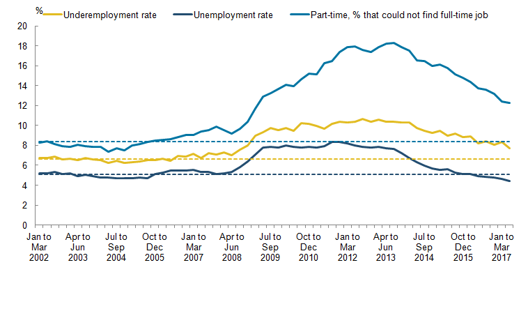
While the unemployment rate has recovered to its pre-downturn rate, the underemployment rate and the share of part-time workers who could not find a full-time job have not, suggesting that the unemployment rate may underestimate the degree of slack in the labour market.
In addition to the headline measures, unemployment rates by duration and by specific groups, including age and sex, can highlight groups of workers most vulnerable to joblessness and transitions back into employment.
Figure 3 shows the unemployment rates by duration between May to July 1993 and May to July 2017.
Figure 3: Unemployment rate by duration
UK, May to July 1993 to May to July 2017

Source: Office for National Statistics
Notes:
- The dotted lines represent the pre-downturn average from 2002 to 2007.
Download this image Figure 3: Unemployment rate by duration
.png (35.1 kB) .xls (183.3 kB)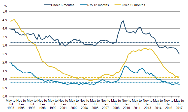
Short-term unemployment is defined as people who have been unemployed for less than six months. The short-term unemployment rate reached its pre-downturn minimum of 2.9% in the three months up to April 2001, down 0.4 percentage points from the same period a year earlier. It then increased sharply from early 2008, rising from 3.1% to 4.5% in the three months to July 2009. From this peak there was a steady downwards trend, which has continued beyond the pre-downturn minimum to a rate of 2.5%.
Medium-term unemployment is defined as people who have been unemployed for a length of 6 to 12 months. The medium-term unemployment rate gradually declined from 1993 and stagnated by early 1996, reaching its lowest point of 0.7% in the three months to July 2001. The medium-term unemployment rate increased sharply at the start of 2009 and was 0.7 percentage points higher in the three months leading up to July 2009 compared with the same time the previous year. After July 2009, the medium-term unemployment rate followed a general downwards trend with the exception of the three months between August 2011 and April 2012, where it rose by between 0.2 and 0.3 percentage points before returning to trend. The medium-term unemployment rate returned to its May to July 2005 low of 0.7% by May 2016 and has remained there since.
Long-term unemployment measures people who have been unemployed for longer than a year. The long-term unemployment rate rapidly decreased, from 4.4% of the labour force in February to April 1994, to 0.9% by the three months leading up to January 2005. After reaching its low point in 2005, the long-term unemployment rate more than tripled, reaching a peak of 2.8%, in the three months February to April 2013. The long-term unemployment rate has fallen rapidly since, reaching 1.1% in the three months to July 2017, a decrease of 1.7 percentage points from the same month four years before.
Short-term unemployment is, on a quarter-to-quarter basis, more volatile than medium- and long-term unemployment, although the rate has largely stayed within a 3 to 4% band. Medium-term unemployment follows a similar path to short-term unemployment, but at a much lower level. This could be due to the fact that most people either find jobs within 12 months, or leave the labour force.
Long-term unemployment is affected by the downturn later than short- and medium-term unemployment. People who became unemployed in 2008 firstly affected the short-term unemployment rate and only filtered through to long-term unemployment after a year. Whereas medium-term and long-term unemployment rates have returned to their pre-downturn levels, the short-term unemployment rate has continued to fall beyond that level and it will be interesting to see if that trend continues.
Figure 4 shows the unemployment rate as a share of the labour force for different age groups. The downturn led to a rise in the unemployment rate for all age groups, affecting younger people the most.
Figure 4: Unemployment rate by age
UK, August to October 1993 to May to July 2017
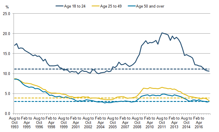
Source: Office for National Statistics
Notes:
- The dotted lines represent the pre-downturn average from 2002 to 2007.
Download this image Figure 4: Unemployment rate by age
.png (20.3 kB) .xls (41.5 kB)
The rate of unemployment for the 18 to 24 year old category averaged 11.1% between 2002 and 2007, and fell from 17.8% in the months leading up to April 1993 to 9.9% at its lowest point in mid-2001. After this, the unemployment rate for this age group followed a general upward trend and rose to a peak in July 2011 of 20.2%. It then fell to 10.6%, below its pre-downturn trend in the three months up to July 2017.
The 25 to 49 year old unemployment rate followed a downward trend from 1993, where it fell from 9% to 4% by April 2001. Before 2008, this rate of unemployment remained at around 4% and sharply increased in July 2009 to a rate 2.2 percentage points higher than in the same period a year earlier. The 25 to 49 year old unemployment rate then fell and was at a record low of 3.3% in the three months to July 2017. This age group follows a similar trend to the 50 and over age group.
50 and over year olds have the lowest unemployment rate when compared with the other age group categories, in part driven by the higher levels of inactivity. The unemployment rate of those aged 50 and over fell by 6.1 percentage points between early 1993 and October 2004. Prior to 2008, the lowest unemployment rate recorded for 50 and over year olds was 2.7% in the three months leading up to October 2004 and the highest, 8.8%, recorded in January 1993. The downturn had the smallest effect on this category, rising by only 1.7 percentage points from 3.0% in July 2008 to 4.7% in January 2010. Following this rise, the unemployment rate for 50 and over year olds followed a general downwards trend to 2.9% in April 2017.
Unemployment for 18 to 24 year olds is much more volatile than for the other two age categories. Possible reasons for this may be that older people have more established careers and skills that give them greater job security. In contrast, younger people are likely to be less qualified to do a job that requires experience and are more replaceable when economic shocks occur.
An hours-based measure: The Bell-Blanchflower approach
The current measure of underemployment focuses on those who are in employment already and so may not include the potential for those who are unemployed to work and only captures those who are already in work and claim they want more hours.
It is possible to bring measures of underemployment and unemployment together if certain assumptions are made. The Bell-Blanchflower underemployment index combines the underemployed and overemployed in terms of hours and includes the unemployed population. This gives a measure of underemployment at both the intensive (those who are in work and wish to work more hours) and extensive (those who are unemployed) margins of the labour market and combines them to give a ratio of net unemployed hours to total available hours.
The index is calculated using the following equation:
This index can be constructed from the variables in the Labour Force Survey (LFS) about number of extra hours individuals would like to work, how many fewer hours they would like to work and total actual hours worked in their main and second job. This index can be made more specific through filtering by individual characteristics available in the LFS.
There are assumptions that the unemployed desire the same amount of hours as the economy average and that labour is content at current wages. Figure 5 shows the published rates of underemployment and unemployment and the Bell-Blanchflower measure of underemployment. Averages from 2002 to 2007 are also shown.
Figure 5: Rates of underemployment, unemployment and the Bell-Blanchflower measure of underemployment
UK, January to March 2002 to January to March 2017
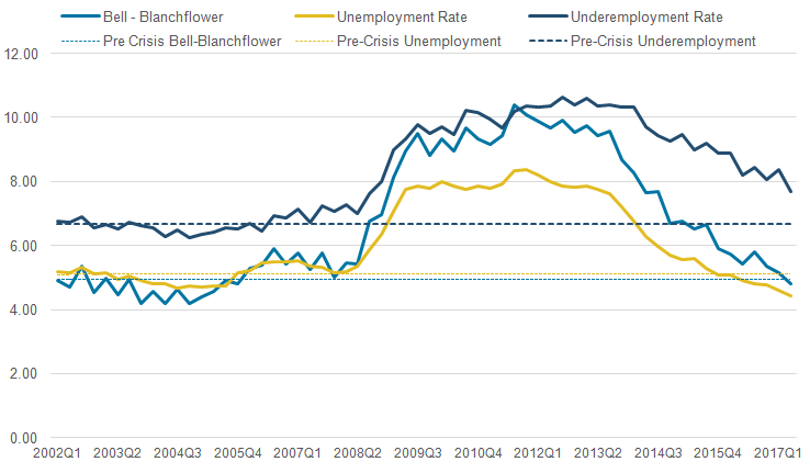
Source: HM Treasury calculations, Office for National Statistics (Labour Force Survey)
Notes:
- The dotted lines represent the pre-downturn average from 2002 to 2007.
Download this image Figure 5: Rates of underemployment, unemployment and the Bell-Blanchflower measure of underemployment
.png (34.6 kB) .xls (26.6 kB)
The Bell-Blanchflower underemployment rate generally followed the unemployment rate, but began to deviate after the economic downturn, following the published underemployment rate more closely. This may have been in part down to the rise in involuntary part-time working. This trend is somewhat reversed after 2013, as the Bell-Blanchflower rate has moved closer to the unemployment rate. This may be down to a combination of less pervasive involuntary part-time employment and a rise in overemployment.
Both the Bell-Blanchflower underemployment rate and the published underemployment rate suggest there was greater excess capacity in the economy than the unemployment rate would indicate. However, there has since been a decline in all these measures and the Bell-Blanchflower rate has now fallen to pre-downturn levels.
The US approach: capturing different dimensions of unemployment
This section uses the Labour Force Survey (LFS) to create a range of unemployment measures for the UK, based on the US approach. The US Bureau of Labor Statistics (BLS) currently produces six measures named U-1 to U-6. These include the International Labour Organisation’s (ILO) standard unemployment measure (U-3), as well as a number of broader measures, which successively add discouraged workers (U-4), the marginally attached (U-5) and the underemployed (U-6) to the unemployed. See Annex A for detailed definitions.
In the 1970s, Julius Shiskin, Commissioner of Labor Statistics in the United States, noted that, “no single way of measuring unemployment can satisfy all analytical or ideological interests.” Shiskin developed a range of unemployment measures which, after a redesign of the Current Population Survey (CPS) in 1994, led to the BLS’s current definitions U-1 to U-6.
The BLS measures are derived from the CPS which, due to differences in how the surveys are constructed, does not allow a direct mapping to the LFS. However, it is possible to construct measures that closely approximate the BLS definitions (Figure 6). We find that, as with the US statistics, the UK measures of unemployment move together quite closely, increasing through the downturn, before stabilising. In a time of record low unemployment rates, the story of falling unemployment holds across all measures.
Figure 6: Labour Force Survey-derived U-3 to U-6 rates for the UK
UK, April 2005 to April 2017
Source: Office for National Statistics
Download this chart Figure 6: Labour Force Survey-derived U-3 to U-6 rates for the UK
Image .csv .xlsU-4: Not searching for economic reasons (discouraged)
U-3 is defined as all people aged 16 and over who have actively sought work in the last four weeks and are available to start work in the next two weeks, or those who have found a job and are waiting to start in the next two weeks. U-4 adds discouraged workers to the standard ILO definition. “Discouraged” in the Current Population Survey (CPS) has a very specific meaning, namely that “persons must explicitly want and be available for work and have searched for work in the prior year, even though they are not currently looking for a job because they feel their search would be in vain” (Bregger and Haugen, 1995).
Unfortunately the Labour Force Survey (LFS) does not directly support this definition because we only know if a worker is currently “not searching because they feel their search would be in vain” and not whether they had previously attempted to search for a job. The LFS does offer some ability to track people over time because of its structure over five waves. However, as the questions concerning searching for a job refer only to the previous four weeks (as opposed to the quarter since the preceding survey) an individual might conceivably be classified as not searching in every sampling period but have nonetheless searched for a job in the previous year.
In Appendix B we include, as with the other unemployment measures, the relevant codes to upper and lower bound the LFS estimates exploiting the wave structure the LFS offers. “Economic reason” for discouragement in a CPS context is “believes no work available in line of work or area; could not find any work; lacks necessary schooling, training, skills, or experience; employers think too young or too old; or other types of discrimination.” (US Bureau of Labor Statistics, 2006).
Figure 7 shows the Bureau of Labor Statistics (BLS) measure of U-4 alongside the estimates from the LFS. We can see that since 2012 the two countries have been roughly in line.
Figure 7: Bureau of Labour Statistics U-4 rate for the US and Labour Force Survey-derived U-4 rate for the UK
US and UK, April 2005 to April 2017
Source: Office for National Statistics, US Bureau of Labour Statistics
Download this chart Figure 7: Bureau of Labour Statistics U-4 rate for the US and Labour Force Survey-derived U-4 rate for the UK
Image .csv .xlsBoth measures of U-4 appeared to be relatively stable pre-economic downturn. The main difference seems to be in the period from 2007 to 2010, when the increase in the unemployed and discouraged workers is much steeper in the US. This difference occurs across all measures of unemployment and may in part be driven by differences in government benefit policies in the two countries.
These differences were mentioned in a speech by K Forbes (Bank of England, 2016): “…the UK programmes were designed in a way that were more stringent but reduced marginal tax rates on both personal income and consumption, possibly increasing incentives to work for some people. UK programmes also reduced the costs to companies for employees, thereby providing an incentive to keep workers. In contrast, the changes to US benefit policy over this period slightly increased the cost to employers for workers, and substantially reduced the incentives to work – such as by easing the eligibility for benefits and increasing the implicit tax rate for moving from unemployment to work”.
This policy perhaps compounded already existing differences in labour flexibility between the two countries where it is generally perceived to be easier to both hire and fire employees in the US. The US and UK U-4 measures start to converge in 2010 and then follow the same downwards trend as the other measures of unemployment.
U-5: Not searching (marginally attached)
The cumulative definition continues with U-5 adding the marginally attached to the International Labour Organisation (ILO) unemployed and discouraged workers in U-4. The marginally attached are defined as those “who desire work but give other reasons for not searching (such as childcare problems, school, family responsibilities, or transportation problem). This group is made up of people who want a job, are available for work, and have looked for work within the past year. This group is generally described as having some marginal attachment to the labor force.”(US Bureau of Labor Statistics, 2006).
For the marginally attached definition we would select the variables “student” and “looking after family” in addition to the variables in the U-4 definition.
Figure 8 shows the Bureau of Labor Statistics (BLS) measure of U-5 against the estimates from the LFS. It seems that in general the U-5 rate was flatter in the half-decade post the economic downturn in the UK compared with the US; since then the rate has declined in both countries. In recent years there has been a trend of higher inactivity rates in the US, particularly those who are marginally attached as reflected in the differential between the UK and US U-5 rates. This is contrast to Figure 7 where we can see the U-4 rates track each other closely in the last half-decade.
Figure 8: Bureau of Labour Statistics U-5 rate for the US and Labour Force Survey-derived U-5 rate for the UK
US and UK, April 2005 to April 2017
Source: Office for National Statistics, US Bureau of Labour Statistics
Download this chart Figure 8: Bureau of Labour Statistics U-5 rate for the US and Labour Force Survey-derived U-5 rate for the UK
Image .csv .xlsU-6: Underemployment in part-time workers
U-6 continues the cumulative trend and adds total employed part-time for economic reasons, which in the Labour Force Survey (LFS) is “could not find a full-time job”, to U-5. Persons employed part-time for economic reasons (U-6 measure) are “those working less than 35 hours per week who want to work full-time, are available to do so, and gave an economic reason (their hours had been cut back or they were unable to find a full-time job) for working part-time. These individuals are sometimes referred to as involuntary part-time workers” (US Bureau of Labor Statistics, 2017).
Figure 9 shows the Bureau of Labor Statistics (BLS) measure of U-6 for the US against the estimates from the LFS.
Figure 9: Bureau of Labour Statistics U-6 rate for the US and Labour Force Survey-derived U-6 rate for the UK
US and UK, April 2005 to April 2017
Source: Office for National Statistics, US Bureau of Labour Statistics
Download this chart Figure 9: Bureau of Labour Statistics U-6 rate for the US and Labour Force Survey-derived U-6 rate for the UK
Image .csv .xlsU-6 displays the highest underemployment rate as expected when compared with the other unemployment measures as it sums the other measures of labour underutilisation. Both the LFS and BLS U-6 measures indicate a steep rise in unemployment and underemployment around the time of the economic downturn. The graph highlights a separation between the measures as the BLS U-6 measure rose above the U-6 LFS measure during the downturn, before returning to a lower rate than the U-6 LFS measure post the economic downturn. This follows U-4 and U-5 where the US rates peak above the UK rate during the economic downturn. The BLS measure is clearly more volatile throughout the period, with the highest peak in 2010 and lowest trough in 2006.
U-2: Hardship of unemployment
“U-2 is made up of persons who had become unemployed because they lost their jobs (rather than those who recently entered the job market or those who quit jobs to look for work). The thinking in this case was that those who lost their jobs (many perhaps without advance notice) likely experienced more financial difficulty than those who entered into unemployment largely of their own volition and on their own schedule” (Haugen, 2009).
The variables that capture U-2 from the Labour Force Survey (LFS) are related to various reasons for a person leaving their last job including being “made redundant” and a “temporary job which came to an end”. Figure 10 shows the Bureau of Labor Statistics (BLS) measure of U-2 against the estimates from the LFS.
Figure 10: Bureau of Labour Stastics U-2 rate for the US and Labour Force Survey-derived U-2 rate for the UK
US and UK, July 2013 to April 2017
Source: Office for National Statistics, US Bureau of Labour Statistics
Download this chart Figure 10: Bureau of Labour Stastics U-2 rate for the US and Labour Force Survey-derived U-2 rate for the UK
Image .csv .xlsConclusion
This analysis has highlighted some of the many ways labour force data can be used to measure labour underutilisation in the economy. The Bell-Blanchflower method shows how the traditional International Labour Organisation (ILO) unemployment rate does not fully capture the increase in labour market slack through underemployment, particularly in the half-decade post the 2008 economic downturn. Furthermore, breakdowns by both duration and age reveal significant differences in the profile of unemployment for 18 to 24 year olds and short-term unemployment compared with other demographics.
Despite these differences, we find measures of labour underutilisation using Labour Force Survey (LFS)-derived measures of U-3 to U-6 all quite closely co-move, suggesting our measures are robust against any definitional differences between one specific measure and another. These measures together imply that labour underutilisation in the UK is now broadly at the same level or slightly below the level before the economic downturn. This is similar to the picture seen in the US using the U-3 to U-6 measures of underutilisation, which have also largely fallen back to pre-downturn levels.
References
Bregger, J E and Haugen, S E (1995). BLS introduces new range of alternative unemployment measures, Monthly Labor Review, Volume 118, Number 10, pages 19 to 26.
Bell, D N F and Blanchflower, D G (2013). Underemployment in the UK revisited. National Institute Economic Review, Number 234.
Forbes, K (2016). A tale of two labour markets: the UK and US. External MPC member, Bank of England speech citing, Mulligan, Casey, 2015. “Fiscal Policies and the Prices of Labor: A Comparison of the UK and US” Journal of Labor Policy.
Haugen, S E (2009) Measures of Labor Underutilization from the Current Population Survey. US Bureau of Labor Statistics Working Papers.
Office for National Statistics (2017), Labour Force Survey User Guide Version 2.
US Bureau of Labor Statistics. (2006). Design and Methodology Current Population Survey.
US Bureau of Labor Statistics (2017), Local Area Unemployment Statistics.
Walling A and Clancy G (2010) ‘Underemployment in the UK Labour Market’, Economic and Labour Market Review, Volume 4, Issue 2, pages 16 to 24.
Notes for: Measuring labour market underutilisation
The underemployment rate is published quarterly by ONS in Table EMP16. The latest data were published in August 2017 for Quarter 2 (Apr to June) 2017.
In the three months to November 2011.
5. Results of the consultation on changes to the ONS GDP release schedule
Office for National Statistics (ONS) launched a consultation on 13 July 2017 proposing an alternative model for the publication of gross domestic product (GDP) estimates; the full details of the model can be found in the consultation document.
In summary, this model would give two estimates of quarterly GDP using data from all three of the output, income and expenditure approaches around six weeks and 13 weeks after the end of the preceding quarter. This would be a change from three estimates of quarterly GDP, published four, eight and 13 weeks after the end of the preceding quarter. In addition, the Index of Services publication would be moved two weeks earlier to become part of the Short Term Economic Indicator theme day, enabling the publication of monthly GDP estimates that would include both a three-month rolling estimate and an estimate for the latest month.
The aim of the consultation was to get users' views on the proposals, including how these might impact on their uses of GDP data and whether or not they felt that the proposed changes would be an improvement overall to ONS's current GDP publication schedule.
The consultation closed on 14 September 2017 and we have now published a response to this consultation. In summary, the clear majority of respondents were in favour of the proposed changes to the GDP publication model, saying that the higher quality first estimate of GDP along with the early view of income and expenditure data will mean the figures are more reliable and helpful, and ultimately lead to greater confidence in the GDP estimates. However, a small number of respondents expressed concerns over the loss of timeliness in the proposed first estimate of GDP. Furthermore, some respondents expressed concerns over the implications of monthly GDP (based on the output measure) estimates. For example, there were concerns that the availability of both monthly and quarterly GDP estimates could result in confusion and that monthly GDP had the potential to be misinterpreted.
Given the largely positive response to our proposals, we will move to using the new GDP publishing model in 2018, with the first estimate of monthly GDP (for the reference month of May) being introduced in July 2018 and the first quarterly GDP estimate (for Quarter 2 (Apr to June) 2018) under the new model being introduced in August 2018.
Ahead of this move, we will aim to take forward the following actions:
we will develop a package of products to be released as part of the new monthly and quarterly publications under the new model in collaboration with users, with the aim of providing a clear and coherent picture of economic activity
we will take a number of steps to ensure that any negative impact on data content in the first estimate of GDP is minimised; for example, we will be reviewing our survey and broader data processing timetables as well as our estimation and forecasting methods
we will publish an article in spring 2018 explaining the changes to the publication model in more detail, the products that we will produce under the new model and a clear schedule of publication dates from the date of implementation
6. Understanding the UK economy
This section of the Economic review provides an overview of the performance of the UK economy using data published by Office for National Statistics (ONS). It has a particular focus on the most recently published data for Quarter 2 (Apr to June) 2017 covering gross domestic product (GDP) and productivity. It also covers analysis of a range of measures of spare capacity in the labour market and the latest estimates of real household disposable income by household type for 2016 to 2017.
GDP growth
The Quarterly national accounts (QNA), released on 29 September 2017, show that the UK economy grew by 0.3% in Quarter 2 (Apr to June) 2017, the same rate as in Quarter 1 (Jan to Mar) 2017. Figure 11 shows that GDP growth has slowed in the first two quarters of 2017, while the economy has grown 1.5% compared with the same quarter a year ago – the slowest rate since Quarter 1 2013.
Figure 11: Gross domestic product (GDP) growth, quarter-on-quarter and quarter on same quarter a year ago growth rate
UK, Quarter 1 (Jan to Mar) 2008 to Quarter 2 (Apr to June) 2017
Source: Office for National Statistics
Notes:
- Q1 refers to Quarter 1 (Jan to Mar), Q2 refers to Quarter 2 (Apr to Jun), Q3 refers to Quarter 3 (Jul to Sep) and Q4 refers to Quarter 4 (Oct to Dec).
Download this chart Figure 11: Gross domestic product (GDP) growth, quarter-on-quarter and quarter on same quarter a year ago growth rate
Image .csv .xlsThe output measure of GDP increased by 0.3% in Quarter 2 2017, driven by a 0.4% rise in services output, while construction and production both detracted from growth, falling by 0.5% and 0.3% respectively. While output in the services sector has been the main driver of recent growth in the UK economy, activity in the sector has slowed in the first two quarters of 2017. This is partly due to a decline in the output of “consumer-focused” industries, such as retail trade, with output remaining broadly flat in the first half of 2017 following several years of strong growth.
The expenditure measure of GDP also increased by 0.3% in Quarter 2 2017, with private consumption, government consumption and net trade contributing positively to growth, while gross capital formation detracted from growth. The largest quarterly growth contribution came from net trade (0.4 percentage points), reflecting a 1.7% increase in exports, while imports only increased by 0.2%. On a quarter on same quarter a year ago basis, the contribution from net trade has gradually increased over the past three quarters, from zero contribution in Quarter 4 (Oct to Dec) 2016 to 0.4 percentage points in Quarter 2 2017, following four consecutive negative contributions.
Growth in household final consumption expenditure (HHFCE) slowed to 0.2% in Quarter 2 2017, the slowest quarterly growth rate since Quarter 4 2014. Private consumption has been relatively subdued in recent periods, with its contribution to quarter-on-year GDP growth declining from 2.0 percentage points in Quarter 2 2016 to 1.0 percentage point in Quarter 2 2017. These latest figures reflect a revised quarterly growth profile for HHFCE in 2016, with a stronger first half of the year and a weaker second half of the year (downwards revision of 0.2 and 0.3 percentage points in Quarter 3 (July to Sept) and Quarter 4 respectively).
Gross fixed capital formation (GFCF) also contributed positively to quarterly GDP growth in Quarter 2 2017, increasing by 0.6%, with business investment – the largest component of GFCF – growing by 0.5%. The latest figures show a stronger growth profile for business investment across 2016 and the first half of 2017, with upward revisions of between 0.1 and 1.0 percentage points in each of the last six quarters. Despite these revisions, business investment remains relatively weak overall, declining by 0.4% in 2016 compared with growth of 3.7% in 2015.
Household saving ratio recovers from previous low to reach 5.4% in Quarter 2 2017
The Quarterly sector and financial accounts provide further information about the UK economy, including a new household only saving ratio. Previously, ONS has only published a combined households and non-profit institutions serving households (NPISH) saving ratio, but these accounts will be published separately as of Blue Book 2017.
The household saving ratio rose from 3.8% in Quarter 1 (Jan to Mar) 2017 to 5.4% in Quarter 2 (Apr to June) 2017 – the largest quarterly increase in the saving ratio since Quarter 2 2013. This increase reflected relatively strong growth in real household disposable income (RHDI), driven primarily by a fall in taxes, coupled with slowing growth in household consumption. RHDI increased by 1.6% in Quarter 2 2017 following six quarters of relatively flat or negative growth. However, it should be noted that the sharp fall in Quarter 1 2017 may in part be due to the timing of tax payments.
The latest figures include significant revisions due to improvements in the measurement of dividend income, which have led to an upwards revision of the households and NPISH saving ratio by an average of 0.9 percentage points from 1997 to 2016, with a revised 2016 estimate of 7.1% (revised up from 5.2%). The households and NPISH saving ratio has been on a declining trend since Quarter 3 (July to Sept) 2015, falling sharply from 9.7% to 4.0% in Quarter 1 2017. This is a slightly more marked decline compared with previously published estimates of the households and NPISH saving ratio, which saw the ratio fall from 6.6% to 1.7% over the same period.
The current account deficit widens to 4.6% of GDP in Quarter 2
The UK’s current account deficit increased in Quarter 2 (Apr to June) 2017 to 4.6% of GDP from a newly revised figure of 4.4% in Quarter 1 (Jan to Mar) 2017. There have been significant revisions to the current account deficit, which mainly reflect methodological improvements to the payments of corporate bonds interest. As a result, the current account deficit in 2016 has been revised from 4.4% to 5.9%, which has almost entirely been driven by revisions to investment income. However, recent trends remain broadly similar to previously published estimates with the deficit widening from 2.4% of GDP in 2011 to 5.9% in 2016. This article covers the revisions to the current account balance in more detail.
Measures of labour market spare capacity
Figure 12 examines a broad range of measures, which can be used to judge the degree of spare capacity in the labour market. The latest data represent Quarter 2 (Apr to June) 2017.
Figure 12: Measures of spare capacity in the labour market, relative to 2002 to 2007 average
UK

Source: Office for National Statistics
Notes:
- Variables which capture the degree of capacity utilisation are marked with an * are inverted to give a measure of spare capacity, and all variables are standardised and shown relative to their 2002 to 2007 average.
Download this image Figure 12: Measures of spare capacity in the labour market, relative to 2002 to 2007 average
.png (17.8 kB) .xls (31.7 kB)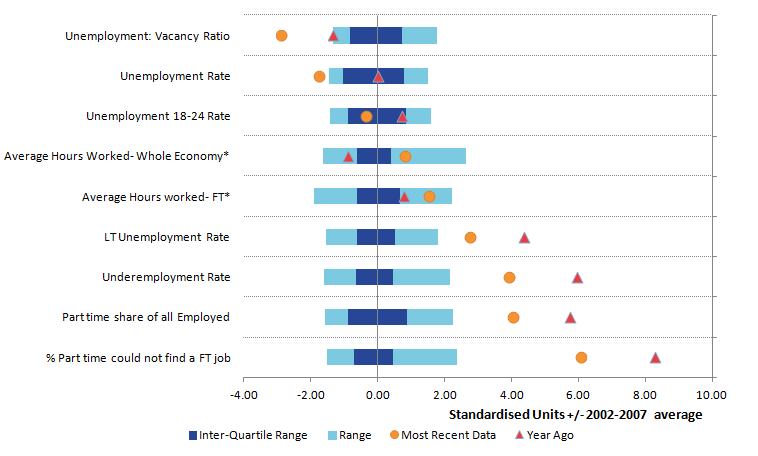
Data to the left of the vertical axis (negative points relative to the mean) indicate lower-than-average spare capacity, while points to the right of the axis indicate higher-than-average spare capacity. Dots indicate the most recent observation and triangles indicate the variables’ values a year ago.
Comparing data now and a year ago, Figure 12 shows that most variables of spare capacity in the labour market show a shift to the left over the last year suggesting broad-based labour market tightening. Particularly, the unemployment rate and unemployment to vacancy ratio suggest the labour market is currently relatively tight and near or below the minimum points of these data since January 2002.
Some measures raise questions about structural changes in the UK labour market. In particular, the proportion of part-time workers in the economy and those who cannot find full-time work is markedly above the long-run average prior to the downturn, suggesting that there may be resources in the labour market that firms can mobilise to increase output. However, this may also reflect a shift in preferences to part-time work and there has been a decrease in those part-time workers who could not find a full-time job over the last year.
Similarly, the underemployment rate – which captures employees who are available and would like to work more hours – at 7.7% in Quarter 2 2017, remains above its pre-crisis average of 6.7%, though has decreased from its Quarter 3 (July to Sept) 2012 peak of 10.6%. This has decreased over the past year as the average hours worked in the economy has increased. Further information on alternative measures of underemployment is given in Section 4 of this Economic review.
Productivity and foreign direct investment
The weakness of the UK’s productivity performance since the economic downturn constitutes a “puzzle” for academics and policy-makers alike. New estimates indicate that in 2016, UK productivity levels were 15.1% below the rest of the G7 advanced economies on an output per hour basis. Furthermore, new estimates of international comparisons of productivity by industry highlight that this gap is broad-based, with the UK towards the back of the field in all high-level industry groups when compared with France, Germany and Italy.
There is much policy interest in this area and a large literature is now devoted to the pursuit of explaining this productivity “puzzle”. One way that we can try to further understand the UK’s productivity performance relative to other comparable economies is to examine the relationship in the UK economy between foreign direct investment (FDI) and productivity.
The link between FDI and productivity is the subject of a large academic literature and holds considerable policy-maker interest. Firms that attract flows of investment from overseas corporations (inwards investment) are widely thought to benefit from increased investment, access to technology and expertise, as well as stronger management and organisational practices, while firms that undertake investment overseas (outwards investment) are thought to benefit from access to larger markets.
A considerable proportion of the literature is also devoted to identifying the indirect impact of FDI flows on domestic firms. The literature posits that new FDI in an industry can have an impact on domestic firms in the same industry (horizontal spillovers) or on firms in the supply chain (vertical spillovers), through a wide range of transmission mechanisms.
Flows of FDI are consequently thought to have considerable potential to affect firm-level productivity. In new ONS analysis, we link firm-level FDI data on immediate foreign ownership to firm-level responses in the Annual Business Survey (ABS) for the 2012 to 2015 period to explore the composition of firms with FDI relationships (which we term FDI firms) in terms of their size and industry. Unlike much of the literature that looks at ultimate foreign ownership, we are able to distinguish between firms with inward FDI relationships – receiving investment from overseas corporations – and outward FDI relationships – investing in overseas corporations – which may have different characteristics.
Despite accounting for a relatively small share of firms, our linked dataset shows that firms with an FDI relationship compared with non-FDI firms account for a disproportionately large share of total annual turnover of around 37% and around 20% of total employment over the period.
The first step in this productivity analysis is to compare the average productivity levels of firms with and without an FDI relationship. Table 1 shows the mean and median real productivity levels1 for FDI and non-FDI firms between 2012 and 2015. We find the level of productivity of the median FDI firm to be at least twice that of the non-FDI firm, while the mean productivity level for the FDI firms was at least three times that of the non-FDI firms. We observe similar ratios when we compare the productivity of the average non-FDI firm with the average productivity of firms with either an inward or outward FDI relationship.
Table 1: Mean and median of real labour productivity by foreign direct investment status, Great Britain, 2012 to 2015
| £, 000 per worker per year | |||||||||||||||
| Median | Mean | Of which mean of: | |||||||||||||
| No FDI | FDI | No FDI | FDI | Inward FDI | Outward FDI | ||||||||||
| 2012 | 25.3 | 61.6 | 44.3 | 123.0 | 125.5 | 119.2 | |||||||||
| 2013 | 26.5 | 53.4 | 47.5 | 156.8 | 159.2 | 161.7 | |||||||||
| 2014 | 27.1 | 63.3 | 48.6 | 153.4 | 165.7 | 109.0 | |||||||||
| 2015 | 27.7 | 59.3 | 48.3 | 172.7 | 185.6 | 140.3 | |||||||||
| Source: Office for National Statistics | |||||||||||||||
| Notes: | |||||||||||||||
| 1. Labour productivity is calculated as GVA/employment, in 2015 constant prices. | |||||||||||||||
| 2. FDI includes firms with either inward or outward FDI relationship. In the final two columns, FDI has been split between these different relationships. | |||||||||||||||
| 3. Includes all firms covered by the Annual Business Survey (ABS) excluding section K (Financial and Insurance Activities), weighted to reflect the population of firms. | |||||||||||||||
Download this table Table 1: Mean and median of real labour productivity by foreign direct investment status, Great Britain, 2012 to 2015
.xls (29.7 kB)Figure 13 – which presents the distribution of real productivity for FDI and non-FDI firms across high-level industry groups in 2015 – highlights several striking features of the performance of FDI and non-FDI firms.
Figure 13: Labour productivity distribution by industry and foreign direct investment status
Great Britain, 2015

Source: Office for National Statistics
Notes:
- Tails (lines) represent the 10th to 90th percentiles, boxes represent the inter-quartile ranges, and dots show medians.
- Labour productivity is calculated as GVA/employment, in 2015 constant prices.
- FDI includes firms with either inward or outward FDI relationship.
- Includes all firms covered by the Annual Business Survey (ABS) excluding sections K (Financial and Insurance Activities).
- Firms can have negative levels of value added per worker in specific periods when they report larger values of purchases than their total turnover.
- Key: ABDE – Non-manufacturing production: A (Agriculture, Forestry and Fishing), B (Mining and Quarrying), D (Electricity, Gas, Steam and Air Conditioning Supply) and E (Water Supply; Sewerage, Waste Management and Remediation Activities). C – Manufacturing F – Construction G&I – Distribution, Hotels & Restaurants Services: G (Wholesale and Retail Trade; Repair of Motor Vehicles and Motorcycles) and I (Accommodation and Food Service Activities). H&J – Transport, Storage & Communication Services: H (Transportation and Storage) and J (Information and Communication). LMN – Business Services & Real Estate: L (Real Estate Activities), M (Professional, Scientific and Technical Activities) and N (Administrative and Support Service Activities). PQRS – Other Services: P (Education), Q (Human Health and Social Work Activities), R (Arts, Entertainment and Recreation) and S (Other Service Activities).
Download this image Figure 13: Labour productivity distribution by industry and foreign direct investment status
.png (30.6 kB) .xls (23.6 kB)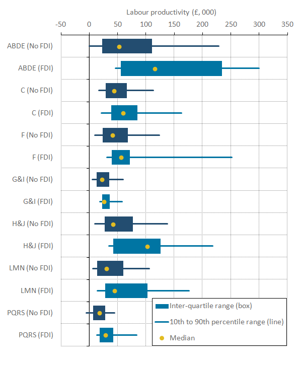
Firstly, it is apparent that median labour productivity was higher for FDI firms than for domestically-orientated firms in all these high-level industries. This difference was particularly marked in the production industries (ABDE) and transport, storage and communication services (H and J).
Secondly, the gap in productivity between the 10th percentile – the least productive firms – and the 90th percentile – the most productive – varies markedly across industries, but is typically wider for FDI firms. This suggests that while average productivity among FDI firms is higher, they also have a wider dispersion of productivity levels.
Finally, all three summary statistics – the median, inter-quartile range and the 10th to 90th percentiles – are shifted to the right for FDI firms relative to non-FDI firms. This suggests that while industry composition may be important in explaining the average performance of FDI firms relative to non-FDI firms, there also appears to be some additional premium associated with FDI status within industry.
Since FDI status is non-random we employ regression analysis to estimate the robustness of the previous findings, examining the link between FDI and productivity while controlling for variations in size, industry, time and region. Figure 14 shows the coefficients on our FDI status by industry interactions from this analysis. The association between industry and labour productivity for domestic firms is shown in (darker) blue, while the productivity premium of FDI firms in specific industries is shown as the difference between the (lighter) yellow and (darker) blue points. This presentation shows that the FDI premium is positive across the range of industries presented here, but varies across industries. This is consistent with the industry distributions presented in Table 1.
However, when we test the significance of these variations, only two industries have a statistically significant FDI premium for the FDI and industry interactions. This means that the productivity performance of FDI firms are statistically different from non-FDI firms in these two industries, which are mining and quarrying (B) and electricity, gas, steam and air conditioning supply (D) (Figure 14). These industries will nevertheless be important contributors to the productivity performance of the economy.
Figure 14: Coefficients of interaction between foreign direct investment status and industry
Great Britain, 2012 to 2015

Source: Office for National Statistics
Notes:
- Each data point represents the coeffecient on the interaction term between FDI relationship (FDI or No FDI) and industry.
- The R-squared for this regression is 0.066. There are 172668 observations. Time dummies, region dummies, size dummies are all included in the regression.
- We used 17 Industry dummies, based on the 2007 Standard Industry Classification, covering Sections A to S with the exclusion of Sections K (Financial and Insurance Activities) and Section O (Public Administration and Defence). Section A (Agriculture, Forestry and Fishing) is used as the base industry.
- Industries are based on the 2007 Standard Industrial Classification (SIC2007).
- A constant is included in all regressions, and all results are weighted.
- FDI includes firms with either inward or outward FDI relationship. 7. The time period covers 2012 to 2015.
Download this image Figure 14: Coefficients of interaction between foreign direct investment status and industry
.png (16.9 kB) .xls (39.4 kB)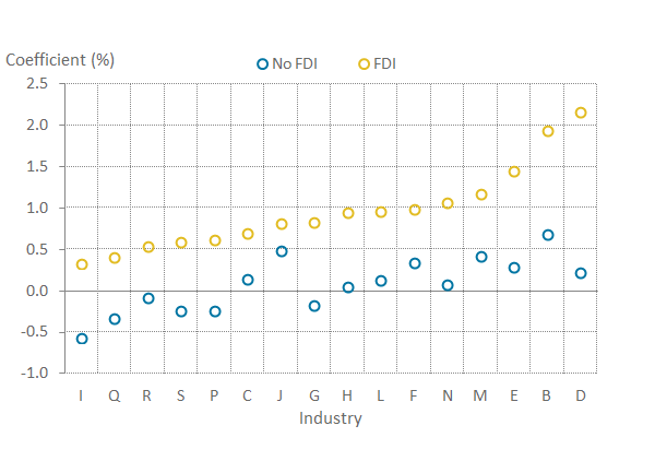
These results take us a step further in understanding the nature of firm performance at the top end of the productivity distribution in particular. However, they are only a first step and there are several areas for further analysis.
Firstly, we intend to develop this work to examine the relationship between FDI presence and the productivity of domestic firms.
Second, we plan to increase the granularity of our analysis to examine – in particular – whether there is more variation at the detailed industry level than presented here.
Thirdly, we plan to extend our analysis to consider the impact of FDI status and presence on measures of multi-factor productivity, which can better account for the contribution of capital to output.
Finally, further work in this area will involve exploring the relatively low productivity micro-FDI firms, with particular focus on new (greenfield) FDI and the links between FDI, trade and productivity.
Economic well-being: real median equivalised disposable income
To understand properly changes in households' economic well-being, it is important to have measures that reflect the experience of the typical household, such as median household disposable income. Median household income represents the middle of the income distribution and provides a good indication of the “typical” household.
In order for us to meet the considerable user demand for more timely data on household incomes, we have developed this set of Experimental Statistics, produced using so-called “nowcasting” techniques. In October 2015, we started producing provisional estimates for measures of the distribution of household income using “nowcasting” techniques. Unlike forecasting, which relies heavily on projections and assumptions about the future economic situation, nowcasting uses data that are already available for the period of study. The Nowcasting household income in the UK release provides more detail on the methodology.
Figure 15 presents the provisional estimates of median household disposable income for the financial year ending 2017, for all households as well as retired and non-retired households.
Figure 15: Median equivalised household disposable income by household type
UK, 1977 to financial year ending 2017
Source: Office for National Statistics
Notes:
- Households are ranked by their equivalised disposable incomes, using the modified-OECD scale.
- 1994/95 represents the financial year ending 1995, and similarly through to 2016/17, which represents the financial year ending 2017.
- Income figures have been deflated to 2016/17 prices using our Consumer Price Index which includes owner occupiers' housing costs.
Download this chart Figure 15: Median equivalised household disposable income by household type
Image .csv .xlsThe median household disposable income for all households, during the financial year ending 2017 was £27,200, an increase of 1.8% compared with a year ago. However, the median income for retired and non-retired households was £22,000 and £29,000 respectively, for the financial year ending 2017, increasing by 1.7% and 1.5% respectively, compared with a year ago.
Despite the similar growth rate, described previously for the retired and non-retired households, their pattern of change since the start of the economic downturn has been very different. The median income for retired households increased by an average 1.4% per year between the financial year ending 2008 and the financial year ending 2017. On the other hand, the median income for non-retired households remained almost flat for this time period, with an average growth rate of 0.0% per year.
A number of factors have driven the consistent growth in the incomes of retired households since financial year ending 2008. One factor is a rise in the number of households reporting receipts from private pensions or annuities and another is an increase in average income from the State Pension, due in part to the effect of the “triple lock”. The triple lock guarantees that the basic State Pension will rise by a minimum of either 2.5%, the rate of inflation or average earnings growth, whichever is largest.
The fall in average disposable income for non-retired households after the economic downturn reflected a fall in income from employment (including self-employment). Similarly, it is earnings growth at the household level, in part due to rising employment levels, that has been the main driver of the most recent increases in average income for non-retired households.
Figure 16 presents the effects of taxes and benefits on households’ income for the financial year ending 2016, by age group.
Figure 16: The effects of taxes and benefits by age of the main earner in the household
UK, financial year ending 2016
Source: Office for National Statistics
Download this chart Figure 16: The effects of taxes and benefits by age of the main earner in the household
Image .csv .xlsOn average, in the financial year ending 2016, households with a household head aged 65 and over received more in benefits (including in-kind benefits) than they paid in taxes (direct and indirect taxes). For households with a household head aged 65 and over, the State Pension and Pension Credit was the largest component of the benefits received, followed by the benefit derived from the National Health Service, which becomes increasingly important as age increases.
On the other hand, households with a household head aged between 25 and 64 paid more in taxes (direct and indirect) than they received in benefits (including in-kind benefits). Those in their late 40s on average paid the most in taxes (£18,300). Households where the main earner was in their early 40s, whilst also paying a lot in taxes (£17,800 on average), also received the highest average amount in benefits of those below State Pension age (£15,400), due mainly to the benefit in kind received from state-provided education (£6,900). More details about the effect of taxes and benefits on inequality can be found in the Effects of taxes and benefits on UK household income release.
Notes for: Understanding the UK economy
- The deflators used here are experimental industry level deflators, based to 2015. They are a mixture of product and implied industry (division) level deflators.
7. Annex A
Annex A: Definitions of US Bureau of Labor Statisitcs U-1 to U-6
Back to table of contents8. Annex B
Annex B: Definitions of U-2 to U-6 using Labour Force Survey variables
Back to table of contents9. Annex C
Annex C: Recent Economic statistics analytical publications by ONS
Back to table of contents10. Annex D
Table 2: UK demand side indicators
| 2015 | 2016 | 2016 | 2017 | 2017 | 2017 | 2017 | 2017 | 2017 | 2017 | ||
|---|---|---|---|---|---|---|---|---|---|---|---|
| Q4 | Q1 | Q2 | Apr | May | Jun | Jul | Aug | ||||
| GDP | 2.3 | 1.8 | 0.6 | 0.3 | 0.3 | ||||||
| Index of Services | |||||||||||
| All Services1 | 2.6 | 2.5 | 0.6 | 0.1 | 0.4 | -0.1 | 0.3 | 0.3 | -0.2 | .. | |
| Business Services & Finance1 | 2.4 | 1.7 | 0.3 | 0.6 | 0.1 | -0.4 | 0.5 | 0.2 | 0.0 | .. | |
| Government & Other1 | 0.9 | 1.3 | 0.1 | 0.4 | 0.3 | 0.2 | 0.0 | 0.0 | 0.0 | .. | |
| Distribution, Hotels & Rest1 | 4.7 | 5.1 | 1.9 | -0.8 | 0.9 | 0.5 | 0.1 | 0.4 | 0.0 | .. | |
| Transport,Stor. & Comms1 | 4.0 | 4.1 | 0.7 | -0.8 | 1.2 | -0.7 | 0.5 | 1.3 | -1.6 | .. | |
| Index of Production | |||||||||||
| All Production1 | 1.2 | 1.3 | 0.7 | 0.3 | -0.3 | 0.2 | 0.1 | 0.4 | 0.3 | 0.2 | |
| Manufacturing1 | 0.0 | 0.9 | 1.3 | 0.6 | -0.3 | -0.1 | 0.1 | 0.2 | 0.4 | 0.4 | |
| Mining & Quarrying1 | 8.1 | -1.0 | -8.8 | 2.9 | 0.6 | -1.3 | 0.4 | 3.8 | -1.1 | -2.0 | |
| Construction1 | 4.4 | 3.8 | 2.2 | 1.9 | -0.5 | ||||||
| Retail Sales Index | |||||||||||
| All Retailing1 | 4.4 | 4.9 | 0.9 | -1.4 | 1.5 | 2.5 | -0.9 | 0.2 | 0.6 | 1.0 | |
| All Retailing excl Fuel1 | 4.0 | 4.7 | 1.1 | -1.2 | 1.0 | 2.1 | -1.4 | 0.6 | 0.7 | 1.0 | |
| Predom. Food Stores1 | 2.2 | 3.6 | -0.1 | -0.6 | 0.0 | 1.1 | -0.9 | -1.2 | 1.9 | 0.2 | |
| Predom. Non-Food Stores1 | 4.3 | 3.6 | 1.1 | -1.7 | 1.4 | 2.7 | -2 | 1.8 | 0.0 | 0.9 | |
| Non-Store Retailing1 | 13.1 | 16.7 | 7.2 | -1.6 | 3.9 | 3.7 | -1.3 | 2.6 | -0.5 | 5.0 | |
| Trade | |||||||||||
| Balance2 3 | -32.4 | -43 | -7.3 | -8.9 | -6.5 | -1.1 | -2 | -3.3 | -4.2 | -5.6 | |
| Exports4 | -0.3 | 5.9 | 7.8 | 1.3 | 2.2 | 0.8 | 0.3 | -1.1 | -1.4 | 0.6 | |
| Imports4 | -1.1 | 7.5 | 0.9 | 2.2 | 0.5 | -4.3 | 2.1 | 1.4 | 0.3 | 3.2 | |
| Public Sector Finances | |||||||||||
| PSNB-ex5 | -20.1 | -20.7 | -7.6 | -11.6 | 2.2 | 0.3 | 0.2 | 1.7 | -1.2 | -1.3 | |
| PSND-ex as a % GD | 84.6 | 86.0 | 86.0 | 86.8 | 87.7 | 86.2 | 86.8 | 87.7 | 87.6 | 88.0 | |
| Source: Office for National Statistics | |||||||||||
| Notes: | |||||||||||
| 1. Percentage change on previous period, seasonally adjusted, CVM. | |||||||||||
| 2. Levels, seasonally adjusted, CP. | |||||||||||
| 3. Expressed in £ billion. | |||||||||||
| 4. Percentage change on previous period, seasonally adjusted, CP. | |||||||||||
| 5. Public Sector net borrowing, excluding the impact of financial interventions. Level change on previous period a year ago, not seasonally adjusted. | |||||||||||
| 6. Public Sector net borrowing, excluding the impact of financial interventions, the Royal Mail Pension Plan and transfers from the Bank of England Asset Purchase Facility. Level change on previous period a year ago, not seasonally adjusted, CP, Financial Year. | |||||||||||
| 7. Where applicable, CDIDs refer to the index series on which the growth rates are based. | |||||||||||
Download this table Table 2: UK demand side indicators
.xls (31.2 kB)
Table 3: UK supply side indicators
| 2015 | 2016 | 2016 | 2017 | 2017 | 2017 | 2017 | 2017 | 2017 | 2017 | 2017 | ||
|---|---|---|---|---|---|---|---|---|---|---|---|---|
| Q4 | Q1 | Q2 | Apr | May | Jun | Jul | Aug | Sept | ||||
| Labour Market | ||||||||||||
| Employment Rate1,2 | 73.7 | 74.4 | 74.6 | 74.8 | 75.1 | 74.9 | 75.1 | 75.3 | 75.1 | .. | ||
| Unemployment Rate1 3 | 5.4 | 4.9 | 4.8 | 4.6 | 4.4 | 4.5 | 4.4 | 4.3 | 4.3 | .. | ||
| Inactivity Rate1 4 | 22 | 21.7 | 21.6 | 21.5 | 21.3 | 21.5 | 21.3 | 21.2 | 21.4 | .. | ||
| Claimant Count Rate7 | 2.3 | 2.2 | 2.2 | 2.2 | 2.3 | 2.3 | 2.3 | 2.3 | 2.3 | 2.3 | 2.3 | |
| Total Weekly Earnings6 | 483 | 495 | 499 | 500 | 504 | 504 | 504 | 506 | 505 | .. | ||
| CPI | ||||||||||||
| All-item CPI5 | 0.0 | 0.7 | 1.2 | 2.1 | 2.7 | 2.7 | 2.9 | 2.6 | 2.6 | 2.9 | 3.0 | |
| Transport5 | -2.1 | 0.5 | 2.8 | 5.8 | 4.9 | 6.4 | 4.7 | 3.7 | 3.1 | 3.2 | 4.2 | |
| Recreation &Culture5 | -0.6 | 0.4 | 0.6 | 1.4 | 1.6 | 1 | 2.3 | 1.5 | 1.4 | 1.8 | 2.5 | |
| Utilities5 | 0.5 | 0.2 | 0.3 | 0.8 | 1.9 | 1.6 | 2.1 | 2 | 2.2 | 2.2 | 2.1 | |
| Food & Non-alcoh Bev5 | -2.6 | -2.4 | -1.8 | 0.3 | 2 | 1.5 | 2.1 | 2.3 | 2.6 | 2.1 | 3.0 | |
| PPI | ||||||||||||
| Input8 | -12.8 | 2 | 14.1 | 18.6 | 12.5 | 15.3 | 12.1 | 9.9 | 6.3 | 8.4 | 8.4 | |
| Output8 | -1.7 | 0.5 | 2.5 | 3.7 | 3.5 | 3.6 | 3.6 | 3.3 | 3.2 | 3.4 | 3.3 | |
| HPI | 6.0 | 7.0 | 5.4 | 4.4 | 4.7 | 4.8 | 4.4 | 4.9 | 4.5 | 5.0 | .. | |
| Source: Office for National Statistics | ||||||||||||
| Notes: | ||||||||||||
| 1. Monthly data shows a three month rolling average (e.g. The figure for June is the mid-point of the 3 month average May to July). | ||||||||||||
| 2. Headline employment figure is the number of people aged 16-64 in employment divided by the total population 16-64. | ||||||||||||
| 3. Headline employment figure is the number of unemployed people (aged 16 and over) divided by the economically active population (aged 16 and over). | ||||||||||||
| 4. Headline inactivity figure is the number of economically active people aged 16 to 64 divided by the 16 to 64 population. | ||||||||||||
| 5. Percentage change on previous period a year ago, seasonally adjusted. | ||||||||||||
| 6. Estimates of total pay include bonuses but exclude arrears of pay (£). | ||||||||||||
| 7. Calculated by JSA claimants divided by claimant count plus workforce jobs. | ||||||||||||
| 8. Percentage change on previous period a year ago, non-seasonally adjusted. | ||||||||||||