Table of contents
- Authors
- Main points
- Introduction
- Estimating the value of service exports by destination from different parts of Great Britain
- Measuring the impact of the depreciation of sterling on the current account and the international investment position
- The UK experience of global commodity price movements
- Consultation on changes to the ONS gross domestic product release schedule
- Understanding the UK economy
- Effect on gross domestic product and other economic statistics from improvements being introduced in Blue Book and Pink Book 2017
- Annex A - Weights for IMF and UK-based commodity indices
- Annex B - Demand and supply indicators
2. Main points
Service exports by destination
- London dominated the absolute value of service exports to the EU accounting for 42% of all EU service exports from Great Britain in 2015.
- Although exporting smaller values of services compared to London, the regions with the highest proportion of their exports sent to the EU were: the North East (50%), the West Midlands (47%), the South East (45%) and Yorkshire and The Humber (40%).
- The North West dominated in the export of services in the manufacturing sector with 53% of its exports going to Asia.
Impact of sterling on the current account and international investment position
- The effective export price (UK export price adjusted for exchange rate movements) has been on a declining trend and has fallen 5.2% since Quarter 3 (July to Sept) 2015.
- There is limited evidence of a sustained pick-up in export volumes due to the recent decline in the value of sterling, but there are tentative signs of a slow-down in services imports (particularly of UK residents travelling abroad) in response to the recent movement in sterling.
- The currency depreciation since Quarter 3 2015 has had a positive effect on foreign direct investment (FDI), portfolio and other investment credits in each quarter of 2016.
- Currency effects are also noticeable in the quarterly change in the net international investment position throughout 2016.
The UK experience of global commodity price movements
- The sterling exchange rate depreciation during 2016 has been a strong influence on differences between the UK-weighted index for commodity prices compared with world commodity prices, which are also reflected, to differing degrees, in the prices producers pay for imported food and metal commodities.
Understanding the UK economy
- The household saving ratio fell to a new record low and is mirrored in the net lending and net borrowing data, which show that in Quarter 1 (Jan to Mar) 2017, the household and non-profit institutions serving households (NPISH) sector continued to be a net borrower.
- There was a 0.5% fall in labour productivity in Quarter 1 2017, ending a run of productivity growth that extended over the previous four quarters, suggesting a continuation of the “productivity puzzle”.
- As at May 2017, total real weekly pay remains below its pre-downturn level for finance and business services, construction and manufacturing industries.
3. Introduction
This edition of the economic review is the second following the introduction of economic statistics theme days in January this year. Each economic review in this new format will have an overarching analytical theme and follow a quarterly publication timetable. The theme of this edition is international influences on UK economic statistics. There are three new analytical pieces of research in this edition, two of which have more detailed articles to accompany them:
- Estimates of the value of trade in services by destination from different parts of Great Britain – this extends experimental data for UK exports of services by region and industry to include the destination of these exports for 2015
- Measuring the impact of sterling depreciation on the current account and international investment position – this includes analysis of the impact of currency movements on foreign direct investment (FDI) included in the latest FDI analysis publication but extended to Quarter 1 (Jan to Mar) 2017
- The UK experience of global commodity price movements using a constructed UK-weighted price index
Where possible, each economic review will also highlight progress being made to develop improved methods and statistics that reflect the modern economy in line with the recommendations in the Independent review of UK economic statistics final report (Bean review). In this review we highlight the launch of a consultation on a change to the publication of economic statistics, particularly the first estimate of gross domestic product (GDP).
We also cover some of the most recent data for Quarter 1 2017 published in the Quarterly National Accounts, Economic well-being, labour market and UK productivity statistical bulletins.
We have also recently published an interactive quiz on what has happened to important economic datasets since the EU referendum and overall real-time data on the performance of the UK economy can be found in the dashboard for understanding the UK economy.
The next economic review is due for publication in October 2017 with a theme of labour market analysis. The economic review to be published in January 2018 will have a prices analysis theme.
Back to table of contents4. Estimating the value of service exports by destination from different parts of Great Britain
Introduction
On 11 July 2017, we published new experimental analysis of service exports from different parts of Great Britain by destination. This is in response to increasing demand to understand where services are being exported from and to and in particular, to support decision-making in light of recent events including the declaration of the UK to leave the EU, the publication of the Consultation to the industrial strategy and continued devolution negotiations. The demand for service trade statistics by destination has also come from the devolved administrations of Scotland, Wales and Northern Ireland, the Greater London Authority, and the new English “city regions”1.
In May 2017, we published the estimated values of NUTS12 service exports, which presented figures for 2011 to 2015. The new analysis extends these estimates of the value of service exports by breaking down the NUTS1 area service exports according to the country and continent they are being exported to.
As in the existing analysis of trade in services, the International Trade in Services survey (ITIS) is used as the main dataset, although it is important to note that the survey does not cover the whole of the UK economy. In particular, businesses in travel, transport, banking, other financial institutions, higher education, charities and a large proportion of businesses within the legal profession are not covered by the ITIS survey. These data are obtained from other sources such as the International Passenger Survey and the Bank of England.
Estimates for the overall level of trade in services, including these industries, are published in our annual UK Balance of Payments, known as the Pink Book, and monthly UK trade publications. Based on the 2015 estimates, ITIS data contributed approximately 55% to the total exports of services and 43% to total service imports, for the whole of the UK.
Methodology
The methodology for this new experimental data series involved dividing up the export values contained in the ITIS sample by different countries of destination at an enterprise level, into their component local units (the physical locations that make up the organisation). To do this, we used the local unit employee proportions within each enterprise from the Inter-Departmental Business Register (IDBR) to apportion ITIS export values by different countries. We assigned a geographical location and industrial sector to those values using the local unit information from the IDBR.
While we use the same source and definitions as applied in ITIS, there are still differences to the total values. The total value of Great Britain service exports calculated by summing up the regional and country breakdowns in this article was £100.4 billion in 2015, whereas the total UK exports of services (excluding travel, transport and finance) as reported in the International Trade in Services statistical bulletin in 2015 in current prices was £123.2 billion. These differences are a result of two factors:
- differences in the methodology to calculate some industrial sectors, whereby some values are allocated to industrial sections that get excluded from analysis during the apportioning phase; in particular, products collected by ITIS that get allocated to local units in transport, accommodation and food, and finance are not part of our analysis, hence they were excluded
- Northern Ireland and the Channel Islands are excluded from our analysis, as we focus on businesses located within Great Britain
Further details on the methodology are in the full article.
NUTS1 service exports by continent and Commonwealth status
The EU was the largest destination for service exports from Great Britain, receiving just under £36.9 billion (or 37%) of total service exports. The second-largest destination for service exports was the Americas (25%), followed by Asia (18%), the rest of Europe (13%), Africa (5%), then Australasia, Oceania and the rest of the world (2%).
Figure 1 shows that London dominated the absolute value of service exports to the EU, compared with other regions, producing just over £15.6 billion, which was 42% of all EU service exports from Great Britain in 2015. The second most important destination for London’s service exports was the Americas, which received £11.7 billion.
The NUTS1 areas with the highest proportion of their exports headed to the EU were: the North East (50%), the West Midlands (47%), the South East (45%) and Yorkshire and The Humber (40%). These regions were, hence, relatively more dependent on the EU as their final service exports destination compared with other NUTS1 areas, given that 37% of the total Great Britain exports went to the EU.
Figure 1: Total value of service exports from NUTS1 areas by continent
Great Britain, 2015
Source: Office for National Statistics International Trade in Services
Download this chart Figure 1: Total value of service exports from NUTS1 areas by continent
Image .csv .xlsIn terms of the Commonwealth countries, these data also show that service exports to the Commonwealth from Great Britain were 10% of total exports or just over £9.8 billion in 2015. London was the largest contributor, generating around £4.6 billion, which was almost half of total service exports to the Commonwealth in 2015.
The South East was the second-largest exporting NUTS1 area to the Commonwealth, contributing 20% of total exports, followed by Scotland with 11%. The NUTS1 areas with the highest proportion of their exports headed to the Commonwealth were Scotland (15%), followed by the East Midlands (12%) and London (11%).
NUTS1 service exports by industry
The 2015 estimates show that the real estate and professional, scientific and technical services industries made the largest contribution to the overall Great Britain service exports, generating a total of £35.3 billion.
UK businesses within these industries exported a wide range of services in 2015, such as legal, accounting, engineering, management consulting, advertising, research and development, and the buying, selling and renting of property. The professional, scientific and technical services industries make up an important sector in which the UK has a comparative advantage. The EU was the largest destination for Great Britain exports from the real estate, professional, scientific and technical services industries, with London as the dominant contributor to exports in these industries.
In 2015, the manufacturing industry within Great Britain made the third-largest contribution to service exports, after real estate, professional, scientific and technical services industries (grouped into one category), and the information and communication industry, generating £15.4 billion in 2015.
Manufacturing is typically thought of as a goods-based industry, creating tools, machinery and products through mechanical and technological processes. However, the manufacturing industry also generates notable service outputs, including activities such as design, leasing, installation and consultancy services.
As the UK economy has moved from a manufacturing basis to a service basis, the manufacturing industry has followed suit and itself provides services to customers. The EU was the most important destination for manufacturing service exports, receiving close to £5.0 billion, followed by Asia with £4.3 billion, then the Americas with £3.9 billion.
London was the least-important region for manufacturing service exports (Figure 2). This is because London’s specialisation tends to be in business and financial services, whereas regions outside of London are relatively more specialised in manufacturing, agriculture and extraction industries.
In the North West, the most important destination for manufacturing service exports was Asia, generating £2 billion or 53% of the total manufacturing service exports from the North West. In the South West, the most important destination for manufacturing service exports was the Americas, generating 46% of the total South West manufacturing service exports.
Figure 2: Total value of service exports from NUTS1 areas by manufacturing industries
2015
Source: Office for National Statistics International Trade in Services
Download this chart Figure 2: Total value of service exports from NUTS1 areas by manufacturing industries
Image .csv .xlsThe three NUTS1 areas where exports to the EU were not dominant were Wales, the East of England and the North West. The dominant destination for Welsh and East of England service exports was the Americas (40% and 35% of the total areas’ service exports respectively), whereas the dominant destination for North West exports was Asia (42% of the total North West service exports).
NUTS1 service exports by single country of destination
Figure 3 shows that the largest single destination for service exports was the US, receiving £20.94 billion or 21% of the total world service exports from Great Britain.
Figure 3: Top ten countries receiving Great Britain service exports
2015
Source: Office for National Statistics International Trade in Services
Download this chart Figure 3: Top ten countries receiving Great Britain service exports
Image .csv .xlsThe US was followed by Germany, Switzerland, the Netherlands, Ireland, Saudi Arabia, France, Italy, Sweden and Belgium as the top 10 countries receiving Great Britain service exports3. In almost all NUTS1 areas, except the North East, the US was the single most dominant destination for service exports. In the North East, the single most important destination was the Netherlands. Service exports from the North East to the Netherlands were driven by the manufacturing industry, which generated around £0.4 billion exports to the Netherlands in 2015.
Further detailed breakdowns of trade in services from each NUTS1 area of Great Britain and each European and Asian country are available in the article Estimating the value of service exports by destination from different parts of Great Britain: 2015. For example, for London and the East of England, the most important destination for service exports was Switzerland, whereas the most important European country for service exports from Wales, the West Midlands, the North East and the North West was the Netherlands. The Netherlands was the second-largest destination for London’s service exports.
Within Asia, during 2015 the largest single destination for London’s service exports was Japan, receiving over £0.8 billion in 2015, while in Yorkshire and The Humber, the South West and Wales, the single-largest Asian destination for service exports was Saudi Arabia. China was the single most important destination in Asia for service exports from the West Midlands in 2015.
Further developments
These estimates are considered as Experimental Statistics, but we are continuing development work. In the coming months, we will be carrying out a user consultation to gather user views of the NUTS1 service exports with the intention of making these estimates into official statistics or National Statistics. Continuing development of the NUTS1 service exports methodology forms part of the ONS Supporting Devolution programme and also part of the UK trade development plan.
In December 2016, HM Revenue and Customs (HMRC) made improvements to its Regional Trade Statistics methodology for goods exports, bringing it more in line with our service exports estimates. However, the two outputs are still not directly comparable and users are advised to proceed with caution in any attempt to combine the two sets of export statistics. We continue to work with colleagues at HMRC in attempting to align our outputs even further.
Notes for: Estimating the value of service exports by destination from different parts of Great Britain
For information about City regions please refer to the article Combined Authority economic indicators.
The Nomenclature of Units for Territorial Statistics (NUTS) is a hierarchical classification of administrative areas, used across the EU for statistical purposes. There are 12 NUTS1 areas in the UK: Scotland, Wales, Northern Ireland, and the nine former English Government Office Regions.
The list of top countries presented in this article may differ to that presented in the International Trade in Services statistical bulletin. This is because our analysis focuses on Great Britain and NUTS1-level service exports, whereas the ITIS publication is at UK level only. Our analysis excludes trade by Northern Ireland and is calculated at a lower geographic level, thus will show different individual trading patterns to the national level.
5. Measuring the impact of the depreciation of sterling on the current account and the international investment position
Introduction
This section aims to capture the impacts of the recent depreciation of sterling on the main components in the current account. The current account is an important economic indicator and together with the capital account determines whether a country is a net lender (in surplus) or a net borrower (in deficit) to or from the rest of the world.
The current account is made up of three components:
- trade
- primary income account
- secondary income account
Due to secondary income being a comparatively small proportion of the current account, we will only focus on the first two components. Within the primary income account this analysis focuses on investment income, which includes foreign direct investment (FDI), portfolio investment and other investment.
This section will also look at the impacts of the sterling exchange rate on the main components of the international investment position (IIP); direct investment, portfolio investment and other investment. The net IIP is an important barometer of the financial condition and creditworthiness of a country.
Exchange rate context
Since Quarter 3 (July to Sept) 2015, sterling has fallen quarter-on-quarter though it appears to have stabilised more recently (Figure 4). According to the Bank of England’s effective exchange rate1, sterling depreciated to a series record low in Quarter 4 (Oct to Dec) 2016. This section will attempt to examine the impacts of these changes on the main components in the current account and the international investment position.
Figure 4: Bank of England’s effective exchange rate
Quarter 3 (July to Sept) 2012 to Quarter 1 (Jan to Mar) 2017, UK
Source: Bank of England
Download this chart Figure 4: Bank of England’s effective exchange rate
Image .csv .xlsSimple economic theory suggests that a depreciation in the domestic currency should lead to an increase in the price of imported goods and services (in sterling terms) as the purchasing power of sterling falls. All else equal, this is expected to lead to a contraction in import demand. A sterling depreciation should also correspond to a fall in export prices (in foreign currency terms), making UK goods and services relatively cheaper abroad and stimulating demand from overseas buyers.
The combined upward pressure on exports and downward pressure on imports should lead to an improvement in the overall UK trade balance, although it is recognised that this process may take some time. This is the so-called “J-curve effect”, in which the trade balance initially worsens after a currency depreciation before improving in the longer run as volumes of exports and imports adjust to price changes2.
Figure 5 shows that this broad pattern prevailed in the UK during the 1990s, following sterling’s withdrawal from the European Exchange Rate Mechanism in 1992 and subsequent sharp depreciation – with the trade balance improving substantially between 1993 and 1998.
Figure 5: Shaded blocks for periods of depreciation Sterling effective exchange rate and balance of UK trade
Quarter 1 (Jan to Mar) 1988 to Quarter 1 2017, UK
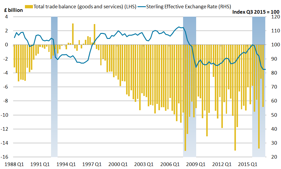
Source: Office for National Statistics, Bank of England
Notes:
- Shaded areas represent periods of sterling depreciation.
Download this image Figure 5: Shaded blocks for periods of depreciation Sterling effective exchange rate and balance of UK trade
.png (54.5 kB) .xlsx (38.9 kB)
In contrast, previous ONS analysis on UK trade performance following the onset of the 2008 global downturn found little evidence of an exchange rate impact on the overall trade balance, despite a sterling depreciation of more than 25% between Quarter 3 2007 and Quarter 1 (Jan to Mar) 2009.
Similarly, in the most recent period of sterling depreciation, there has been little evidence to indicate a consistent improvement in the UK trade balance. While the trade balance has narrowed in some quarters since sterling began to depreciate in Quarter 3 2015, there has not been a sustained improvement over time and the trade deficit remains at a similar level to that seen in Quarter 3 2015 (widening slightly from £8.5 billion in Quarter 3 2015 to £8.8 billion in Quarter 1 2017). The trade balance excluding erratic commodities3 also shows a muted response to the recent sterling depreciation, remaining flat at £10.0 billion between Quarter 3 2015 and Quarter 1 2017.
While there may be little movement on an aggregate level, the balance of trade reflects both changes in the quantity of goods and services traded, and changes in the prices of those items. The following sections examine these price and volume effects in turn.
Trade prices
Between Quarter 3 2015 and Quarter 1 2017, UK goods export and import prices4 rose by 14.2% and 10.7% respectively – less than the 17.5% depreciation in sterling effective exchange rate (ERI) over the same period (Figure 6). The sterling export price for UK services rose by 6.3% over the same period, while import prices rose by 10.3%.
While the co-movement of export and import prices may appear contrary to economic theory, it is important to note that both export and import prices are based in sterling for the UK. While export prices have risen in sterling terms, it is possible there may be no change in the price in foreign currency terms. As Figure 6 shows, export prices have tended to follow a close long-run relationship with import prices and previous analysis has also shown that the positive correlation between export and import prices is a phenomenon observed in a number of other countries, including the US and Germany.
Figure 6: UK goods export and import prices and sterling ERI
Quarter 1 (Jan to Mar) 1998 to Quarter 1 2017, UK
Source: Office for National Statistics, Bank of England
Download this chart Figure 6: UK goods export and import prices and sterling ERI
Image .csv .xlsMovements in sterling export prices reflect both exchange rate movements and changes in the price charged by the UK exporter. However, there are a number of reasons why prices may be sticky in the short term.
Firstly, overseas firms that have agreed to pay a fixed price for UK exports are not generally able to renegotiate the terms of those contracts in the short term. Should prices be flexible, a domestic firm’s choice to alter prices also depends on the price elasticity of demand of their products and wider strategic objectives. For example, UK exporters may have the incentive to not pass through the full effect of an exchange rate appreciation to preserve market share, and may not pass on the effects of a depreciation to increase profit margins. Many firms will also have strategies in place to hedge against currency movements in the short term.
Some domestic firms may also agree to export their goods at a fixed price in the importer’s currency to maintain client relationships and consistency of orders. This would result in an increase in sterling export prices in the event of a depreciation. Conversely, some UK exporters will choose to trade at a fixed sterling price, reducing the foreign currency price. As prices are sticky in the short term, the initial impact of sterling depreciation on sterling export prices will therefore likely reflect the proportion of trade conducted on a sterling basis compared with trade denominated in a foreign currency.
For example, if all UK exporters priced their products in sterling, then sterling export prices would remain unchanged following a depreciation. The higher the proportion of export trade conducted on a foreign currency basis, the more sterling export prices would be expected to increase following a sterling depreciation. Conversely, if all imports into the UK were conducted on a sterling basis, then sterling import prices would remain unchanged.
Table 1 shows the proportion of import and export currency transactions disaggregated by EU and non EU trade. Exports to the EU are more weighted towards foreign currencies (61%) – especially the euro – while imports are more weighted towards sterling (52%). However, for trade with non-EU countries, exports are more weighted towards sterling (51%), while imports are more weighted towards foreign currencies (61%) – particularly the US dollar.
The stronger growth of EU export prices since Quarter 3 2015 (15.4%) compared with growth in non-EU export prices (13.3%) supports the notion that movements in sterling trade prices have largely been driven by the substantial amount of trade conducted in a foreign currency, rather than actual changes in the price charged by exporters.
Table 1: Proportion of Import and Export Currency Transactions by EU and non-EU
| UK | ||||
| % | ||||
| Imports from EU | Imports from Non-EU | Exports to EU | Exports to Non-EU | |
| Sterling | 52.2 | 39.5 | 38.9 | 50.6 |
| Euro | 39.5 | 12.9 | 46.0 | 4.9 |
| US Dollar | 7.3 | 40.1 | 13.7 | 39.9 |
| Other | 1.0 | 7.5 | 1.4 | 4.6 |
| Source: Office for National Statistics. | ||||
Download this table Table 1: Proportion of Import and Export Currency Transactions by EU and non-EU
.xls (640.5 kB)Rising sterling export prices may also reflect the high proportion of imported inputs that are used in the production of UK exports5, as some domestic exporters may pass through the higher cost of intermediate goods to maintain profit margins. While input prices (price of materials and fuels bought by UK manufacturers for processing) have risen by 15.0% between Quarter 3 2015 and Quarter 1 2017, this second-round effect of sterling depreciation is likely to take some time to emerge.
Figure 7 shows the import intensities (percentage of indirect imported content) for selected UK exports in both 2010 and 2013. While there has been an increase in import intensity between 2010 and 2013 for a number of commodities, there have been particularly large increases in basic iron and motor vehicles, where imported content now accounts for over 40% of exports. Those goods that have a higher import intensity are more likely to see faster upward pressure on export prices when the cost of imported inputs rise. However, it should be noted that production costs of intermediate consumption are only one factor influencing a firm’s pricing decisions; factors such as industry structure and price elasticity of demand will also play an important role.
Figure 7: Import intensities (indirectly imported inputs as % of export final demand), selected UK exports, 2010 and 2013
Source: Office for National Statistics
Download this chart Figure 7: Import intensities (indirectly imported inputs as % of export final demand), selected UK exports, 2010 and 2013
Image .csv .xlsIn summary, the observed increase in sterling import prices following the recent currency depreciation has been in line with economic expectations, while the increase in export prices (on a sterling basis) is likely to be largely attributable to the substantial amount of trade conducted on a foreign currency basis as prices are sticky in the short term. Over time, some UK exporters may choose to pass through the effect of the weaker sterling and lower their foreign currency price to boost demand.
As Figure 8 shows, the effective export price (that is, the UK export price adjusted for exchange rate movements6) has fallen 5.2% since Quarter 3 2015. While this might suggest some degree of pass through, it also appears to be a continuation of the declining trend seen before the start of the depreciation and is therefore more likely to reflect other factors in the firms’ pricing decisions.
Figure 8: Contributions to changes in UK export price index, non seasonally-adjusted (RHS); sterling export price index and effective export price index (LHS)
Quarter 1 (Jan to Mar) 2007 to Quarter 1 2017, UK

Source: Office for National Statistics
Download this image Figure 8: Contributions to changes in UK export price index, non seasonally-adjusted (RHS); sterling export price index and effective export price index (LHS)
.png (45.3 kB) .xlsx (34.0 kB)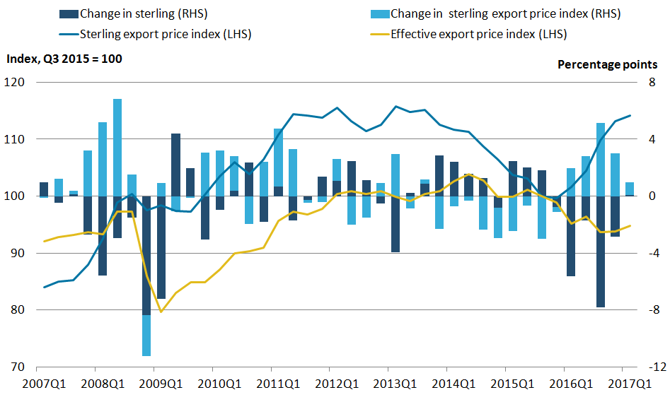
Trade volumes
Figure 9 shows trends in export volumes of goods and services before and after the start of the recent sterling depreciation in Quarter 3 2015. While goods exports have increased in the last two quarters and are up 3.9% since Quarter 3 2015, they have been on an increasing trend since late 2013 and indeed, rose more markedly in the quarters leading up to the sterling depreciation than in more recent quarters. Exports excluding trade in erratic commodities and oil reveal a similar underlying story.
Exports of services – which account for around 45% of total UK exports – have also increased since Quarter 3 2015 (8.6%). However, this also appears to be a continuation of the increasing trend seen since 2010, before sterling began to depreciate.
The lack of responsiveness to exchange rate movements is not surprising, with sectors that dominate the UK’s services exports – such as financial and business services – expected to be relatively price inelastic as they are more likely to compete on non-price factors such as quality and reputation. Similarly, UK manufacturing exports tend to be concentrated in high-value added sectors – such as pharmaceuticals – which are less sensitive to price changes and more sensitive to other demand factors.
There is therefore little evidence to suggest that recent sterling movements have had an impact on the volume of UK goods and services being exported7, although it is yet to be seen whether the more recent pick-up in goods will continue. This pick-up has primarily been driven by exports of machinery and transport equipment, which have seen 12.6% growth over the past year8 despite a continued rise in export prices.
Figure 9: Exports of goods, goods less oil and erratics, and exports of services (volumes) and sterling ERI
Quarter 1 (Jan to Mar) 2007 to Quarter 1 2017, UK
Source: Office for National Statistics, Bank of England
Download this chart Figure 9: Exports of goods, goods less oil and erratics, and exports of services (volumes) and sterling ERI
Image .csv .xlsImport volumes
Figure 10 shows trends in import volumes for the same time period as Figure 9 (Quarter 1 2007 to Quarter 1 2017).
Figure 10: Imports of goods, goods less oil and erratics and imports of services (volumes) and sterling ERI
Quarter 1 (Jan to Mar) 2007 to Quarter 1 2017, UK
Source: Office for National Statistics, Bank of England
Download this chart Figure 10: Imports of goods, goods less oil and erratics and imports of services (volumes) and sterling ERI
Image .csv .xlsThe continued growth in overall imported goods may be attributable to a number of factors. Previous analysis has suggested that the increasing integration of the UK economy within global supply chains may limit the impact of rising import prices on the level of import penetration, as import substitution is more difficult in the short term. Another possibility is that despite the increase in import prices, the price of imported goods remains relatively cheap compared to domestic alternatives, reducing the incentive to substitute away from imports into domestic goods.
The ability to substitute imported goods for domestic alternatives also depends on the availability of alternatives and the extent to which domestic production is able to adjust to meet the increase in demand. Goods for which the UK is heavily reliant on imports are likely to be relatively more price inelastic. For example, the UK is highly dependent on imports to meet domestic demand for fruit and vegetables9 and despite a 14.4% rise in import prices since Quarter 3 2015, import volumes of fruit and vegetables have continued to increase (up 11.1%). This may be partly attributable to the fact that a number of fruit and vegetables cannot be grown on UK soil, or are out-of-season.
On the services side, there are tentative signs of a slowdown with imports flattening out in recent quarters following a period of steady growth. This weakness is partly attributable to slower growth in travel imports (that is, UK residents travelling abroad), which account for around one-third of total service imports and have remained at broadly similar levels during the currency depreciation, following steady growth since early 2012 (Figure 11).
Figure 11: Exports and imports of travel services, chained-volume measures, seasonally adjusted
Quarter 1 (Jan to Mar) 2007 to Quarter 1 2017, UK
Source: Office for National Statistics
Download this chart Figure 11: Exports and imports of travel services, chained-volume measures, seasonally adjusted
Image .csv .xlsExchange rate movements are expected to have a relatively quick pass through to the tourism sector, with a sterling depreciation having an immediate impact on the purchasing power of UK travellers abroad, which is likely to reduce expenditure. Travel services are also less likely to be constrained by long-term contracts and be relatively price elastic due to their discretionary nature and, while imperfect, the availability of domestic substitutes (travel within the UK).
Figure 11 also shows that there has been a far more muted exchange rate response on the export side (that is, overseas residents travelling in the UK). While a depreciation might be expected to encourage visitors to the UK to take advantage of the weaker sterling, there has been little evidence of an increase in travel exports.
Interestingly, the more pronounced impact on travel imports and relatively muted response of exports was also seen during the 2008 to 2009 financial crisis and sharp depreciation of the sterling. The resilience of exports suggests that factors other than relative price, such as global economic conditions or consumer preferences, play a stronger role in determining the demand for UK travel and tourism.
Summary of the impact of sterling depreciation on trade
There appears to be little evidence of a strong export response to the recent sterling depreciation. While volumes of UK goods exports have picked up slightly in recent quarters, it remains to be seen whether this trend will continue as prices become less sticky in the long run. Meanwhile, imports of goods have also continued to grow in spite of a weaker sterling and rising import prices, which may reflect increasing integration into global supply chains and may limit substitutability of goods. On the services side, while exports continue to increase in line with recent trends, there are signs of an exchange rate impact on imports – reflected in a slowing of travel services imports growth.
Impact of sterling on investment income
Investment income accounts for the vast majority of primary income. Investment income can be broken down further and this section will focus on the three main components:
- foreign direct investment (FDI)
- portfolio investment (PI)
- other investment (OI)
Foreign direct investment can be defined as having an equity interest in an enterprise resident in another country of at least 10% or more of the ordinary shares or voting stock.
Portfolio investment represents equity holdings of less than 10% of the equity capital and debt securities, such as corporate or government bonds.
Other investment includes trade credits, loans, currency and deposits and other assets and liabilities.
Since Quarter 3 (July to Sept) 2015, sterling has depreciated quarter-on-quarter. This depreciation of sterling should lead to greater income being earned on investments due to a number of the following being held in foreign currencies:
- UK direct investment abroad (credits)
- UK portfolio investment abroad (credits)
- UK other investment abroad (credits)
- rest of the world other investment in the UK (debits) – a number of these investments are held in foreign currency because of the large banking sector in the UK
Table 2 shows how sterling depreciation affects investment values.
Table 2: Example of how sterling devaluation works
| In quarter 3 2015 | In quarter 3 2016 |
| $1.50 = £1 | $1.30 = £1 |
| $150 = £100 | $150 = £115 |
| Source: Bank of England | |
| Notes: | |
| 1. Figures are rounded to the nearest 10 cents. | |
Download this table Table 2: Example of how sterling devaluation works
.xls (17.9 kB)Using this example, the depreciation of sterling in Quarter 3 (July to Sept) 2016 provides an extra £15 against the same amount of earnings made in US dollars. By stripping out the effect of sterling during 2016, this analysis will estimate what the amount of investment income would have been had the sterling exchange rate remained constant.
To try and account for the exchange rate impacts, we have created effective weighted exchange rates for each of the four earnings types previously mentioned.
This exchange rate has been applied to the published data to create a “counterfactual series”, which is the estimate of income earned on the investment had the exchange rate remained unchanged. The analysis assumes that UK “direct investment” abroad (credits) and UK “portfolio investment” abroad (credits) investments are all held in foreign currency and therefore will show the maximum impact caused by exchange rate movements. In “other investment”, the analysis applies the exchange rate to known deposits and loans held in foreign currency.
Foreign direct investment
The exchange rate can affect the value of UK-owned businesses abroad (assets) and the earnings these generate (credits). A sustained depreciation (or appreciation) of sterling relative to other currencies can increase (or decrease) the value of any foreign-currency-denominated UK credits when these are converted to sterling. In practice, UK companies may value some of their credits generated overseas in sterling; this would mute the impact that exchange rate movements would have on the value of credits. Further research on the exchange rate impacts on FDI can be found in section 3 of UK foreign direct investment: trends and analysis, summer 2017.
Figures 12 to 15 are split into two panels. Panel A (left hand side) shows the difference between the published series and the counterfactual series which holds the exchange rate constant. Panel B (right hand side) shows the quarterly credit or debit growth, and how much it is affected by the exchange rate effects and change due to other factors.
Figure 12: FDI credits and counterfactual indices, seasonally adjusted, and FDI credits growth by exchange rate effects and other effects, percentage change on the previous quarter
Quarter 1 (Jan to Mar) 2014 to Quarter 1 2017

Source: Office for National Statistics
Download this image Figure 12: FDI credits and counterfactual indices, seasonally adjusted, and FDI credits growth by exchange rate effects and other effects, percentage change on the previous quarter
.png (28.9 kB) .xls (27.6 kB)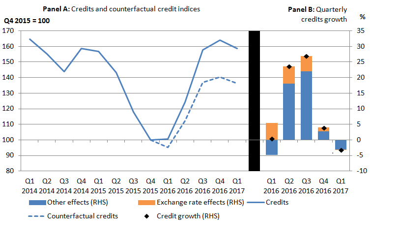
Figure 12 panel A shows that using the counterfactual of no exchange rate movements in 2016, the trend in FDI credits would have been similar to the published series. These results suggest that the value of UK FDI credits would have fallen over Quarter 1 (Jan to Mar) 2016 had the exchange rate not depreciated. The exchange rate effect off-set the other effects on FDI credits in that quarter to leave the overall value close to that from Quarter 4 (Oct to Dec) 2015.
It can also be noted that growth is still recorded in the value of FDI credits under this extreme scenario. The exchange rate effect increased the value of credits in all quarters of 2016, although its impact diminished over the five quarters presented in Figure 12b; the exchange rate effect was negligible in Quarter 1 2017.
The counterfactual suggests that 61.6% of the increase in the value of credits over this period would have occurred without any exchange rate movements.
Portfolio investment income
Using the same approach, Figure 13 panel A shows that without accounting for the exchange rate, portfolio investment credits rose by 14.5% from Quarter 4 2015 to Quarter 1 2017. However, after accounting for the exchange rate, portfolio investment income would have fallen by 5.8% over the same time period. This is also reflected in Figure 13b, with the exchange rate effects having a positive impact on credit growth throughout 2016.
Figure 13: Portfolio investment credits and counterfactual indices, and portfolio investment credits growth by exchange rate and other factors, change on the previous quarter
Quarter 1 (Jan to Mar) 2014 to Quarter 1 2017, UK

Source: Office for National Statistics
Download this image Figure 13: Portfolio investment credits and counterfactual indices, and portfolio investment credits growth by exchange rate and other factors, change on the previous quarter
.png (25.6 kB) .xls (27.1 kB)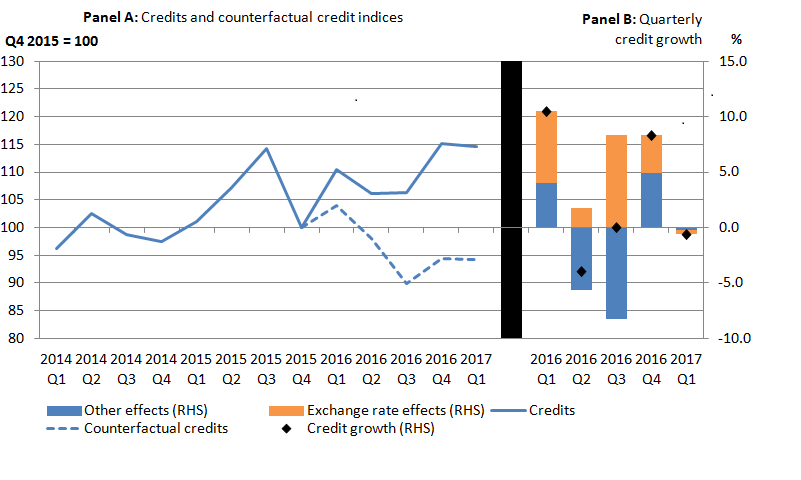
Other investment income
This analysis applies the exchange rate to known deposits and loans held in foreign currency.
Since the end of 2015, investment income earned abroad (credits) has increased (Figure 14 panel A). However, after accounting for the exchange rate, other investment income rose at a slower pace, with the counterfactual line tracking below the published line. Other investment income credits are 30.8% higher in Quarter 1 2017 compared with Quarter 4 2015 (base year), whereas the counterfactual series only increased by 9.9% over the same period.
Figure 14 panel B also breaks down the impacts of the exchange rate and other factors for each of the quarters, with each quarter throughout 2016 showing the exchange rates as having a positive effect on the growth of credits.
Figure 14: Other investment credits and counterfactual indices, and other investment credit growth by exchange rate and other factors, change on the previous quarter
Quarter 1 (Jan to Mar) 2014 to Quarter 1 2017, UK

Source: Office for National Statistics
Download this image Figure 14: Other investment credits and counterfactual indices, and other investment credit growth by exchange rate and other factors, change on the previous quarter
.png (27.2 kB) .xls (29.7 kB)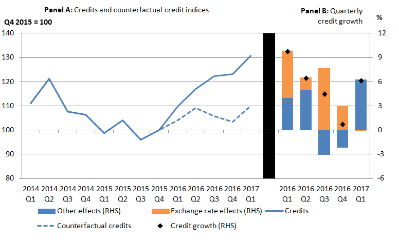
Figure 15 shows the trends for the other investment income for the debits section.
Figure 15: Other investment debits and counterfactual indices, ; and other investment debit growth by exchange rate and other factors, change on previous quarter
Quarter 1 (Jan to Mar) 2014 to Quarter 1 2017

Source: Office for National Statistics
Download this image Figure 15: Other investment debits and counterfactual indices, ; and other investment debit growth by exchange rate and other factors, change on previous quarter
.png (28.3 kB) .xls (18.4 kB)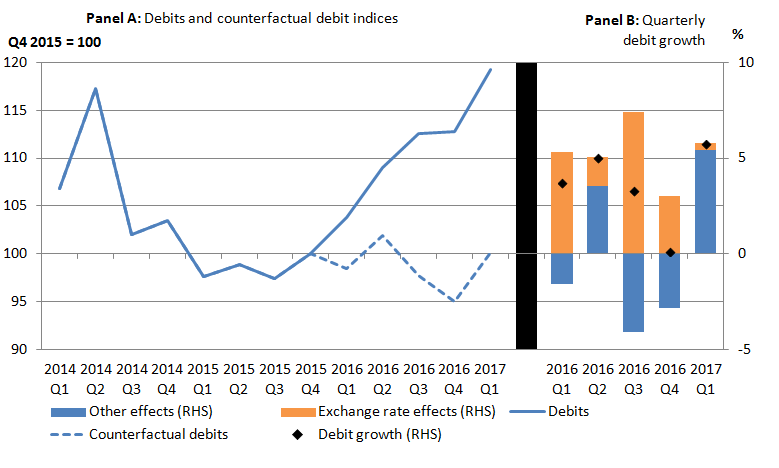
The counterfactual series tracks below the published data series (Figure 15 panel A). Moreover, when we compare the two lines, the counterfactual line is flatter signalling a more stable trend, whereas the published credit line shows a positive trend. Figure 15 panel B also shows the exchange rate effects have caused debits to increase quarter-on-quarter, particularly in Quarter 1 2016 and Quarter 3 2016.
Measuring the impact of sterling on the international investment position
The net international investment position (IIP) returned to positive territory in Quarter 1 2016 for the first time in over 2 years, so this section will breakdown the impacts that contributed to this by looking at total assets, total liabilities and the net10 on a quarterly basis. Alongside other statistics, the IIP is an important barometer of the financial condition and creditworthiness of a country, therefore it is important to consider the other impacts on the IIP.
The IIP measures the stock of assets and liabilities at the end of the period, which is the sum of the opening balance, financial flows and other changes (where the other changes could be price changes or currency changes). The earnings associated with these investments feed into the primary income account within the current account. So, if an individual invests in a foreign bond, the flow of this investment appears in the financial account (and effects the level of assets within the IIP), while the earnings that this individual may receive in the form of interest payments feature within the current account and financial account.
The main components that make up the IIP assets (direct investment, portfolio investment and other investment) have a number of investments held in foreign currencies. Therefore, a depreciation in sterling may lead to a greater value of investments than if the exchange rate had remained constant. This is also true for other investment liabilities because the UK has a large banking sector.
To obtain the exchange rate impacts, we have created a currency coefficient and applied this to the starting stock and half of the flows11.
Assets
In the series history, the financial flows would have been one of the main drivers behind the change in the IIP. However, since Quarter 3 2015 when the exchange rate started to depreciate, currency changes have been one of the main contributors to the change in IIP assets throughout 2016 (see Figure 16).
Figure 16: Total quarterly change in IIP assets broken down into impacts
Quarter 1 (Jan to Mar) 2014 to Quarter 1 2017, UK
Source: Office for National Statistics
Download this chart Figure 16: Total quarterly change in IIP assets broken down into impacts
Image .csv .xlsThe greatest impacts of the currency changes can be seen in the first 3 quarters of 2016, with Quarter 1 2016 in particular signalling an increase in £456 billion caused by the depreciation in sterling. In fact, in the final quarters of 2015 and in Quarters 1 and 3 in 2016, IIP assets would have declined quarter-on-quarter had the exchange rate remained unchanged. This is because financial flows12 indicate the UK was a net seller, for example, in Quarter 1 2016 the UK sold £40.2 billion of foreign assets.
Liabilities
Currency changes will also impact the liabilities side, although only other investment will be significantly impacted by the fall in sterling as the majority of those investments are held in foreign currency. Using the same method as described previously, we can split out the total changes into the four main impacts, that is, other changes, currency changes, price changes and flows.
Figure 17 suggests that due to the depreciation in sterling throughout 2016, currency changes led to stronger growth in liabilities quarter-on-quarter than if the sterling exchange rate had remained constant. For example, in Quarter 2 (Apr to June) 2016, the depreciation in sterling led to an increase in liabilities by £211 billion.
Figure 17: Total quarterly change in IIP liabilities broken down into impacts
Quarter 1 (Jan to Mar) 2014 to Quarter 1 2017
Source: Office for National Statistics
Download this chart Figure 17: Total quarterly change in IIP liabilities broken down into impacts
Image .csv .xlsNet international investment position
Figure 18 shows the breakdown of the impacts on the net IIP. Again the effect of the depreciation in sterling can be clearly seen, particularly from Quarter 1 2016. Furthermore, if the exchange rate had remained constant, the total change in the net IIP would have probably declined quarter-on-quarter in both Quarter 1 2016 and Quarter 2 2016. Other changes have also had a sizable effect on the UK’s net IIP, particularly when there are large gross assets and liabilities, creating a divergence in the flow-stock relationship.
Figure 18: Total quarterly change in net IIP broken down into impacts
Quarter 1 (Jan to Mar) 2014 to Quarter 1 2017, UK
Source: Office for National Statistics
Download this chart Figure 18: Total quarterly change in net IIP broken down into impacts
Image .csv .xlsOverall effect of sterling depreciation on the current account and IIP
The overall effect of the recent fall in sterling on the overall current account is difficult to quantify. For trade, apart from exchange rate movements, there are a number of other factors that can drive changes in the price and volumes of both exports and imports. Overall, there is little evidence to indicate a consistent improvement in the UK trade balance caused by the sterling depreciation.
Meanwhile, the effect of sterling on investment income is a bit more clear-cut. According to our analysis, if exchange rates had remained unchanged throughout 2016, investment income credits for direct, portfolio and other would have been lower. This is also the case on the debits side for other investment income.
The net international investment position has also been clearly affected by currency movements since Quarter 3 2015, particularly in the first half of 2016.
Notes for: Measuring the impact of the depreciation of sterling on the current account and the international investment position
To measure the overall change in the exchange value of a currency, a weighted average of the movements in cross-exchange rates against a basket of other currencies can be used, with the weights reflecting the relative importance of the other currencies, as measured by trade flows between the relevant countries.
This process is governed by the Marshall-Lerner condition, which states that the trade balance will only improve when the sum of the absolute values of the price elasticities of demand for imports and exports are greater than one.
Erratic commodities are defined as ships, aircraft, precious stones, silver and non-monetary gold.
Trade prices refer to the prices of goods traded (not overall goods and services), unless stated otherwise.
According to Organisation for Economic Co-operation and Development (OECD) data, imported content accounted for almost a quarter (22.9%) of the UK’s exports in 2011, broadly in line with the OECD average (24.3%).
The effective export price index is estimated by summing the percentage change in sterling export price and the percentage appreciation in the sterling exchange rate (converted into an index).
While previous analysis suggests that weaker gross domestic product (GDP) growth of the UK’s major trading partners may have limited the exchange rate impact on UK exports during the 2008 downturn, this is unlikely to account for the muted export response in this episode of depreciation.
This is compared to its 5-year average annual growth of 3.4%.
The import penetration rate (the percentage of final household consumption directly due to imports) is estimated to be 38.8% for fruit and 37.7% for vegetables.
Total assets, total liabilities and the net figures used are not consistent with those published in the balance of payments, as these numbers do not include financial derivatives and reserve assets.
The currency coefficient is applied to only half the flows as it is assumed that flows and currency changes are attributed evenly across the period and therefore half of the flow transactions will already include the currency effect.
Total financial assets, liabilities and the net figures used are not consistent with those published in the balance of payments, as these numbers do not include financial derivatives and reserve assets.
6. The UK experience of global commodity price movements
Introduction
The International Monetary Fund (IMF) produces a commodity price index, which aggregates movements in the world prices for a range of commodities, including crude oil. Commodities are homogenous products that are internationally traded in a world currency, often US dollars. The weights for these products in the index are determined by average world export earnings of these products between 2002 and 2004 and the IMF index is expressed in US dollars.
As a first step in analysis of the UK experience, an equivalent commodity price index, still expressed in dollars, can be constructed using the import share of the same commodities to the UK using HM Revenue and Customs (HMRC) data from 2010. This will highlight any differences in the movement of the IMF and UK index purely due to the weighting of the commodities (Table 3 in the Annex).
As a second step, the UK index can be expressed in sterling by applying the monthly average dollar-to-sterling exchange rate. This enables analysis of the UK experience of commodity price changes, including sterling exchange rates effects compared with the movement of world prices.
Analysis between 1997 and 2017 will focus on:
- comparing US dollar and UK-weighted commodity price indices in US dollars and sterling
- comparing the experience of UK-weighted commodity prices in aggregate and broken down by imported products from the EU and non-EU countries
- trends in commodity prices for imported food to the UK compared with imported costs for UK food producers as published in the UK Producer Prices index
- trends in metal commodity prices and imported metal prices as published in the UK Producer Prices index
UK and IMF commodity price indices
Figure 19 shows the IMF and UK commodity index using IMF prices on a US dollar basis. Both indices follow closely through time, apart from late-2008 and early-2009, when the IMF commodity index fell faster than the UK commodity index. This could be attributed to the fall in crude oil prices, as the IMF commodity index has a slightly higher weighting for crude oil (53.8%) compared to the UK commodity index (51.0%).
Figure 19: IMF commodity index ($) and UK commodity index ($) and (£) using IMF prices
January 1997 to May 2017
Source: Office for National Statistics, IMF
Notes:
- Import values for each commodity were selected at the four-digit commodity code level within the HMRC trade data, with weights constructed by taking the proportions of the value of imports from the total value of commodity imports selected.
- The prices of commodities are sourced from the IMF’s index of primary commodity prices.
- The Bank of England monthly average spot exchange rate used to convert IMF commodity prices in US Dollars into Sterling.
Download this chart Figure 19: IMF commodity index ($) and UK commodity index ($) and (£) using IMF prices
Image .csv .xlsFigure 19 also shows the UK equivalent commodity price index in sterling. The two UK series diverge prior to the financial crisis as the commodity index based in US dollars rose faster than the sterling price index, which coincides with sterling appreciating against the US dollar over the period. The two series then converged during mid-2009 and continued to generally track each other up until 2016. From this point, the price index based in sterling started to rise rapidly, while the price index based in US dollars saw a more modest rise. This shows the impact of the depreciation of sterling in June 2016 onwards.
UK commodity index for EU and non-EU imported goods
Figure 20 shows the UK commodity index, expressed in sterling broken down by imports from the EU and outside the EU. By breaking down the aggregate UK commodity index, we can see how prices are changing in relation to the different composition of commodities in the EU and Non-EU commodity index (Table 4 in the Annex).
Figure 20: UK commodity index (£), alongside the UK commodity index for EU (£) (imports from the EU) and Non-EU (£) (imports from outside EU) using IMF prices
January 1997 to May 2017
Source: Office for National Statistics, IMF
Download this chart Figure 20: UK commodity index (£), alongside the UK commodity index for EU (£) (imports from the EU) and Non-EU (£) (imports from outside EU) using IMF prices
Image .csv .xlsThe close relationship between the UK aggregate commodity price index and the price index of UK commodity imports from non-EU countries can be explained by the large weighting of crude oil, which represents 51.0% and 58.9% in each index, respectively.
Moreover, the non-EU commodity index is mostly dominated by fuels (crude oil, natural gas and coal), which represents 80.4% of the non-EU import index compared with the EU commodity price index (39.2%), where food products tend to have a much higher weighting (48.2%).
Count of transactions of UK imports by currency and industry
While differences in the relative weights of UK imports of commodities compared with the world export share of these commodities can help explain the experience of commodity prices in the UK, there are also differences in the currency with which industries that rely more on commodity inputs in their supply chain are transacted.
Figure 21 shows the proportion of all import currency transactions completed by currency and manufacturing industries, weighted by the value of these imports in the total.
Figure 21: Proportion of Import currency transactions completed (weighted) by currency and industry
September 2016
Source: Office for National Statistics
Download this chart Figure 21: Proportion of Import currency transactions completed (weighted) by currency and industry
Image .csv .xlsFor example, industries such as motor vehicles, trailers and semi-trailers, which use more finished products in their supply chain than commodities, report more than 60% of imports in sterling in the Import Price Survey. In contrast, basic metals and fabricated metals manufacturers tend to rely more on commodity inputs of raw materials and only report that around 20% to 30% of their imports are transacted in sterling. This could mean that these manufacturers are more affected by both changes in international prices and exchange rate effects than other types of manufacturers.
Further analysis of the import intensity of manufacturing industries’ supply chains and how this relates to input producer prices and the exchange rate is available in the Prices economic commentary: June 2017.
Food commodity prices
Focusing on food, there are a number of differences between the IMF and UK commodity index proportions, which are accounted for by certain food types (see Table 5 in the Annex). For example, the UK imports a greater proportion of poultry and fish, and a smaller proportion of soybean and soybean meal, beef and wheat than the IMF commodity index.
Figure 22 shows the weighted index for food commodities using the IMF commodity index (in US dollars) and UK commodity index (in US dollars and sterling), as well as the imported food series within input Producer Prices Index (PPI), indexed to 2012 equals 100.
Figure 22: UK food commodity index ($ and £), IMF food commodity index ($) using IMF prices and Imported food PPI
January 1997 to May 2017
Source: Office for National Statistics, IMF
Download this chart Figure 22: UK food commodity index ($ and £), IMF food commodity index ($) using IMF prices and Imported food PPI
Image .csv .xlsThe IMF food index (dollars) and UK food index (dollars) show some differences in movement over time, reflecting the different composition of commodities in the indices. The UK food index in sterling, from 2016 onwards in particular, increases at a much faster pace than the UK food index in dollar terms, which reflects the depreciation of sterling against the US dollar, as well as increasing food commodity prices over the period.
Despite this, the imported food series within input PPI increases at a much slower rate than the UK food commodity index. This could be partly attributed to the relatively high proportion of currency transactions conducted in sterling (47.4%) within the food industry (see Figure 4) and the likelihood that producers may have short-to-medium-term arrangements with foreign exporters to keep prices constant in sterling terms, to protect themselves from potential price increases.
It is interesting to note the variation in food commodity prices has been quite wide over the last 20 years, with some products such as tea, bananas, fish and groundnuts growing between 100% and 200% in sterling terms, whereas shrimp has only grown around 3% over the same period with all series showing considerable volatility (Figure 23).
Figure 23: Selected food commodity price indices (£)
January 1997 to May 2017
Source: IMF
Download this chart Figure 23: Selected food commodity price indices (£)
Image .csv .xlsMetal commodity prices
Moving onto metals, the difference between the product mix of the IMF and UK metal commodity index can be seen in Table 6 in the Annex. The UK imports a greater proportion of nickel, tin and lead compared with the IMF commodity index, which tend to be more volatile relative to other metal commodities in the index.
Figure 24 shows the IMF metals commodity index, UK metals commodity index on a US dollar and sterling basis alongside imported PPI metals.
Figure 24: UK metal commodity index in (£) and ($), the IMF metal commodity index ($) and metals PPI
January 1997 to May 2017
Source: Office for National Statistics, IMF
Download this chart Figure 24: UK metal commodity index in (£) and ($), the IMF metal commodity index ($) and metals PPI
Image .csv .xlsWhile the IMF metals commodity index closely tracked the UK metals commodity index on a US dollar basis up until late-2005, the UK metals commodity index grew faster during 2006 and 2007. However, on a sterling basis, the UK commodity index didn’t increase as much as expected during the period and in fact closely tracked the IMF metals commodity index. This would suggest the appreciation of the sterling had a role to play in reducing the effect of metal commodity prices on the UK.
Looking at the imported PPI metals over the same period, the indices didn’t increase as fast between 2006 and 2007 compared with the UK (pounds) and IMF metal (dollars) commodity price indices. This may reflect contacts with international suppliers, which share some of the risk in changing world prices, and the amount of imports transacted in sterling. In recent periods the UK imported PPI metals commodity index has more closely tracked the UK sterling commodity price indices than the dollar equivalent metal commodity price indices. This may suggest that metal commodity prices and the relatively large amount of imports for basic and fabricated metal manufactures that are in non-sterling currencies (Figure 21) are having a larger effect on the UK than in previous years.
Conclusion
This analysis has highlighted that the UK experience of global commodity prices broadly mirrors changes in world commodity prices, but there are periods when changes in the sterling-to-dollar exchange rate amplify or mute the effect of world prices. There have generally been higher costs in 2016 and 2017 for commodities imported into the UK compared with world prices, largely driven by the recent depreciation of sterling against the dollar and other currencies.
The food and metals commodity price indices expressed in sterling both show a greater increase in the last 18 months than the equivalent indices expressed in US dollars. This is mainly driven by the depreciation of sterling, but also reflects some differences in the weighting for these commodities within each index.
Back to table of contents7. Consultation on changes to the ONS gross domestic product release schedule
We currently publish three gross domestic product (GDP) releases for each quarter. Partly in response to two major reviews that commented on our approach to publishing GDP estimates – the Barker-Ridgeway National Statistics Quality Review and Sir Charles Bean’s Independent Review of UK Economics Statistics – we are consulting on an alternative model for the publications of GDP estimates.
This new model would give two balanced estimates of quarterly GDP using data from the output, income and expenditure approaches 6 weeks and 13 weeks after the end of the preceding quarter. In addition, the Index of Services publication would be moved 2 weeks earlier to become part of the Short-Term Economic Indicator theme day, allowing the publication of monthly GDP estimates.
While our current publication model has the benefit of affording quick and credible estimates of GDP, the proposed approach would result in monthly estimates of GDP as well as allowing us to publish a quicker balanced picture of the whole economy and a higher quality first estimate of GDP.
The move of the Index of Services would give further clarity to the publication of economic statistics and is the final important step in reducing the “see-saw” narrative that can emanate from statistics on a related theme being published at different times. It is also noteworthy that the publication of monthly GDP estimates would consolidate the UK’s position at the forefront of short-term GDP estimation.
The consultation document contains full details of the proposals and their potential effect. This consultation is open to responses from all. The consultation will be open for responses from Thursday 13 July to Thursday 14 September 2017.
After the consultation closes we will review all of the responses and use these to inform our final recommendation on the approach to GDP releases. We will publish a summary of the comments and chosen approach approximately 4 weeks after the consultation closes.
It is expected that any changes would be implemented from GDP publications relating to Quarter 2 (Apr to June) 2018 due for publication in Quarter 3 (July to Sept) 2018.
Contact details for statistical and other enquiries and how you can take part in the consultation are contained in the consultation document.
Back to table of contents8. Understanding the UK economy
This section of the economic review provides an overview of the performance of the UK economy using data published by Office for National Statistics (ONS). It has a particular focus on the most recently published data for Quarter 1 (Jan to Mar) 2017 covering gross domestic product (GDP), economic well-being, productivity and real wage growth.
GDP growth
The Quarterly National Accounts (QNA), released on 30 June 2017, indicated that the UK economy grew by 0.2% in Quarter 1 2017 and by 2.0% when compared with the same quarter of the previous year. The quarterly reading is weaker than in recent periods with quarterly GDP growth averaging 0.5% since the start of 2010.
Household saving ratio falls to a new record low
The Sector and financial accounts provides further information about the UK economy and includes the household and non-profit institutions serving households (NPISH) saving ratio. The saving ratio can be volatile because gross saving is a small difference between two large numbers – total resources and final consumption expenditure. Looking through the volatility, the household saving ratio has been declining since Quarter 3 (July to Sept) 2015, with the latest period showing that the household saving ratio fell from 3.3% in Quarter 4 (Oct to Dec) 2016 to 1.7% in Quarter 1 2017. This is the lowest saving ratio on record (Figure 25).
The decline in the household saving ratio in the quarter is partly as a result of higher tax payments reducing disposable income. Some of the fall could be as a result of the timing of those payments, but the underlying trend is for a continued fall in the saving ratio on the back of increasing consumer prices and subdued wage growth.
Figure 25: UK final consumption expenditure, total available resources, gross saving and saving ratio, seasonally adjusted
UK, Quarter 1 (Jan to Mar) 2005 to Quarter 1 2017

Source: Office for National Statistics
Notes:
- Total available household resources = gross disposable income plus adjustment for the change in pension entitlements.
- Saving ratio = gross saving (total resources minus final consumption expenditure) divided by total resources.
Download this image Figure 25: UK final consumption expenditure, total available resources, gross saving and saving ratio, seasonally adjusted
.png (23.0 kB) .xls (72.7 kB)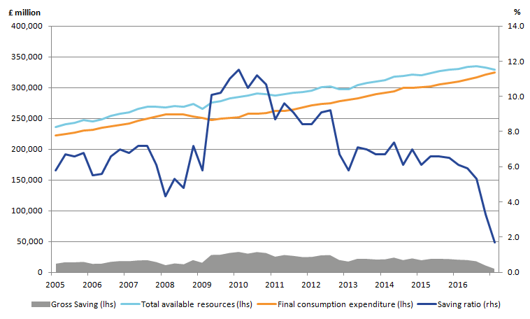
The fall in the household saving ratio is mirrored in the net lending and net borrowing data. Figure 26 shows the net lending and net borrowing position of the different sectors of the UK economy and highlights that in Quarter 1 2017, the household and NPISH sector continued to be a net borrower.
In Quarter 1 2017, the public sector and private financial corporations were also net borrowers, although public sector net borrowing as a share of nominal GDP has declined to its lowest since 2002.
Figure 26: Net lending (+) / borrowing (-) by sector as a % of nominal GDP
UK, Quarter 1 (Jan to Mar) 2014 to Quarter 1 2017
Source: Office for National Statistics
Download this chart Figure 26: Net lending (+) / borrowing (-) by sector as a % of nominal GDP
Image .csv .xlsProductivity, as measured by output per hour has fallen 0.5% in Quarter 1 2017
Labour productivity as measured by output per hour fell by 0.5% in Quarter 1 2017, down from 0.4% in the previous quarter. As a consequence, UK labour productivity fell slightly below its pre-downturn peak in Quarter 4 2007.
Although productivity fell for the economy as a whole, manufacturing productivity rose by 0.2% – but was outweighed by a fall in services productivity of 0.6%.
This fall in labour productivity ends a run of productivity growth, which extended over the previous four quarters and suggests a continuation of the “productivity puzzle”. The puzzle is demonstrated by Figure 27, which shows the paths of output per worker and output per hour relative to their pre-downturn peaks, as well as the projected paths of these measures had their respective pre-downturn growth rates been sustained.
On an output per hour basis, had labour productivity continued to grow at its pre-downturn rate, it would be around 20% higher than at present. The gap on a per worker basis is slightly smaller – reflecting changes in average hours over this period – but remains substantial.
Figure 27: Output per hour and output per worker, UK
Seasonally adjusted, Quarter 1 (Jan to Mar) 1994 to Quarter 1 2017
Source: Office for National Statistics
Download this chart Figure 27: Output per hour and output per worker, UK
Image .csv .xlsThe weakness of UK labour productivity growth during the economic recovery reflects both relatively weak productivity growth within industries and a shift in the nature of production in the UK towards less productive activities. All else equal, the level of output per hour in the UK will rise (fall) if the level of labour productivity in any given industry increases (falls), or if labour moves away from less (more) productive industries towards more (less) productive industries.
Figure 28 shows the contributions of these two effects – within industry productivity growth and the "allocation" effect – to overall labour productivity growth over the past 2 decades. Prior to the downturn, the allocation effect made a relatively small, slightly negative contribution. Productivity growth was largely supported by within industry productivity growth, although the source of this effect changed over time; while services (excluding finance) contributed strongly and positively for most of the period, the contribution from finance gradually increased in the run up to the downturn.
Conversely, the contribution to productivity growth from non-manufacturing production was fairly large in the late 1990s but gradually fell and turned negative – primarily due to falling output in mining and quarrying, partly related to falling reserves of oil and gas in the North Sea.
Figure 28: Contributions to quarter-on-year Output per Hour Growth, Seasonally Adjusted
UK, Quarter 1 (Jan to Mar) 1997 to Quarter 1 2017
Source: Office for National Statistics
Download this chart Figure 28: Contributions to quarter-on-year Output per Hour Growth, Seasonally Adjusted
Image .csv .xlsBoth the overall rate of labour productivity growth and the contributions of these factors have changed over the post-downturn period and show a particularly marked change over the last 2 years.
Figure 28 shows that the allocation effect has been negative since the start of 2015 – indicating a relatively sharp allocation effect towards lower-productivity activities – and has been larger than at any point over the past 2 decades. Although this kind of analysis is often sensitive to the level of industry aggregation that is used, the change in the allocation effect over recent years holds even when using a more detailed industry breakdown to calculate the allocation effect.
In Quarter 1 2017, a negative allocation effect of 0.7 percentage points weighed down on output per hour growth, which was 0.3% on the year. This negative allocation effect over the past 2 years reflects a shift of resources away from higher productivity industries, such as finance and mining and quarrying, toward lower productivity industries such as administrative services.
In Quarter 1 2017, real household disposable income per head declined by 2.1%
In Quarter 1 2017, real household disposable income (RHDI) per head declined by 2.1% compared with the same quarter a year ago (Quarter 1 2016). This is 2.8 percentage points lower than the 4-year average growth rate, but still 2.1% above its pre-economic downturn level.
Despite growth in both real net national disposable income (NNDI) per head and real gross domestic product (GDP) per head in Quarter 1 2017, RHDI fell at the fastest rate since the end of 2011.
Figure 29 highlights the contributions to growth from different components of RHDI. It shows that, higher prices facing households had a negative contribution to RHDI growth in Quarter 1 2017 compared with the same quarter a year ago – contributing negative 1.8 percentage points. However, growth in wages and salaries (in nominal terms) supported RHDI, contributing 1.7 percentage points.
Figure 29: Contributions to quarter-on-same-quarter-a-year-ago growth in real household disposable income per head
Chain volume measure, Quarter 1 (Jan to Mar) 2013 to Quarter 1 2017
Source: Office for National Statistics
Notes:
- Real household disposable income includes non profit institutions serving households (NPISH).
- Q1 refers to Quarter 1 (January to March), Q2 refers to Quarter 2 (April to June), Q3 refers to Quarter 3 (July to September) and Q4 refers to Quarter 4 (October to December).
- Contributions may not sum due to rounding.
Download this chart Figure 29: Contributions to quarter-on-same-quarter-a-year-ago growth in real household disposable income per head
Image .csv .xlsEconomic sentiment – consumer confidence
It is important to consider sentiment, along with other measures of economic well-being, to improve our understanding of how changes in official measures of the economy are perceived by individuals. The Eurobarometer Consumer Survey, conducted by GFK on behalf of the European Commission, provides information regarding perceptions of the economic environment.
Figure 30: Contributions to consumer confidence indicator
Quarter 1 (Jan to Mar) 2008 to Quarter 2 (Apr to June) 2017
Source: European Commission
Notes:
- The source is the Eurobarometer Consumer Survey, which is collected by GFK for the European Commission.
- A negative balance means that, on average, respondents are less confident about the economy. A positive balance means they are more confident and a zero balance indicates no change.
Download this chart Figure 30: Contributions to consumer confidence indicator
Image .csv .xlsThe Consumer Confidence Index measures a range of consumer attitudes, including forward expectations of the general economic situation, households’ financial positions, and unemployment and saving expectations.
Figure 30 shows that the Consumer Confidence Index was negative from Quarter 1 2008 to Quarter 4 2013 as a result of the consumers’ negative perception during and after the economic downturn. Consumers started feeling more confident about the economy from Quarter 1 2014 until Quarter 1 2016, as the Consumer Confidence Index had a positive balance.
The Consumer Confidence Index has been negative since Quarter 2 2016 suggesting that consumers in the UK felt less confident about the future of the UK economy since Quarter 2 2016. Figure 30 highlights that the confidence indicator was negative 7.5 in Quarter 2 2017, 6.3 points lower that its aggregate balance the same quarter a year ago.
The main reasons for the decrease in the Consumer Confidence Index were the negative expectations of the consumers of the general economic situation. The latter decreased by 8.8 points to negative 24.5 from Quarter 2 2016 to Quarter 2 2017. Analysis by GFK suggests that the negative trend could potentially be explained by economic uncertainty abroad and later, in 2016, reduced confidence following the EU referendum.
Consumer price inflation continues to outpace growth in wages
Consumer price inflation (measured using the Consumer Prices Index including owner occupiers’ housing costs (CPIH)) has been steadily increasing and is at its highest rate since April 2012. Set against this, wage growth has been subdued with average weekly earnings for employees for the 3 months to May 2017 compared with a year earlier, increasing by 1.8% including bonuses and by 2.0% excluding bonuses. Adjusted for inflation, average weekly earnings fell by 0.7% including bonuses and by 0.5% excluding bonuses, over the 3 months to May 2017 compared with a year ago (Figure 31).
Figure 31: Regular average weekly earnings growth: real and nominal
UK, seasonally adjusted, 3 month on 3 month a year ago, May 2006 to May 2017
Source: Office for National Statistics
Download this chart Figure 31: Regular average weekly earnings growth: real and nominal
Image .csv .xlsTo examine this performance in more detail, Figure 32 shows real earnings across selected industrial groups, deflated by CPIH and indexed to their respective average values in 2007.
Real earnings have differed across industries since the downturn. Of the four industrial groupings shown in Figure 32, average weekly earnings fell most in finance and business services, and construction. Real earnings continued to move downward for all industrial groupings up until mid-2014 and started to recover by the end of 2014. As at May 2017, total real weekly pay remains below its pre-downturn value for all categories except hotels and restaurants. This could be partly attributed to the increase in the living wage having a larger impact on the industry.
Figure 32: Real average weekly earnings (total pay) across selected industry groupings
UK January 2007 to May 2017
Source: Office for National Statistics
Download this chart Figure 32: Real average weekly earnings (total pay) across selected industry groupings
Image .csv .xls9. Effect on gross domestic product and other economic statistics from improvements being introduced in Blue Book and Pink Book 2017
As part of the communication plan for Blue Book 2017 we have published four further impact articles this quarter that describe the impact that the improvements being introduced as part of Blue Book will have on:
- estimates of current price and chained volume measure of gross domestic product (GDP) from 1997 to 2015
- the main aggregates for the Sector and financial accounts and Balance of Payments 1997 to 2012
- the detailed Sector and financial account estimates 1997 to 2012
- the detailed Balance of Payments estimates 1997 to 2012
Two further detailed impacts articles for the Sector and financial accounts and Balance of Payments covering data for 2013 to 2015 will be published on 21 August 2017, at which point the indicative estimates for the years 1997 to 2012 may also be revised.
Current price GDP estimates
In summary, the range of current price changes being introduced in Blue Book 2017 have the combined effect of increasing the level of current price GDP in 2015 by approximately £16.0 billion, around 0.9%. Average annual current price GDP growth between 1997 and 2015 remains unrevised at 3.9% per year.
Figure 33 shows the contribution in pounds billons to the overall current price change.
Figure 33: Contributions to changes to Current Price GDP annual levels, near final impact
1997 to 2015
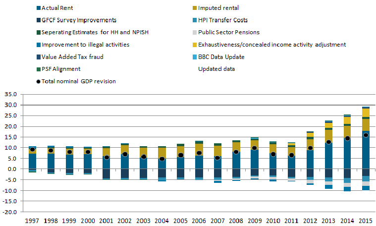
Source: Office for National Statistics
Notes:
- These figures are still provisional at this stage and final quality assurance is currently being undertaken. The finalised version of these data will be published in the UK National Accounts publications on 29 September 2017.
Download this image Figure 33: Contributions to changes to Current Price GDP annual levels, near final impact
.png (22.6 kB)
The main source of revision in Blue Book 2017 is from Improvements to the methods used to estimate rental (both actual and imputed). Additionally, for the period 2013 to 2015, annual current price data sources have been updated, meaning that the revisions to current price levels in these years tend to be larger than for the years before 2013.
Real GDP estimates
Most of the improvements to current price GDP in Blue Book 2017 directly affect the estimates of real GDP as well. The package of real GDP changes as a whole, over the period 1997 to 2015, have the combined impact of very slightly reducing the average annual growth of real GDP by around 0.01 percentage points. However, the headline average GDP growth over this period remains at 2.0% per annum in Blue Book 2017, as it was in Blue Book 2016.
The average revision to quarter-on-quarter real GDP growth introduced at this Blue Book is unchanged to two decimal points over the period from Quarter 2 (Apr to June) 1997 to Quarter 4 (Oct to Dec) 2015. Over the same period the average absolute revision to quarter-on-quarter real GDP growth is 0.05 percentage points. The peak to trough of the 2008 to 2009 economic downturn has been revised from negative 6.3% to negative 6.1% and GDP returned to pre-economic downturn levels in Quarter 2 2013, one quarter earlier than previously estimated.
Effect on the sector and financial accounts
On 5 June 2017, we published an article that detailed the impacts on the sector and financial Accounts, 1997 to 2012 resulting from the main Blue Book improvements that impact on the institutional sector accounts. These are:
- improving the household, private non-financial corporations and non-profit institutions serving households (NPISH) sectors' non-financial accounts
- improving the treatment of corporate bonds interest, as well as a number of other changes
The presentation of separate estimates for the household and NPISH sectors in Blue Book 2017 provided an opportunity to refresh how we produce data on households and in particular their income. The improvements were all described in the 19 April 2017 article Improving the household, private non-financial corporations and non-profit institutions serving households sectors' non-financial accounts.
We are also making improvements to the way in which corporate bonds are treated in the national accounts this year, including the way in which we calculate interest paid to the holders of corporate bonds. Further information on these changes can be found in the 19 April 2017 article Improvements to the treatment of corporate bonds interest.
Figure 34 shows the impacts of the changes described in the previously mentioned articles on the household saving ratio. There is a significant upward effect from introducing new methodology for household data, particularly after 2003, with the largest impact in 2008. There is then a broadly consistent downward impact from splitting the household and NPISH sectors’ data, with minimal impact from the bonds changes.
Figure 34: Indicative impact to the households and non-profit institutions serving households (NPISH) saving ratio
UK, 1997 to 2012
Source: Office for National Statistics
Notes:
- At this stage all data remain indicative while final quality assurance is completed. The impacts for 2013 to 2015 will be published on 21 August 2017, at which point these indicative estimates for the early years may also be revised.
Download this chart Figure 34: Indicative impact to the households and non-profit institutions serving households (NPISH) saving ratio
Image .csv .xlsEffects on other variables can be found in the detailed impact article and the effects for 2013 to 2015 will be published on 21 August 2017, at which point these indicative estimates for the years 1997 to 2012 may also be revised.
Effect on the Balance of Payments
Also published on 5 June 2017 was a detailed assessment of changes to balance of payments annual estimates, 1997 to 2012. The UK Balance of Payments is affected by most of the same methodological improvements that have been described for both GDP and sector and financial accounts. The article provided a full table of the changes in the 2017 editions of the Blue Book and Pink Book, as well the range of effects and the components affected.
Trade revisions
Revisions to trade are relatively small with the revisions positive throughout from 1997 to 2012. The biggest revision is in 2012 (£4.0 billion), with the inclusion of tuition fees having the greatest impact.
Primary income balance revisions
The total revisions between 1997 and 2012 are all negative apart from 1997, with the corporate bonds negative change outweighing the increases caused by the other changes.
Current account balance revisions
Figure 35 shows the level of the current account balance as currently published compared with the Pink Book 2017 indicative balance. The revisions between 1997 and 2012 are mostly negative with the only exception being a slight increase in 1997. Up to 2003 the revisions are relatively small (less than £4 billion in any year). However, the revisions from 2004 onwards are larger, reflecting the same greater revisions seen in the trade and primary income statistics.
Figure 35: Indicative current account balance revision
UK, 1997 to 2012
Source: Office for National Statistics
Notes:
- At this stage all data remain indicative while final quality assurance is completed. The impacts for 2013 to 2015 will be published on 21 August 2017, at which point these indicative estimates for the early years may also be revised.
Download this chart Figure 35: Indicative current account balance revision
Image .csv .xls10. Annex A - Weights for IMF and UK-based commodity indices
Table 3: IMF and UK commodity aggregated index weight for commodities (2010)
| % | ||
| IMF Commodity Index (2002 - 2004) | UK Commodity Index (2010) | |
| Aluminum | 3.9% | 0.9% |
| Bananas | 0.4% | 1.3% |
| Barley | 0.3% | 0.0% |
| Beef | 1.4% | 0.1% |
| Coal | 2.6% | 4.9% |
| Cocoa beans | 0.7% | 0.5% |
| Coffee | 0.9% | 1.2% |
| Copper | 2.8% | 0.9% |
| Cotton | 0.7% | 0.1% |
| Fish | 2.5% | 3.8% |
| Groundnuts | 0.2% | 0.2% |
| Hides | 2.6% | 0.1% |
| Iron ore | 1.3% | 0.2% |
| Lamb | 0.3% | 1.0% |
| Lead | 0.2% | 0.8% |
| Maize | 1.0% | 0.4% |
| Natural gas | 6.9% | 18.6% |
| Nickel | 1.1% | 1.3% |
| Olive oil | 0.3% | 0.4% |
| Oranges | 0.5% | 1.1% |
| Palm oil | 0.7% | 0.6% |
| Poultry | 0.9% | 3.1% |
| Rapeseed oil | 0.3% | 0.2% |
| Rice | 0.6% | 0.9% |
| Rubber | 0.5% | 0.4% |
| Shrimp | 0.7% | 0.6% |
| Soybean oil | 0.4% | 0.2% |
| soybeans and soybeans meal | 2.0% | 0.7% |
| Spot crude petroleum | 53.8% | 51.0% |
| Sugar | 0.9% | 1.4% |
| Sunflower/Safflower oil | 0.2% | 0.5% |
| Swine meat | 1.1% | 0.2% |
| Tea | 0.3% | 0.7% |
| Tin | 0.2% | 0.2% |
| Uranium | 0.5% | 0.0% |
| Wheat | 1.7% | 0.5% |
| Wood | 3.4% | 0.4% |
| Wool | 0.5% | 0.3% |
| Zinc | 0.6% | 0.4% |
| Source: Office for National Statistics, HMRC and IMF | ||
Download this table Table 3: IMF and UK commodity aggregated index weight for commodities (2010)
.xls (29.7 kB)
Table 4: UK commodity aggregated index weights for imports from non-EU and EU, 2010
| UK Commodity Index - Non EU (2010) | UK Commodity Index - EU (2010) | |
| Aluminum | 0.8% | 1.4% |
| Bananas | 1.4% | 0.8% |
| Barley | 0.0% | 0.3% |
| Beef | 0.0% | 0.7% |
| Coal | 5.4% | 1.4% |
| Cocoa beans | 0.5% | 0.3% |
| Coffee | 0.9% | 3.0% |
| Copper | 0.3% | 4.5% |
| Cotton | 0.1% | 0.1% |
| Fish | 3.2% | 7.8% |
| Groundnuts | 0.2% | 0.3% |
| Hides | 0.0% | 0.4% |
| Iron ore | 0.0% | 1.1% |
| Lamb | 1.1% | 0.7% |
| Lead | 0.9% | 0.3% |
| Maize | 0.1% | 2.3% |
| Natural gas | 16.1% | 33.3% |
| Nickel | 1.6% | 0.0% |
| Olive oil | 0.0% | 2.5% |
| Oranges | 0.7% | 3.7% |
| Palm oil | 0.6% | 0.9% |
| Poultry | 1.7% | 11.7% |
| Rapeseed oil | 0.0% | 1.2% |
| Rice | 0.6% | 2.5% |
| Rubber | 0.5% | 0.3% |
| Shrimp | 0.6% | 0.7% |
| Soybean oil | 0.1% | 0.9% |
| soybeans and soybeans meal | 0.7% | 0.5% |
| Spot crude petroleum | 58.9% | 4.6% |
| Sugar | 1.0% | 3.4% |
| Sunflower/Safflower oil | 0.2% | 2.5% |
| Swine meat | 0.0% | 1.1% |
| Tea | 0.8% | 0.3% |
| Tin | 0.2% | 0.0% |
| Uranium | 0.0% | 0.0% |
| Wheat | 0.3% | 1.7% |
| Wood | 0.3% | 1.3% |
| Wool | 0.3% | 0.4% |
| Zinc | 0.3% | 1.3% |
| Source: Office for National Statistics, HMRC and IMF | ||
Download this table Table 4: UK commodity aggregated index weights for imports from non-EU and EU, 2010
.xls (29.2 kB)
Table 5: UK food commodity aggregated index, imports from non-EU and EU, 2010
| % | ||||
| IMF Food Commodity Index (2002 - 2004) | UK Commodity Food Index (2010) | UK Commodity Food Index - Non EU (2010) | UK Commodity Food Index - EU (2010) | |
| Bananas | 2.2% | 6.5% | 9.4% | 1.6% |
| Barley | 1.6% | 0.2% | 0.0% | 0.6% |
| beef | 7.7% | 0.5% | 0.0% | 1.4% |
| Cocoa beans | 3.8% | 2.6% | 3.7% | 0.5% |
| Coffee | 4.9% | 5.9% | 5.9% | 6.0% |
| Fish | 13.7% | 19.5% | 21.8% | 15.6% |
| Groundnuts | 1.1% | 1.0% | 1.2% | 0.5% |
| Lamb | 1.6% | 5.2% | 7.5% | 1.3% |
| Maize | 5.5% | 2.2% | 0.8% | 4.7% |
| Olive oil | 1.6% | 1.8% | 0.0% | 4.9% |
| Oranges | 2.7% | 5.7% | 4.7% | 7.4% |
| Palm oil | 3.8% | 3.1% | 3.9% | 1.7% |
| Poultry | 4.9% | 15.9% | 11.4% | 23.5% |
| Rapeseed oil | 1.6% | 0.9% | 0.0% | 2.5% |
| Rice | 3.3% | 4.6% | 4.3% | 5.0% |
| Shrimp | 3.8% | 3.1% | 4.1% | 1.5% |
| Soybean oil | 2.2% | 1.0% | 0.5% | 1.8% |
| soybeans and soybeans meal | 10.9% | 3.5% | 4.9% | 1.0% |
| Sugar | 4.9% | 7.1% | 7.2% | 6.9% |
| Sunflower/Safflower oil | 1.1% | 2.6% | 1.2% | 5.0% |
| Swine meat | 6.0% | 0.8% | 0.0% | 2.2% |
| Tea | 1.6% | 3.6% | 5.4% | 0.6% |
| Wheat | 9.3% | 2.6% | 2.1% | 3.4% |
| Source: Office for National Statistics, HMRC and IMF | ||||
Download this table Table 5: UK food commodity aggregated index, imports from non-EU and EU, 2010
.xls (44.0 kB)
Table 6: UK metals commodity aggregated index, imports from non-EU and EU, 2002 to 2004 and 2010
| % | ||||
| IMF Metals Commodity Index (2002 - 2004) | UK Commodity Metals Index (2010) | UK Commodity Metals Index - Non EU (2010) | UK Commodity Metals Index - EU (2010) | |
| aluminium | 38.6% | 18.3% | 19.2% | 15.9% |
| copper | 27.7% | 18.9% | 6.5% | 52.7% |
| Iron ore | 12.9% | 3.7% | 0.6% | 12.4% |
| Tin | 2.0% | 3.7% | 4.9% | 0.4% |
| Nickel | 10.9% | 28.7% | 39.2% | 0.0% |
| Zinc | 5.9% | 8.8% | 6.4% | 15.4% |
| Lead | 2.0% | 17.9% | 23.3% | 3.2% |
| Source: Office for National Statistics, HMRC and IMF | ||||
Download this table Table 6: UK metals commodity aggregated index, imports from non-EU and EU, 2002 to 2004 and 2010
.xls (42.5 kB)11. Annex B - Demand and supply indicators
Table 7: UK Demand Side Indicators
| 2015 | 2016 | 2016 | 2016 | 2017 | 2017 | 2017 | 2017 | 2017 | 2017 | |
| Q3 | Q4 | Q1 | Jan | Feb | Mar | Apr | May | |||
| GDP | 2.2 | 1.8 | 0.5 | 0.7 | 0.2 | |||||
| Index of Services | ||||||||||
| All Services1 | 2.6 | 2.9 | 0.9 | 0.8 | 0.1 | -0.2 | 0 | 0.3 | 0.2 | .. |
| Business Services & Finance1 | 2.9 | 2.4 | 0.7 | 0.5 | 0.5 | 0.5 | -0.3 | 0.3 | 0.2 | .. |
| Government & Other1 | 0.5 | 1.6 | 0.3 | 0.3 | 0.4 | 0.3 | -0.2 | 0.2 | 0.1 | .. |
| Distribution, Hotels & Rest1 | 4.5 | 5.1 | 1.1 | 2 | -0.6 | -1 | 1 | -0.4 | 1.1 | .. |
| Transport,Stor. & Comms1 | 3.7 | 3.7 | 2.6 | 0.8 | -0.8 | -2.2 | -0.5 | 1.7 | -0.7 | .. |
| Index of Production | ||||||||||
| All Production1 | 1.2 | 1.2 | -0.4 | 0.4 | 0.1 | -0.5 | -0.8 | -0.5 | 0.2 | -0.1 |
| Manufacturing1 | -0.2 | 0.7 | -0.7 | 1.2 | 0.3 | -1.2 | -0.4 | -0.6 | 0.2 | -0.2 |
| Mining & Quarrying1 | 8.4 | 0.6 | 4.5 | -6.9 | 1.5 | 1 | -2.4 | 1.5 | -1.5 | 0.1 |
| Construction1 | 4.9 | 2.4 | -0.3 | 1 | 1.1 | |||||
| Retail Sales Index | ||||||||||
| All Retailing1 | 4.4 | 4.9 | 1.8 | 0.9 | -1.5 | -0.5 | 1.4 | -1.4 | 2.5 | -1.2 |
| All Retailing excl Fuel1 | 4 | 4.7 | 1.8 | 1.1 | -1.3 | -0.3 | 1.2 | -1.1 | 2.2 | -1.6 |
| Predom. Food Stores1 | 2.2 | 3.6 | 1.5 | -0.2 | -0.8 | 0.3 | 0.4 | -0.5 | 1.3 | -0.9 |
| Predom. Non-Food Stores1 | 4.3 | 3.6 | 1.3 | 1 | -1.7 | -0.8 | 1.8 | -1.6 | 2.5 | -2.3 |
| Non-Store Retailing1 | 13.1 | 16.7 | 6.3 | 7.5 | -2 | -0.7 | 1.5 | -0.9 | 4.2 | -1.8 |
| Trade | ||||||||||
| Balance2 3 | -29.8 | -37 | -14.8 | -4.8 | -8.8 | -2.6 | -2.5 | -3.7 | -2.1 | -3.1 |
| Exports4 | 1.1 | 5.8 | 1 | 7.6 | 0.6 | -1.4 | -0.9 | 2.7 | -1.6 | 0.9 |
| Imports4 | -0.1 | 6.8 | 5.9 | 0.3 | 3.2 | 0.2 | -1.2 | 5 | -4.4 | 2.7 |
| Public Sector Finances | ||||||||||
| PSNB-ex3 5 | -22.1 | -22.2 | -4.8 | -7 | -10.2 | -2.6 | -5.5 | -2.1 | 0.3 | -0.3 |
| PSND-ex as a % GDP | 84.6 | 85.7 | 83.6 | 85.7 | 86.5 | 84.6 | 85.1 | 86.5 | 85.9 | 86.5 |
| Source: Office for National Statistics | ||||||||||
| Notes: | ||||||||||
| 1. Percentage change on previous period, seasonally adjusted, CVM | ||||||||||
| 2. Levels, seasonally adjusted, CP | ||||||||||
| 3. Expressed in £ billion | ||||||||||
| 4. Percentage change on previous period, seasonally adjusted, CP | ||||||||||
| 5. Public Sector net borrowing, excluding the impact of financial interventions. Level change on previous period a year ago, not seasonally adjusted | ||||||||||
Download this table Table 7: UK Demand Side Indicators
.xls (23.0 kB)
Table 8: Supply side indicators
| 2015 | 2016 | 2016 | 2016 | 2017 | 2017 | 2017 | 2017 | 2017 | 2017 | |
| Q3 | Q4 | Q1 | Jan | Feb | Mar | Apr | May | |||
| Labour Market | ||||||||||
| Employment Rate1 2 | 73.7 | 74.4 | 74.4 | 74.6 | 74.8 | 74.6 | 74.8 | 74.8 | 74.9 | .. |
| Unemployment Rate 1 3 | 5.4 | 4.9 | 4.8 | 4.8 | 4.6 | 4.7 | 4.6 | 4.6 | 4.5 | .. |
| Inactivity Rate1 4 | 22 | 21.7 | 21.7 | 21.6 | 21.5 | 21.6 | 21.5 | 21.5 | 21.5 | .. |
| Claimant Count Rate 7 | 2.3 | 2.2 | 2.2 | 2.3 | 2.2 | 2.2 | 2.2 | 2.3 | 2.3 | 2.3 |
| Total Weekly Earnings6 | 483 | 495 | 496 | 499 | 500 | 499 | 499 | 502 | 503 | 503 |
| CPI | ||||||||||
| All-item CPI5 | - | 0.7 | 0.7 | 1.2 | 2.1 | 1.8 | 2.3 | 2.3 | 2.7 | 2.9 |
| Transport5 | -2.1 | 0.5 | 0.8 | 2.8 | 5.8 | 5.7 | 6.9 | 4.7 | 6.4 | 4.7 |
| Recreation &Culture5 | -0.6 | 0.4 | 0.7 | 0.6 | 1.4 | 0.9 | 1.6 | 1.6 | 1 | 2.3 |
| Utilities5 | 0.5 | 0.2 | - | 0.3 | 0.8 | 0.6 | 0.7 | 1.1 | 1.6 | 2.1 |
| Food & Non-alcoh Bev5 | -2.6 | -2.4 | -2.3 | -1.8 | 0.3 | -0.5 | 0.2 | 1.2 | 1.5 | 2.1 |
| PPI | ||||||||||
| Input8 | -12.8 | 2 | 6.5 | 14.1 | 18.6 | 19.9 | 19.3 | 16.8 | 15.6 | 11.6 |
| Output8 | -1.7 | 0.5 | 0.8 | 2.5 | 3.7 | 3.6 | 3.7 | 3.6 | 3.6 | 3.6 |
| HPI8 | 5.9 | 6.9 | 6.7 | 5.3 | 4.9 | 4.9 | 5.3 | 4.5 | 5.6 | .. |
| Source: Office for National Statistics | ||||||||||
| Notes: | ||||||||||
| 1. Monthly data shows a three month rolling average (e.g. The figure for April is for the three months March to May) | ||||||||||
| 2. Headline employment figure is the number of people aged 16-64 in employment divided by the total population 16-64 | ||||||||||
| 3. Headline unemployment figure is the number of unemployed people (aged 16+) divided by the economically active population (aged 16+) | ||||||||||
| 4. Headline inactivity figure is the number of economically active people aged 16-64 divided by the 16-64 population | ||||||||||
| 5. Percentage change on previous period a year ago, seasonally adjusted | ||||||||||
| 6. Estimates of total pay include bonuses but exclude arrears of pay (£) | ||||||||||
| 7. Calculated by JSA claimants divided by claimant count plus workforce jobs | ||||||||||
| 8. Percentage change on previous period a year ago, non-seasonally adjusted | ||||||||||