Table of contents
- Main points
- Introduction
- Results: England
- National changes in inequality between 1999 to 2003 and 2009 to 2013
- Upper Tier Local Authorities
- How inequality varies with healthy life expectancy
- Next steps
- Acknowledgements
- What data are available and where to access the data?
- Interactive visual story
- Technical annex
- Background notes
- Methodology
1. Main points
In 2009 to 2013, life expectancy at birth in England for males was 79.1 years, but the level of inequality in life expectancy between males living in the most and least deprived parts of England was 7.9 years. Life expectancy for females was 83.0 years. This was 4 years higher than for males, but despite that the level of inequality in female life expectancy between the most and least deprived was 2 years less than for males (5.9 years).
The number of years an individual could expect to live in good health (healthy life expectancy) in 2009 to 2013 was 63.5 years for males and 64.8 years for females. The level of inequality between those living in the most and least deprived parts of England was 16.7 years for males and 16.8 years for females, much greater than the inequality in life expectancy. Inequality in disability-free life expectancy (years of life spent free from disability) was slightly lower than inequality in healthy life expectancy for both males and females (14.5 and 13.6 years, respectively).
In the ten years between 1999 to 2003 and 2009 to 2013, there was little change in the level of inequality in England between the most and least deprived for both life expectancy and disability-free life expectancy among males and females. Data are not available to measure the change in inequality in healthy life expectancy on a comparable basis over this time period.
For life expectancy there was a small fall of 0.1 years in male inequality and a slight rise of 0.5 years in female inequality.
For disability-free life expectancy there was a fall of 0.7 years in male inequality and a slight rise of 0.3 years in female inequality.
The local authorities in England with the widest inequalities in life expectancy, healthy life expectancy and disability-free life expectancy are mostly in the North West, North East, Yorkshire and The Humber and some parts of Inner London.
Some authorities with wide inequalities in healthy life expectancy also have low overall healthy life expectancy for the authority as a whole. Authorities with these characteristics are largely dominated by metropolitan areas in relatively deprived parts of the North West, North East, Yorkshire and The Humber and the West Midlands.
By contrast, those authorities with low overall healthy life expectancy and narrow inequalities were particularly found in London.
Public Health England will continue to report on inequalities in life expectancy for England and within local authorities on an annual basis as part of the Public Health Outcomes Framework (PHOF). Inequality in healthy life expectancy within England as a whole is also reported annually as part of the PHOF, but annual figures on inequality within local authorities are not available
2. Introduction
This bulletin, and the accompanying data, measure health inequality within England in the period 2009 to 2013 and to what extent it has changed since the period 1999 to 2003. They present estimated life expectancy, healthy life expectancy (HLE) and disability-free life expectancy (DFLE) at birth for small areas within England, known as middle layer super output areas (MSOAs). These measures are used in conjunction with estimates of level of deprivation for the same small areas to identify inequalities between more and less deprived populations and, where possible, to assess whether the scale of those inequalities has changed over time.
All life expectancy figures presented in this bulletin are period life expectancies. Period expectation of life at birth for an MSOA in 2009 to 2013 is an estimate of the average number of years an individual would survive if he or she experienced the MSOA’s age-specific mortality rates for that time period throughout the rest of his or her life.
The period life expectancy data are used with additional data on health status from the 2011 Census to report 2 measures of health expectancy in this bulletin:
disability-free life expectancy (DFLE) – the average number of years that an individual can expect to live free from a limiting persistent illness or disability in their lifetime
healthy life expectancy (HLE) – the average number of years a person might expect to live in “good” health in their lifetime
The level of inequality in healthy life expectancy within English upper tier local authorities was estimated for the first time for the period 2009 to 2013 to provide data to support the Public Health Outcomes Framework indicator on inequality in healthy life expectancy within local authorities. Trend data are not available for inequality in HLE because the questions on general health asked at the 2001 and 2011 Censuses differ and therefore healthy life expectancy cannot be estimated consistently.
This report includes a national and a local authority section, and measures inequality using the slope index of inequality (further details about the slope index can be found in the technical annex). In addition to the analyses conducted for 2009 to 2013, the national section provides a comparison with data for life expectancy and disability-free life expectancy during 1999 to 2003, enabling us to assess whether inequality has narrowed, remained constant or widened.
The local authority section looks at the relationship between healthy life expectancy and the slope index of inequality in HLE in the period 2009 to 2013. It illustrates how local authorities are distributed according to their level of both inequality and years lived in good health.
The geographical distribution of the inequality in life expectancy, healthy life expectancy, and disability-free life expectancy within local authorities is illustrated using static maps in this document. A visual story entitled How Long Will You Live in Good Health? is available online which includes interactive maps.
Reference tables accompanying this release include all the data presented in this bulletin and also report the slope index of inequality for life expectancy, HLE and DFLE in 2009 to 2013 for English regions. In addition, life expectancy and disability-free life expectancy are available for MSOAs in 1999 to 2003.
Back to table of contents3. Results: England
Inequality in life expectancy, healthy life expectancy (HLE) and disability-free life expectancy (DFLE) in 2009 to 2013
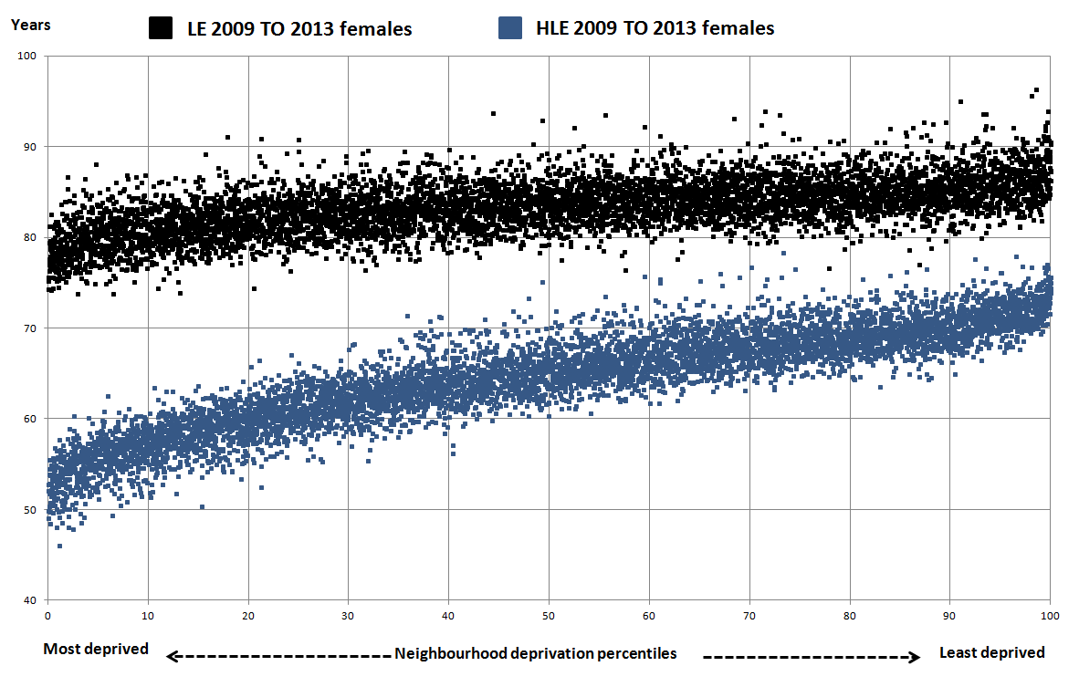
Figures 1 and 2 present life expectancy and healthy life expectancy at birth for males and females respectively, by middle layer super output areas (MSOAs) within England. Life expectancy and HLE at birth is plotted by percentiles of neighbourhood deprivation, using the ranking of areas according to their respective deprivation score based on the Index of Multiple Deprivation (IMD) 2015 to show how these health measures vary by the area’s level of deprivation (further details are available in the technical annex).
Figure 1: Male life expectancy and healthy life expectancy at birth for neighbourhoods (MSOAs) by the Index of Multiple Deprivation (IMD) 2015: England 2009 to 2013

Source: Census - Office for National Statistics
Notes:
- To calculate neighbourhood deprivation percentiles, MSOAs are ranked by using IMD 2015 scores from most deprived to least deprived and divided by the total number of MSOAs included in the analysis and expressed as a percentage
Download this image Figure 1: Male life expectancy and healthy life expectancy at birth for neighbourhoods (MSOAs) by the Index of Multiple Deprivation (IMD) 2015: England 2009 to 2013
.png (52.5 kB) .xls (934.4 kB)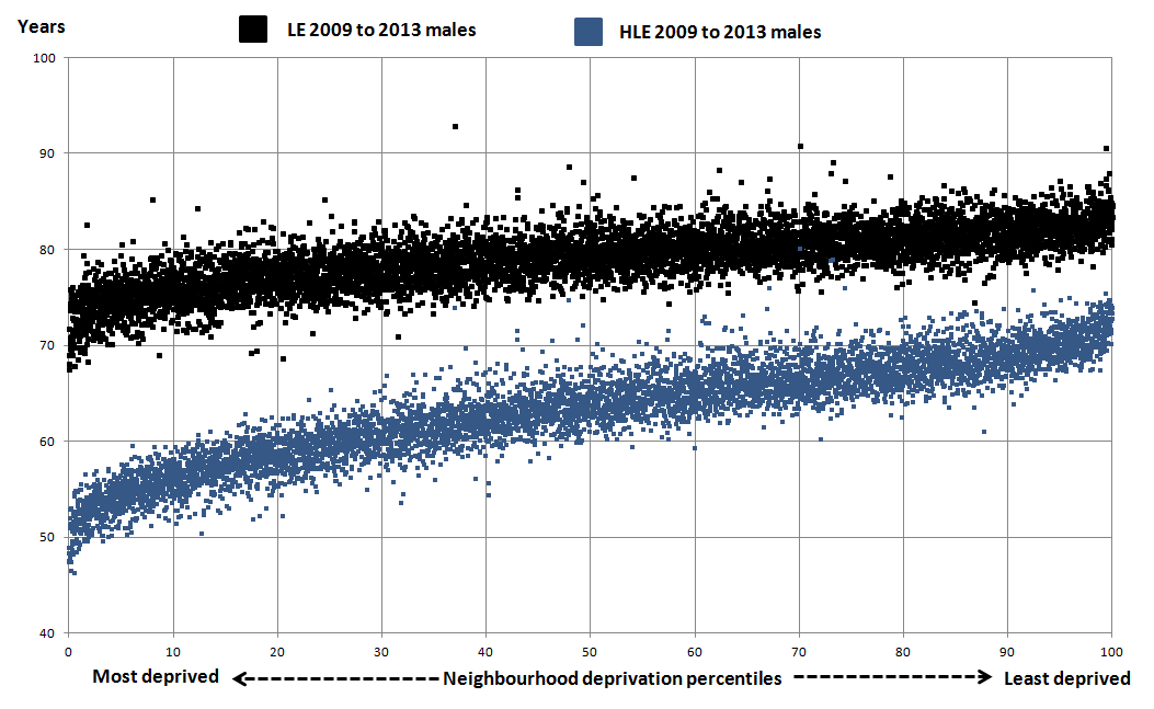
Figure 2: Female life expectancy and healthy life expectancy at birth for neighbourhoods (MSOAs) by the Index of Multiple Deprivation (IMD) 2015: England 2009 to 2013
Source: Census - Office for National Statistics
Notes:
- To calculate neighbourhood deprivation percentiles, MSOAs are ranked by using IMD 2015 scores from most deprived to least deprived and divided by the total number of MSOAs included in the analysis and expressed as a percentage
Download this image Figure 2: Female life expectancy and healthy life expectancy at birth for neighbourhoods (MSOAs) by the Index of Multiple Deprivation (IMD) 2015: England 2009 to 2013
.png (85.9 kB) .xls (942.6 kB)
The charts clearly show that the lower the level of deprivation, the higher the life expectancy and HLE. Another feature that is striking in these charts is the much narrower gap observed between life expectancy and healthy life expectancy amongst the least deprived compared with the most deprived. This pattern means that those living in more deprived areas will spend a greater proportion of their life in not good general health.
DFLE shows a similar pattern, but is not presented on these charts.
This inequality can be quantified in a single number using a summary measure called the slope index of inequality (SII). The SII provides a measure of the difference between the least and most deprived for these indicators, for example, how much life expectancy varies across levels of local deprivation. It takes account of health inequalities across the whole range of deprivation within England, and represents the range in years of life expectancy (or DFLE or HLE) from most to least deprived. The higher the SII, the greater the inequality.
Table 1 summarises the life expectancy, HLE and DFLE at birth for males and females together with the slope index of inequality in England.
Table 1: Life expectancy, healthy life expectancy and disability-free life expectancy at birth and the slope index of inequality by sex
| England 2009 to 2013 | ||
| Years | ||
| Metric | Male | Female |
| Life Expectancy | 79.1 | 83.0 |
| SII in Life Expectancy | 7.9 | 5.9 |
| Healthy Life Expectancy | 63.5 | 64.8 |
| SII in Healthy Life Expectancy | 16.7 | 16.8 |
| Disability-free Life Expectancy | 64.1 | 65.0 |
| SII in Disability-free Life Expectancy | 14.5 | 13.6 |
| Source: Census - Office for National Statistics | ||
Download this table Table 1: Life expectancy, healthy life expectancy and disability-free life expectancy at birth and the slope index of inequality by sex
.xls (25.6 kB)Life expectancy for males in England over the period 2009 to 2013 was 79.1 years. The level of inequality (SII) in life expectancy between men living in the most and least deprived areas was 7.9 years in England over this period. Among females, life expectancy at birth in England was 83.0 years; but the level of inequality was 2 years less than for males at 5.9 years (Table 1).
In 2009 to 2013, male HLE was 63.5 years. The level of inequality in HLE between men living in the most and least deprived areas was 16.7 years. This range is 8.8 years wider than for life expectancy. Among females, HLE at birth was 64.8 years, with a level of inequality of 16.8 years, substantially wider than the inequality in female life expectancy by almost 11 years. It is interesting to note that inequality in HLE is similar for males and females, whereas inequality in life expectancy is much greater for males.
For males at birth in England in the period 2009 to 2013, DFLE was 64.1 years and the level of inequality between the most and least deprived was 14.5 years. For females, DFLE at birth was 65.0 years and the level of inequality between the most and least deprived was 13.6 years.
Back to table of contents4. National changes in inequality between 1999 to 2003 and 2009 to 2013
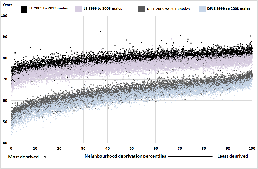
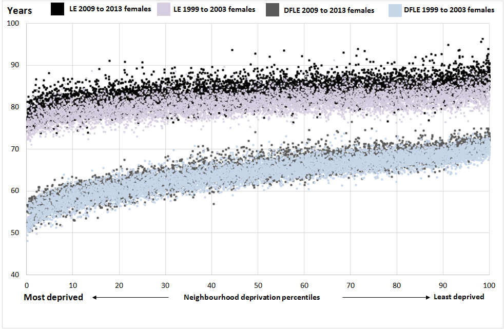
Figures 3 and 4 show scatter plots of life expectancy and disability-free life expectancy (DFLE) at birth across percentiles of area deprivation using Index of Multiple Deprivation 2004 for 1999 to 2003 and the Index of Multiple Deprivation (IMD) 2015 for 2009 to 2013. Unfortunately estimates of healthy life expectancy (HLE) are not available for 1999 to 2003 so we are not able to look at trends in this. In Figures 3 and 4 the 2009 to 2013 data points are darker shades and the 1999 to 2003 are the lighter shades.
In general, life expectancy has increased between the 2 time points in the majority of middle layer super output areas (MSOAs), for both sexes. However, on average the increases among females are not as great as for males, and for DFLE fewer MSOAs have seen an increase, as shown by the fact that the darker data points are mostly not visible. There were 222 MSOAs that experienced a decline in male life expectancy at birth and 616 for females out of 6,691 comparable areas across the 2 time periods. For male DFLE at birth, 358 MSOAs experienced a decline while for females a decline occurred in 2,014.
Figure 3: Male life expectancy and disability-free life expectancy for neighbourhoods (all MSOAs) in 1999 to 2003 and in 2009 to 2013 by the Index of Multiple Deprivation 2004 and 2015 respectively, England
Source: Census - Office for National Statistics
Notes:
- To calculate neighbourhood deprivation percentiles, MSOAs are ranked by using IMD 2004 and 2015 scores from most deprived to least deprived and divided by the total number of MSOAs included in the analysis and expressed as a percentage
Download this image Figure 3: Male life expectancy and disability-free life expectancy for neighbourhoods (all MSOAs) in 1999 to 2003 and in 2009 to 2013 by the Index of Multiple Deprivation 2004 and 2015 respectively, England
.png (157.3 kB) .xls (1.5 MB)
Figure 4: Female life expectancy and disability-free life expectancy for neighbourhoods (all MSOAs) in 1999 to 2003 and in 2009 to 2013 by the Index of Multiple Deprivation 2004 and 2015 respectively, England
Source: Census - Office for National Statistics
Notes:
- To calculate neighbourhood deprivation percentiles, MSOAs are ranked by using IMD 2004 and 2015 scores from most deprived to least deprived and divided by the total number of MSOAs included in the analysis and expressed as a percentage
Download this image Figure 4: Female life expectancy and disability-free life expectancy for neighbourhoods (all MSOAs) in 1999 to 2003 and in 2009 to 2013 by the Index of Multiple Deprivation 2004 and 2015 respectively, England
.png (175.4 kB) .xls (1.5 MB)
By calculating the SII for both 1999 to 2003 and 2009 to 2013, it is possible to assess how inequalities in life expectancy and DFLE have changed over time. (The SII for HLE is only available for 2009 to 2013).
Table 2: Slope index of inequality (SII) in life expectancy at birth and disability-free life expectancy at birth (DFLE), within England, 1999 to 2003 [1] and 2009 to 2013 [2]
| Period | Male | Female | ||||
| SII (Years) | Lower 95 % confidence interval | Upper 95 % confidence interval | SII (Years) | Lower 95 % confidence interval | Upper 95 % confidence interval | |
| Life Expectancy at birth | ||||||
| 1999 to 2003 | 8.0 | 7.9 | 8.2 | 5.4 | 5.2 | 5.6 |
| 2009 to 2013 | 7.9 | 7.7 | 8.0 | 5.9 | 5.7 | 6.1 |
| Disability-free Life Expectancy at birth | ||||||
| 1999 to 2003 | 15.2 | 15.1 | 15.4 | 13.3 | 13.1 | 13.5 |
| 2009 to 2013 | 14.5 | 14.3 | 14.6 | 13.6 | 13.5 | 13.8 |
| Source: Office for National Statistics | ||||||
| Notes: | ||||||
| 1. SII for 1999-2003 based on 2001 MSOA boundaries and Index of Multiple Deprivation 2004 | ||||||
| 2. SII for 2009-13 based on 2011 MSOA boundaries and Index of Multiple Deprivation 2015 | ||||||
Download this table Table 2: Slope index of inequality (SII) in life expectancy at birth and disability-free life expectancy at birth (DFLE), within England, 1999 to 2003 [1] and 2009 to 2013 [2]
.xls (33.3 kB)As measured by the SII, the inequality in life expectancy has decreased from 8.0 to 7.9 for males across the 2 time periods, and for females has increased from 5.4 to 5.9 years. For DFLE, inequality between the most deprived and least deprived in England has decreased from 15.2 years to 14.5 years for males, and increased from 13.3 years to 13.6 years for females.
Therefore between the two time periods, there has been a slight narrowing of inequality for males in life expectancy and DFLE, and a slight widening of inequality for both indicators for females, however, these differences are small. These results for life expectancy are consistent with those which have been reported in the Public Health Outcomes Framework indicator of inequality in life expectancy, for which trend data are currently available from Public Health Outcome Framework 2002 to 2004 to the period 2011 to 2013.
The SII figures for 1999 to 2003 were defined using the Index of Multiple Deprivation 2004 (IMD 2004), while the figures for 2009 to 2013 were calculated using the Index of Multiple Deprivation 2015 (IMD 2015). These versions of the IMD allow the ranking of MSOAs based on the definition of deprivation which was current to the time period being examined. To explore whether changes in the level of inequality would be affected by the choice of deprivation index, the SII figures were calculated again with data for 1999 to 2003 based on IMD 2015 and figures for 2009 to 2013 based on IMD 2004. The results were consistent, demonstrating that the change in IMD has had little impact on the scale of inequality.
In summary, the SII results show that across the whole population of England, in the ten years between 1999 to 2003 and 2009 to 2013, there has been little change in the level of inequality for both male and female life expectancy and DFLE.
Back to table of contents5. Upper Tier Local Authorities
Map 1 shows the inequality in life expectancy across England’s Upper Tier Local Authorities separately for males and females. The darkest areas show those parts of England with the widest inequalities which are mostly in the North West, North East, Yorkshire and the Humber and selected parts of inner London. The male inequality exceeds the female inequality in all local authorities, as the paler shades indicate on the female map. Moreover, there are 10 local authorities where the inequality in male life expectancy was 10 or more years, but there was only 1 authority (Middlesbrough) for females.
Map 1: Slope index of inequality (SII) in life expectancy (LE) at birth by sex for Upper Tier Local Authorities (UTLAs): England 2009 to 2013

Download this image Map 1: Slope index of inequality (SII) in life expectancy (LE) at birth by sex for Upper Tier Local Authorities (UTLAs): England 2009 to 2013
.png (297.2 kB)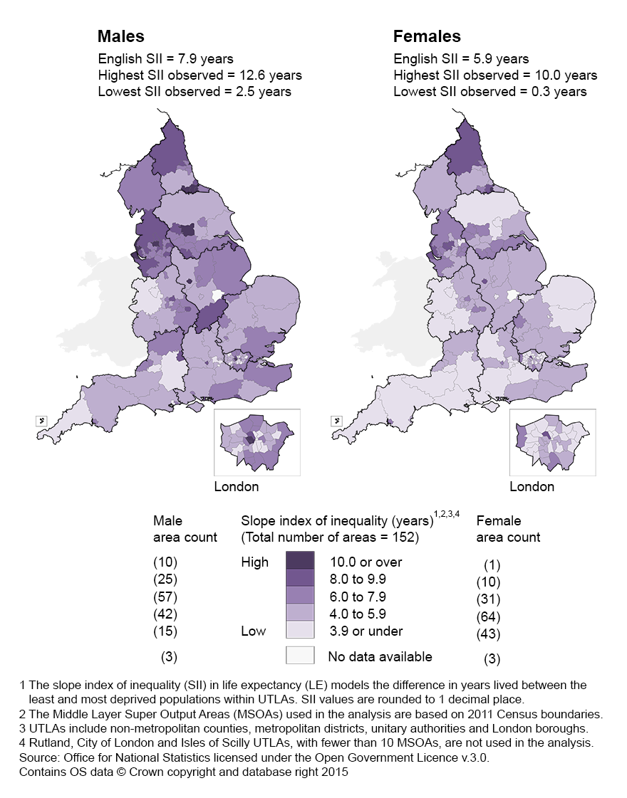
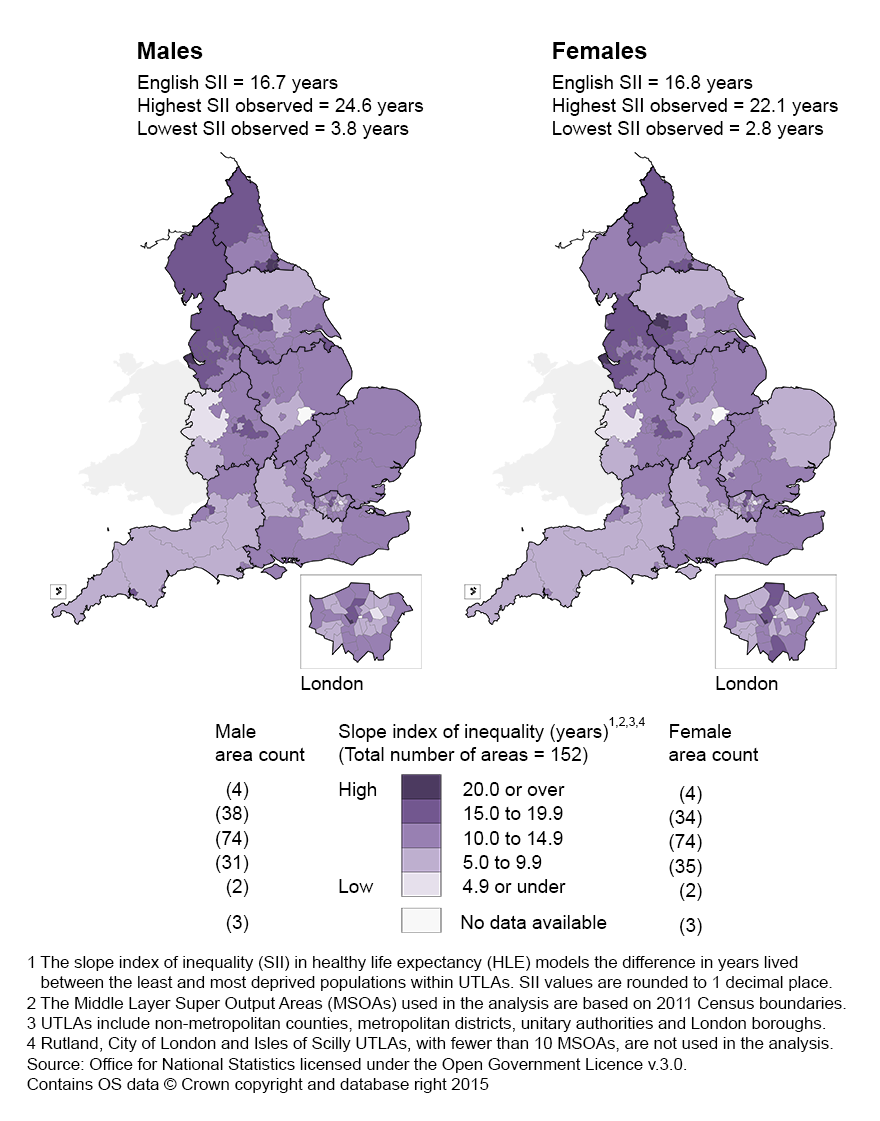
Maps 2 and 3 extend the illustration of inequality to healthy life expectancy (HLE) and disability-free life expectancy (DFLE) at birth. These maps are on slightly different scales and it should be noted that the inequality is generally larger in healthy life expectancy than in disability-free life expectancy, but each is substantially larger than the inequality in life expectancy.
map 2: Slope index of inequality (SII) in healthy life expectancy (HLE) at birth by sex for Upper Tier Local Authorities (UTLAs): England 2009 to 2013
Download this image map 2: Slope index of inequality (SII) in healthy life expectancy (HLE) at birth by sex for Upper Tier Local Authorities (UTLAs): England 2009 to 2013
.png (289.0 kB)
Map 3: Slope index of inequality (SII) in disability-free (DFLE) at birth by sex for Upper Tier Local Authorities (UTLAs): England 2009 to 2013

Download this image Map 3: Slope index of inequality (SII) in disability-free (DFLE) at birth by sex for Upper Tier Local Authorities (UTLAs): England 2009 to 2013
.png (299.4 kB)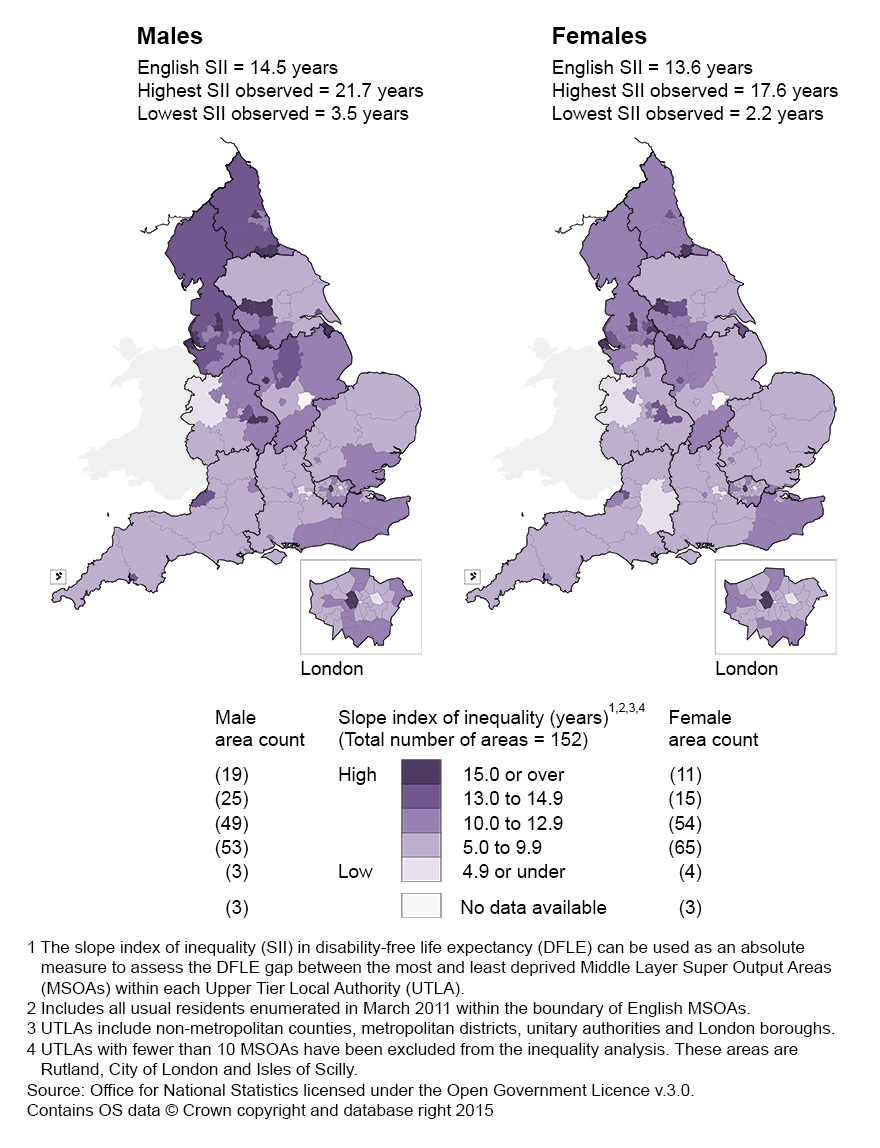
Further details on how the inequality in healthy life expectancy varies across administrative geography can be found in the visual story entitled How Long Will You Live in Good Health?.
Back to table of contents6. How inequality varies with healthy life expectancy
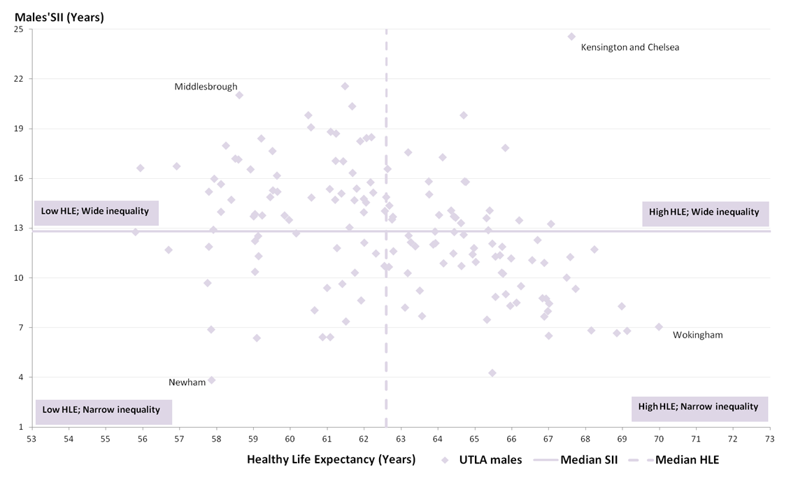
When looking at healthy life expectancy (HLE) among English local authorities in 2009 to 2013 authorities can be put into 1 of 4 types using the median values for healthy life expectancy (HLE) and the slope index of inequality (SII) in HLE (Figures 5 and 6). The types can be characterised by:
high healthy life expectancy and wide inequality (top right of the chart)
high healthy life expectancy and narrow inequality (bottom right of the chart)
low healthy life expectancy and wide inequality (top left of the chart)
low healthy life expectancy and narrow inequality (bottom left of the chart)
We have also published a summary ('How Long Will You Live in Good Health?') that focuses on the most notable authorities highlighted in Figures 5 and 6.
Figure 5: Slope index of inequality (SII) in male healthy life expectancy (HLE) for local authorities with the median of the local authorities on each measure
England 2009 to 2013
Source: Census - Office for National Statistics
Download this image Figure 5: Slope index of inequality (SII) in male healthy life expectancy (HLE) for local authorities with the median of the local authorities on each measure
.png (78.9 kB) .xls (138.2 kB)
Figure 6: Slope index of inequality (SII) in female healthy life expectancy (HLE) for local authorities with the median of the local authorities on each measure
England 2009 to 2013

Source: Census - Office for National Statistics
Download this image Figure 6: Slope index of inequality (SII) in female healthy life expectancy (HLE) for local authorities with the median of the local authorities on each measure
.png (75.7 kB) .xls (121.9 kB)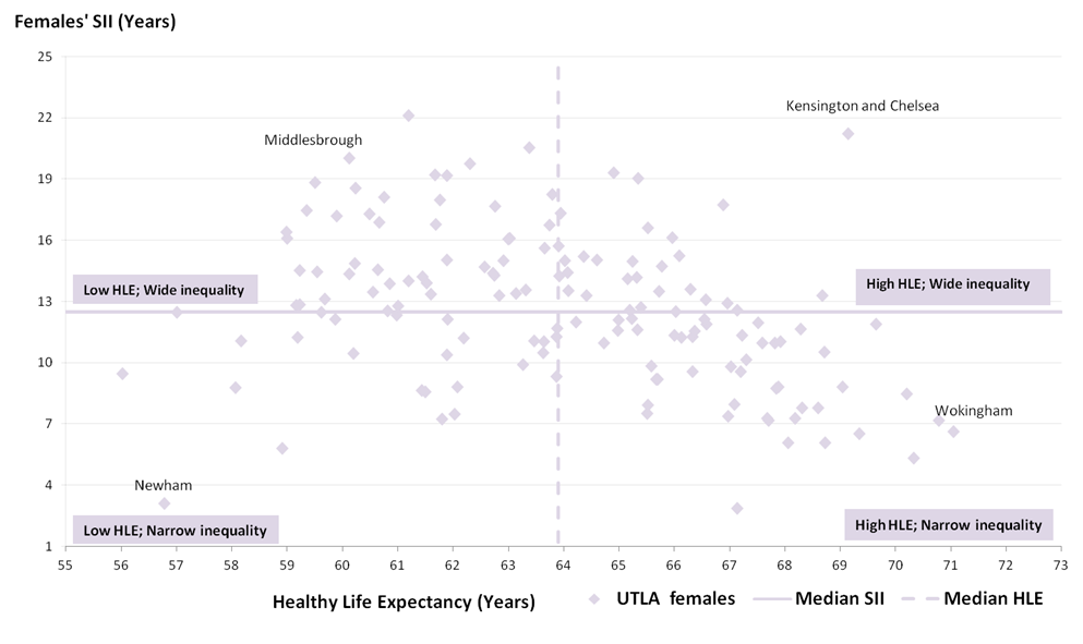
The slope index of inequality describes the extent of overall inequalities in life expectancy, DFLE and HLE within the local authority. Areas with a diverse range of communities, from very affluent to very deprived, will tend to have wide inequalities in these health outcomes as well, and the SII will reflect these underlying differences. Similarly, local authorities that have relatively uniform populations will tend to have smaller health inequalities and lower SII scores. If areas with larger populations contain a broader range of communities they will have higher scores, but if they are large and relatively uniform, they will not. These underlying population factors must be taken into account when interpreting the SII.
A high score in an area may sometimes also result from random variation in the numbers of deaths or responses to the census questions. The width of the confidence interval around the SII gives an indication of the degree of uncertainty around the calculated values.
Areas with high healthy life expectancy and wide inequality
Looking at Figures 5 and 6, areas in the top right hand quadrant are characterised by high HLE for the authority as a whole and wide inequality. For males, this means authorities with a HLE of more than 62.6 years and an inequality in HLE between the least and most deprived parts of more than 12.8 years. The most notable examples in London are Kensington and Chelsea, Westminster, Camden, Merton and Bromley. Outside London, examples include Swindon, Solihull, parts of the North West such as Warrington, Cheshire East, Cheshire West and Chester, Trafford and Stockport.
For females this means authorities with HLE above 63.9 years and inequality in HLE above 12.5 years. The authority composition is largely similar to males with Kensington and Chelsea having the widest inequality in that quadrant.
Areas with low healthy life expectancy and narrow inequality
In the bottom left section of Figures 5 and 6, females in these authorities had HLE below 63.9 years and inequality in HLE below 12.5 years. This quadrant is notable for the high number of London boroughs within it, including Tower Hamlets, Newham, Hackney, Brent, Barking and Dagenham, Islington, Waltham Forest, Lambeth, Southwark, Lewisham, Greenwich, Hounslow and Redbridge. In Newham, the inequality was only 3.1 years and 5.8 years in Barking and Dagenham. A notable example outside London with these characteristics was Slough. The composition of the authorities for males was very similar.
Areas with high healthy life expectancy and narrow inequality
In these authorities with high HLE and narrow inequality, male HLE at birth is higher than 62.9 years but the inequality in HLE is below 12.8 years. Female HLE is higher than 63.9 years and the inequality in HLE is lower than 12.5 years. Some of the most notable examples are Wokingham, Richmond-upon-Thames, Windsor and Maidenhead, West Berkshire, Wiltshire and Shropshire. Such authorities have low levels of deprivation generally are largely non-metropolitan in character and located predominantly in the South East, South West and the East of England regions.
Areas with low healthy life expectancy and wide inequality
In authorities with low HLE and wide inequality, male HLE at birth is lower than 62.9 years but the inequality in HLE is wider than 12.8 years. Female HLE is lower than 63.9 years and the inequality in HLE is wider than 12.5 years. Examples include Middlesbrough, Bradford, Bolton, Blackpool, Liverpool, Wirral, Blackburn with Darwin, Knowsley, Rochdale, Oldham, Halton, Newcastle-upon-Tyne, Walsall, Coventry and Birmingham. There is a clear link with metropolitan areas in relatively deprived parts of the North West, North East, Yorkshire and The Humber and the West Midlands.
The pattern of the inequality across geographical areas is generally consistent for HLE and DFLE, but there are some local authorities that have a higher inequality for females: healthy life expectancy and disability-free life expectancy is higher for females in 57 and 27 local authorities respectively. Further details on how the inequality in healthy life expectancy and disability-free life expectancy varies across administrative geography can be found using the interactive maps available with this release.
Healthy life expectancy at birth and the slope index of inequality in healthy life expectancy for all local authorities is available in the references tables and interactive maps accompanying this release.
Back to table of contents7. Next steps
Unfortunately these data on healthy life expectancy (HLE) and disability-free life expectancy (DFLE) for small areas are currently only possible to produce every 10 years using census data. However, with greater reliance on administrative data sources in the future, such analyses may be possible at more frequent intervals.
Public Health England will continue to report on inequalities in life expectancy for England and within local authorities on an annual basis as part of the Public Health Outcomes Framework (PHOF). The next update to these data will be in February 2016.Inequality in healthy life expectancy within England as a whole is also reported annually as part of the PHOF, but annual figures on inequality within local authorities are not available.
Back to table of contents8. Acknowledgements
This bulletin and the accompanying data were commissioned by and produced in conjunction with Public Health England.
Back to table of contents9. What data are available and where to access the data?
Estimates of life expectancy, healthy life expectancy (HLE) and disability free life expectancy (DFLE) at birth for males and females for the period 2009 to 2013 are available to download alongside this bulletin for:
England
the regions of England
each upper tier local authority
each middle layer super output area
Estimates of life expectancy and DFLE at birth for each middle layer super output area for the period 1999 to 2003 (2.61 Mb Excel sheet) are also available to download alongside this bulletin:
- each middle layer super output area
Estimates of the inequality in life expectancy, HLE and DFLE at birth for the period 2009 to 2013 using the slope index of inequality are available to download alongside this bulletin within:
England
the regions of England
each upper tier local authority
The Index of Multiple Deprivation 2015 deprivation score for each MSOA in England is also available for download. All data included in this analysis is available for download from the ONS website
Back to table of contents10. Interactive visual story
'How Long Will You Live in Good Health?' shows the inequality in life expectancy and healthy life expectancy. This section contains charts, commentary and interactive digital maps.
Small Areas variation in healthy life expectancy
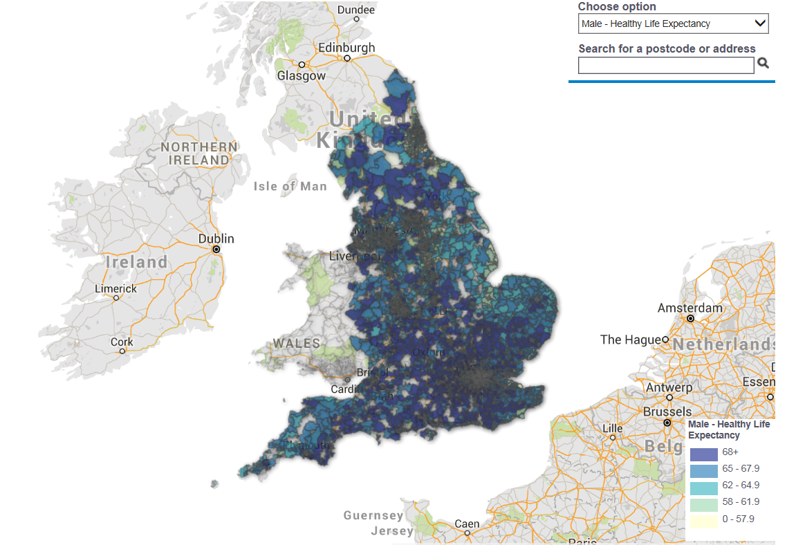
Download this image Small Areas variation in healthy life expectancy
.png (639.5 kB)
11. Technical annex
What are middle layer super output areas (MSOAs)?
Super output areas were designed to improve the reporting of small area statistics and are built up from groups of census output areas. Middle layer super output areas (MSOAs) were originally released in 2004 for England and Wales and were updated during the delivery of 2011 Census statistics. There are 6,791 MSOAs in England and their population sizes range from approximately 5,000 to 15,000. They were created to ensure a consistently large enough population for statistical analyses to enable comprehensive coverage.
How has area deprivation for MSOAs been measured?
Deprivation has been measured using the English indices of deprivation, produced by Department for Communities and Local Government (DCLG). The indices provide a measure of relative deprivation for all lower layer super output areas in England. It should be noted that not all residents of a deprived area will be deprived, and conversely, not all deprived people will live in deprived areas.
The English Indices of Deprivation 2015 were published by the DCLG in September 2015. These are based on 37 separate indicators, organised across 7 distinct domains of deprivation which are combined, using appropriate weights, to calculate the Index of Multiple Deprivation 2015 (IMD 2015). IMD 2015 has been used throughout this bulletin to measure the slope index of inequality (SII). In addition, the Index of Multiple Deprivation 2004 was used to calculate the SII for life expectancy and disability-free life expectancy in 1999 to 2003.
The 7 primary domains of each index are shown in Table A1, with the relative weight of each domain shown in brackets. Although the domains and weights are the same in both versions of the IMD, there have been changes to some of the indicators which make up each domain.
Table A1: Constituent domains of Index of Multiple Deprivation 2015 and 2004
| Index of Multiple Deprivation 2015 domains | Index of Multiple Deprivation 2004 domains |
| Income (22.5%) | Income deprivation (22.5%) |
| Employment (22.5%) | Employment deprivation (22.5%) |
| Education, Skills and Training (13.5%) | Education, Skills and Training (13.5%) |
| Health and Disability (13.5%) | Health and Disability (13.5%) |
| Crime (9.3%) | Crime (9.3%) |
| Barriers to Housing and Services (9.3%) | Barriers to Housing and Services (9.3%) |
| Living Environment (9.3%) | Living Environment (9.3%) |
Download this table Table A1: Constituent domains of Index of Multiple Deprivation 2015 and 2004
.xls (32.8 kB)As IMD 2004 and IMD 2015 were both released for lower super output areas (LSOAs), scores have been calculated for middle layer super outputs areas for the analyses in this bulletin. These were calculated for each MSOA by taking a population weighted average of the deprivation scores of their constituent LSOAs.
Further details of the methodology can be found in Appendix A of the DCLG research report.
What is life expectancy at birth?
All life expectancy figures presented in this bulletin are period life expectancies. Period expectation of life at birth for a particular MSOA in 2009 to 2013, represents an estimate of the average number of years a new born baby would survive if he or she experienced the MSOA’s age-specific mortality rates for that time period throughout the rest of his or her life. It is not the number of years a person will expect to live, because the death rates of the area are likely to change in the future and many of those born in an area will move to a different area for part of their lives.
We calculate life expectancy using the abridged life table method1. Period life expectancy answers the question, 'for a group of people aged x in a given year or period, how long would they live, on average, if they experienced the age-specific mortality rates above age x of the period in question over the course of their remaining lives?2'
What are health expectancies?
Health expectancies are summary measures of population health status that enable monitoring of whether life years are spent in “good” health or free from activity limiting long-standing illness or impairment (disability). In this bulletin, health expectancies are calculated using the Sullivan method3. Sullivan’s method estimates the number of remaining years, at a particular age, which an individual can expect to live in a healthy state (however health may be defined). They can be used to assess population health status over time, and to highlight health inequalities.
The 2 health expectancies reported in this bulletin are disability-free life expectancy (DFLE) and healthy life expectancy (HLE). DFLE is the average number of years that an individual can expect to live free from a limiting persistent illness or disability in their lifetime. HLE is the average number of years a person might expect to live in “good” health in their lifetime. The “good” health state used for estimation of HLE was based on self-reports of general health at the 2011 Census; specifically those reporting their general health as “very good” or “good” were defined as in ‘Good’ health in this context. Further details on how the general health question from the 2011 Census has been used to measure healthy life expectancy can be found on our website.
DFLE and HLE estimates in this bulletin are a snapshot of the health status of the population during 2009 to 2013, based on self-reported health status and mortality rates in that period. As with period life expectancies, they are not a guide to how long someone will actually expect to live in good health, or free from disability, as mortality rates and levels of health status are likely to change in the future.
How inequality has been measured and coverage
These analyses measure the inequality within England, English regions and English Upper Tier Local Authorities using the slope index of inequality (SII).
To calculate the SII, within each local authority, MSOAs were ranked from most to least deprived. Life expectancy (or HLE or DFLE) was then calculated for each MSOA. To allow for differences in population size between MSOAs, each was given a rank score based on the midpoint of its range in the cumulative distribution of the local authority’s population. If the most deprived MSOA contained 5% of the local authority’s population, its rank score would be 5/2=2.5. If the second most deprived MSOA included 12% of the population, its rank score would be 5+(12/2)=11. The life expectancy for each MSOA is plotted against this rank score and a population‐weighted regression line is fitted to the data by the least squares method. The SII is the gradient of the resulting fitted line, thus representing the absolute difference in life expectancy (or HLE or DFLE) between the most and least deprived areas within a local authority. The same method was used to calculate the SIIs within England as a whole and the English regions.
There were 3 Upper Tier Local Authorities excluded from the analyses because of inadequate numbers of MSOAs to measure inequality with sufficient statistical precision to be meaningful. A threshold was set at the outset of a minimum of 10 MSOAs for viable estimation of the SII. The Isles of Scilly and City of London Corporation have only one MSOA each and therefore measurement of inequality within these areas was not possible. Rutland was also excluded because it contained only five MSOAs. All other Upper Tier Local Authorities were included.
Notes for technical annex
The Chiang II method of abridgement and conversion of the central age-specific mortality rate into the probability of survival in the age stratum is used and complies with the standard ONS approach to estimate life expectancy at sub-national level (192.5 Kb Excel sheet)
ONS (2011): Guide to period and cohort life expectancy
Sullivan, D.F. (1971). A single index of mortality and morbidity. HSMHA Health Reports, 86:347-354