Table of contents
- Main points
- Summary
- National life expectancy at birth
- National life expectancy at age 65
- Regional life expectancy at birth
- Regional life expectancy at age 65
- Local area life expectancy at birth
- Local area life expectancy at age 65
- Animated maps
- Background
- Users and policy context
- Results on our website
- Methods
- References
- Background notes
1. Main points
In 2012 to 2014, life expectancy for newborn baby boys was highest in Kensington and Chelsea (83.3 years) and lowest in Blackpool (74.7 years). For newborn baby girls, life expectancy was highest in Chiltern (86.7 years) and lowest in Middlesbrough (79.8 years).
When this series first began (1991 to 1993), East Dorset had the highest male and female life expectancy at birth. Two decades later, baby boys in Blackpool and girls in Middlesbrough can still expect lower life expectancy. In contrast, baby girls in Chiltern, and boys in Kensington and Chelsea, can expect to live 4 to 5 years longer.
The inequality between the local areas with the highest and lowest newborn life expectancy has increased despite improvements across local areas over the last 2 decades.
In 2012 to 2014, the inequality between the local areas with the highest and lowest life expectancy at birth was greater for boys than girls.
The majority of local areas in the bottom 50 with the lowest life expectancy at birth (68% of areas for boys and 70% for girls) were in the North East, the North West and Wales.
The top 50 local areas with the highest male life expectancy at birth were in the South East, East of England, South West, London and East Midlands only. For females, the top 50 included areas in these regions and 1 each in the North West and Yorkshire and The Humber.
The most rapid increases in male life expectancy at birth over the last 2 decades were in London (7.0 years), the North East (6.0 years) and the North West (5.8 years), while the East (5.4 years) and South West (5.3 years) experienced the slowest increase. A similar picture was observed for females. Consequently, regional differences in life expectancy at birth have reduced.
For men at age 65, life expectancy was highest in Kensington and Chelsea (21.6 years) and lowest in Manchester (15.9 years). For women at this age, life expectancy was highest in Camden (24.6 years) and again lowest in Manchester (18.8 years).
In 2012 to 2014, the inequality between the local areas with the highest and lowest life expectancy at age 65 was fairly similar for men and women (5.7 and 5.8 years respectively).
2. Summary
Period life expectancy at a given age for an area is the average number of years a person would live, if he or she experienced the particular area’s age-specific mortality rates for that time period throughout his or her life.
This bulletin presents male and female period life expectancy at birth and at age 65 for England and Wales and local areas within both countries. We present figures for the period 2012 to 2014 and analyse how life expectancy has changed since 1991 to 1993 when we started producing these data.
The term "local areas" refer to local authority districts and these include unitary authorities, London boroughs, metropolitan districts and non-metropolitan districts in England and Wales.
Back to table of contents3. National life expectancy at birth
Life expectancy increase has been faster in England than Wales
Life expectancy for newborn babies has steadily increased in England and Wales since 1991 to 1993. The increase has however been greater in England than Wales.
In England, life expectancy at birth for boys increased, from 73.7 years in 1991 to 1993, to 79.5 years in 2012 to 2014. This means that a newborn baby boy in England in 2012 to 2014 can expect to live 5.9 years longer than a newborn baby boy in the same country over two decades ago. Similarly, life expectancy for baby girls increased by 4.1 years, from 79.1 years in 1991 to 1993, to 83.2 years in 2012 to 2014.
In Wales, life expectancy at birth increased by 5.3 years for boys, from 73.3 years in 1991 to 1993 to 78.5 years in 2012 to 2014. For girls, it increased by 3.5 years, from 78.8 years in 1991 to 1993, to 82.3 years in 2012 to 2014.
Gap between male and female life expectancy at birth has fallen in England and in Wales
In both countries the gap between male and female life expectancy at birth gradually narrowed between 1991 to 1993 and 2012 to 2014. In England, while girls born in 1991 to 1993 could expect to live 5.4 years longer than boys born in the same period, by 2012 to 2014 the gap had narrowed to 3.7 years. Similarly, in Wales the gap between male and female life expectancy fell from 5.6 years in 1991 to 1993 to 3.8 years in 2012 to 2014.
Gap between England and Wales has become wider for newborn life expectancy
Life expectancy is not only higher in England than Wales, the gap between both countries has increased. The difference between the life expectancy of baby boys in England and Wales increased from almost 5 months in 1991 to 1993 to 1.0 year in 2012 to 2014. Similarly, the gap between girls in both countries widened from around 3 and half months in 1991 to 1993 to 9 and half months in 2012 to 2014.
Figure 1: Life expectancy for babies at birth by sex and country
England and Wales, 1991-1993 to 2012-2014
Source: Office for National Statistics
Notes:
- Figures are based on deaths registered and mid-year population estimates, aggregated over 3 consecutive years.
- Figures for each country exclude deaths of non-residents.
- Newborn life expectancy has steadily increased in England and Wales since 1991-93. Life expectancy is higher in England then in Wales, while the gap between both countries has widened over the last 2 decades.
- The gap between male and female life expectancy at birth has also narrowed in both countries.
Download this chart Figure 1: Life expectancy for babies at birth by sex and country
Image .csv .xls4. National life expectancy at age 65
Men and women aged 65 years could expect to live for an additional 18 to 20 years
In England, life expectancy for men aged 65 years in 2012 to 2014 was 18.8 years, while women at this age could expect to live for an additional 21.2 years. This means that a 65-year-old man could expect to live to almost 84 years, while a woman of the same age could expect to reach her 86th birthday.
In Wales, life expectancy for men and women aged 65 years in 2012 to 2014 was 18.2 years and 20.6 years respectively. This means that men and women at this age could expect to live to reach their 83rd and 85th birthday respectively.
Gap between male and female life expectancy at age 65 has fallen in England and in Wales
The gap between male and female life expectancy at age 65 has narrowed in both countries. In England, the life expectancy of 65-year-old women in 1991 to 1993 was 3.7 years higher than that of men, but by 2012 to 2014, the difference between men and women at age 65 had fallen to 2.4 years.
A similar decrease was observed in Wales, where the difference between the life expectancy of 65-year-old men and women fell from 3.8 years in 1991 to 1993 to 2.4 years in 2012 to 2014.
Gap between England and Wales has become wider for life expectancy at age 65
Similar to at birth, life expectancy at age 65 years increased between 1991 to 1993 and 2012 to 2014, but the increase was greater in England than in Wales. For men, the increase over the periods was 4.4 years in England compared with 4.1 years in Wales and for women, 3.0 years in England compared with 2.7 years in Wales. As a result, not only do 65-year-olds in England have a higher life expectancy than those in Wales, the gap between both countries has increased.
Figure 2: Life expectancy for 65-year-olds by sex and country
England and Wales, 1991–1993 to 2012–2014
Source: Office for National Statistics
Notes:
- Figures are based on deaths registered and mid-year population estimates, aggregated over 3 consecutive years.
- Figures for each country exclude deaths of non-residents.
- Life expectancy at age 65 years increased between 1991-93 and 2012-14, but the increase was greater in England than in Wales. As a result, not only do 65 year olds in England have a higher life expectancy than those in Wales, the gap between both countries has increased.
- The gap between male and female life expectancy at age 65 has narrowed in both countries.
Download this chart Figure 2: Life expectancy for 65-year-olds by sex and country
Image .csv .xls5. Regional life expectancy at birth
Life expectancy at birth remains highest in the south and lowest in the north
Life expectancy varied across English regions in each period examined and tended to be higher among those in the south than in the North and the Midlands.
For boys born in 2012 to 2014, life expectancy at birth was highest in the South East (80.5 years) and lowest in the North East (78.0 years). For girls born in this period, the highest life expectancy was in London (84.2 years), while the lowest was also in the North East (81.7 years).
A number of factors have been identified as plausibly being responsible for the excess mortality, and consequently lower life expectancy, in the northern regions of England. These include socioeconomic, environmental (including working conditions), educational and lifestyle factors, which may act throughout the lifetime of those living in the north, and possibly over generations (Hacking, Muller and Buchan, 2011).
Gap between male and female life expectancy at birth narrowest in the East and widest in the West Midlands
In 1991 to 1993, the gap between male and female life expectancy at birth varied across English regions, from 5.1 years in the East of England, to 6.0 years in London. The gap has since narrowed, but to varying extents across all regions.
In 2012 to 2014, the gap was smallest in the East of England, where the difference between the life expectancy of newborn baby boys and that of girls fell by about a third, from 5.1 years in 1991 to 1993, to 3.4 years in 2012 to 2014. Conversely, the gap in this period was widest in the West Midlands, where the difference between male and female life expectancy at birth fell by just over a quarter, from 5.5 years in 1991 to 1993, to 4.0 years in 2012 to 2014.
London has experienced the most rapid increase in newborn life expectancy
Life expectancy has increased in all English regions since 1991 to 1993, but some regions have experienced greater increases than others. The most rapid increase was in London, closely followed by the North East and the North West. Figures for 2012 to 2014 show that life expectancy for a newborn baby boy in London is now 7.0 years higher than it was in 1991 to 1993. Over the same period, life expectancy for baby boys in the North East and North West increased by 6.0 and 5.8 years, respectively.
A similar picture was observed for baby girls, with life expectancy increasing by 4.9 years in London and 4.3 years in the North East. As a result of life expectancy increasing most rapidly in London, the region now has the highest female life expectancy at birth.
There are a number of plausible reasons why London and the 2 northern regions have seen the greatest increase in life expectancy over the last 2 decades. One explanation is that deaths from causes amenable to healthcare and public health interventions, such as certain cancers, respiratory diseases and heart disease have fallen more rapidly in these regions than anywhere else since 2001 (ONS, 2015).
It is also possible that there is a selective migration of healthy individuals from deprived areas in other regions into London for employment or other economic reasons. This type of migration has been shown to raise ill-health and death rates where these people originated from and lower them where they moved to (Norman, Boyle and Rees, 2005). However, it is not possible to quantify the extent to which better health areas are benefiting from selective migration of healthy people since the health status of these migrants is not known.
Increase in newborn life expectancy has been slowest in the East and South West
The East of England and South West have historically ranked as 2 of the regions with the highest life expectancy for baby boys, but they experienced the smallest increase between 1991 to 1993 and 2012 to 2014 (5.4 and 5.3 years, respectively). Although, baby boys in these regions could still expect to live longer than those in any other region, the gaps in life expectancy at birth between them and those in the northern regions have narrowed.
A similar pattern was observed for female life expectancy at birth, with the East and South West experiencing the smallest increases (3.7 years respectively).
Life expectancy at birth boosted by those aged 65 years and over, but slowed by 20 to 44-year-olds
Deaths rates have improved in most age groups since 1991 to 1993, but the main reason why regional life expectancy at birth has increased as much as it has over the last two decades is that these rates have fallen more rapidly among those aged 65 years and over (ONS, 2014).
Despite the improvements in death rates across all regions, and the 2 northern regions closing the gap on those in the south, a north-south divide in life expectancy persists. This is because death rates are still worse in the north than in the south. In a recent study we showed that death rates in certain age groups in northern regions worsened between 1991 to 1993 and 2011 to 2013, thereby slowing pace of increase in life expectancy at birth. For example, the death rates for 20 to 44-year-olds in the North East worsened over the periods, causing the increase in life expectancy at birth to be approximately 7 days lower than it ought to have been (ONS, 2014).
Figure 3: Life expectancy for newborn baby boys by region
England, 1991 to 1993 and 2012 to 2014
Source: Office for National Statistics
Notes:
- Figures are based on deaths registered and mid-year population estimates, aggregated over 3 consecutive years.
- Figures exclude deaths of non-residents.
- Life expectancy increased in all english regions between 1991-93 and 2012-14, but to varying extents. The south east (80.5 years) had the highest life expectancy for boys born in 2012-14, while the north east had the lowest (78.0 years).
Download this chart Figure 3: Life expectancy for newborn baby boys by region
Image .csv .xls
Figure 4: Life expectancy for newborn baby girls by region
England, 1991 to 1993 and 2012 to 2014
Source: Office for National Statistics
Notes:
- Figures are based on deaths registered and mid-year population estimates, aggregated over 3 consecutive years.
- Figures exclude deaths of non-residents.
- Life expectancy increased in all English regions between 1991-93 and 2012-14, but the increase was most rapid in London. Consequently, London now has the highest newborn life expectancy for girls (84.2 years), while the north east has the lowest (81.7 years).
Download this chart Figure 4: Life expectancy for newborn baby girls by region
Image .csv .xls6. Regional life expectancy at age 65
Life expectancy at age 65 highest in the south and lowest in the north
For men aged 65 years in 2012 to 2014, regional life expectancy was highest in the East (19.3 years) and lowest in the North East (17.9 years). For women, it was highest in London (21.9 years) and lowest in the North East (20.0 years).
Life expectancy for 65-year-old men and women living in the Midlands, and Yorkshire and the Humber was higher than that of those living in the North East and the North West, but lower than that of those in the southern regions (London, East of England, South East and South West).
London, North East and West Midlands see greatest increase in life expectancy at age 65
Regional life expectancy at age 65 increased between 1991 to 1993 and 2012 to 2014. The greatest increase for men was in London and the North East (both 4.7 years) and for women, in London and the West Midlands (3.5 and 3.2 years respectively). For both sexes, the slowest improvements in life expectancy at age 65 were in Yorkshire and The Humber and the South West.
Gap between male and female life expectancy at age 65 narrowest in the North East and widest in London
The gap between male and female life expectancy at age 65 was fairly similar across all regions in 1991 to 1993, varying from 3.6 years in the East of England, to 3.9 years in London. The gap narrowed in all regions between 1991 to 1993 and 2012 to 2014, but to varying degrees. In the North East, the difference between the life expectancy of 65-year-old men and that of women fell by 41%, from 3.7 years in 1991 to 1993, to 2.2 years in 2012 to 2014, making it the region with the smallest gender difference in the latter period.
Conversely, in London where the gap was widest in both periods, the difference between male and female life expectancy at age 65 fell by only 31%, from 3.9 years in 1991 to 1993, to 2.7 years in 2012 to 2014.
Figure 5: Life expectancy for 65-year-old men by region
England, 1991 to 1993 and 2012 to 2014
Source: Office for National Statistics
Notes:
- Figures are based on deaths registered and mid-year population estimates, aggregated over 3 consecutive years.
- Figures exclude deaths of non-residents.
- Life expectancy increased in all English regions between 1991-93 and 2012-14. For men aged 65 years in 2012-14, remaining life expectancy was highest in the east (19.3 years) and lowest in the north east (17.9 years).
Download this chart Figure 5: Life expectancy for 65-year-old men by region
Image .csv .xls
Figure 6: Life expectancy for 65-year-old women by region
England, 1991 to 1993 and 2012 to 2014
Source: Office for National Statistics
Notes:
- Figures are based on deaths registered and mid-year population estimates, aggregated over 3 consecutive years.
- Figures exclude deaths of non-residents.
- Life expectancy increased in all English regions between 1991-93 and 2012-14. For women aged 65 years in 2012-14, remaining life expectancy was highest in London (21.9 years) and lowest in the north east (20 years).
Download this chart Figure 6: Life expectancy for 65-year-old women by region
Image .csv .xls7. Local area life expectancy at birth
A north-south divide is evident in local area life expectancy at birth
The distribution of life expectancy for local areas in England was characterised by a north-south divide, with life expectancy generally being lower in the north than in the south of the country.
In 2012 to 2014, life expectancy for newborn baby boys was highest in Kensington and Chelsea (83.3 years) and lowest in Blackpool (74.7 years). For newborn baby girls, life expectancy was highest in Chiltern (86.7 years) and lowest in Middlesbrough (79.8 years). This means that newborn baby boys in Kensington and Chelsea could expect to live 8.6 years longer than those in Blackpool, while newborn baby girls in Chiltern could expect to live 6.9 years longer than those in Middlesbrough.
To put these figures into perspective, the life expectancy of a baby boy in Kensington and Chelsea is now 5.4 years higher, while that of a boy in Blackpool is 3.2 years lower, than that observed in 1991 to 1993 in East Dorset, where male life expectancy was highest at the time.
A similar picture was observed for newborn baby girls, with female life expectancy at birth still worse in Middlesbrough in 2012 to 2014 (by 2.7 years) than it was in East Dorset more than 2 decades ago, while that of Chiltern is higher by 4.2 years.
Some areas, particularly those in the north, have persistently low life expectancy while others have persistently high life expectancy over time. A report published by The King’s Fund found that areas with higher deprivation among older people, higher unemployment and housing deprivation, and higher prevalence of binge drinking and smoking tend to be at greater risk of having persistently low life expectancy over time. The report also found that many of the areas with persistently high life expectancy are in relatively large rural patches, neighbourhoods in city centres, particularly in West London and travel-to-work areas in central London.
Geographical inequality in newborn life expectancy has increased despite improvements across local areas
Newborn life expectancy has generally improved across local areas over the last 2 decades, but some areas have experienced greater improvements than others. For example, between 1991 to 1993 and 2012 to 2014, male life expectancy at birth increased by only 3.1 years in Blackpool compared with 10.3 years in Kensington and Chelsea. Similarly, female life expectancy at birth increased by 7.9 years in Camden, but in Stevenage, it is still similar to what it was in 1991 to 1993.
As a result of the uneven increases in life expectancy at birth across all areas, the difference between the areas with the highest and lowest figures increased between 1991 to 1993 and 2012 to 2014. The difference in male life expectancy at birth, between the local areas with the highest and lowest figures, rose from 8.3 years in 1991 to 1993 to 8.6 years in 2012 to 2014. For females, the comparable increase was from 6.2 to 6.9 years over the same periods.
Please note that the same areas were not necessarily ranked highest and lowest in all time periods.
Map 1: Life expectancy at birth by sex and local authority district
England and Wales, 2012–14

Source: Office for National Statistics
Download this image Map 1: Life expectancy at birth by sex and local authority district
.png (615.5 kB)
8. Local area life expectancy at age 65
Geographical inequality in life expectancy similar for men and women at age 65
In 2012 to 2014, life expectancy for men at age 65 was highest in Kensington and Chelsea (21.6 years) and lowest in Manchester (15.9 years), the area consistently ranked lowest in each of the last 6 periods. For women at this age, life expectancy was highest in Camden (24.6 years) and again lowest in Manchester (18.8 years). This means that men in Kensington and Chelsea could expect to reach their 86th birthday, while those in Manchester could expect to reach their 80th birthday. Women in Camden could expect to reach their 89th birthday, while those in Manchester could expect to reach their 83rd birthday.
The difference between the local areas with the highest and lowest life expectancy at age 65 is fairly similar for men and women, at 5.7 and 5.8 years respectively.
Map 2 shows the distribution of male and female life expectancy at age 65 across local areas in England and Wales.
Map 2: Life expectancy at age 65 by sex and local authority district
England and Wales, 2012–14

Source: Office for National Statistics
Download this image Map 2: Life expectancy at age 65 by sex and local authority district
.png (615.1 kB)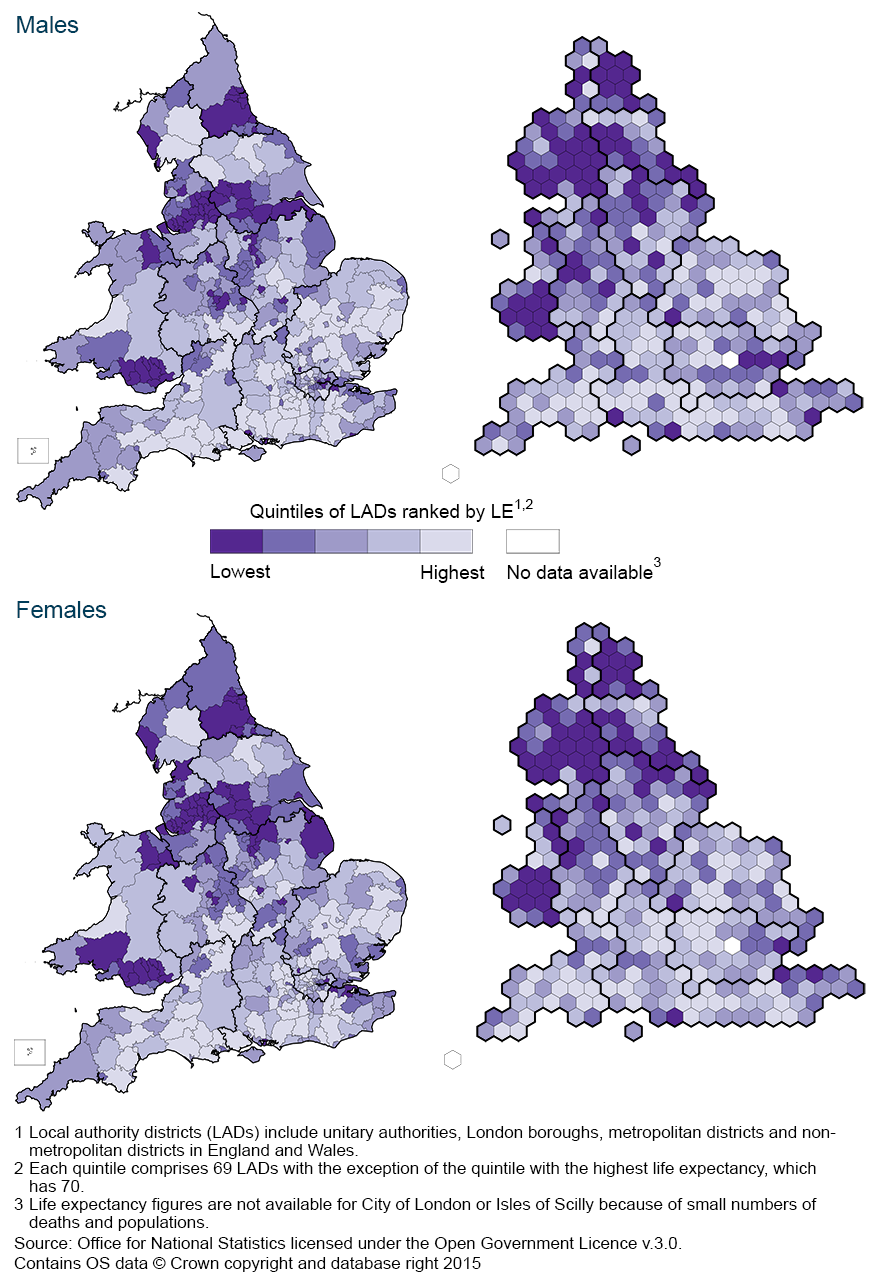
9. Animated maps
To see how life expectancy at birth and at age 65 has changed for your local area between 2000 to 2002 and 2012 to 2014, please refer to our interactive animated maps.
Back to table of contents10. Background
Life expectancy at birth has been used as a measure of the health status of the population of England and Wales since the 1840s. It was employed in some of the earliest reports of the Registrar General to illustrate the differences in mortality experienced by populations in different parts of the country. We have continued this tradition of using life expectancy as an indicator of geographical inequalities in health since 2001 with the publication of subnational life expectancy statistics.
The Strategic Review of Health Inequalities in England post-2010 (Marmot, 2010) reported that people living in the poorest neighbourhoods in England, will, on average, die years earlier than those living in the richest neighbourhoods. The review noted that although population health has improved in England in the past 50 years, in Kensington and Chelsea, a ward in the wealthiest part of London, a man can expect to live to 88 years, while a few kilometres away in Tottenham Green, one of the capital’s poorer wards, male life expectancy is 71 years. It concluded that such health inequalities, which stem from avoidable inequalities in society in terms of income, education, employment and neighbourhood circumstances, are not inevitable and can be significantly reduced.
Other studies have shown that geographical variations in life expectancy can largely be accounted for by individual and area-based deprivation or disadvantage. For example, using an employment and income-based measure, Griffiths and Fitzpatrick (2001) (1 Mb Pdf), established that there was a strong association between deprivation at local authority level in England and life expectancy. They found that decreasing life expectancy was associated with increasing deprivation and that this association was stronger for males than for females. Similarly, Woods, et al. (2005) examined variations in life expectancy at birth across English regions and in Wales, concluding that the geographical patterns observed were largely explained by variations in income deprivation.
These studies provide a compelling case for monitoring inequalities in life expectancy with a view to narrowing the gap between different areas. As noted by Marmot (2010), reducing health inequalities would benefit society in many ways. There would be economic benefits in reducing losses from illness associated with health inequalities. These currently account for productivity losses, reduced tax revenue, higher welfare payments and increased treatment costs.
Back to table of contents11. Users and policy context
Life expectancy figures are widely used by local health planners in monitoring health inequalities and in targeting resources to tackle these inequalities in the most effective manner. They also help to inform policy, planning and research in both public and private sectors in areas such as health, population, pensions and insurance. Main users include the Department of Health and Public Health England, the Welsh Government and Public Health Wales, local and unitary authorities, and private pensions and insurance companies.
In England, the Department of Health’s Public Health Outcomes Framework (Department of Health, 2013) sets out its vision for public health, desired outcomes and the indicators that will help in understanding how well public health is being improved and protected. This framework uses the difference in life expectancy and healthy life expectancy between communities as one of two high level outcomes for monitoring population health. Similarly, the NHS Outcomes Framework (Department of Health, 2014) provides a national overview of how the NHS is performing and includes an objective to prevent people from dying prematurely. One of the 2 overarching indicators used to measure and monitor this objective is life expectancy at age 75.
In addition, male and female life expectancy at birth and the inequality in these measures are part of a new set of indicators (Marmot Indicators 2014) developed by the Institute of Health Equity in collaboration with Public Health England, following the policy recommendations of the Marmot Review. These indicators provide local authorities with the information needed to support the monitoring of the overall strategic direction in reducing health inequalities.
In Wales, life expectancy is used as a high level indicator in the Public Health Strategic Framework Our Healthy Future (OHF) to monitor progress against reducing inequities in health.
At an international level, life expectancy is used by the European Community Health Indicators Monitoring (ECHIM) project to monitor health across Europe. In addition, life expectancy at birth, age 45 and age 65, and by socioeconomic status are also used as indicators of access to care (including inequity in access to care) and inequalities in outcomes in the European Commission’s policy framework on Social Inclusion and Social Protection.
One of the objectives of the European Union’s Sustainable Development Strategy is to promote good public health on equal conditions and improve protection against health threats. Life expectancy at birth is one of the "headline" public health indicators used in monitoring progress against this objective.
Back to table of contents12. Results on our website
Life expectancy figures for England and Wales (combined and separately), English regions and local areas within both countries are available in reference tables accompanying this release.
The workbooks contain:
life expectancy at birth and at age 65 by local areas in England and Wales (combined and separately), English regions, counties, unitary and local authorities. Data are presented for males and females for the periods 1991 to 1993 to 2012 to 2014
the highest and lowest (top and bottom ten) ranked local areas according to life expectancy at birth and at age 65 respectively. Data are presented for males and females and for the periods 2000 to 2002 to 2012 to 2014
local authorities in England and Wales ranked according to life expectancy at birth and at age 65 respectively. Data are presented for males and females for the periods 2000 to 2002 to 2012 to 2014
13. Methods
Calculation
In this bulletin, data for England and Wales were calculated using abridged life table methods (based on 5-year age groups), while those in the National life tables on our website are based on complete life table methods (based on single year of age). The 2 sets of figures may therefore differ slightly.
The life expectancy figures for England and Wales presented here should be used when making national and subnational comparisons.
Abridged life tables were constructed using standard methods (Shyrock and Siegel, 1976; Newell, 1994). Separate tables were constructed for males and females using numbers of deaths registered and mid-year population estimates for 3 consecutive years. A life table template (192.5 Kb Excel sheet) which illustrates the method used to calculate life expectancy (and 95% confidence intervals) for this bulletin, including a description of the notation, can be found on our website.
The 95% confidence interval (CI) for each area was calculated using the revised Chiang method (Chiang II), allowing the calculation of the variance of the mortality rates for those age groups with no deaths registered in the analysis period. This method is the approved standard for our outputs of life expectancy at sub-national level (Toson and Baker, 2003 (288.1 Kb Pdf)).
Interpretation of life expectancy
Period expectation of life at a given age for an area in a given time period is an estimate of the average number of years a person of that age would survive if he or she experienced the particular area’s age-specific mortality rates for that time period throughout the rest of his or her life. The figure reflects mortality among those living in the area in each time period, rather than mortality among those born in each area. It is not therefore the number of years a person in the area in each time period could actually expect to live, both because the death rates of the area are likely to change in the future and because many of those in the area may live elsewhere for at least some part of their lives.
Period life expectancy at birth is also not a guide to the remaining expectation of life at any given age. For example, if female life expectancy at birth was 80 years for a particular area, the life expectancy of women aged 65 years in that area is likely to exceed 15 years. This reflects the fact that survival from a particular age depends only on the death rates beyond that age, whereas survival from birth is based on death rates at every age.
Differences between period and cohort life expectancies
Expectations of life can be calculated in 2 ways: period life expectancy (as presented in this bulletin) and cohort life expectancy.
Cohort life expectancies are calculated using age-specific mortality rates which allow for known or projected changes in mortality in later years and are therefore regarded as a more appropriate measure of how long a person of a given age would be expected to live, on average, than period life expectancy.
For example, period life expectancy at age 65 in 2000 would be worked out using the mortality rate for age 65 in 2000, for age 66 in 2000, for age 67 in 2000, and so on. Cohort life expectancy at age 65 in 2000 would be worked out using the mortality rate for age 65 in 2000, for age 66 in 2001, for age 67 in 2002 and so on.
Period life expectancies are a useful measure of mortality rates actually experienced over a given period and, for past years, provide an objective means of comparison of the trends in mortality over time, between areas of a country and with other countries. Official life tables in England and Wales and in other countries that relate to past years are generally period life tables for these reasons. Cohort life expectancies, even for past years, usually require projected mortality rates for their calculation and so, in such cases, involve an element of subjectivity.
Further information on period and cohort life expectancies can be found on our website.
Back to table of contents