Table of contents
- Key findings
- Summary
- Background
- Users and policy context
- National life expectancy
- Regional life expectancy
- Local area life expectancy
- Animated maps
- Results on the Office for National Statistics website
- Methods
- Interpretation of life expectancy
- Differences between period and cohort life expectancies
- References
- Background notes
1. Key findings
- In 2011–13, the inequality in life expectancy between the local areas with the highest and lowest figures was greater for newborn baby boys than girls, but slightly greater for women than men at age 65.
- The inequality in life expectancy between the local areas with the highest and lowest figures increased for newborn baby boys, but reduced for girls between 2007–09 and 2011–13.
- Life expectancy at birth and at age 65 increased at a faster pace in London, the North East and the North West compared with other regions between 2007–09 and 2011–13.
- In 2011–13, approximately 32% of local areas in the East, 43% in the South East and 28% in the South West were in the fifth of areas with the highest male life expectancy at birth. In contrast, there was no local area in the North East and Wales in this group. A similar pattern was observed for females.
- In 2011–13, life expectancy for newborn baby boys was highest in South Cambridgeshire (83.0 years); 8.7 years longer than in Blackpool with the lowest (74.3 years).
- For newborn baby girls, life expectancy was highest in Chiltern (86.4 years); 6.4 years longer than in Manchester with the lowest (80.0 years).
- For men at age 65, life expectancy was highest in Harrow (21.1 years) and lowest in Manchester (16.0 years).
- For women at age 65, life expectancy was highest in Camden (24.0 years) and lowest in Halton (18.8 years).
2. Summary
This bulletin presents male and female period life expectancy at birth and at age 65 for England and Wales and local areas within both countries. Figures are presented for the period 2011–13, with those for the periods 2007–09 to 2010–12 for comparison purposes. Information is given about the context, calculation and interpretation of life expectancy figures.
An important change has been made to ONS’s reporting of local area life expectancy. Beginning with 2013 data, the bulletin will cover only England and Wales rather than the entire UK. This follows the response to ONS's Consultation on proposed cuts to a number of statistical outputs, required as ONS funding has been reduced.
Back to table of contents3. Background
Period life expectancy at a given age for an area is the average number of years a person would live, if he or she experienced the particular area’s age-specific mortality rates for that time period throughout his or her life.
Life expectancy at birth has been used as a measure of the health status of the population of England and Wales since the 1840s. It was employed in some of the earliest reports of the Registrar General to illustrate the differences in mortality experienced by populations in different parts of the country. This tradition of using life expectancy as an indicator of geographic inequalities in health has been continued by ONS since 2001 with the publication of sub-national life expectancy statistics.
Several studies have shown that geographical variations in life expectancy can largely be accounted for by individual and area based deprivation or disadvantage. For example, using an employment and income based measure, Griffiths and Fitzpatrick (2001) (1 Mb Pdf), established that there was a strong association between deprivation at local authority level in England and life expectancy. They found that decreasing life expectancy was associated with increasing deprivation and that this association was stronger for males than for females. Similarly, Woods, et al. (2005) examined variations in life expectancy at birth across English regions and in Wales, concluding that the geographical patterns observed were largely explained by variations in income deprivation.
More recently, a report on life expectancy at birth by socioeconomic position reported a clear gradient and an increase in the inequality between the most and least advantaged socioeconomic classes between 1982–86 and 2002–06. For example, in 2002–06, boys and girls whose parent(s) had an occupation classified as ‘Higher managers and professionals’, such as directors of major organisations, doctors and lawyers, could be expected to live 5.8 years and 4.2 years longer, respectively, than boys and girls whose parents were in ‘Routine’ occupations such as labourers and cleaners. These figures represent an increase from 4.9 years for boys and 3.8 years for girls in 1982–06 (ONS, 2011 (129.1 Kb Pdf)).
Furthermore, the Strategic Review of Health Inequalities in England post-2010 (Marmot, 2010) reported that people living in the poorest neighbourhoods in England, will, on average, die seven years earlier than those living in the richest neighbourhoods. The Marmot Review noted that although population health has improved in England in the past 50 years, in Kensington and Chelsea, a ward in the wealthiest part of London, a man can expect to live to 88 years, while a few kilometres away in Tottenham Green, one of the capital’s poorer wards, male life expectancy is 71 years. It concluded that such health inequalities, which stem from avoidable inequalities in society in terms of income, education, employment and neighbourhood circumstances, are not inevitable and can be significantly reduced.
These studies provide a compelling case for monitoring inequalities in life expectancy with a view to narrowing the gap between different areas. As noted by Marmot (2010), reducing health inequalities would benefit society in many ways. There would be economic benefits in reducing losses from illness associated with health inequalities. These currently account for productivity losses, reduced tax revenue, higher welfare payments and increased treatment costs.
Back to table of contents4. Users and policy context
Life expectancy figures are widely used by local health planners in monitoring health inequalities and in targeting resources to tackle these inequalities in the most effective manner. They also help to inform policy, planning and research in both public and private sectors in areas such as health, population, pensions and insurance. Key users include the Department of Health and Public Health England, the Welsh Government and Public Health Wales, local and unitary authorities, and private pensions and insurance companies.
In England, the Department of Health’s Public Health Outcomes Framework Healthy lives, healthy people: Improving outcomes and supporting transparency (Department of Health, 2013) sets out its vision for public health, desired outcomes and the indicators that will help in understanding how well public health is being improved and protected. This framework uses the difference in life expectancy and healthy life expectancy between communities as one of two high level outcomes for monitoring population health. Similarly, the NHS Outcomes Framework 2013/14 (Department of Health, 2012) includes an objective to prevent people from dying prematurely. One of the two overarching indicators used to measure and monitor this objective is life expectancy at age 75.
In addition, male and female life expectancy at birth and the inequality in these measures are part of a new set of indicators (Marmot Indicators 2014) developed by the Institute of Health Equity in collaboration with Public Health England, following the policy recommendations of the Marmot Review. These indicators provide local authorities with the information needed to support the monitoring of the overall strategic direction in reducing health inequalities.
In Wales, life expectancy is used as a high level indicator in the Public Health Strategic Framework - Our Healthy Future (OHF) - to monitor progress against reducing inequities in health.
At an international level, life expectancy is used by the European Community Health Indicators Monitoring (ECHIM) project to monitor health across Europe. In addition, life expectancy at birth, age 45 and age 65, and by socioeconomic status are also used as indicators of access to care (including inequity in access to care) and inequalities in outcomes in the European commission’s policy framework on Social Inclusion and Social Protection.
One of the objectives of the European Union’s Sustainable Development Strategy is to promote good public health on equal conditions and improve protection against health threats. Life expectancy at birth is one of the ‘headline’ public health indicators used in monitoring progress against this objective.
Back to table of contents5. National life expectancy
The National life tables, 2011-13 (ONS, 2014a) provide life expectancy figures for the UK and it constituent countries. They are calculated using complete life tables (based on single year of age) for three-year rolling periods. The national life expectancy figures included in this statistical bulletin differ from the ones in the national life tables in that they were calculated using the same methodology used for sub-national life expectancy figures. They may therefore differ very slightly from the national figures in the National life tables.
The national life expectancy figures presented here should be used when making national and sub-national comparisons (see the ‘Methods’ section for more information). Figures here are for the five most recent periods for ease of presentation. The reference tables accompanying this release contain data from 1991–93 onwards.
Life expectancy at birth
Life expectancy at birth in England and Wales (combined) increased between the periods 2007–09 and 2011–13, from 78.1 to 79.3 years for males and 82.2 to 83.0 years for females. Life expectancy increased at a faster pace for males than females, causing the gap between the sexes to narrow from 4.1 years in 2007–09 to 3.7 years in 2011–13.
Life expectancy was higher in England than in Wales in every period examined and the difference between both countries was greater for males than for females. In England, male life expectancy increased from 78.2 years in 2007–09 to 79.4 years in 2011–13. For females, the corresponding increase was from 82.3 to 83.1 years. Over the same period, life expectancy at birth increased in Wales from 77.2 to 78.3 years for males and from 81.5 to 82.3 years for females.
Table 1: Life expectancy at birth: by sex and country, 2007-09 to 2011-13
| Years | |||||
| Country | 2007-09 | 2008-10 | 2009-11 | 2010-12 | 2011-13 |
| Males | |||||
| England and Wales | 78.1 | 78.4 | 78.8 | 79.1 | 79.3 |
| England | 78.2 | 78.5 | 78.9 | 79.2 | 79.4 |
| Wales | 77.2 | 77.6 | 78.0 | 78.2 | 78.3 |
| Females | |||||
| England and Wales | 82.2 | 82.4 | 82.8 | 82.9 | 83.0 |
| England | 82.3 | 82.5 | 82.9 | 83.0 | 83.1 |
| Wales | 81.5 | 81.8 | 82.2 | 82.2 | 82.3 |
| Source: Office for National Statistics | |||||
| Notes: | |||||
| 1. Three year rolling averages, based on deaths registered in calendar years and mid-year population estimates. | |||||
| 2. Figures for England and Wales include deaths of non-residents. Figures for England and Wales separately exclude deaths of non-residents. | |||||
Download this table Table 1: Life expectancy at birth: by sex and country, 2007-09 to 2011-13
.xls (28.2 kB)Life expectancy at age 65
In England and Wales (combined), life expectancy for men at age 65 increased from 17.8 years in 2007–09 to 18.6 years in 2011–13. For females, the corresponding increase was from 20.5 to 21.1 years over the periods. The gender difference in life expectancy narrowed slightly from 2.7 to 2.5 years over these periods.
Similar to at birth, life expectancy at age 65 was higher for men and women in England than in Wales in every period examined (see Table 2). However, as both countries saw similar improvements in life expectancy, there was no change in the difference between them over time.
Table 2: Life expectancy at age 65 by sex and country, 2007-09 to 2011-13
| Years | |||||
| Country | 2007-09 | 2008-10 | 2009-11 | 2010-12 | 2011-13 |
| Males | |||||
| England and Wales | 17.8 | 18.1 | 18.3 | 18.5 | 18.6 |
| England | 17.9 | 18.1 | 18.4 | 18.6 | 18.7 |
| Wales | 17.3 | 17.6 | 17.9 | 18.0 | 18.1 |
| Females | |||||
| England and Wales | 20.5 | 20.7 | 21.0 | 21.1 | 21.1 |
| England | 20.5 | 20.7 | 21.0 | 21.1 | 21.1 |
| Wales | 20.1 | 20.2 | 20.5 | 20.6 | 20.6 |
| Source: Office for National Statistics | |||||
| Notes: | |||||
| 1. Three year rolling averages, based on deaths registered in calendar years and mid-year population estimates. | |||||
| 2. Figures for England and Wales include deaths of non-residents. Figures for England and Wales separately exclude deaths of non-residents. | |||||
Download this table Table 2: Life expectancy at age 65 by sex and country, 2007-09 to 2011-13
.xls (28.2 kB)6. Regional life expectancy
Life expectancy varied across English regions in each period examined and tended to be higher among those in the south than in the north and midlands.
Life expectancy at birth
In 2011–13, life expectancy at birth was highest in the South East (80.4 years) for males and in London for females (84.1years). Conversely, they were lowest in the North West for males (78.0 years) and in the North East for females (81.7 years).
Life expectancy was higher for females than males across all regions in each period examined. In 2011–13 the gender inequality in life expectancy was greatest in London (4.1 years) and smallest in the East of England (3.4 years). Nevertheless, these gaps are narrower than they were in 2007–09.With the exception of London, life expectancy increased at a faster pace among regions in the north and the Midlands than in the south between 2007–09 and 2011–13. For males, the greatest increases were seen in London, the North West and North East while the least were in the South West and South East. For females, a similar picture was observed with the greatest increases in life expectancy seen in London, the East Midlands and the North West and the lowest in the South East and South West. As a result, the gap in male life expectancy between the regions with the highest and lowest figure fell from 2.7 to 2.4 years for males. However, the gap in female life expectancy remained stable at 2.4 years.
Studies have shown that the selective migration of healthy individuals from poorer health areas into better health areas as well as socioeconomic, environmental (including working conditions), educational and lifestyle factors are largely responsible for the excess mortality and consequently lower life expectancy in northern regions compared with those in the south (Hacking, Muller and Buchan, 2011; Norman, Boyle and Rees, 2005). Nevertheless, life expectancy continues to increase at a faster pace in the northern regions and in London than the other southern regions. One possible explanation is the varying rate of decrease in deaths from avoidable causes across English regions. Since 2001, the greatest reduction in deaths rates for potentially avoidable causes such as certain cancers, respiratory and heart disease have been seen in the North East, North West and London (ONS, 2014b).
Table 3: Life expectancy at birth by sex and region, 2007-09 to 2011-13
| Years | |||||
| Region | 2007-09 | 2008-10 | 2009-11 | 2010-12 | 2011-13 |
| Males | |||||
| North East | 76.7 | 77.1 | 77.5 | 77.8 | 78.0 |
| North West | 76.6 | 77.0 | 77.4 | 77.7 | 78.0 |
| Yorkshire and The Humber | 77.4 | 77.7 | 78.1 | 78.3 | 78.5 |
| East Midlands | 78.1 | 78.3 | 78.7 | 79.1 | 79.3 |
| West Midlands | 77.5 | 77.9 | 78.4 | 78.7 | 78.8 |
| East | 79.2 | 79.5 | 79.9 | 80.1 | 80.3 |
| London | 78.5 | 78.8 | 79.3 | 79.7 | 80.0 |
| South East | 79.4 | 79.7 | 80.0 | 80.3 | 80.4 |
| South West | 79.1 | 79.4 | 79.8 | 80.0 | 80.1 |
| Females | |||||
| North East | 80.9 | 81.1 | 81.5 | 81.6 | 81.7 |
| North West | 80.8 | 81.1 | 81.5 | 81.7 | 81.8 |
| Yorkshire and The Humber | 81.4 | 81.7 | 82.0 | 82.2 | 82.2 |
| East Midlands | 82.0 | 82.3 | 82.8 | 82.9 | 83.0 |
| West Midlands | 81.9 | 82.2 | 82.6 | 82.7 | 82.8 |
| East | 83.0 | 83.2 | 83.6 | 83.7 | 83.8 |
| London | 82.9 | 83.2 | 83.6 | 83.8 | 84.1 |
| South East | 83.2 | 83.4 | 83.8 | 83.8 | 83.9 |
| South West | 83.2 | 83.4 | 83.7 | 83.9 | 83.8 |
| Source: Office for National Statistics | |||||
| Notes: | |||||
| 1. Three year rolling averages, based on deaths registered in calendar years and mid-year population estimates. | |||||
| 2. Figures exclude deaths of non-residents. | |||||
Download this table Table 3: Life expectancy at birth by sex and region, 2007-09 to 2011-13
.xls (29.2 kB)Life expectancy at age 65
In 2011–13, life expectancy at age 65 was highest for men in the South East (19.3 years), 1.4 years longer than in the North East with the lowest figure (17.8 years). For women, the comparable figures were 21.9 years in London and 20.0 years in the North East.
Similar to at birth, the greatest improvement in life expectancy at age 65 between 2007–09 and 2011–13 was observed in London, the North East and North West for both sexes.
Gender inequality in life expectancy persists at age 65, albeit to a smaller extent than at birth. In addition, this inequality was smaller in the North East and North West than in other regions.
Table 4: Life expectancy at age 65 by sex and region, 2007-09 to 2011-13
| Years | |||||
| Region | 2007-09 | 2008-10 | 2009-11 | 2010-12 | 2011-13 |
| Males | |||||
| North East | 16.9 | 17.1 | 17.5 | 17.6 | 17.8 |
| North West | 17.0 | 17.2 | 17.6 | 17.8 | 17.9 |
| Yorkshire and The Humber | 17.4 | 17.6 | 17.8 | 18.0 | 18.0 |
| East Midlands | 17.7 | 17.9 | 18.2 | 18.3 | 18.5 |
| West Midlands | 17.6 | 17.9 | 18.2 | 18.4 | 18.4 |
| East | 18.4 | 18.6 | 18.9 | 19.1 | 19.2 |
| London | 18.1 | 18.4 | 18.7 | 18.9 | 19.1 |
| South East | 18.6 | 18.8 | 19.0 | 19.2 | 19.3 |
| South West | 18.5 | 18.7 | 19.0 | 19.1 | 19.2 |
| Females | |||||
| North East | 19.4 | 19.6 | 20.0 | 20.0 | 20.0 |
| North West | 19.5 | 19.8 | 20.1 | 20.2 | 20.2 |
| Yorkshire and The Humber | 20.0 | 20.2 | 20.5 | 20.5 | 20.5 |
| East Midlands | 20.4 | 20.6 | 20.9 | 21.0 | 21.0 |
| West Midlands | 20.4 | 20.6 | 21.0 | 21.0 | 21.1 |
| East | 20.9 | 21.1 | 21.5 | 21.5 | 21.6 |
| London | 21.1 | 21.3 | 21.6 | 21.7 | 21.9 |
| South East | 21.2 | 21.4 | 21.6 | 21.6 | 21.7 |
| South West | 21.2 | 21.4 | 21.6 | 21.7 | 21.7 |
| Source: Office for National Statistics | |||||
| Notes: | |||||
| 1. Three year rolling averages, based on deaths registered in calendar years and mid-year population estimates. | |||||
| 2. Figures exclude deaths of non-residents. | |||||
Download this table Table 4: Life expectancy at age 65 by sex and region, 2007-09 to 2011-13
.xls (29.2 kB)7. Local area life expectancy
The local area life expectancy figures presented in this bulletin are based on the current geographical boundaries.
Life expectancy at birth
The local areas with the highest and lowest male and female life expectancy at birth in England and Wales for the periods 2000–02 to 2011–13 are presented in tables 5 and 6 respectively. For the purpose of this bulletin, figures are only presented for the top and bottom ten ranked local areas.
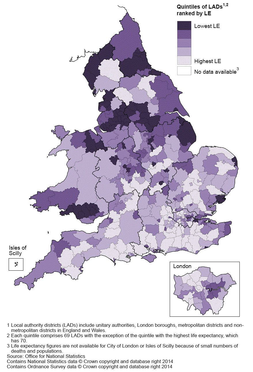
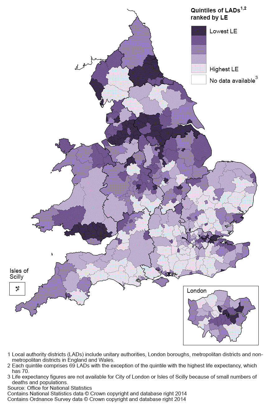
The distribution of life expectancy in England was characterised by a north-south divide, with life expectancy generally being lower among local areas in the north of the country. In 2011–13, male life expectancy at birth was highest in South Cambridgeshire (83.0 years) and lowest in Blackpool (74.3 years). For females, life expectancy at birth was highest in Chiltern at 86.4 years and lowest in Manchester where females could expect to live for 80.0 years. These differences were statistically significant. It is noteworthy that these areas were not always ranked top and bottom respectively in England and Wales. Therefore, the change in inequality in life expectancy is not necessarily a measure of the change in the gap between these specific areas over time.
The difference in male life expectancy between the local areas with the highest and lowest figures rose from 8.3 years in 2007–09 to 8.7 years in 2011–13. Conversely, for females, the geographical inequality fell from 7.3 to 6.4 years over the same periods.
On average, there was an increase in life expectancy of 1.2 years for males and 0.8 years for females across all local areas between 2007–09 and 2011–13. However, not all areas saw an increase over these periods, with the change in male life expectancy ranging from a decrease of 0.4 years in Fareham to an increase of 3.0 years in Haringey. For females, the greatest improvement over these periods was observed in East Northamptonshire (2.5 years) while the greatest decrease was in Vale of White Horse (0.9 years).
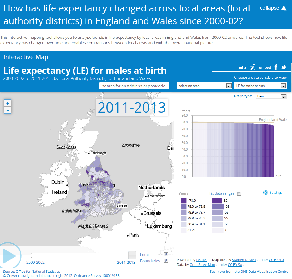
The distribution of male and female life expectancy at birth by local areas in England and Wales for 2011–13 can be found in maps 1 and 2 respectively.
Map 1: Life expectancy (LE) for males at birth by local authority district, England and Wales, 2011–13

Source: Office for National Statistics
Notes:
- Local authority districts include unitary authorities, London boroughs, metropolitan districts and non-metropolitan districts in England and Wales
- Each quintile comprises 69 LADs with the exception of the quintile with the highest life expectancy, which has 70.
- Life expectancy figures are not available for City of London or Isles of Scilly because of small numbers of deaths and populations.
Download this image Map 1: Life expectancy (LE) for males at birth by local authority district, England and Wales, 2011–13
.gif (168.5 kB)
Map 2: Life expectancy (LE) for females at birth by local authority district, England and Wales, 2011–13
Source: Office for National Statistics
Notes:
- Local authority districts include unitary authorities, London boroughs, metropolitan districts and non-metropolitan districts in England and Wales
- Each quintile comprises 69 LADs with the exception of the quintile with the highest life expectancy, which has 70.
- Life expectancy figures are not available for City of London or Isles of Scilly because of small numbers of deaths and populations.
Download this image Map 2: Life expectancy (LE) for females at birth by local authority district, England and Wales, 2011–13
.gif (173.7 kB)Life expectancy at age 65
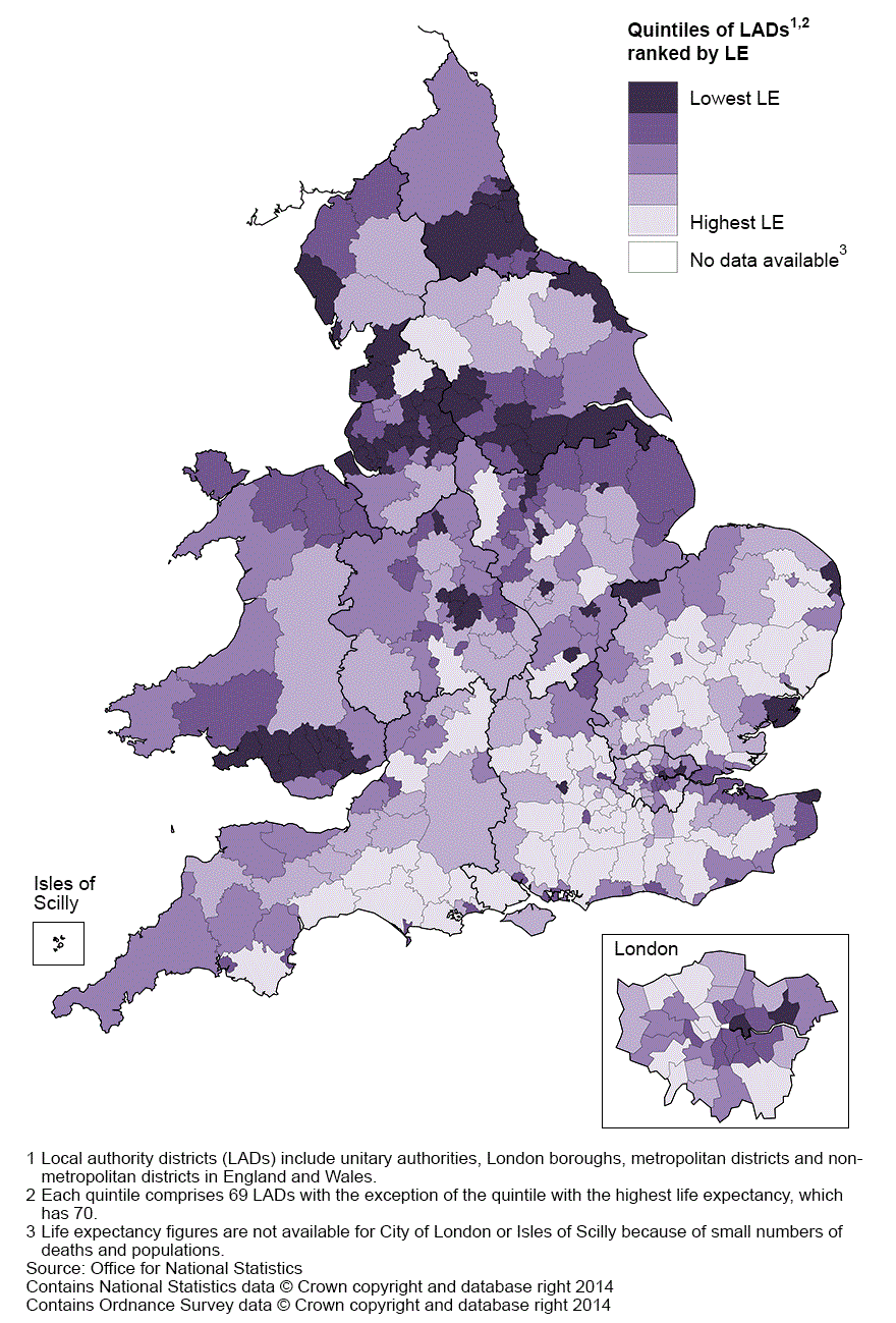
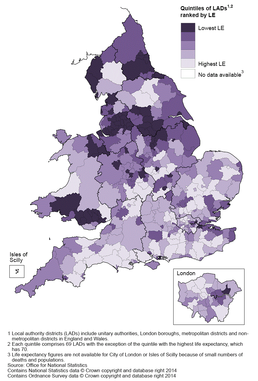
In 2011–13, life expectancy for men at age 65 was highest in Harrow (21.1 years) and lowest in Manchester (16.0 years), the area consistently ranked lowest in each of the last five periods. For women at this age, life expectancy was highest in Camden (24.0 years) and lowest in Halton (18.8 years). These differences were statistically significant. The difference in life expectancy at age 65 between the local areas with the highest and lowest figures was 5.1 years for men and 5.2 years for women.
On average life expectancy at age 65 across all local areas improved by 0.8 years for men and 0.6 years for women between 2007–09 and 2011–13. However, not all areas saw an increase in life expectancy between the two periods. The greatest improvements were in Camden for men and in Welwyn Hatfield for women, where life expectancy rose by 2.3 years and 2.1 years respectively. Conversely, the greatest losses over the periods were in York for men (0.5 years) and Vale of White Horse for women (0.7 years). While national estimates of life expectancy provide a snapshot of the mortality experience of a whole population, they do not reveal the heterogeneity of experience within it. As such, favourable averages at national level or even at regional level may be disproportionately influenced by extremes of mortality experience within these areas. As observed from these figures, the inequality in life expectancy becomes more pronounced as the geographical level of analysis becomes more refined.
The distribution of male and female life expectancy at age 65 by local areas in England and Wales for 2011–13 can be found in maps 3 and 4 respectively.
Map 3: Life expectancy (LE) for males at age 65 by local authority district, England and Wales, 2011–13
Source: Office for National Statistics
Notes:
- Local authority districts include unitary authorities, London boroughs, metropolitan districts and non-metropolitan districts in England and Wales
- Each quintile comprises 69 LADs with the exception of the quintile with the highest life expectancy, which has 70.
- Life expectancy figures are not available for City of London or Isles of Scilly because of small numbers of deaths and populations.
Download this image Map 3: Life expectancy (LE) for males at age 65 by local authority district, England and Wales, 2011–13
.gif (168.7 kB)
Map 4: Life expectancy (LE) for females at age 65 by local authority district, England and Wales, 2011–13

Source: Office for National Statistics
Notes:
- Local authority districts include unitary authorities, London boroughs, metropolitan districts and non-metropolitan districts in England and Wales
- Each quintile comprises 69 LADs with the exception of the quintile with the highest life expectancy, which has 70.
- Life expectancy figures are not available for City of London or Isles of Scilly because of small numbers of deaths and populations.
Download this image Map 4: Life expectancy (LE) for females at age 65 by local authority district, England and Wales, 2011–13
.gif (172.0 kB)8. Animated maps
Life expectancy at birth and at age results for 2000–02 to 2011–13 have been published as a set of interactive animated maps to show the change in life expectancy at local area level over time. Click the link to access the maps, this is a reproduction of the map image.
Back to table of contents

9. Results on the Office for National Statistics website
Life expectancy figures for England and Wales combined, England, Wales, English regions and local areas within both countries are available in two excel workbooks in the Data in this release section.
The workbooks contain:
- life expectancy at birth and at age 65 for local areas in England and Wales (combined and separately), English regions, counties, unitary and local authorities. Data are presented for males and females for the periods 1991–93 to 2011–13
- the highest and lowest (top and bottom ten) ranked local areas according to life expectancy at birth and at age 65 respectively. Data are presented for males and females and for the periods 2000–02 to 2011–13
- local authorities in England and Wales ranked according to life expectancy at birth and at age 65 respectively. Data are presented for males and females for the periods 2000–02 to 2011–13
10. Methods
Calculation
Abridged life tables (based on five-year age groups) were constructed using standard methods (Shyrock and Siegel, 1976; Newell, 1994). Separate tables were constructed for males and females using numbers of deaths registered in calendar years and annual mid-year population estimates. A life table template (192.5 Kb Excel sheet) which illustrates the method used to calculate life expectancy (and 95% confidence intervals) for this bulletin, including a description of the notation, can be found on the ONS website.
The 95 per cent confidence interval (CI) for each area was calculated using the revised Chiang method (Chiang II), allowing the calculation of the variance of the mortality rates for those age groups with no deaths registered in the analysis period. This method is the approved standard for ONS outputs of life expectancy at sub-national level (Toson and Baker, 2003 (288.1 Kb Pdf)).
Back to table of contents11. Interpretation of life expectancy
All figures presented in this bulletin are period life expectancies. Period expectation of life at a given age for an area in a given time period is an estimate of the average number of years a person of that age would survive if he or she experienced the particular area’s age-specific mortality rates for that time period throughout the rest of his or her life. The figure reflects mortality among those living in the area in each time period, rather than mortality among those born in each area. It is not therefore the number of years a person in the area in each time period could actually expect to live, both because the death rates of the area are likely to change in the future and because many of those in the area may live elsewhere for at least some part of their lives.
Period life expectancy at birth is also not a guide to the remaining expectation of life at any given age. For example, if female life expectancy at birth was 80 years for a particular area, the life expectancy of women aged 65 years in that area is likely to exceed 15 years. This reflects the fact that survival from a particular age depends only on the death rates beyond that age, whereas survival from birth is based on death rates at every age.
Back to table of contents12. Differences between period and cohort life expectancies
Expectations of life can be calculated in two ways: period life expectancy (as presented in this bulletin) and cohort life expectancy.
Cohort life expectancies are calculated using age-specific mortality rates which allow for known or projected changes in mortality in later years and are therefore regarded as a more appropriate measure of how long a person of a given age would be expected to live, on average, than period life expectancy.
For example, period life expectancy at age 65 in 2000 would be worked out using the mortality rate for age 65 in 2000, for age 66 in 2000, for age 67 in 2000, and so on. Cohort life expectancy at age 65 in 2000 would be worked out using the mortality rate for age 65 in 2000, for age 66 in 2001, for age 67 in 2002, and so on.
Period life expectancies are a useful measure of mortality rates actually experienced over a given period and, for past years, provide an objective means of comparison of the trends in mortality over time, between areas of a country and with other countries. Official life tables in the UK and in other countries that relate to past years are generally period life tables for these reasons. Cohort life expectancies, even for past years, usually require projected mortality rates for their calculation and so, in such cases, involve an element of subjectivity.
Further information on period and cohort life expectancies can be found on the ONS website.
Back to table of contents